Kunde
ARoS
Bureau
Overtone®
Krediteringer
Beskrivelse
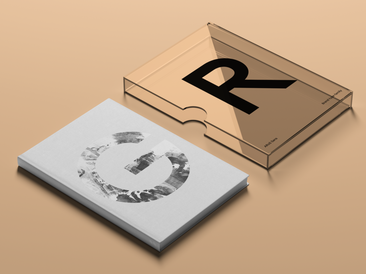
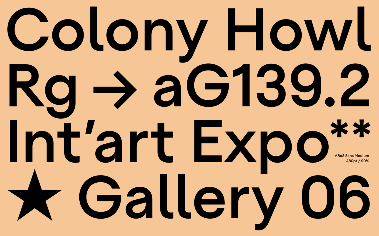
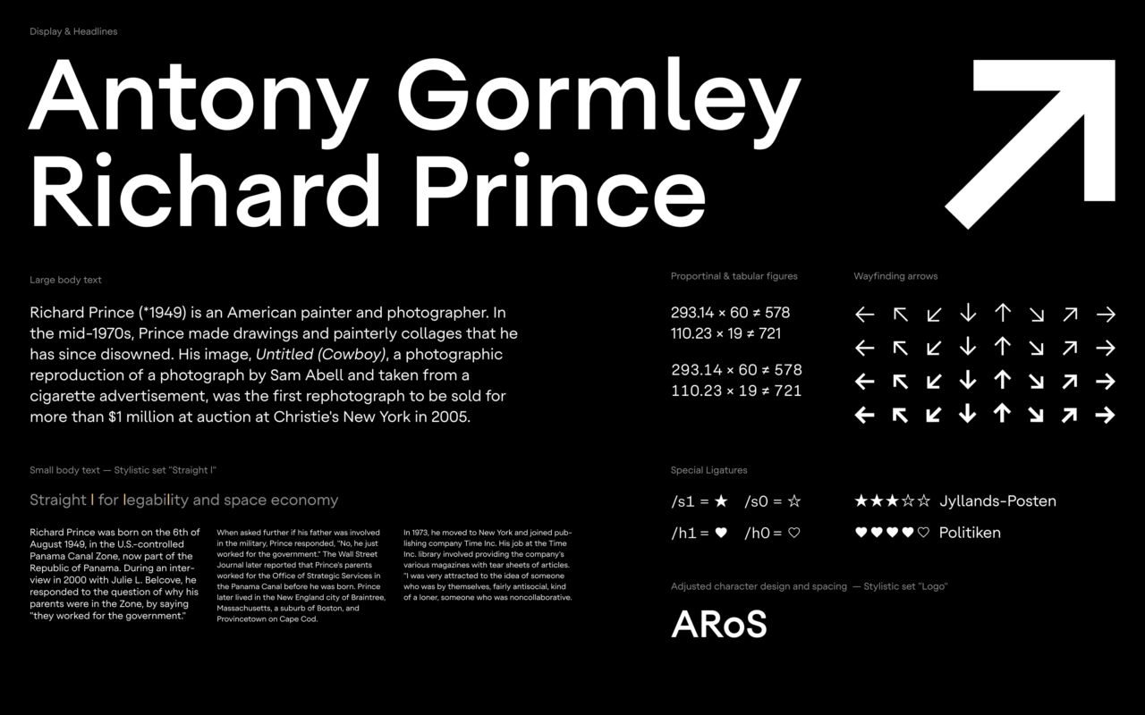
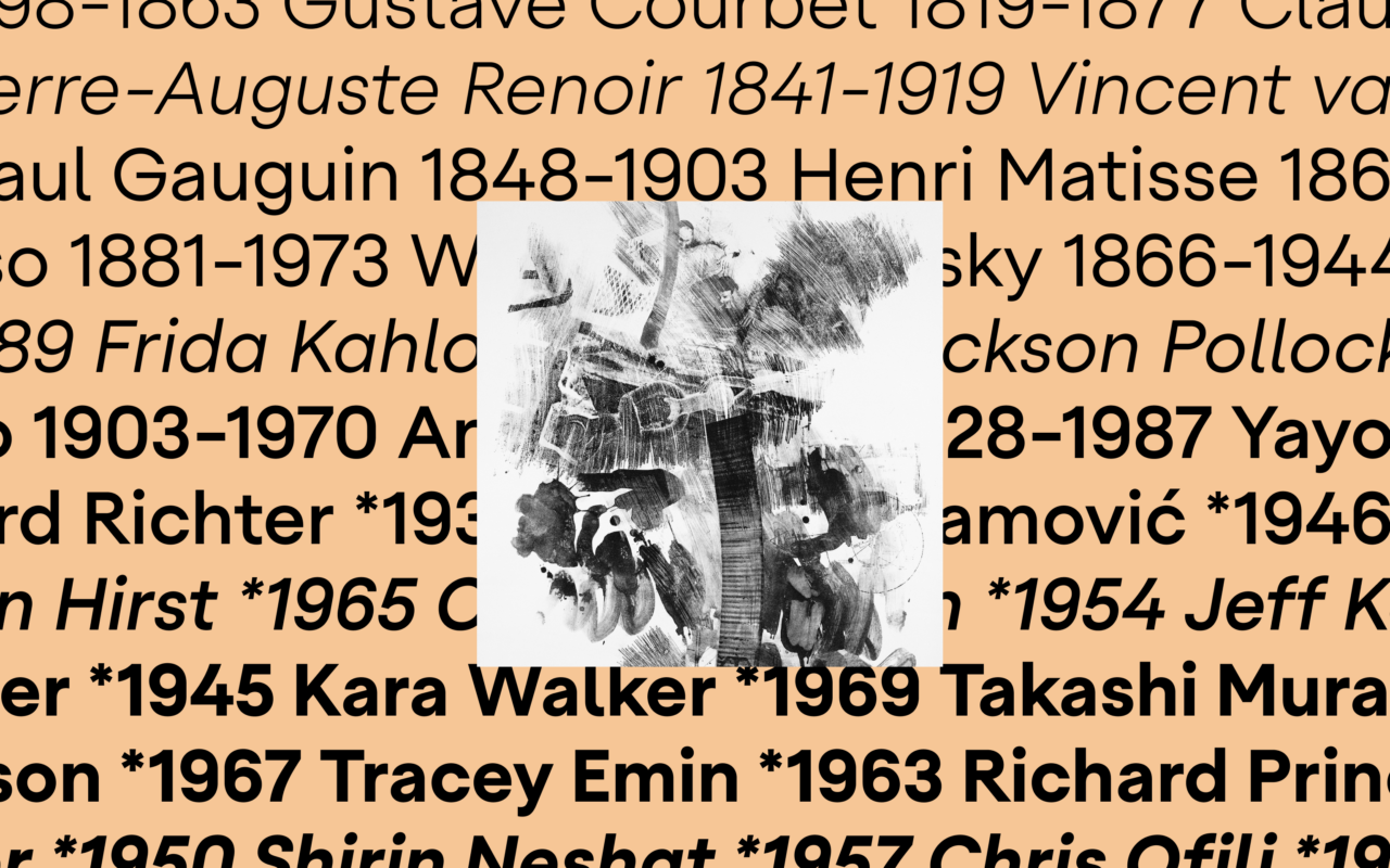
ARoS Sans is a versatile, neo-geometric brand type family designed to create a seamless, cohesive brand experience across digital platforms and exhibition spaces for the ARoS art museum. The design draws from the museum’s legacy, incorporating elements from its former logo, such as the distinctive circular “o” shape, to maintain continuity and brand recognition.
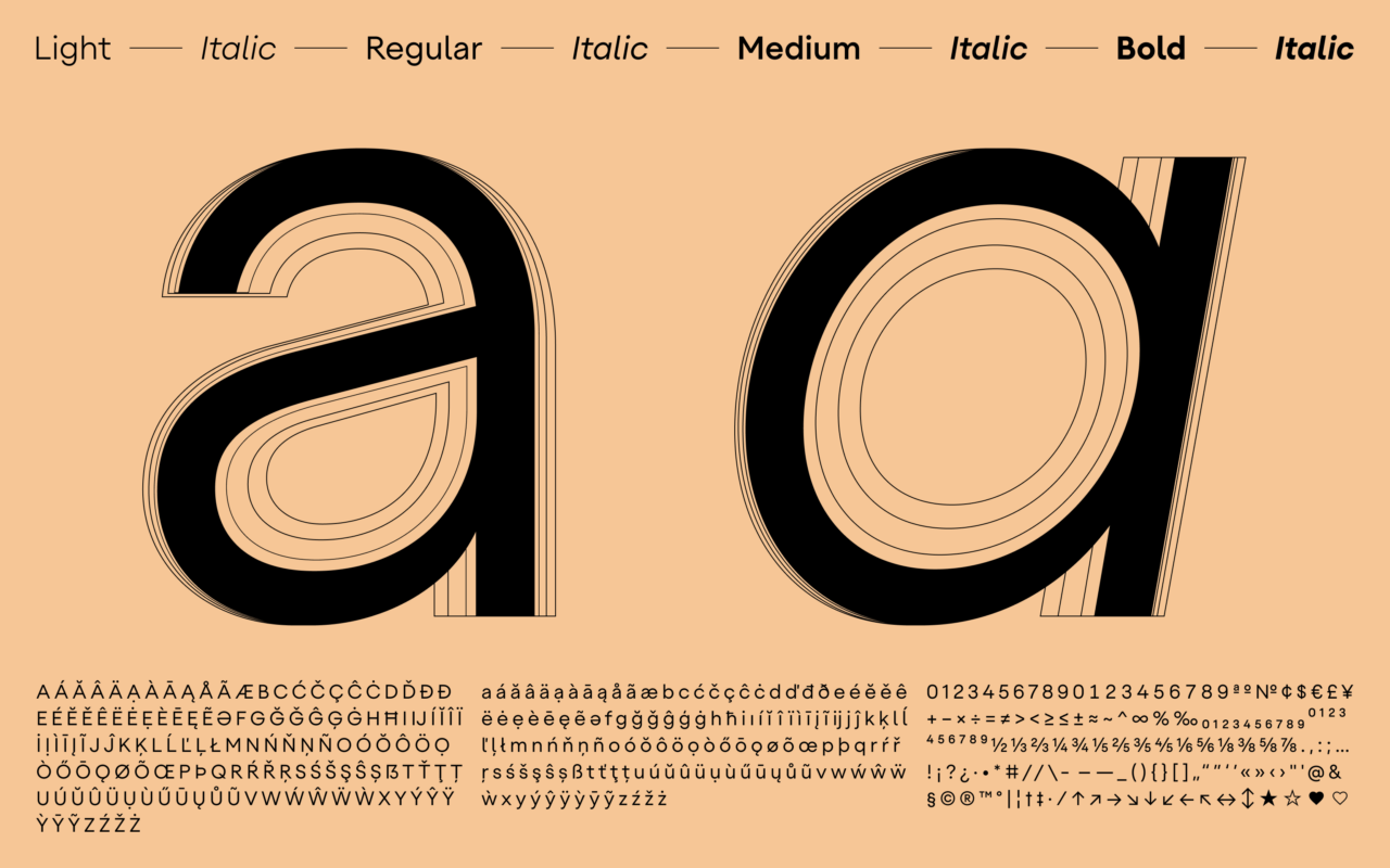
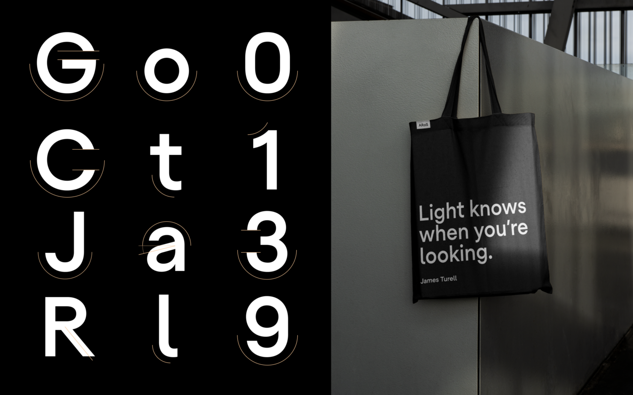
Key features of ARoS Sans include subtle design details in characters like “R”, “a”, “G”, and the tail of the “l”, which add a touch of personality without sacrificing legibility or clarity. This careful attention to form ensures that the typeface maintains both visual impact and functional utility.
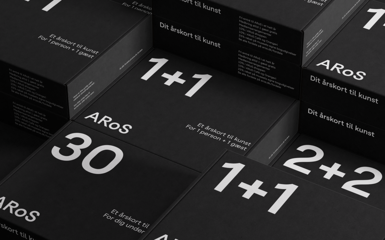
Special features within the type family support the daily use of the typeface, making it an ideal solution for varied applications, from wayfinding signage to exhibition materials.
PDF Filer
Shortliste
CCA 2025

