Kunde
Simply Chocolate
Krediteringer
Beskrivelse
We were briefed on creating a shop for only 13 chocolate bars, but the focus would be more on making a splash and a fun shopping experience, rather than making a super optimised e-commerce solution.
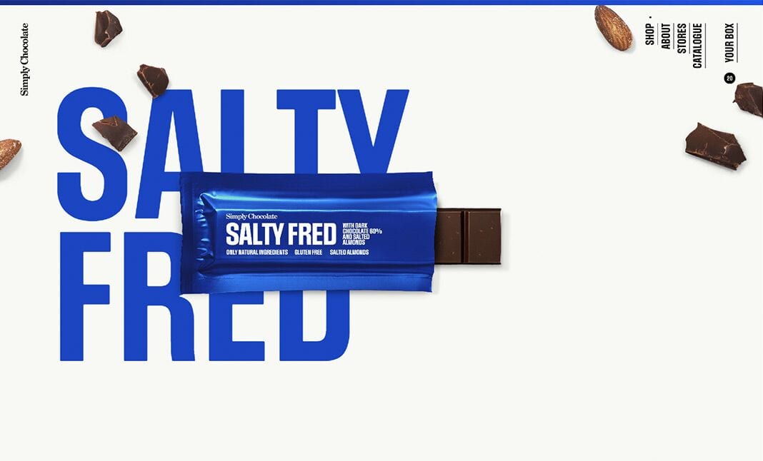
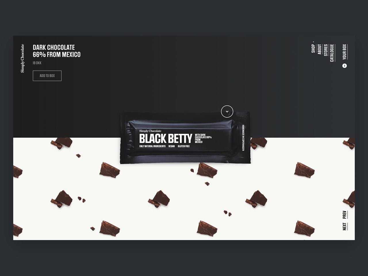
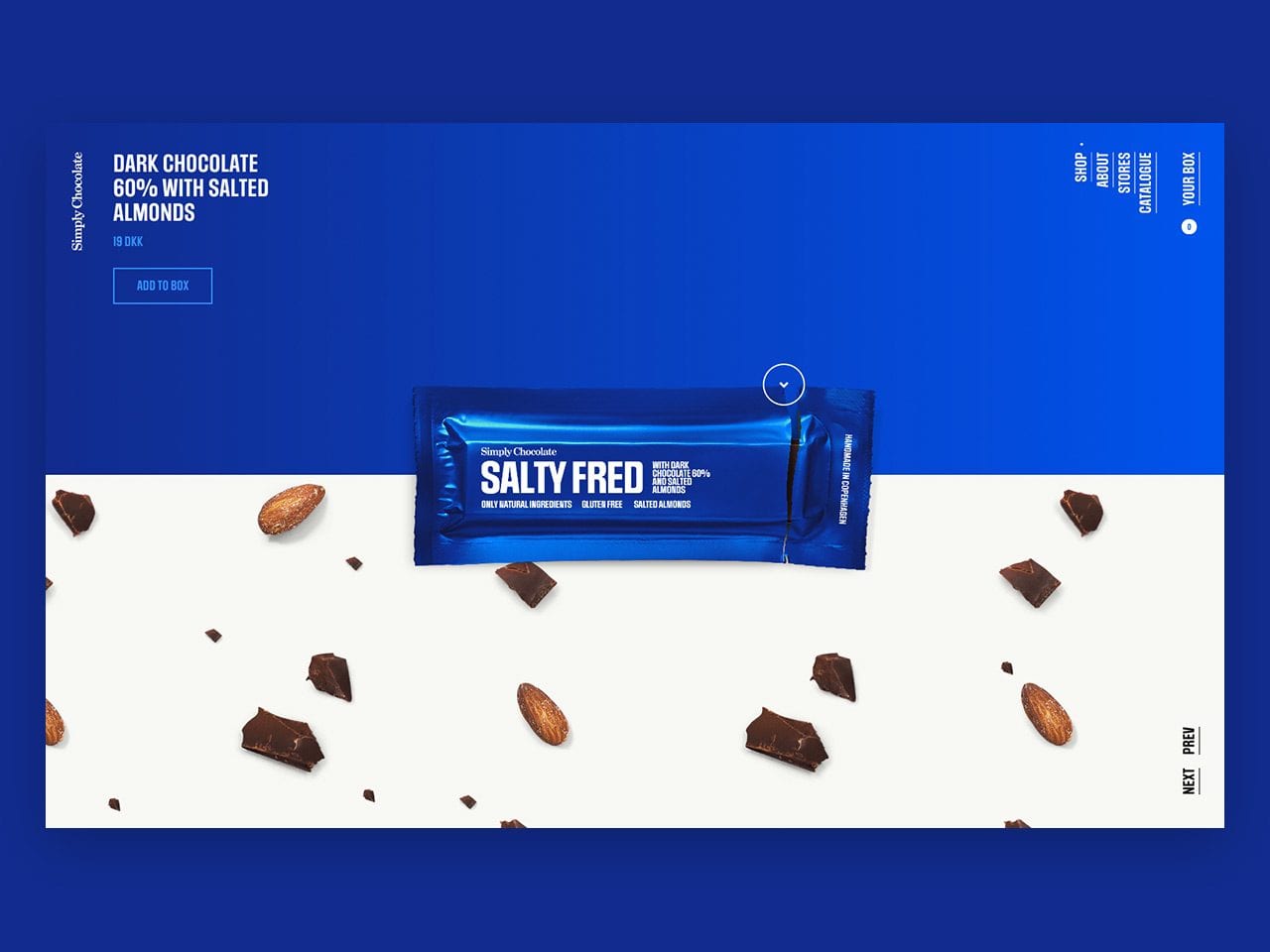
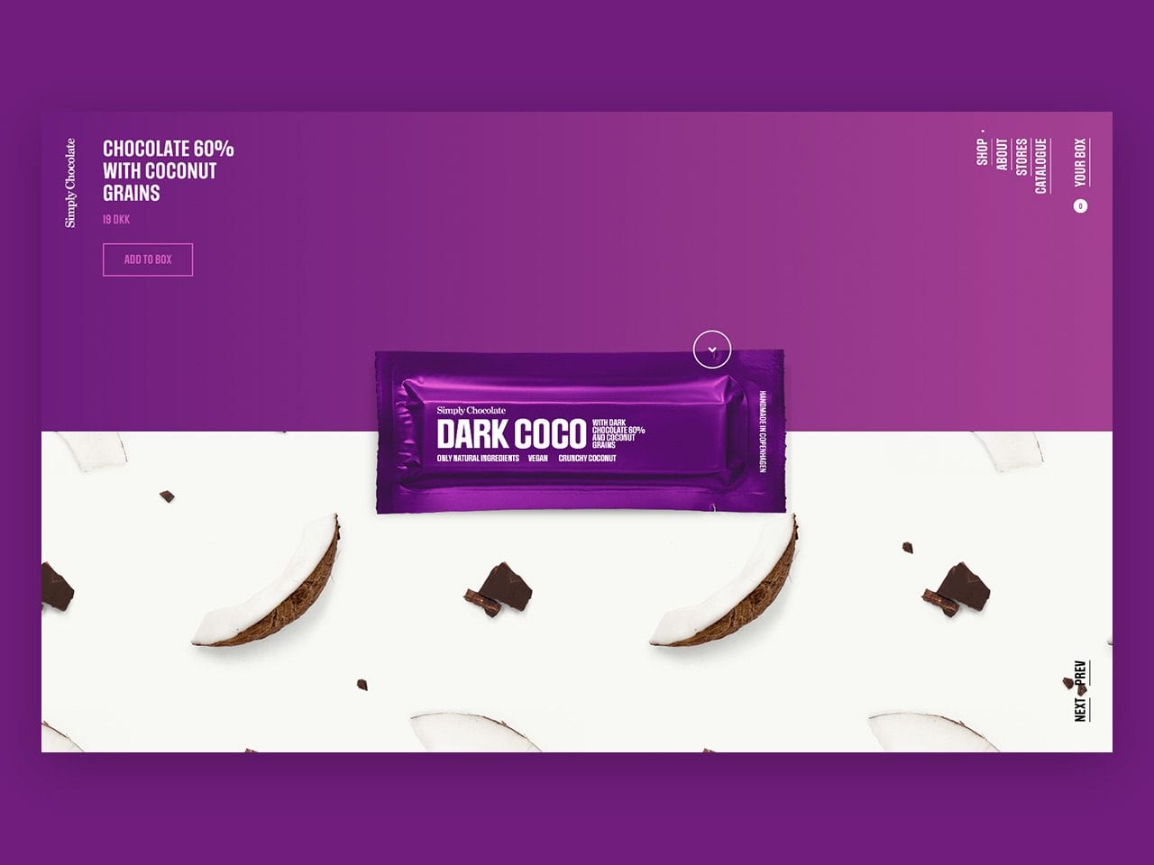
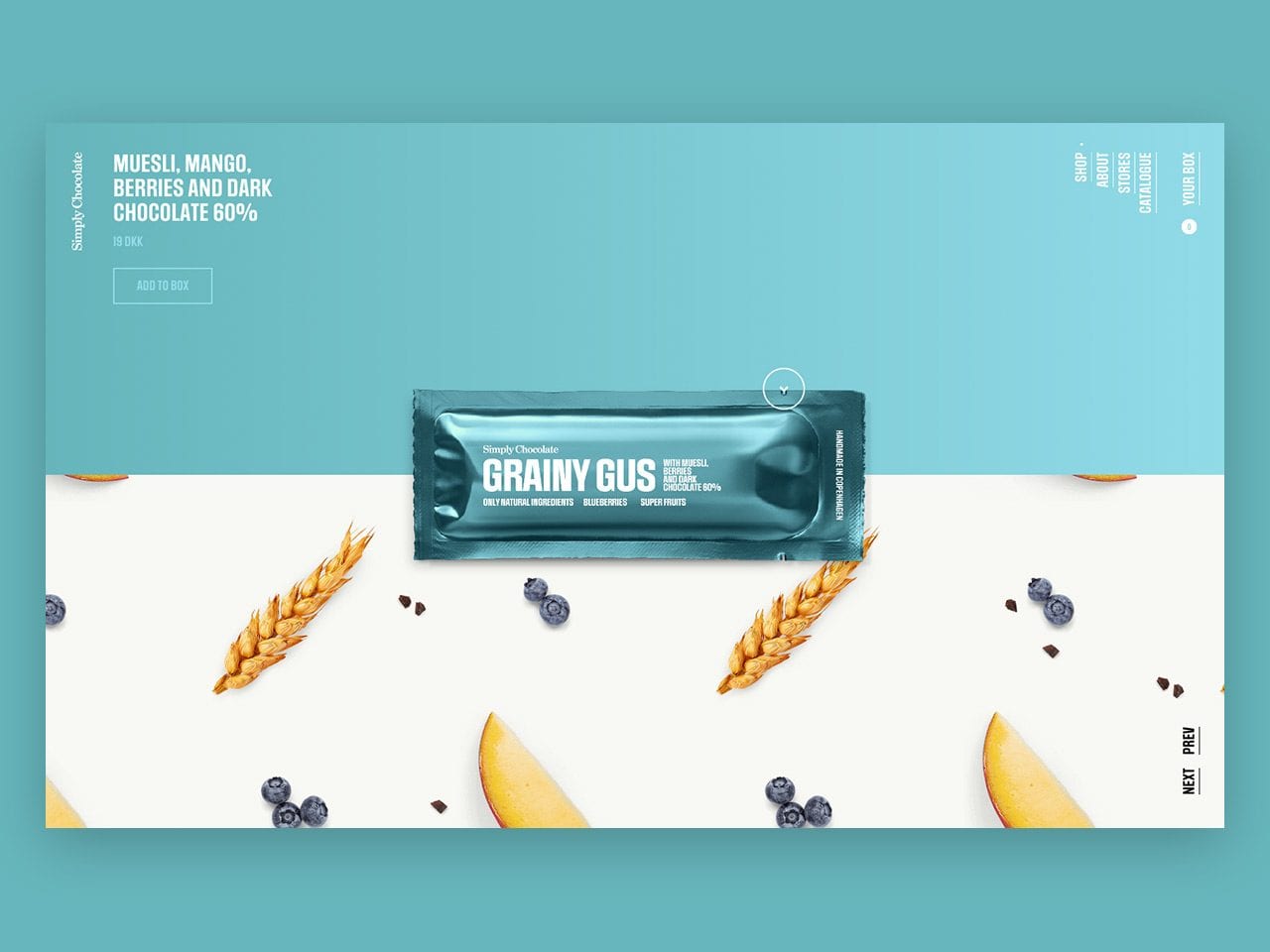
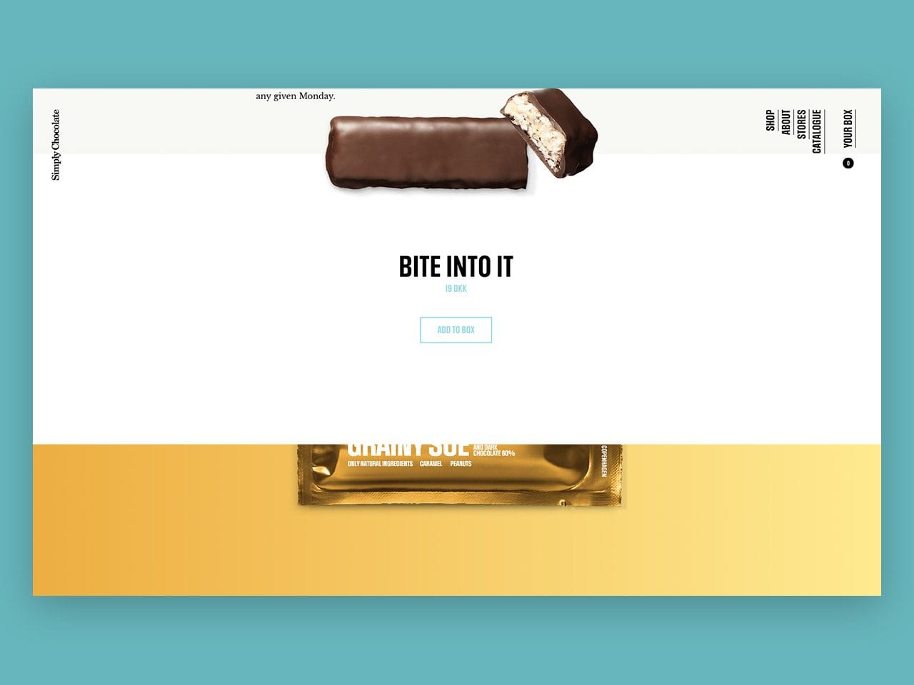
Since the 13 chocolate bars look visually similar, unwrapping a Simply Chocolate bar is like unveiling a surprise. We incorporated this sense of wonder into the website itself by creating a pattern with the ingredients of the bar that both visually shows users the flavors that make each bar unique while enhancing the consistent branding across the site.
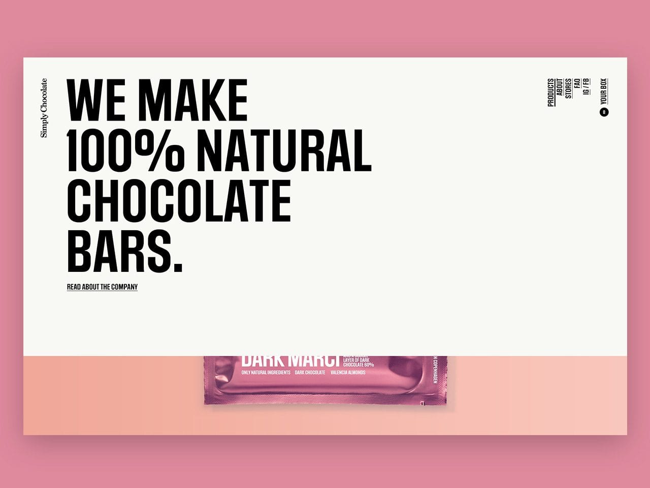
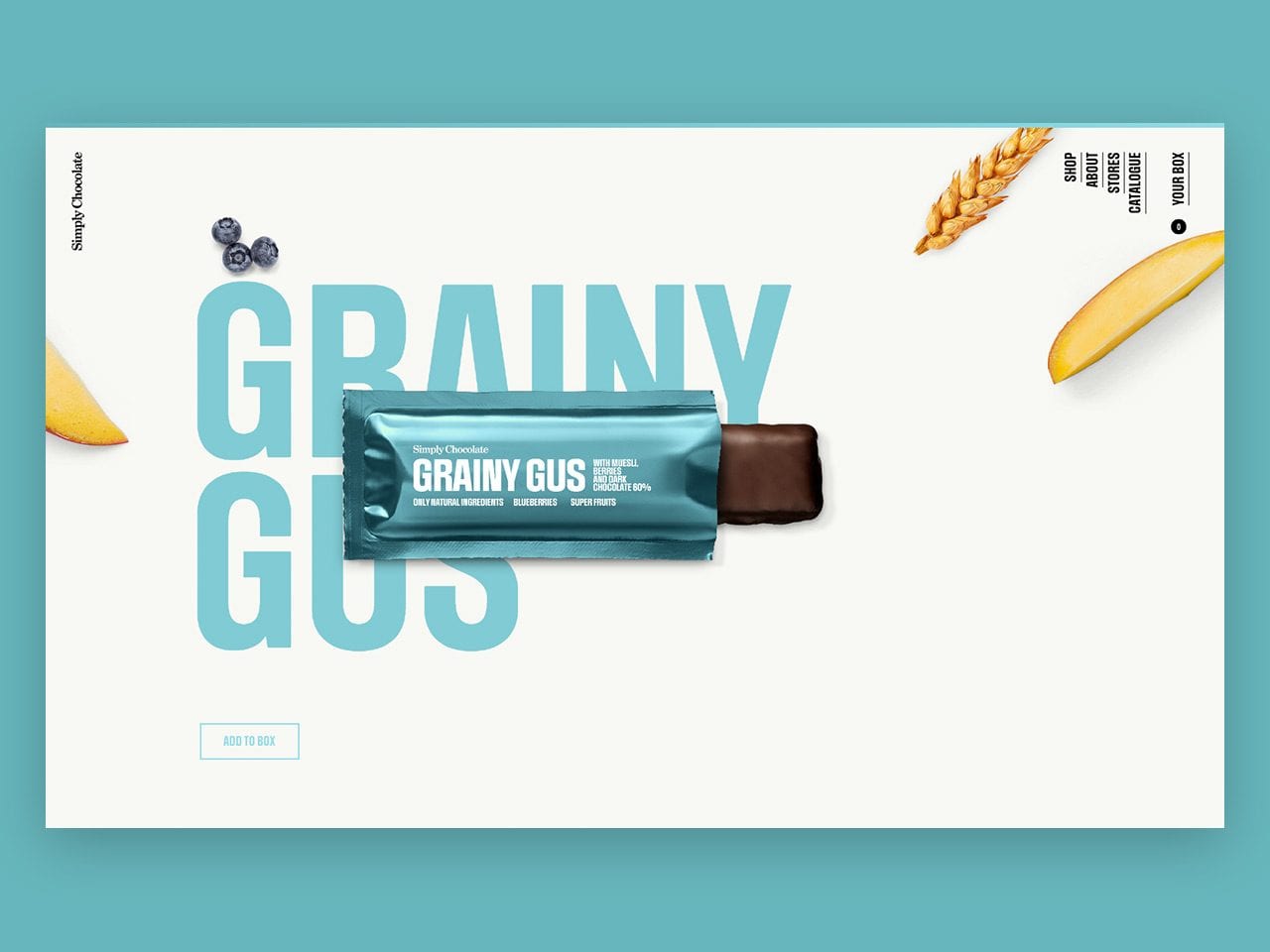
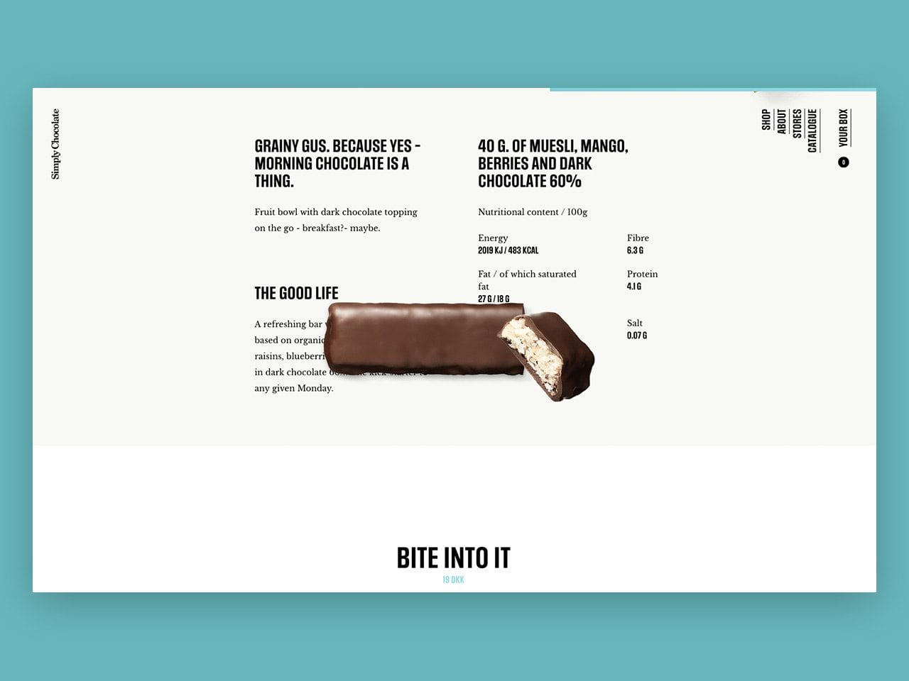
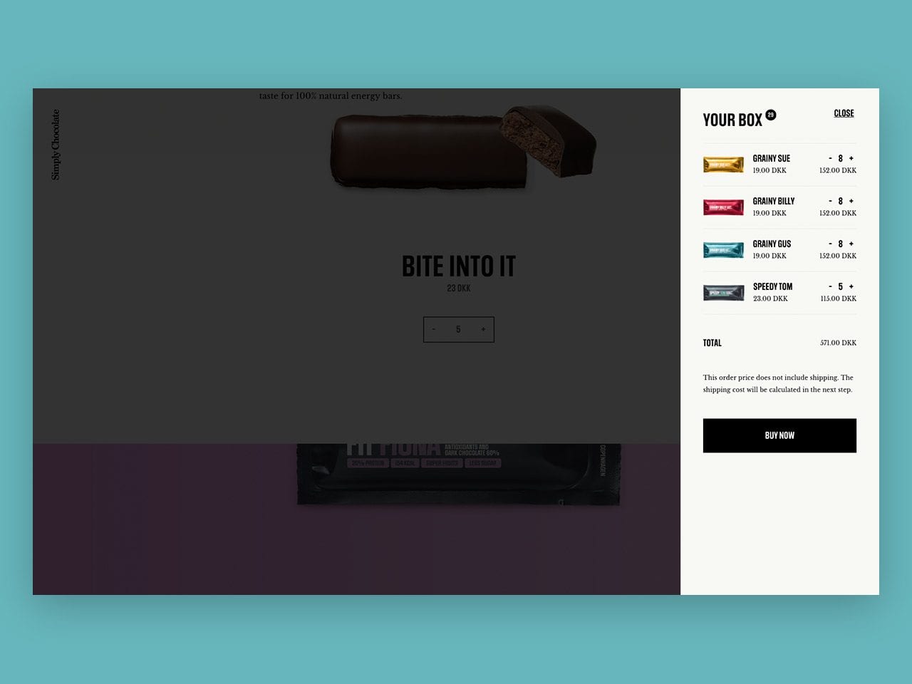
The landing page becomes the overview - you scroll through all the bars here and can see each of them. You can add them to your box (basket) at this step, so you do not need to unwrap them. If you want to dig deeper you can unwrap your bar by dragging an arrow, or by simply clicking the bar to unwrap it. The page for the bar becomes kind of a zoom level where you can read all about the bars and you can stay at this level to go through all of them. The chocolate box (basket) is in a panel on the side, and will follow you throughout the experience. You need to fill a box to check out. Simple.

Vinder 2018
CCA 2018

