Kunde
Tourist
Bureau
Uncle Grey
Krediteringer
Beskrivelse
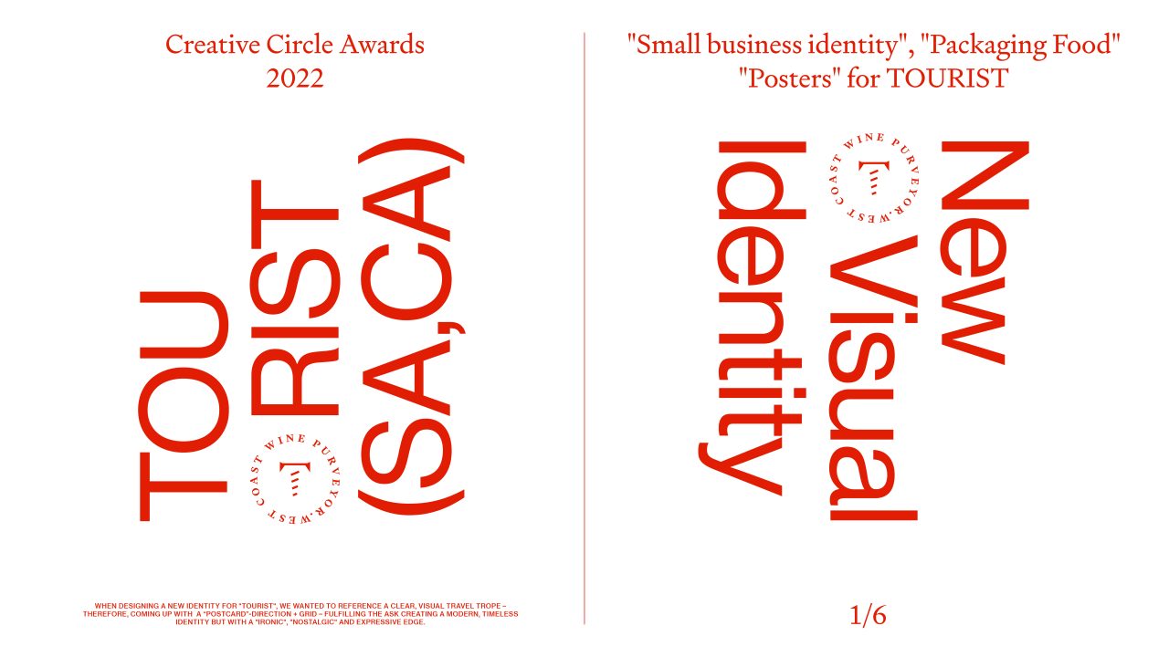
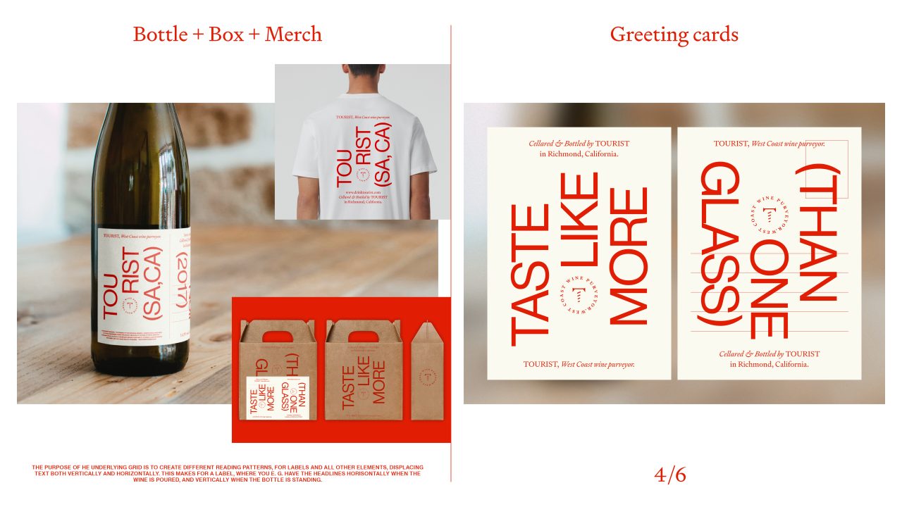
When designing a new identity for ‘Tourist’, we wanted to reference a clear, visual travel trope – therefore, coming up with a “postcard” – Direction + Grid – fulfilling the ask creating a modern, timeless identity but with a “ironic”, “nostalgic” and expressive edge.
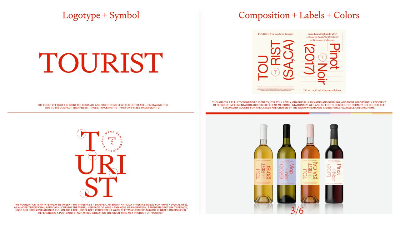
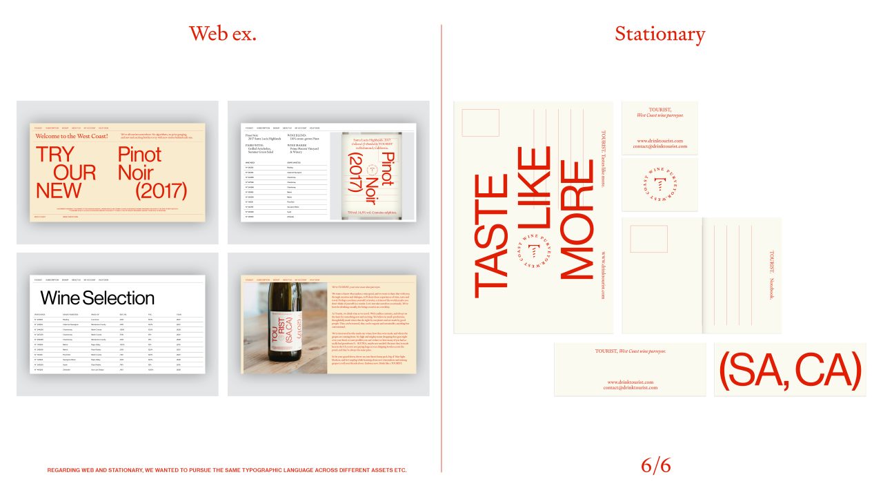
Though it’s a fully typographic identity, it’s still lively, graphically, dynamic and striking, and most importantly efficient in terms of implementation across different mediums – stationary, web and so forth.
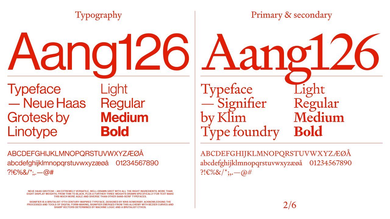
The foundation is an interplay between two typefaces – signifier, an sharp antiqua typeface (ideal for print + digital use), as a more traditional approach, exuding the visual heritage of wine- and neue has grotesk, a modern grotesk typeface, used for display/headlines, e.g., on the label, displaced in different ways. The “Wine-picker”-symbol is based on signifier, referencing a postcard-stamp, while indicating the given wine as a product of “Tourist”.
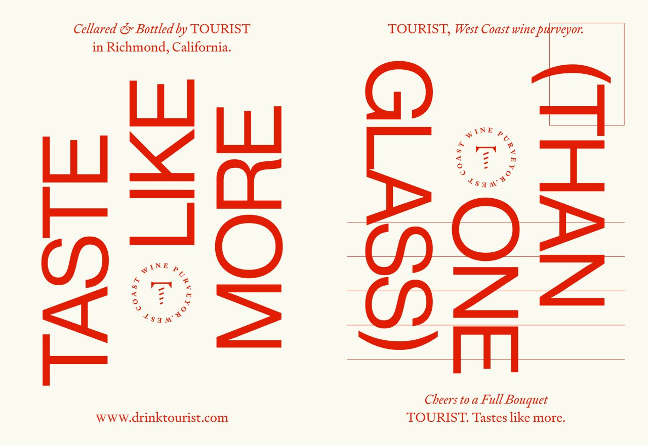
The purpose of the underlying grid is to create different reading patterns, for labels and all other elements, displacing text both vertically and horizontally. This makes for a label, where you e.g. have the headlines horizontally when the wine is poured, and vertically when the bottle is standing.
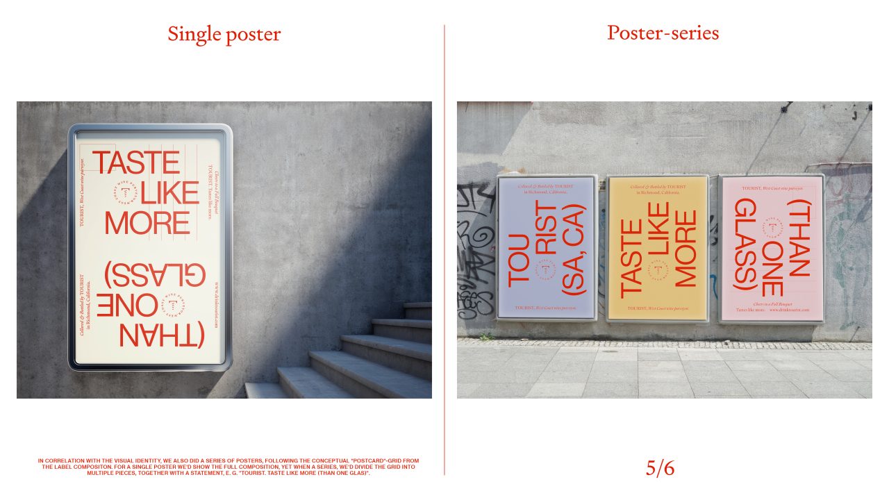
In correlation with the visual identity, we also did a series of posters, following the conceptual “postcard”-grid from the label composition. For a single poster we’d show the full composition, yet when a series, we’d divide the grid into multiple pieces, together with a statement, E.G. “Tourist. Taste Like More (Than One Glas)”.
PDF Filer
Shortliste
CCA 2022

