Kunde
TASAKI
Beskrivelse
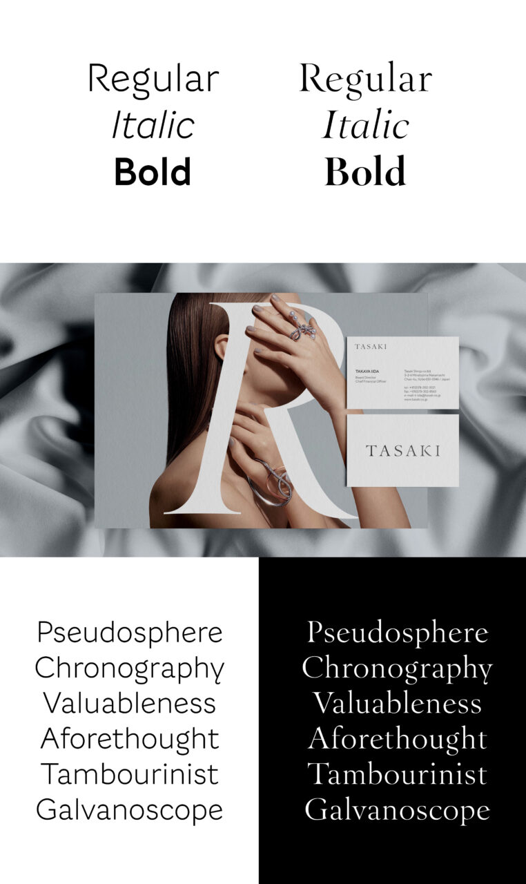
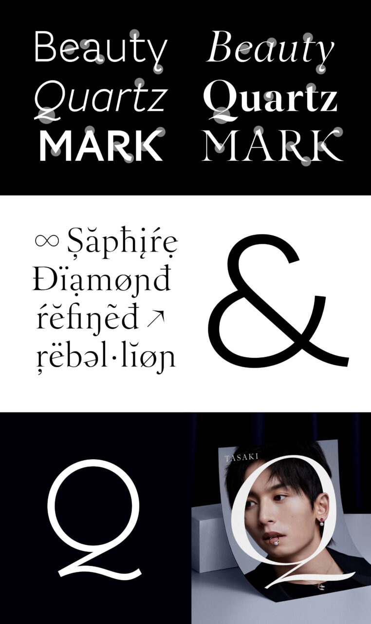
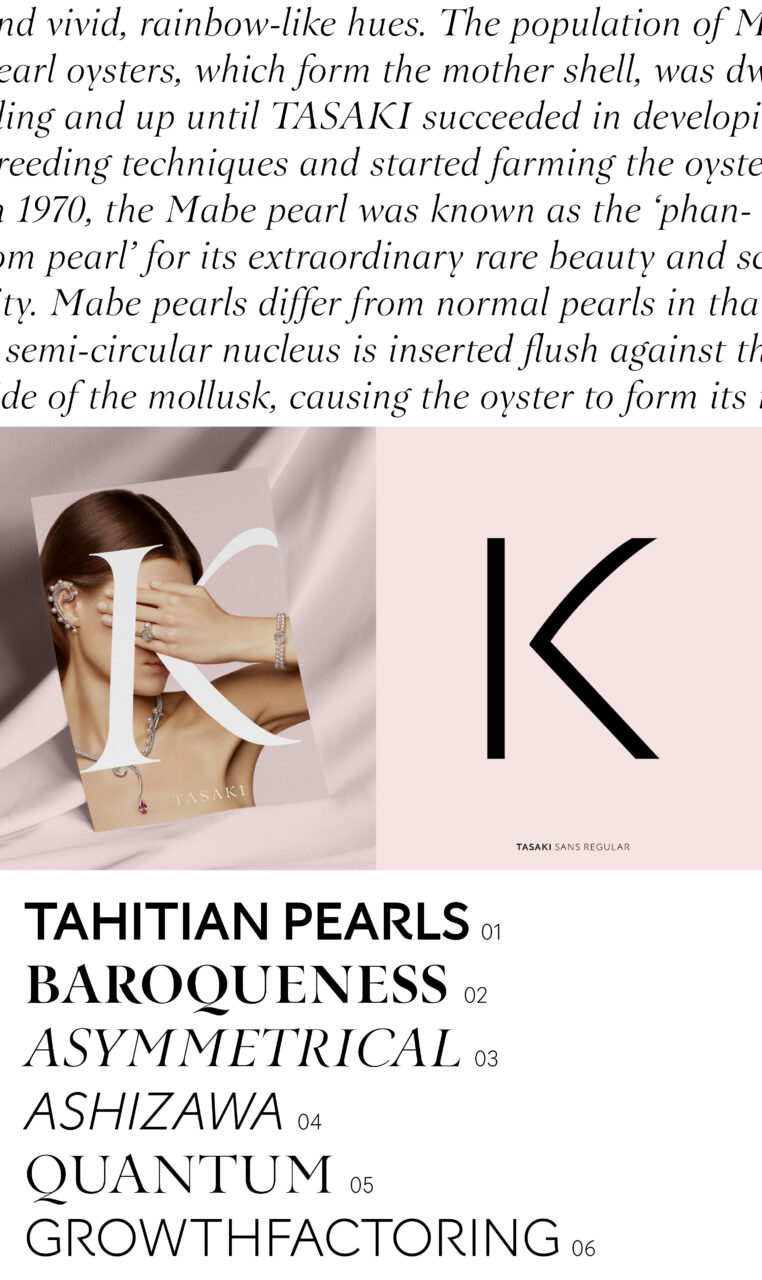
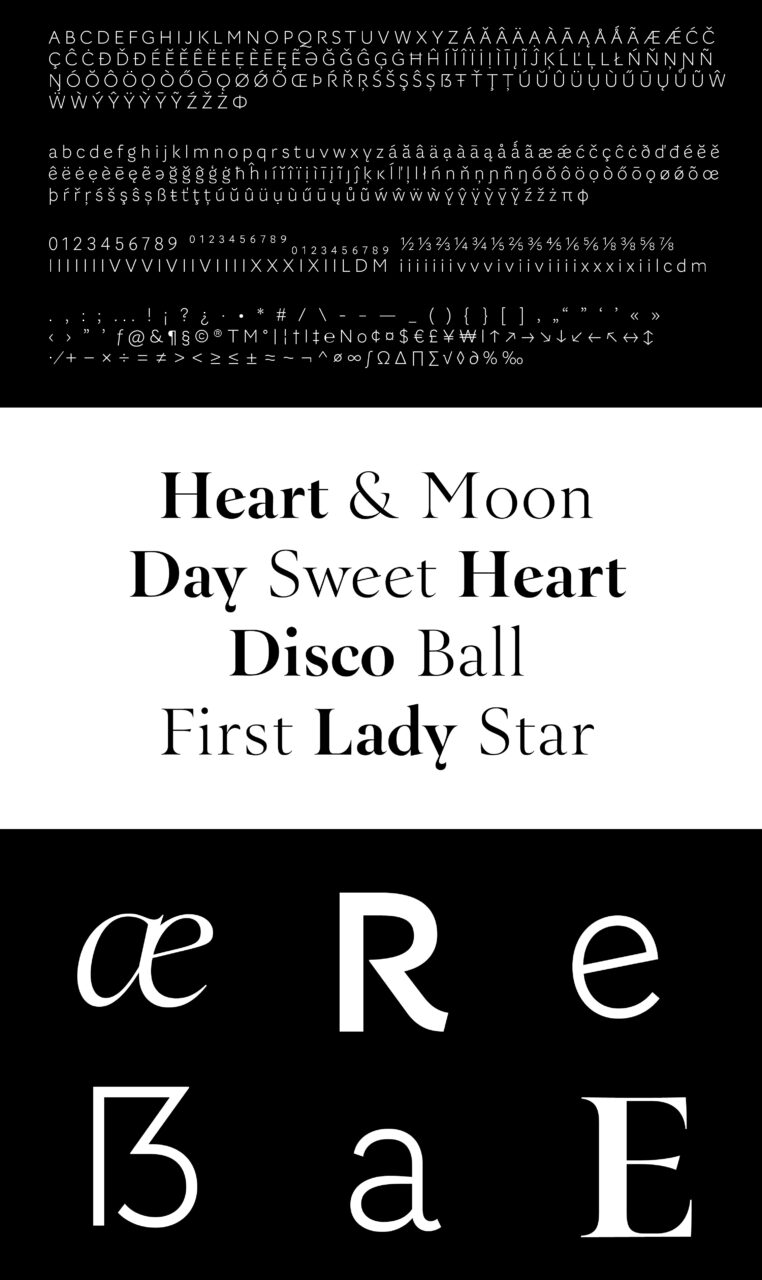
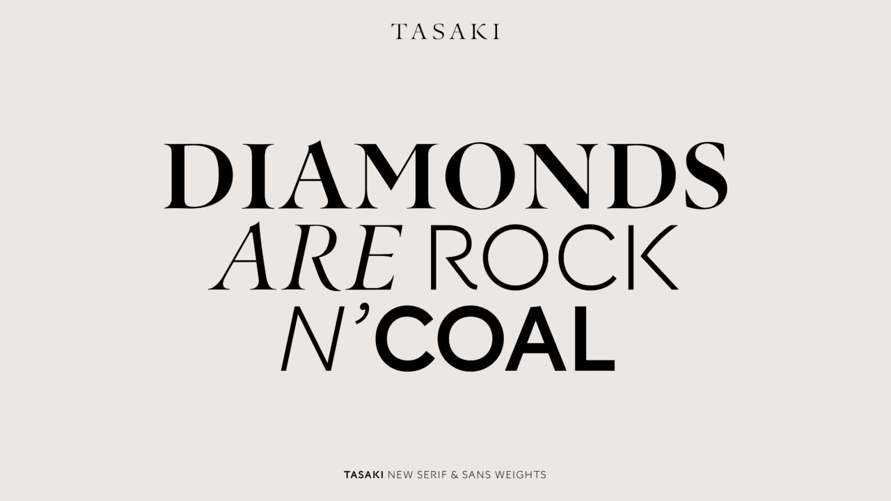
Japanese calligraphy meets modern. This year we revisited the Tasaki typeface and updated an old classic by extending the family with sans and serif weights. Following the design of the original typeface, the extension has incorporated additional glyphs in order to guarantee perfect harmony with the original whilst allowing for greater applicability across all of Tasaki’s touchpoints. Used on everything from jewelry boxes to logo marks, store displays and digital brand communication, the extended Tasaki family has been enabled to speak with all customers and stakeholders in the Tasaki universe.
PDF Filer