Kunde
Rokoko
Bureau
e-Types
Krediteringer
Beskrivelse
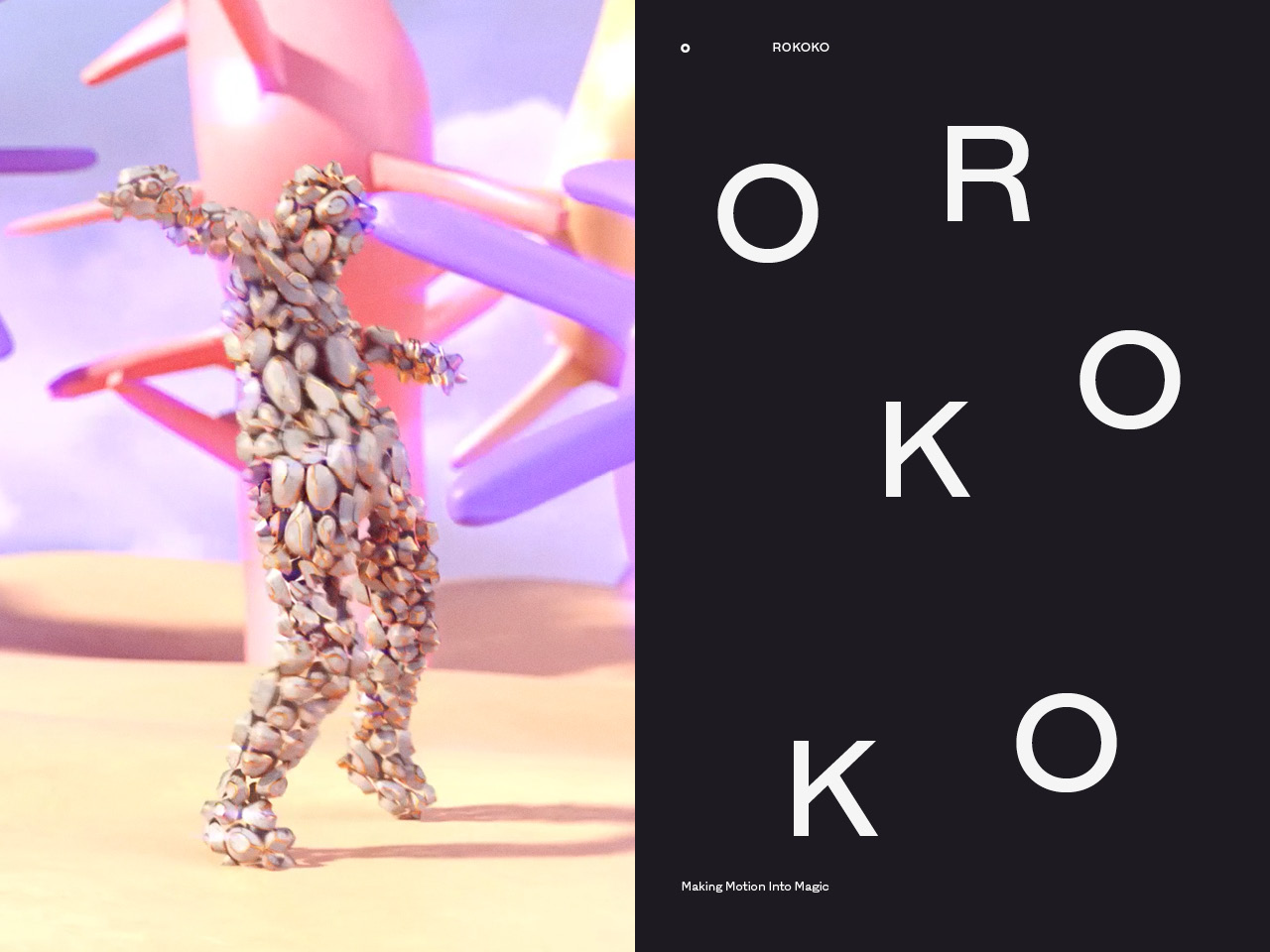
Making Motion Into Magic
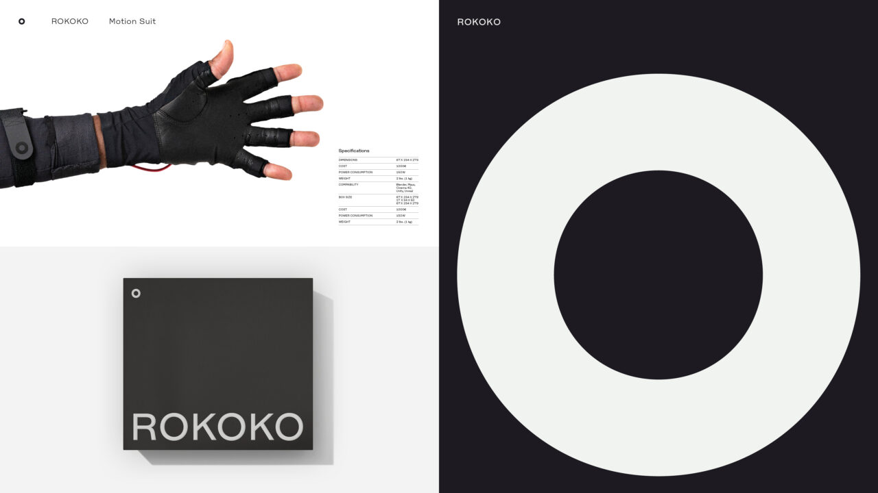
Rokoko is a Danish brand creating motion capture solutions, equipping creators worldwide with the power of animating the human body. Regardless of their budget or technical expertise.
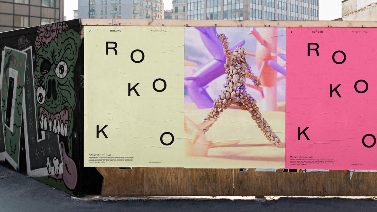
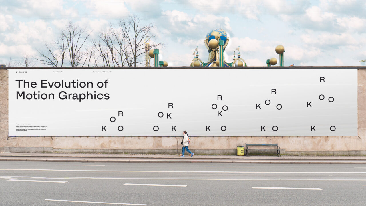
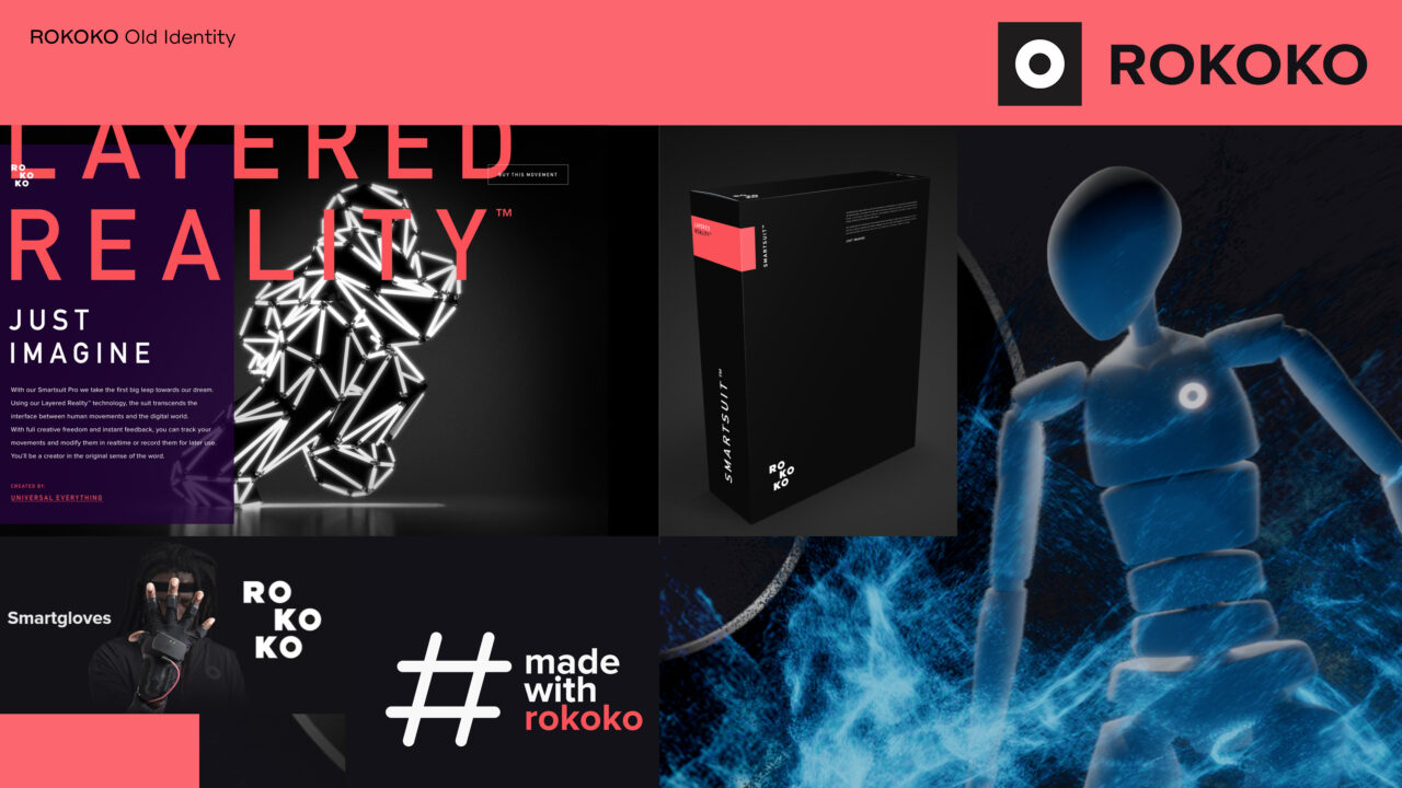
Following recent growth and expansion into new markets, Rokoko wanted to strengthen their visual identity and create a brand system that could scale across multiple channels and surfaces.
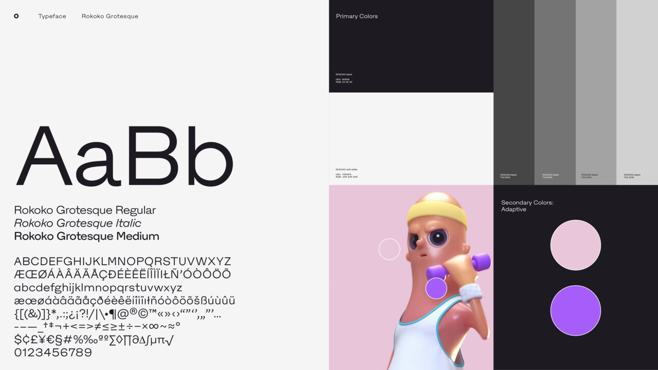
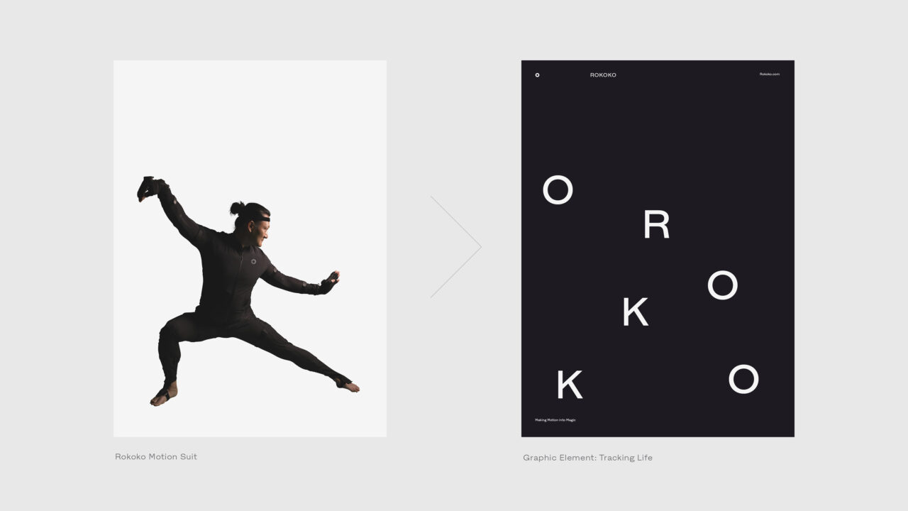
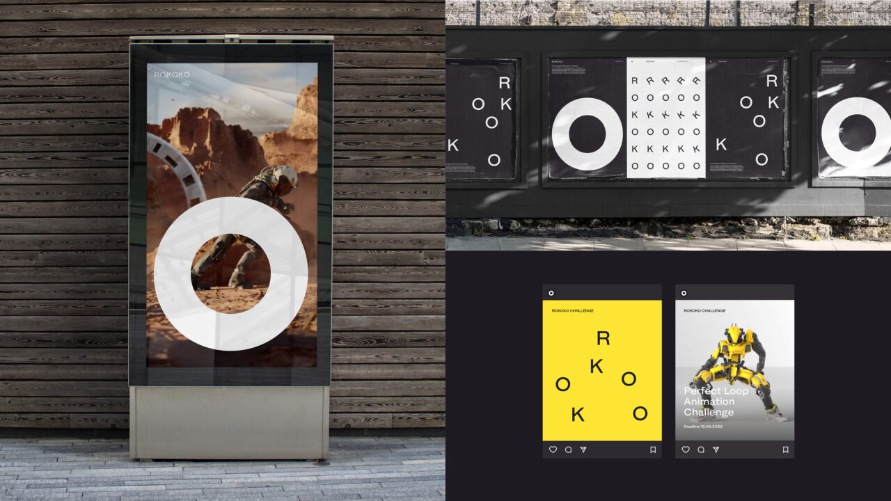
In Rokoko’s transition from a start-up to a scale up, it was important for them to stay true to their grassroots legacy among independent animators and small studios. We honoured this with a creative concept that had the flexibility to both put the spotlight on the amazing Rokoko motion capture tools, but just as importantly create a “stage” to showcase incredible motion capture animations of named creators, installing them as the true heroes of the brand. A win-win situation, where we both prove that the tools can deliver powerful results and where we give credit where credit is due: back to the community that helped build Rokoko into what is has become. The new design system is made to move. The motion principles are making the brand elements come to life as patterns, graphic elements and as Rokoko’s new mascot “Roko”, a character embodying human motion with subtle humour and personality. Rokoko’s circular symbol (The spotlight) plays a key role throughout the identity and is incorporated into the brand’s bespoke typeface “Rokoko Grotesque”.
The visual identity is simple, solid and flexible, covering both existing and new products, as well as coming sub-brands. Enabling Rokoko to establish itself as the unmatched player in the world of animation. Empowering storytellers to set ideas in motion, and make motion into magic.
Rebranding
Brand Strategy
Brand Communication
Brand Guide
Digital Design Toolbox
Bespoke Typeface
Shortliste
CCA 2023

