Kunde
Roskilde Festival
Bureau
e-Types
Beskrivelse
RECLAIMING ORANGE
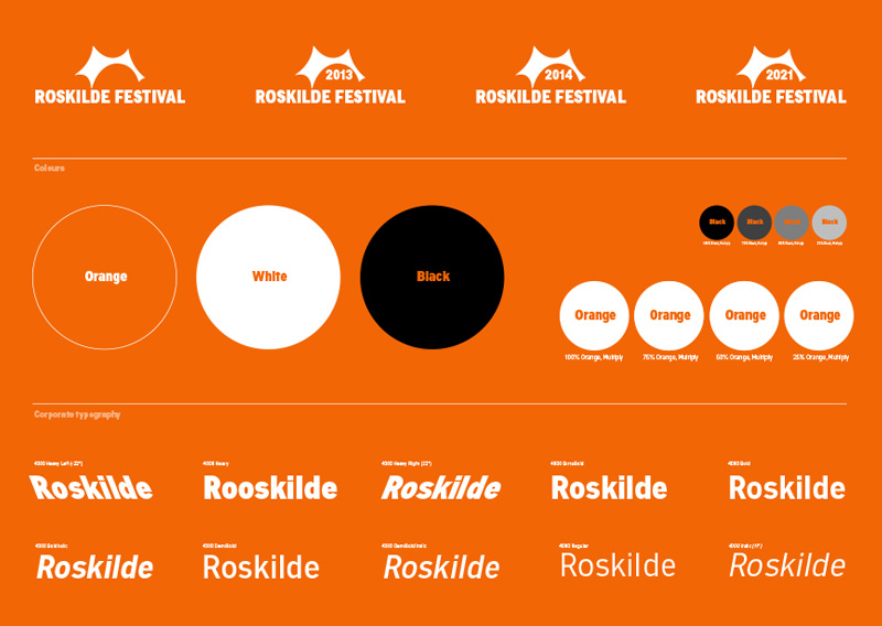
Everybody loves Roskilde and the multitude of expressions that de ne the superbrand. But the festival has grown and was in need of sharpening and revitalising. So how to keep what’s good and discard what’s not? How to communicate the Roskilde spirit across the variety of activites and services running all year round? The answer was to reclaim orange, the true colour of Roskilde.
By establishing a clear and practical system for the brand identity we created a red thread throughout the many activities of the festival, both regarding naming and visual identity. A simple system that introduces the canopy as the brand anchor and dna. The design system allows exibility for versioning the identity needed for the broad range of stakeholders and purposes.
The custom-made, multifaceted typography 4000 supports the canopy in creating consistence and coherence across Roskilde Festival Groups' activities.

Vinder 2014
CCA 2014


