Kunde
Planetarium
Bureau
Studio C
Krediteringer
Beskrivelse
Planetarium is located in the heart of Copenhagen and first opened its doors in 1989. When we first meet Planetarium’s, business was challenged in several ways. But with a new CEO in place and a bold vision for the future, a turnaround was in the horizon. A new brand strategy and brand identity, reflecting the new Planetarium, was needed.
In close collaboration with the new leadership team Studio C developed a new brand strategy build around a clear purpose, changed the name from Tycho Brahe Planetarium to Planetarium, and developed an entirely new brand identity.
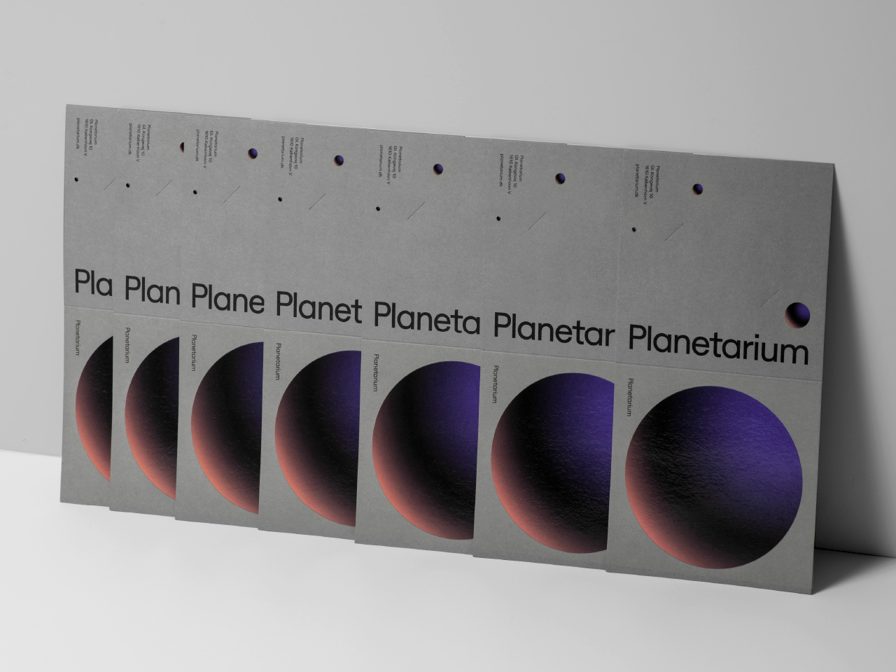
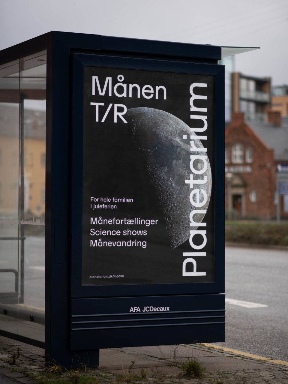
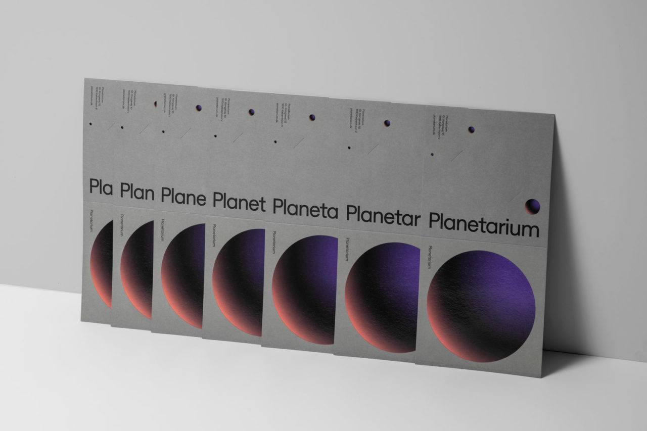
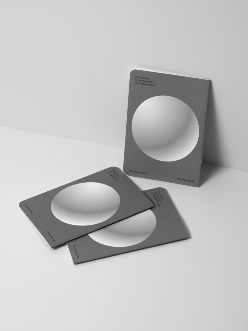
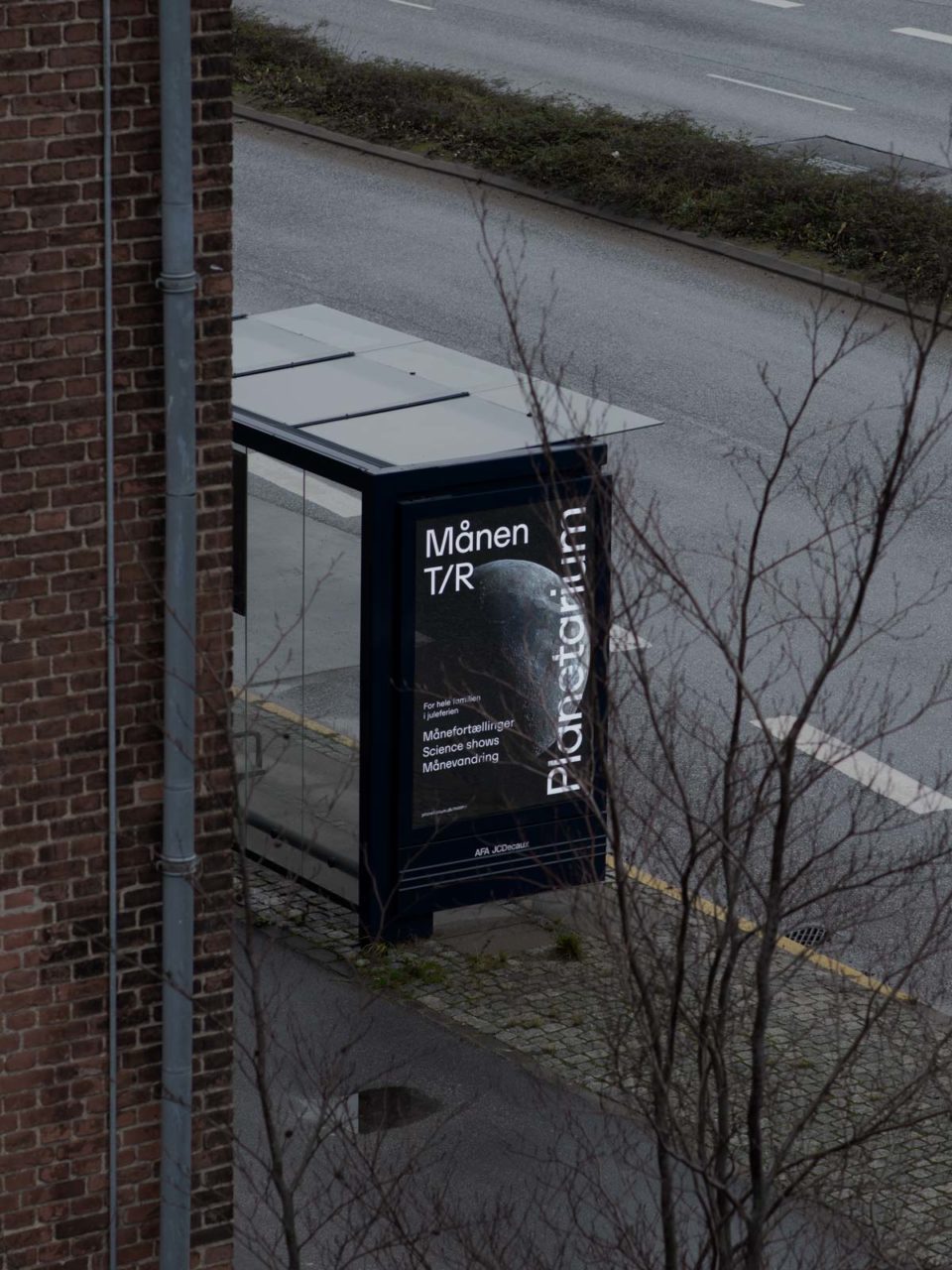
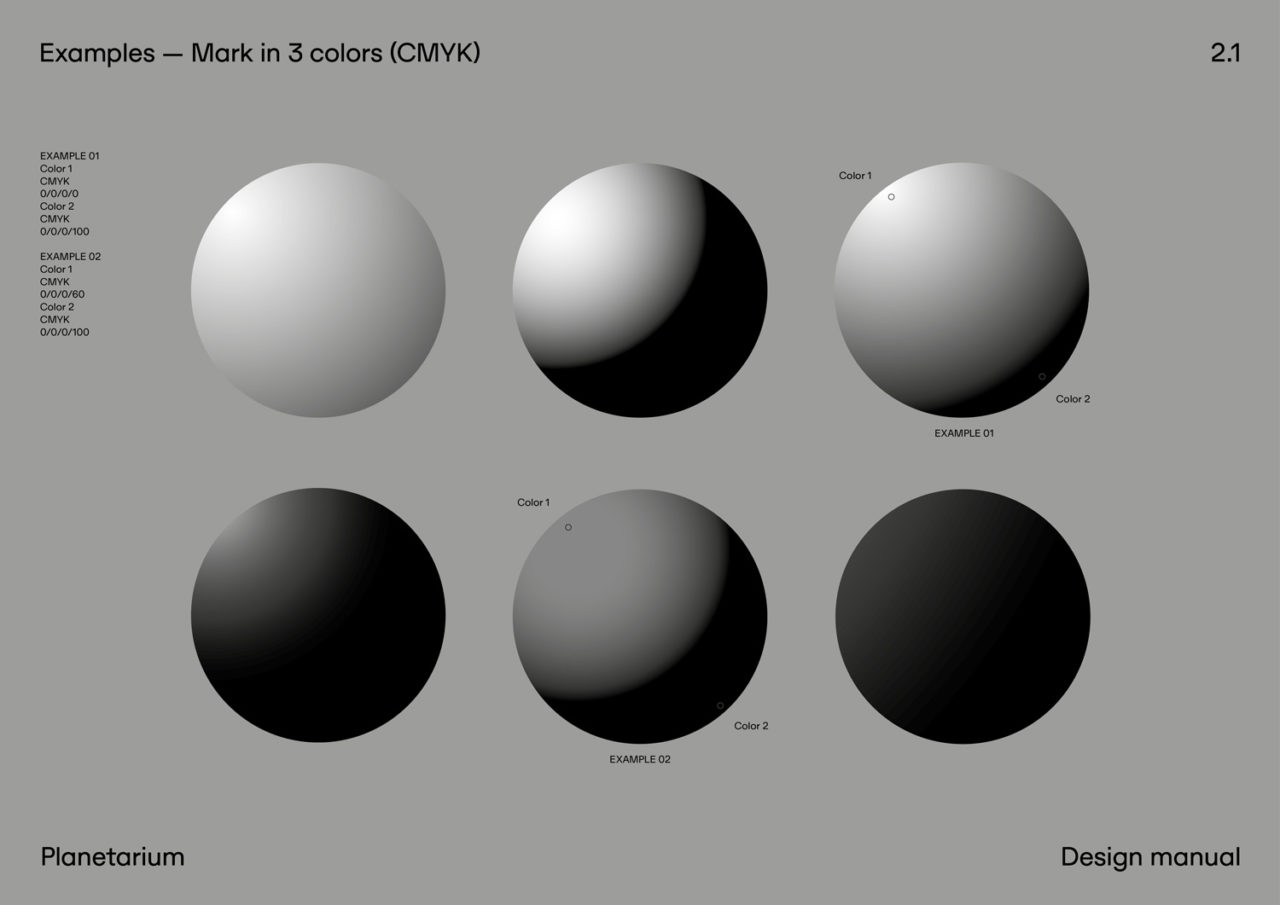
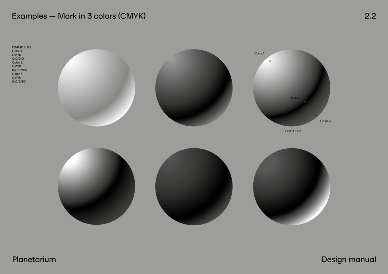
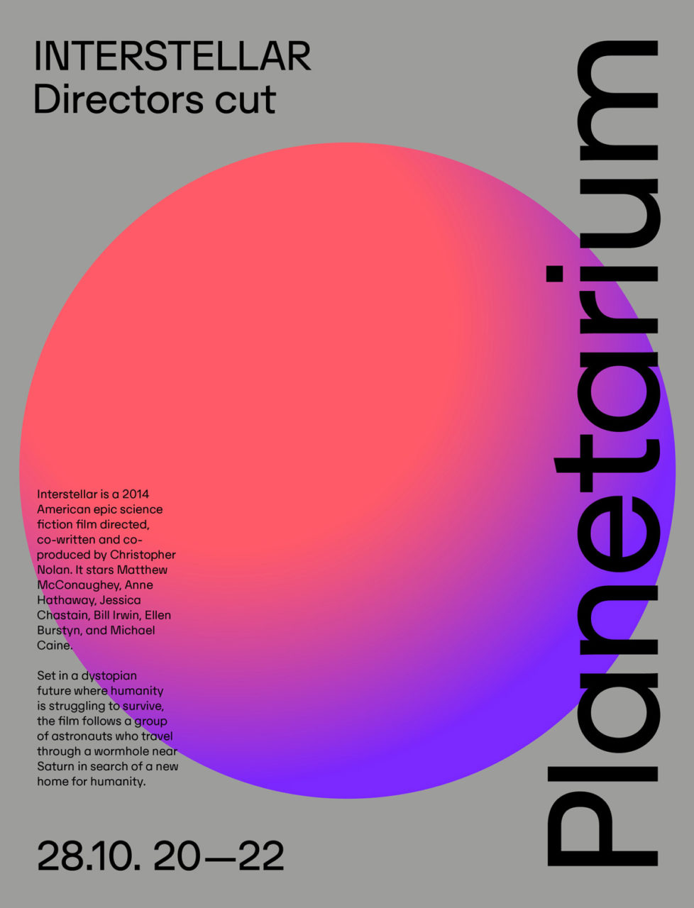
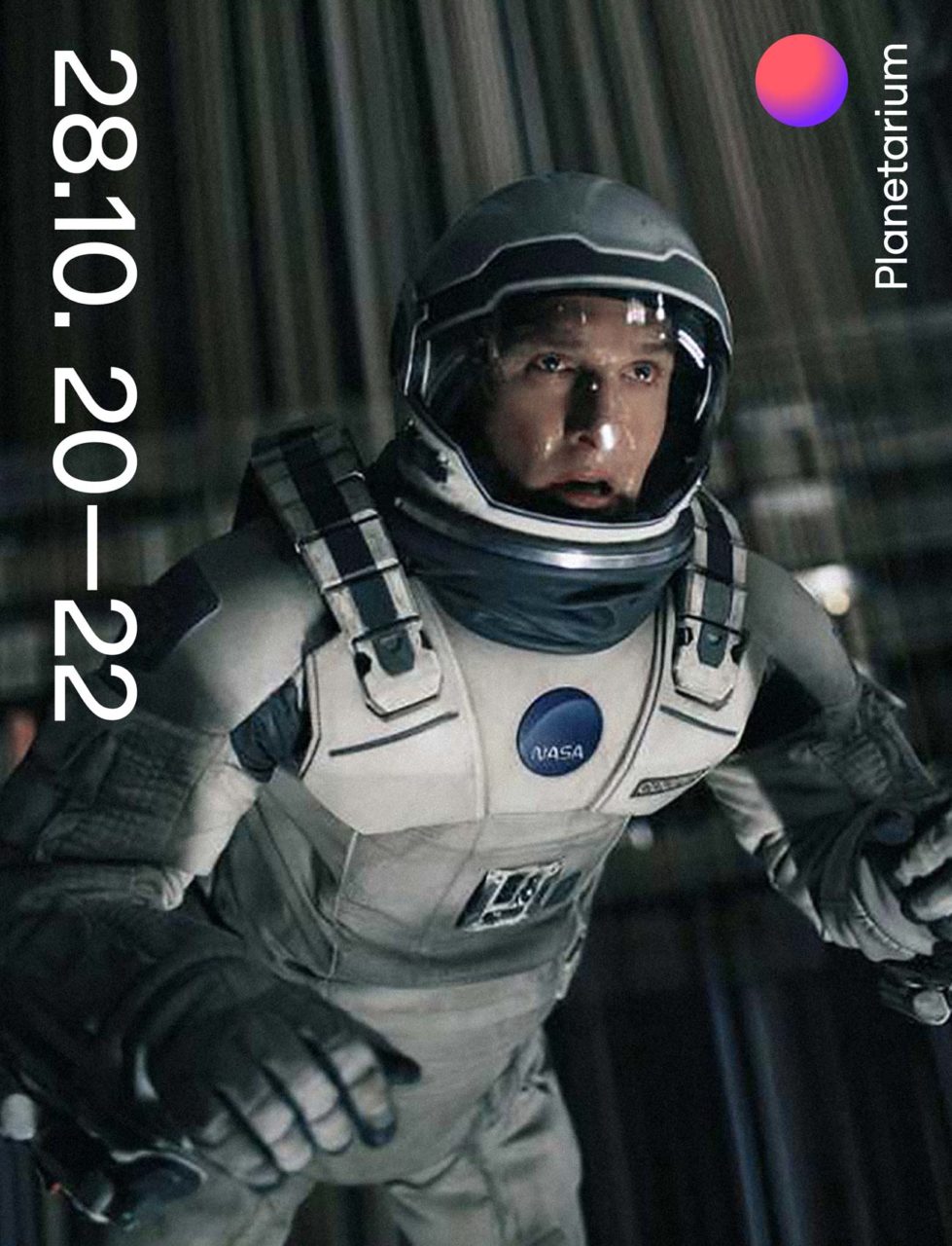
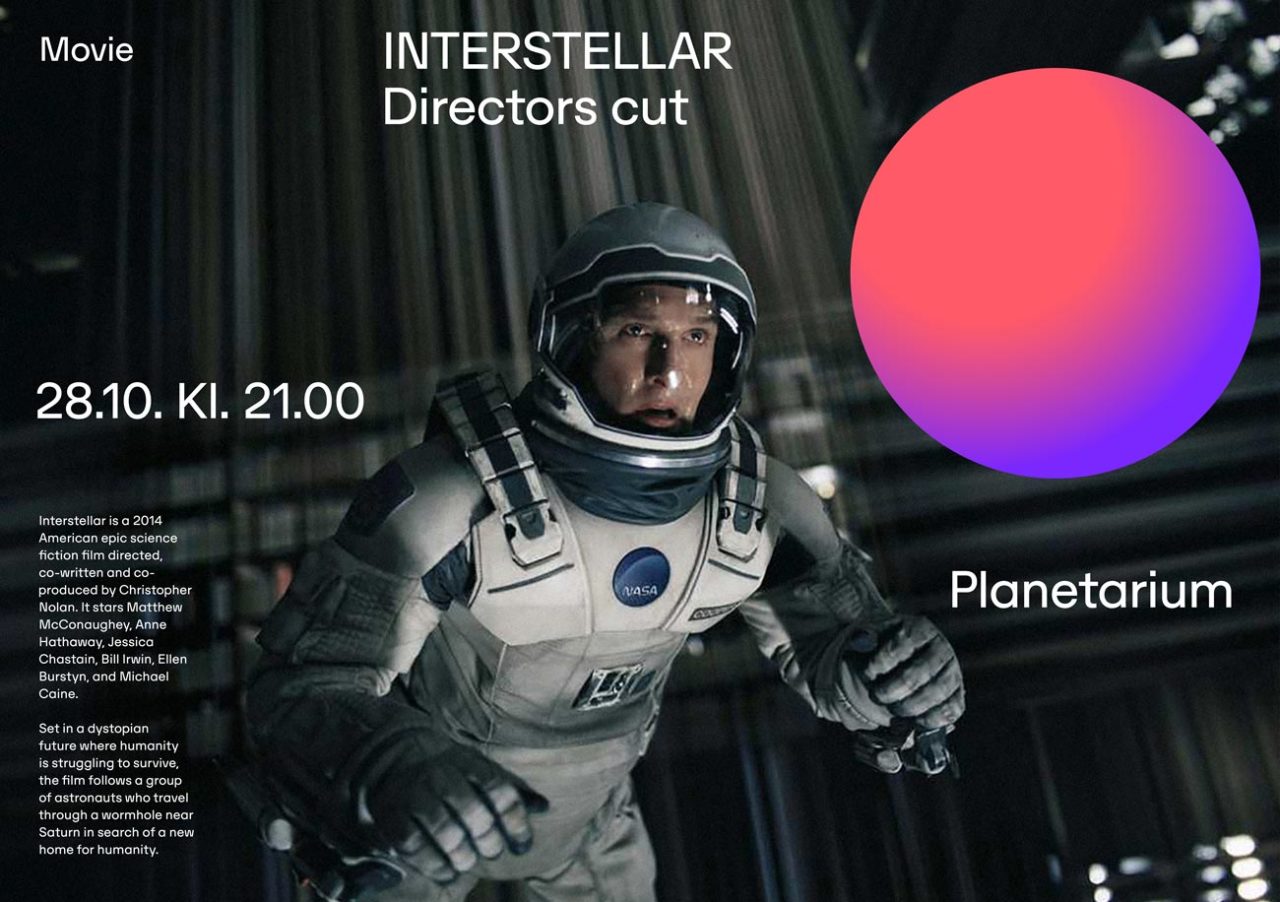
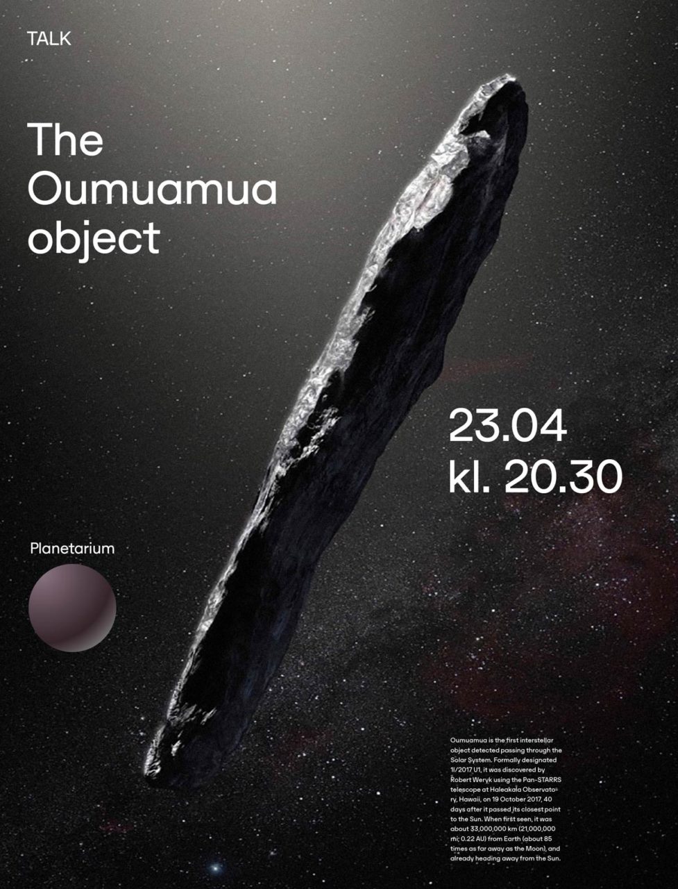
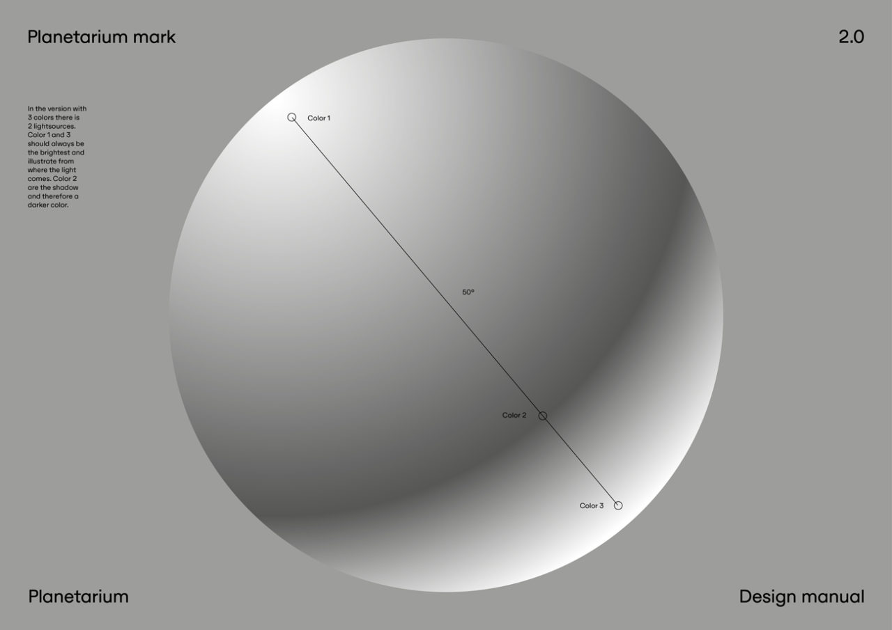
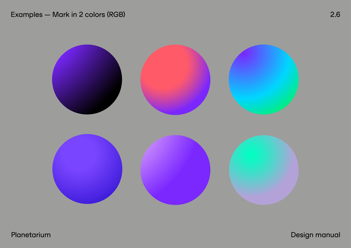
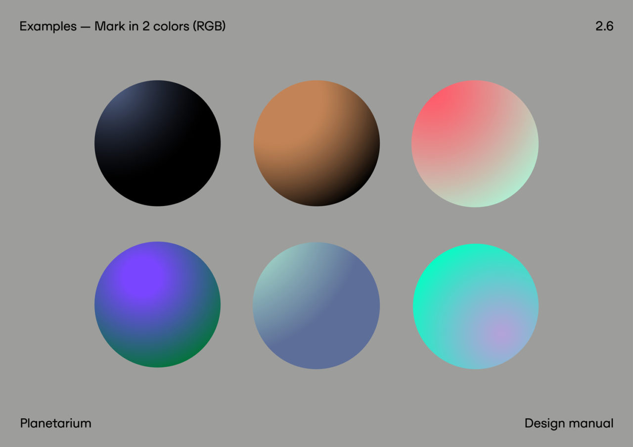
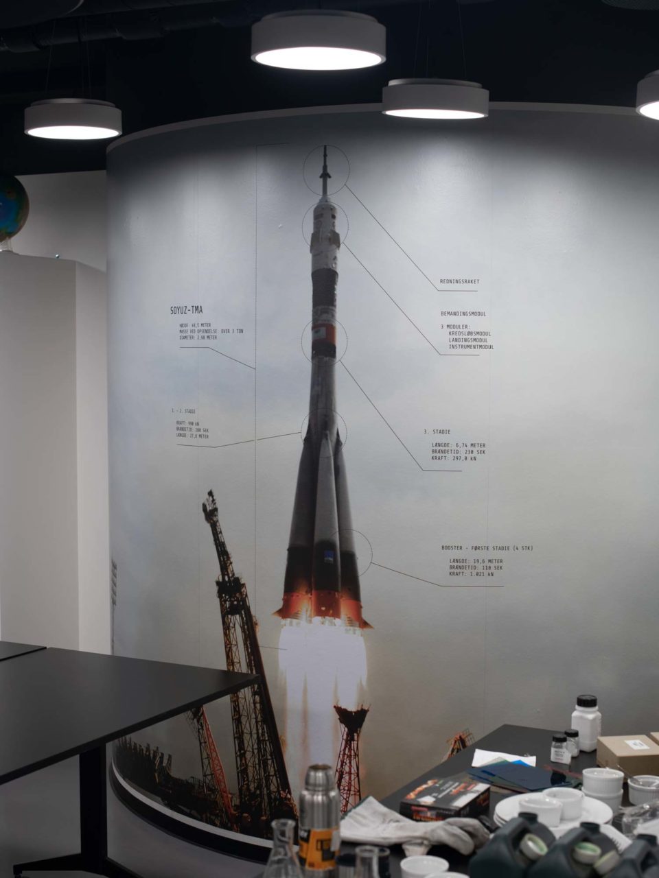
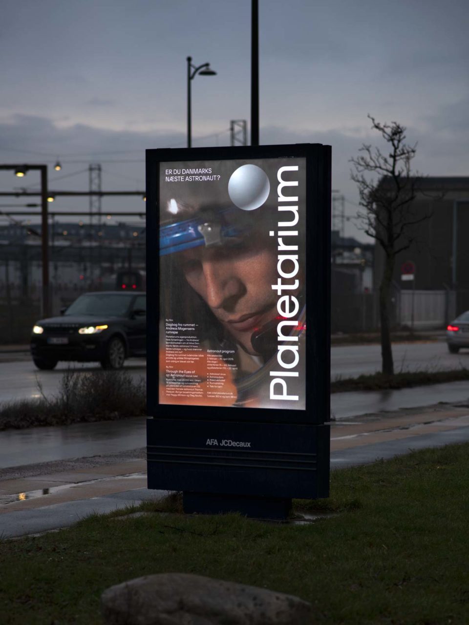
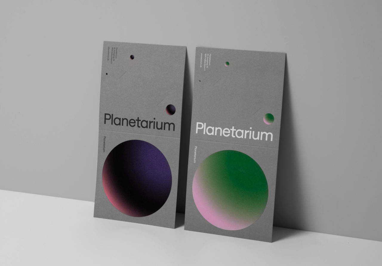
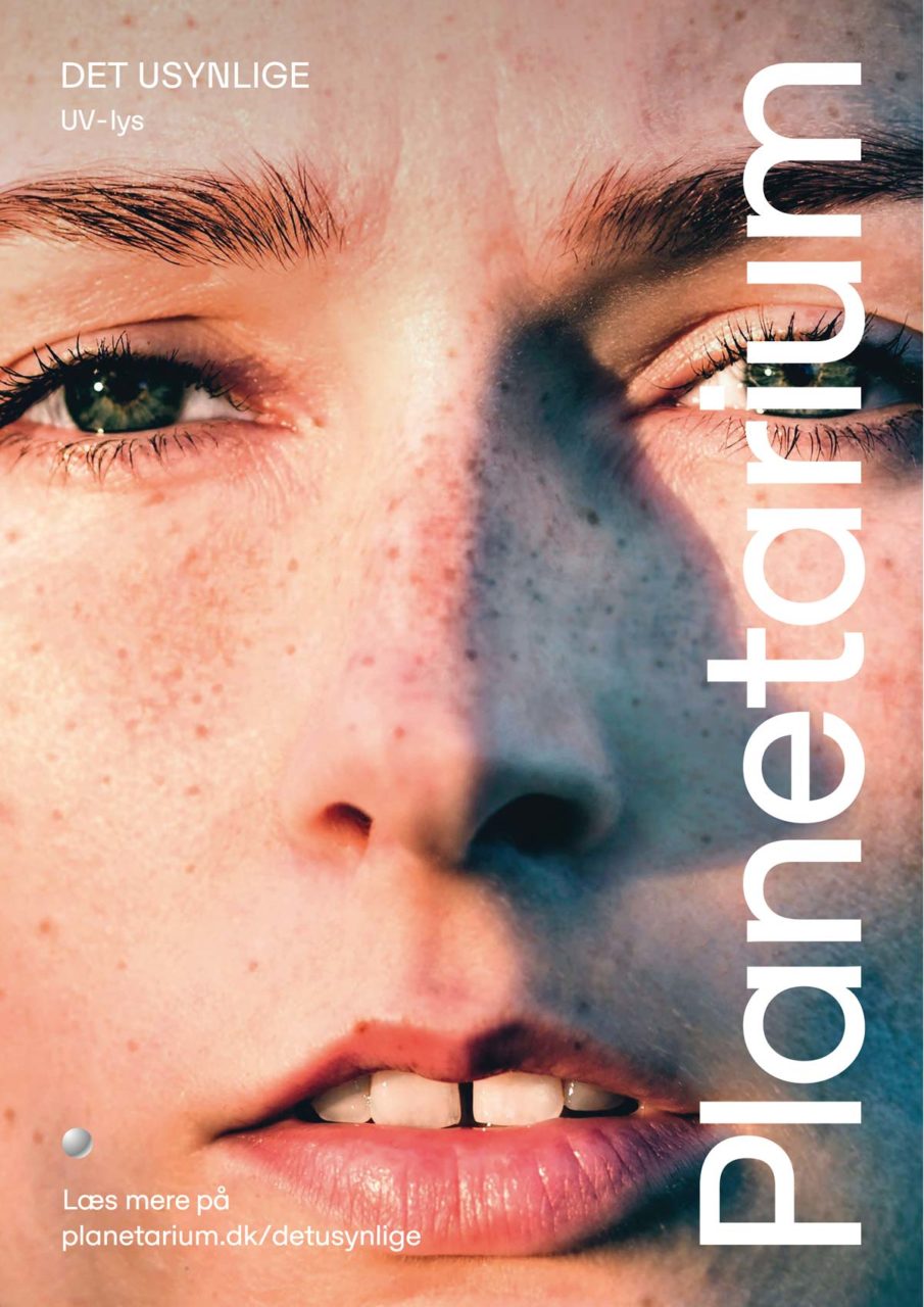
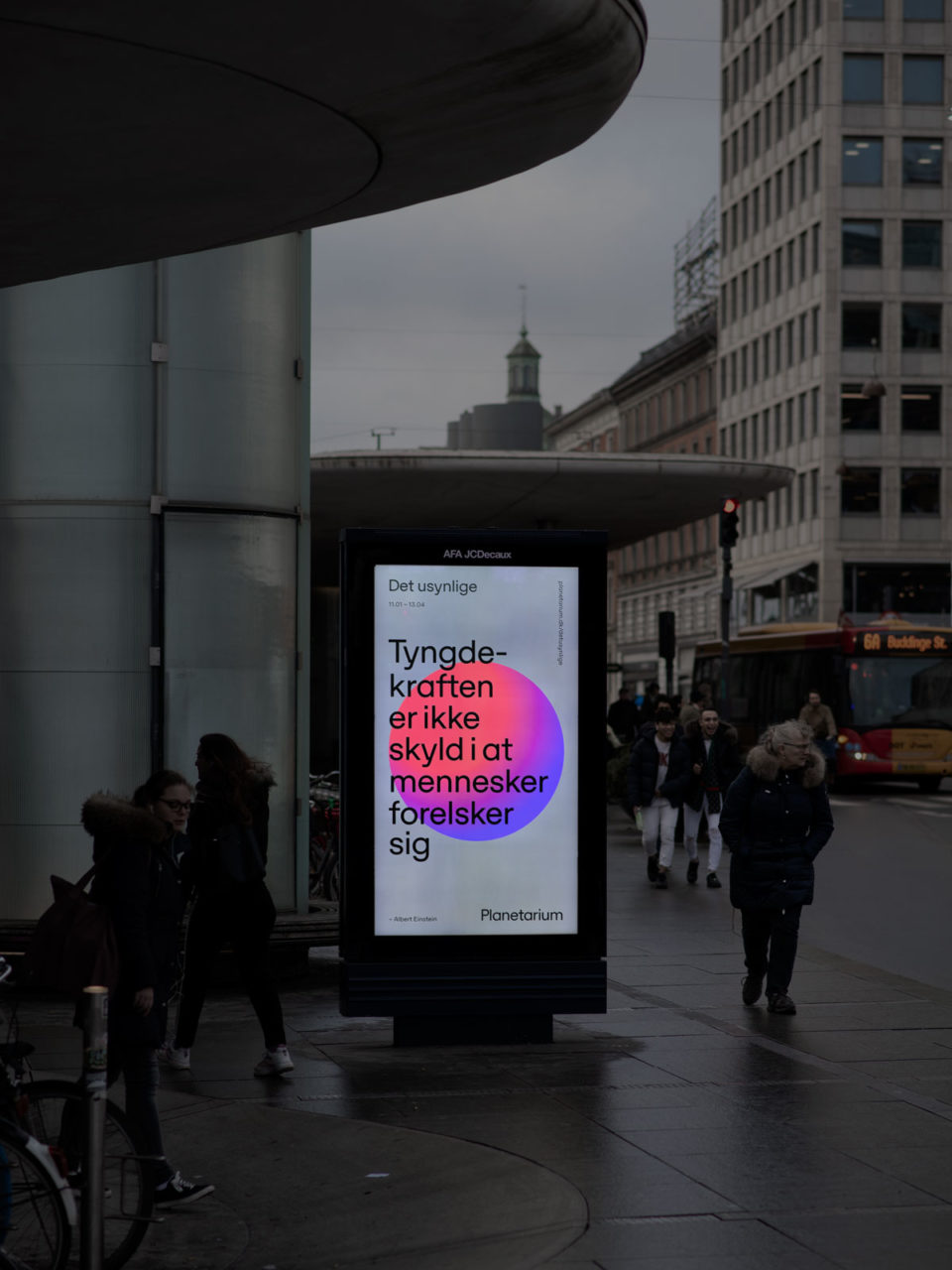
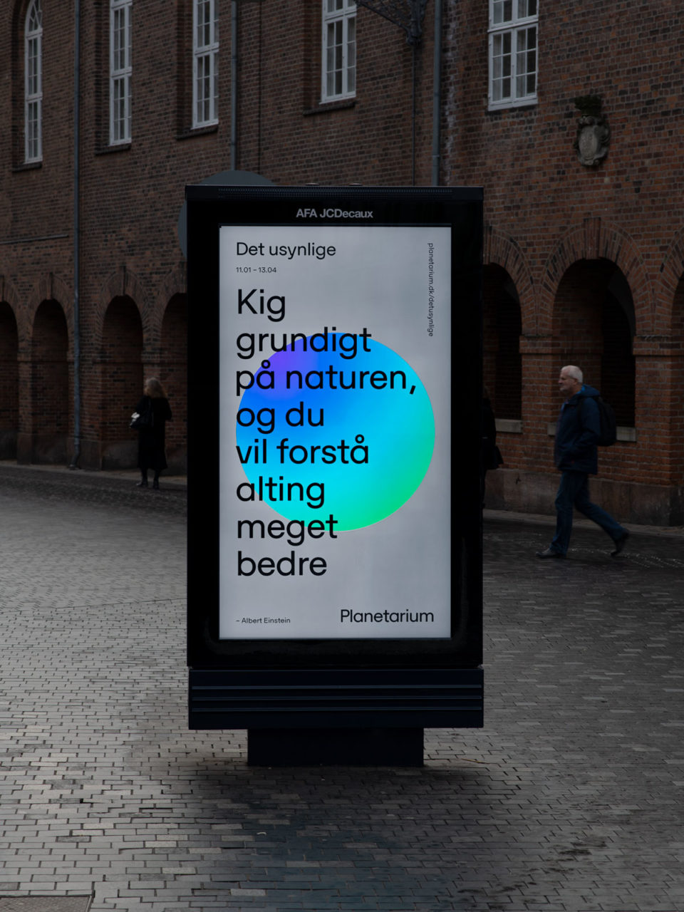
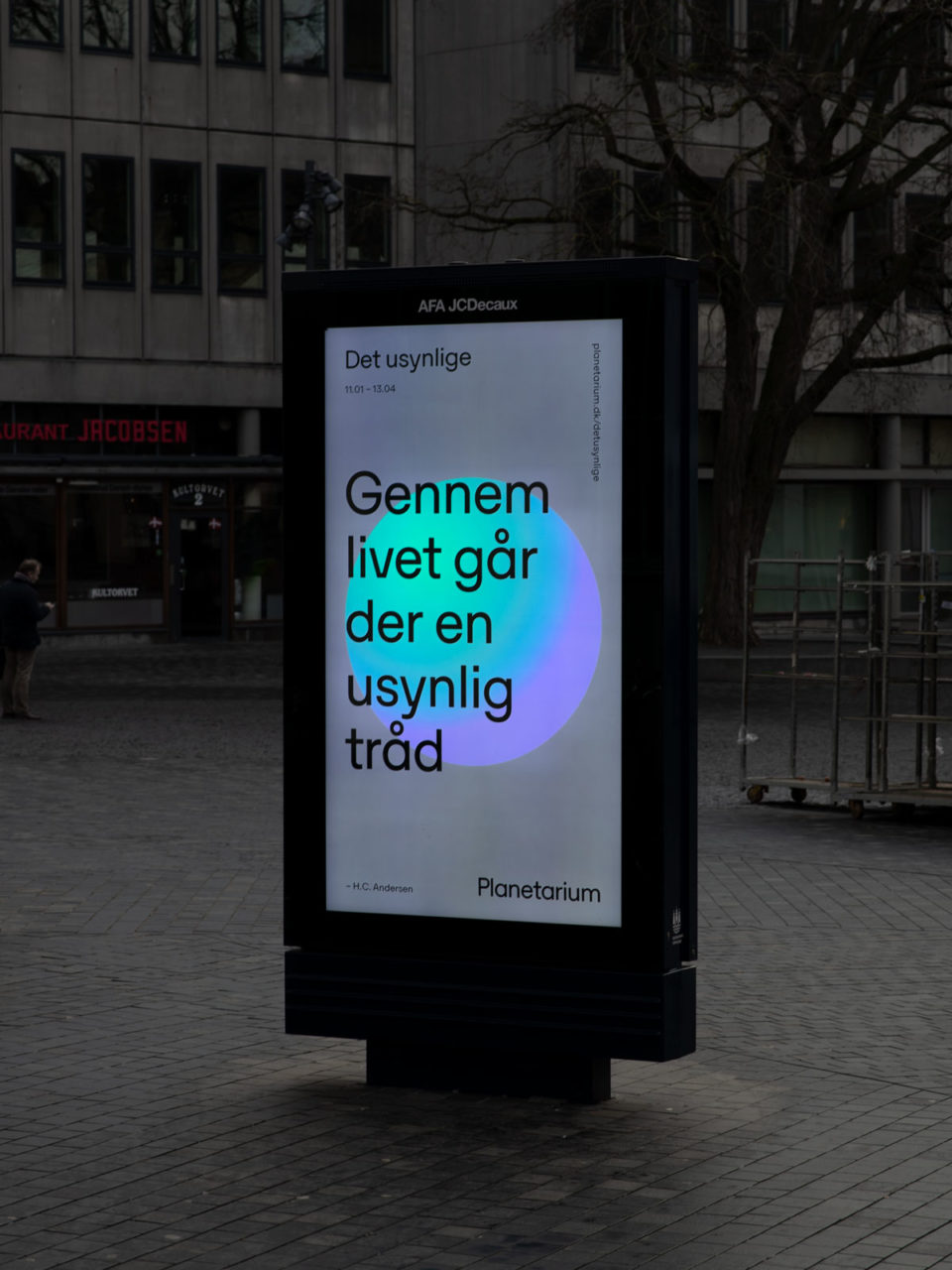
Based on the purpose to “Raise awareness about our existence on Earth and in space” we designed a dynamic brand identity inspired by the “overview effect” - the cognitive shift in awareness astronauts experience when viewing the Earth from outer space. We designed a trademark symbolising a planet to evoke the feeling of being weightless in space and allowed the trademark to move around freely. The trademark is ever changing in colors, sizes and positions. Together with the logotype, an infinite color palette, images ranging from big bang in space to basketball on the Earth, there are almost endless options for how to apply the new brand identity across touch points.
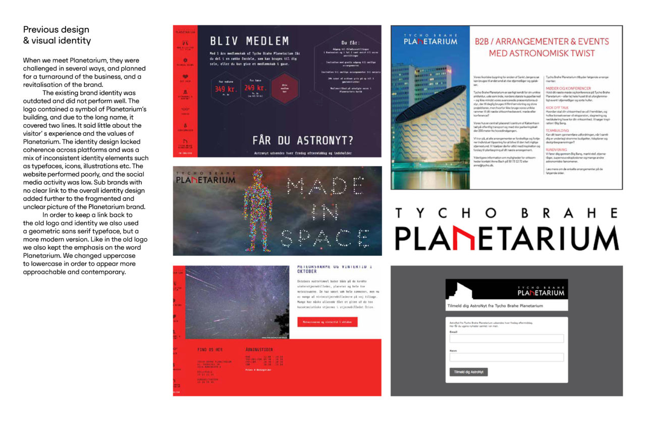
Previous design & visual identity
When we meet Planetarium, they were challenged in several ways, and planned for a turnaround of the business, and a revitalisation of the brand.
The existing brand identity was outdated and did not perform well. The logo contained a symbol of Planetarium’s building, and due to the long name, it covered two lines. It said little about the visitor’ s experience and the values of Planetarium. The identity design lacked coherence across platforms and was a mix of inconsistent identity elements such as typefaces, icons, illustrations etc. The website performed poorly, and the social media activity was low. Sub brands with no clear link to the overall identity design added further to the fragmented and unclear picture of the Planetarium brand.
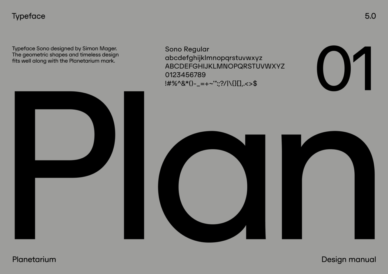
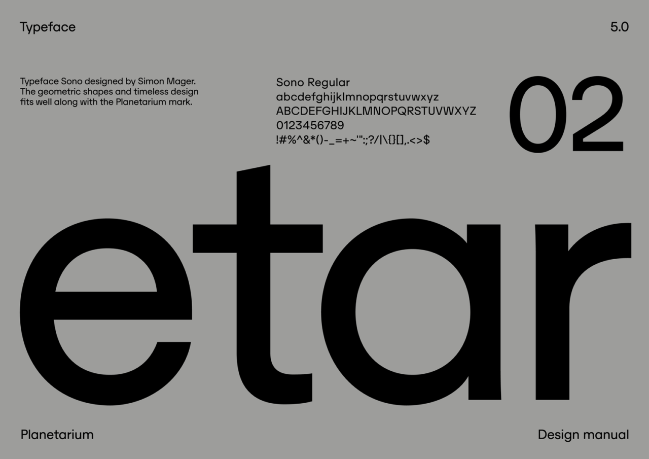
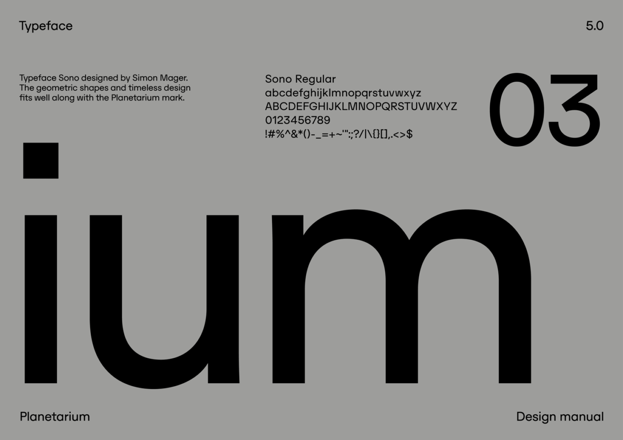
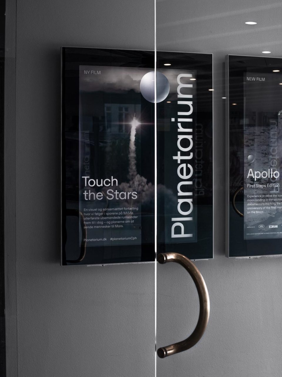
In order to keep a link back to the old logo and identity we also used a geometric sans serif typeface, but a more modern version. Like in the old logo we also kept the emphasis on the word Planetarium. We changed uppercase to lowercase in order to appear more approachable and contemporary.
PDF Filer

Vinder 2020
CCA 2020

