Kunde
Paperlike
Bureau
Daniel Flösser ApS
Krediteringer
Beskrivelse
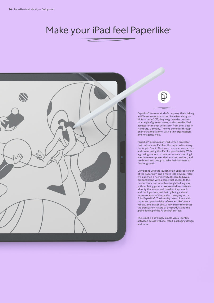
Paperlike® is a new kind of company, that’s taking a different route to market. Since launching on Kickstarter in 2017, they've grown the business to an eight-figure turnover, and taken the iPad accessories market with storm from their base in Hamburg, Germany. They've done this through online channels alone, with a tiny organisation, and no agency help.
Paperlike® produces an iPad screen protector that makes your iPad feel like paper when using the Apple Pencil. Their core customers are artists and doers, using the iPad for productivity. With a growing amount of competitors encroaching it was time to empower their market position, and use brand and design to take their business to further growth.
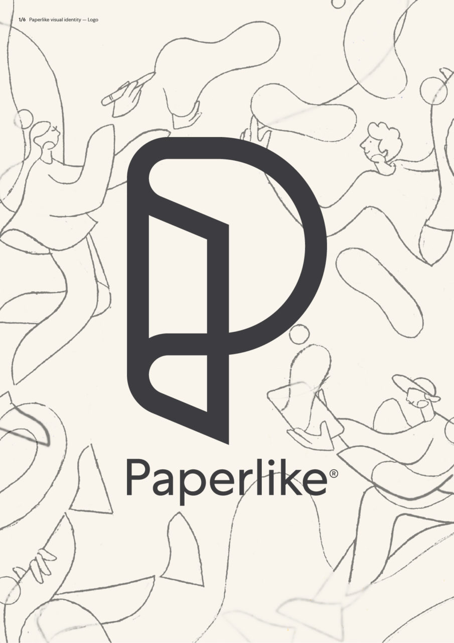
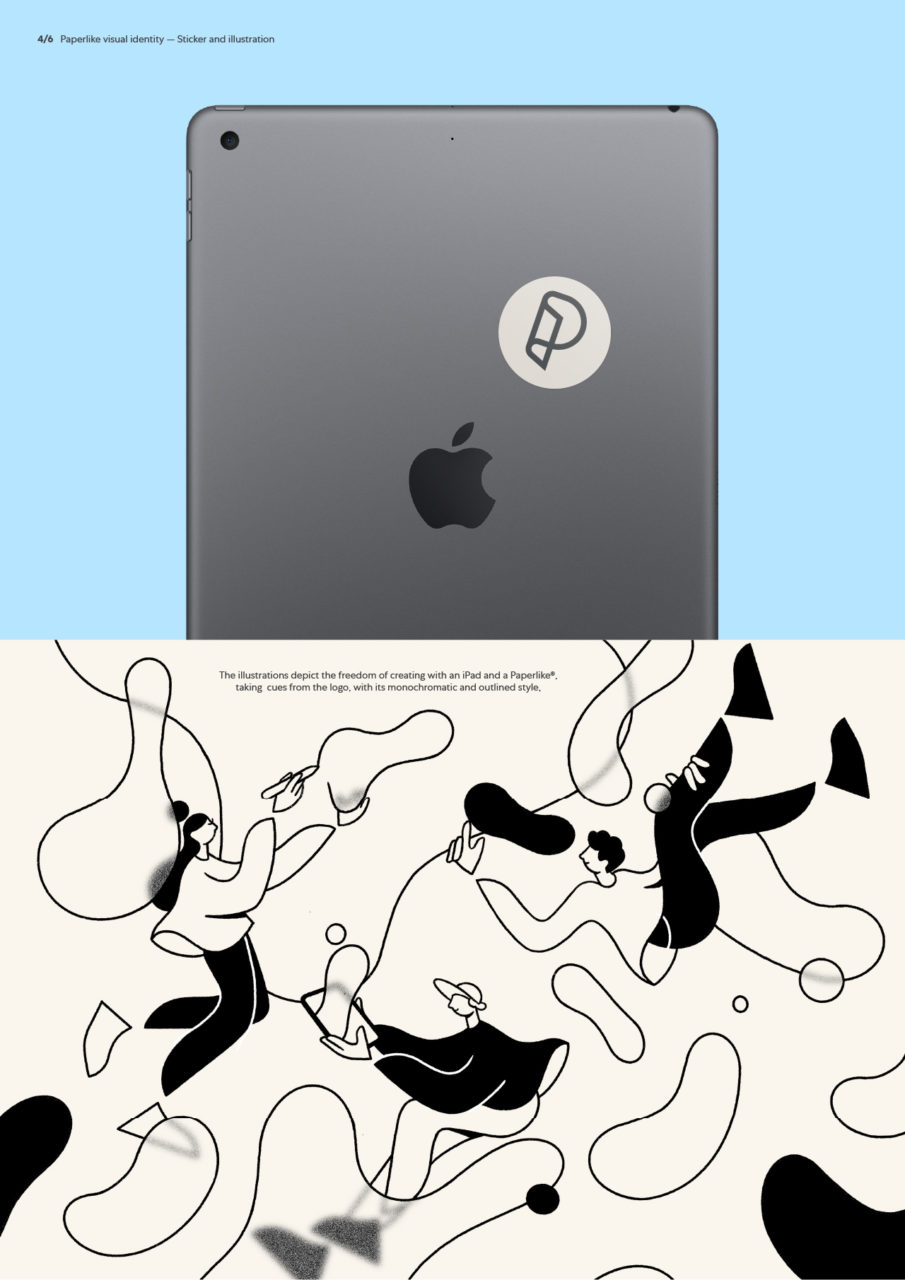
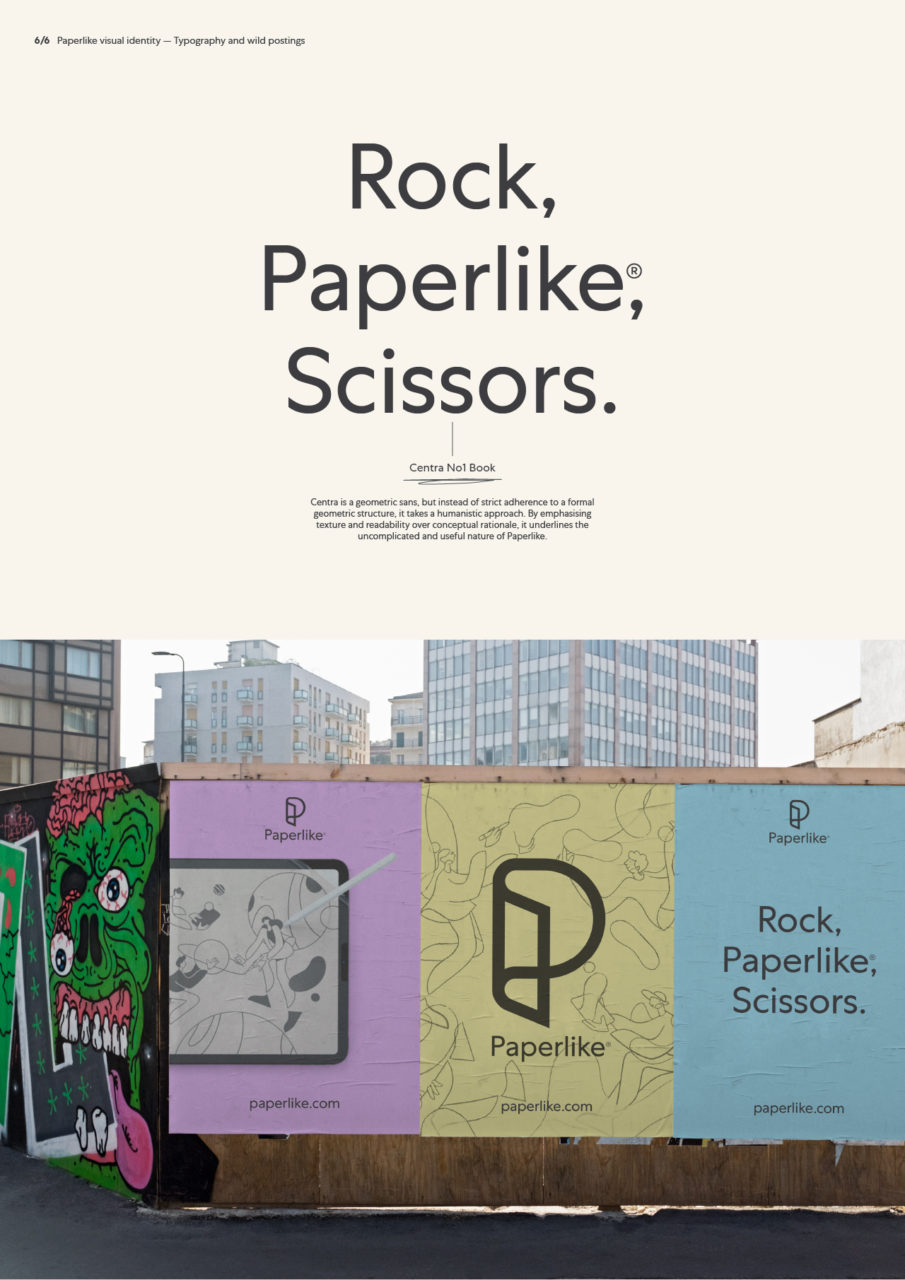
Correlating with the launch of an updated version of the Paperlike®, and a move into physical retail, we launched a new identity. It's rare to have a product brand with a name that speaks to the product function in such a straight talking way, without being generic. We wanted to create an identity that continued this direct approach, and the logo does just that by being a visual representation of the product, swaying into a P for Paperlike®. The identity uses colours with paper and productivity references, like ‘post it yellow’, and ‘eraser pink’, and visually references the transparent nature of the product and the grainy feeling of the Paperlike® surface.
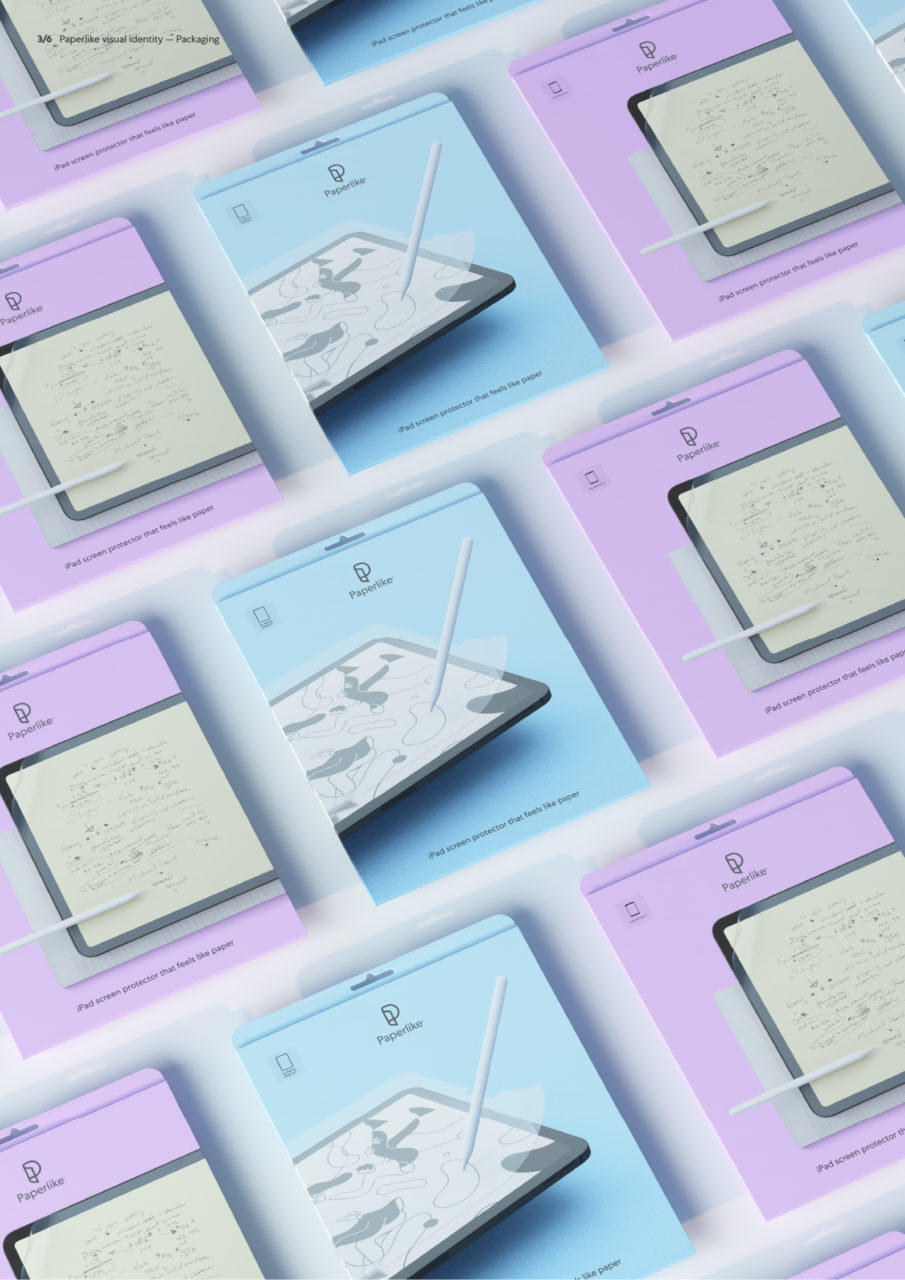
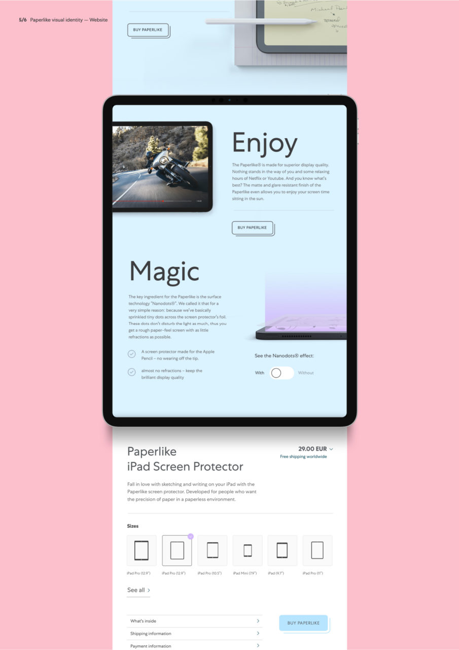
The result is a strikingly simple visual identity, activated across website, retail, packaging design and more.

Vinder 2020
CCA 2020

