Kunde
Ørsted
Beskrivelse
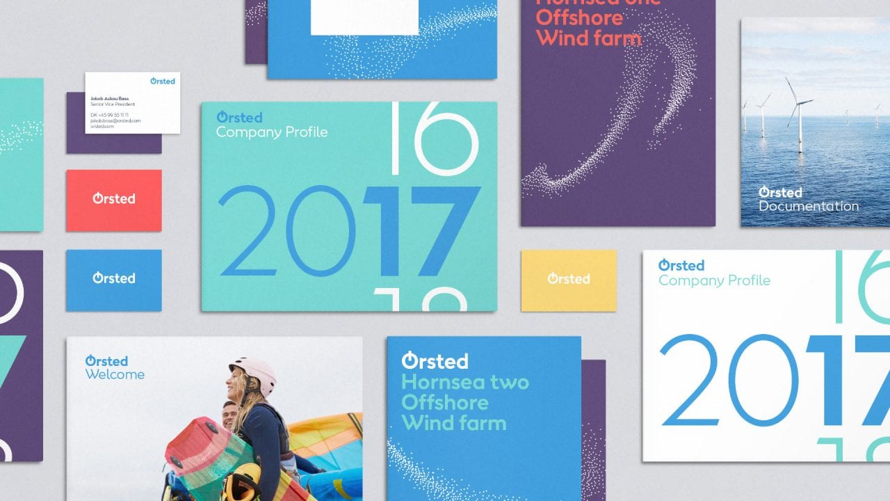
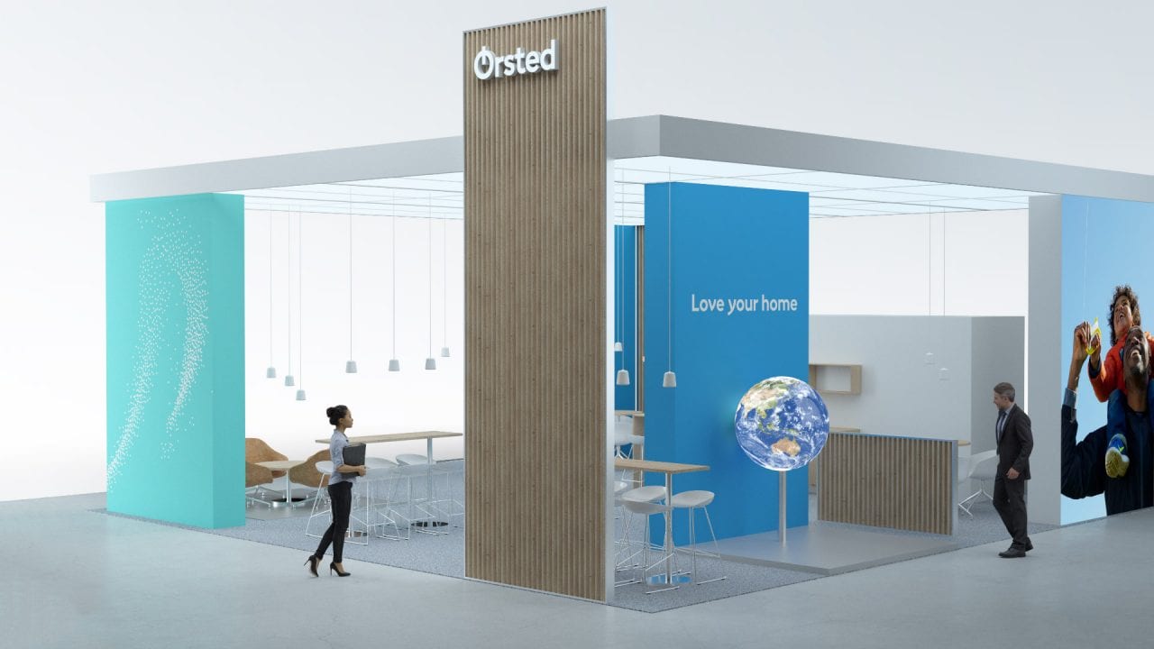
The new Ørsted brand design is bold, optimistic and inventive, and aims to redefine what a corporate brand means within the traditional energy sector. A life unleashed is the focal point for the brand design - not energy alone.
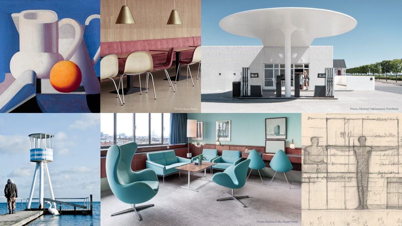
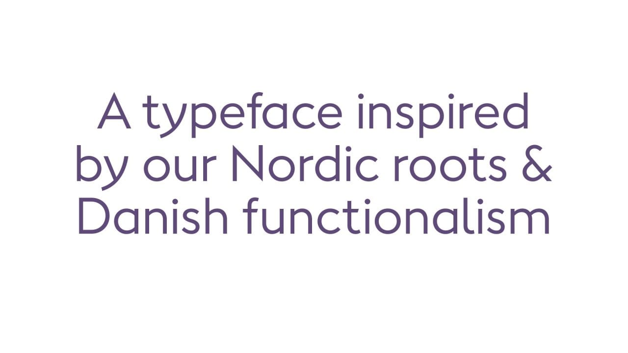
Ørsted is an international company with global ambitions grounded in solid Danish values like humanity, commitment, curiosity and responsibility. Because of this, the new brand found inspiration in the Danish functionalism that represent these values.
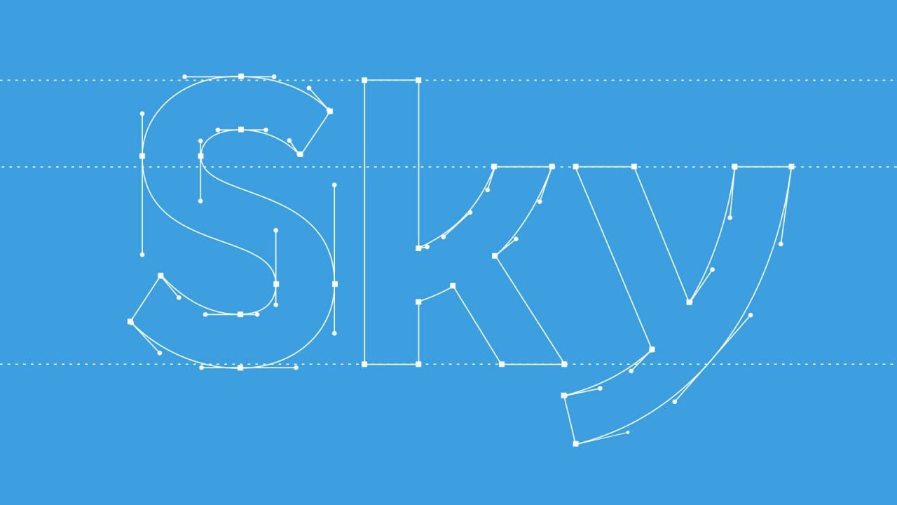
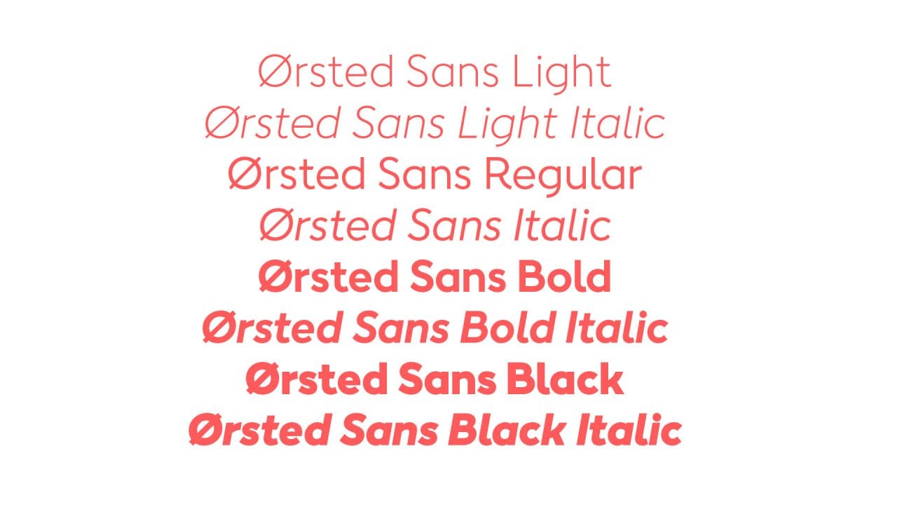
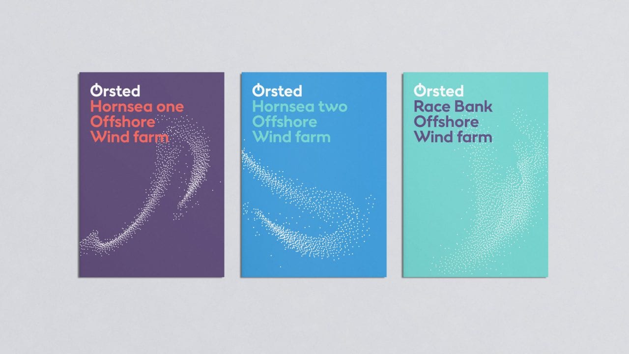
From the custom typeface that combines readability with both Nordic modernist typeface references and a human touch - to the dynamic and living lifestream element that acts as a love letter to nature and visualises the core product of Ørsted - renewable wind energy.
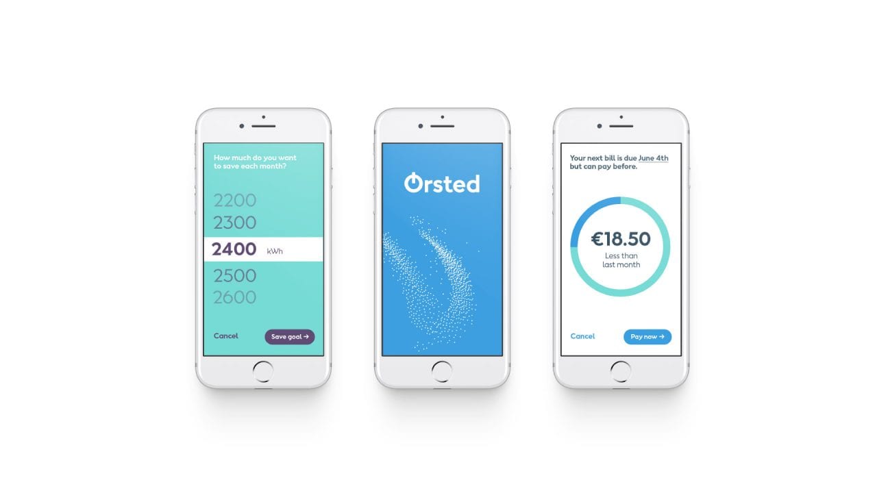
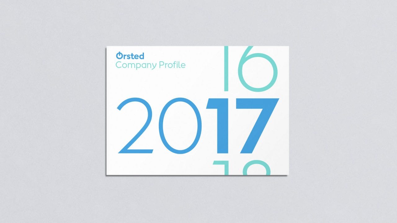
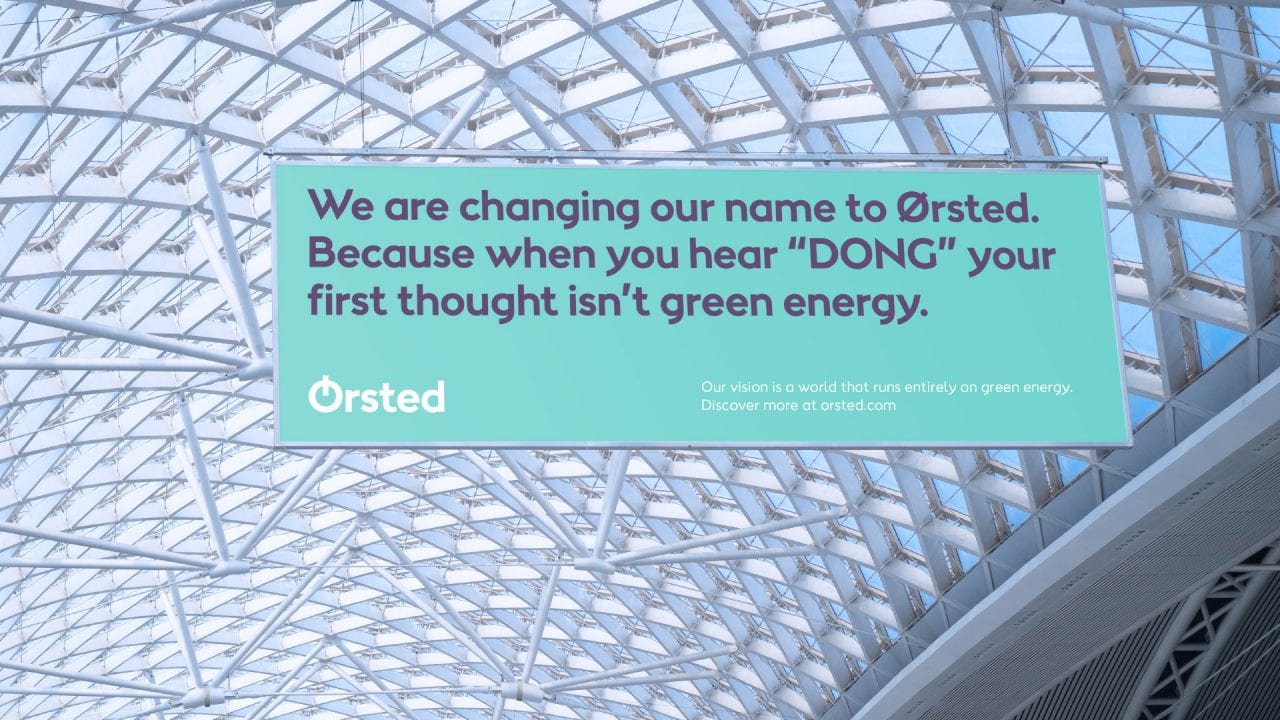
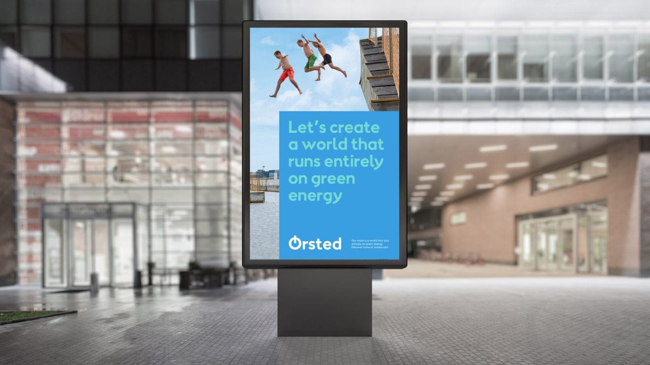
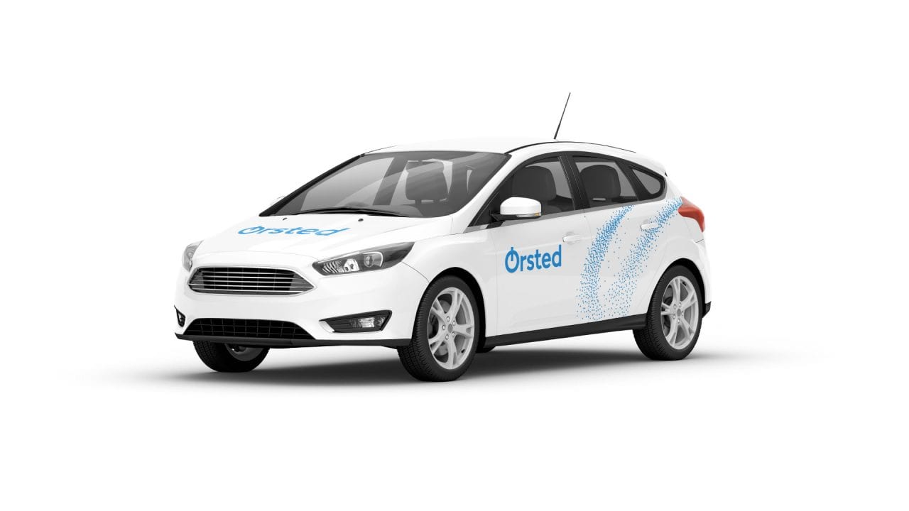
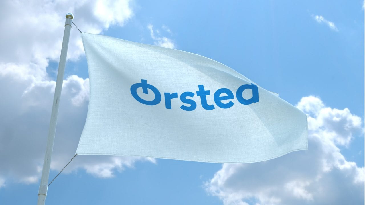
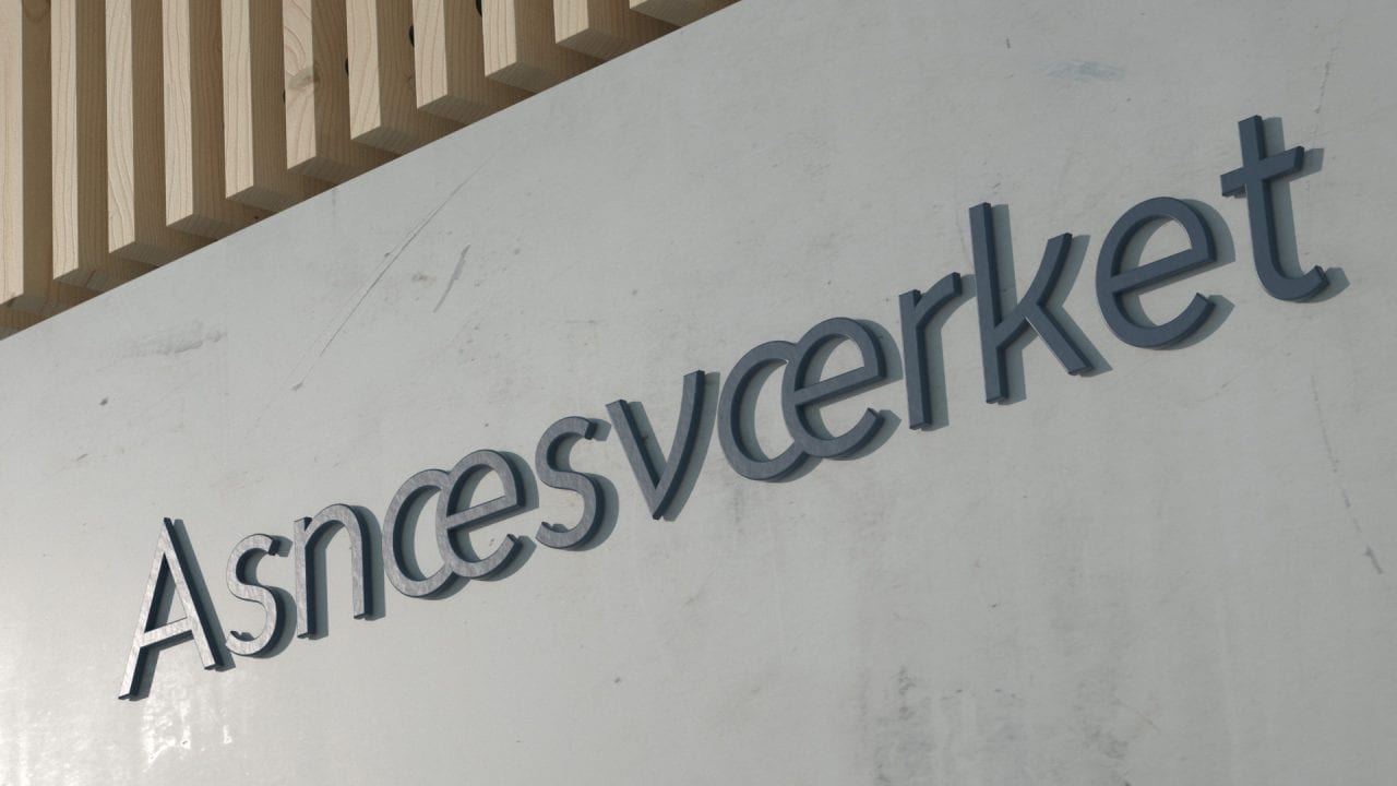
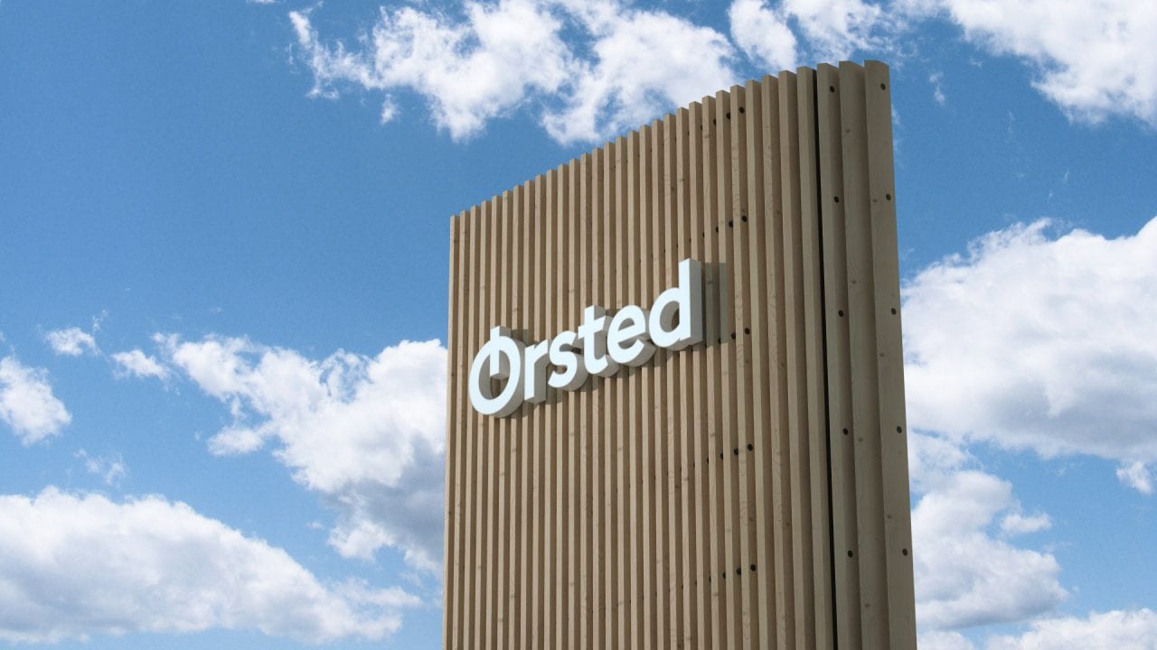
The new brand touches every corner of what is expected of a future-friendly brand - from signage on power plants to logos on ships and a digital brand centre. From publications to uniforms, flags, service design and how the brand should behave when animated, in sound and in physical interactions.
The result is a new brand identity crafted with a meticulous level of detail, for a global leader in renewable energy. A company that contributes with a positive impact on society and delivers the message of a green future loud and clear.

Vinder 2018
CCA 2018

