Kunde
Nilens Jord
Bureau
e-Types
Krediteringer
Beskrivelse
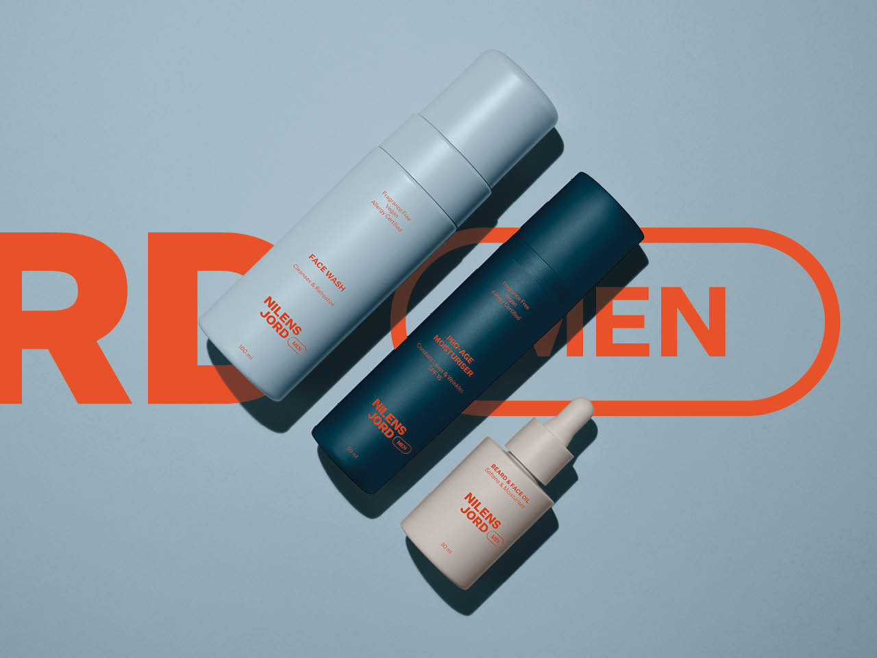
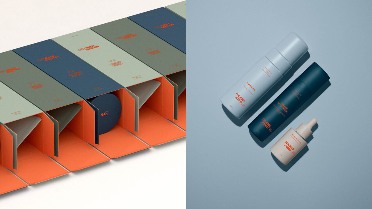
With the introduction of their brand new men's line, the objective was to establish a fresh brand identity for Nilens Jord Mens that could resonate with both a male and female consumer. As part of the concept, we also developed a brand-new packaging concept that could bring the identity to life in a tactile way.
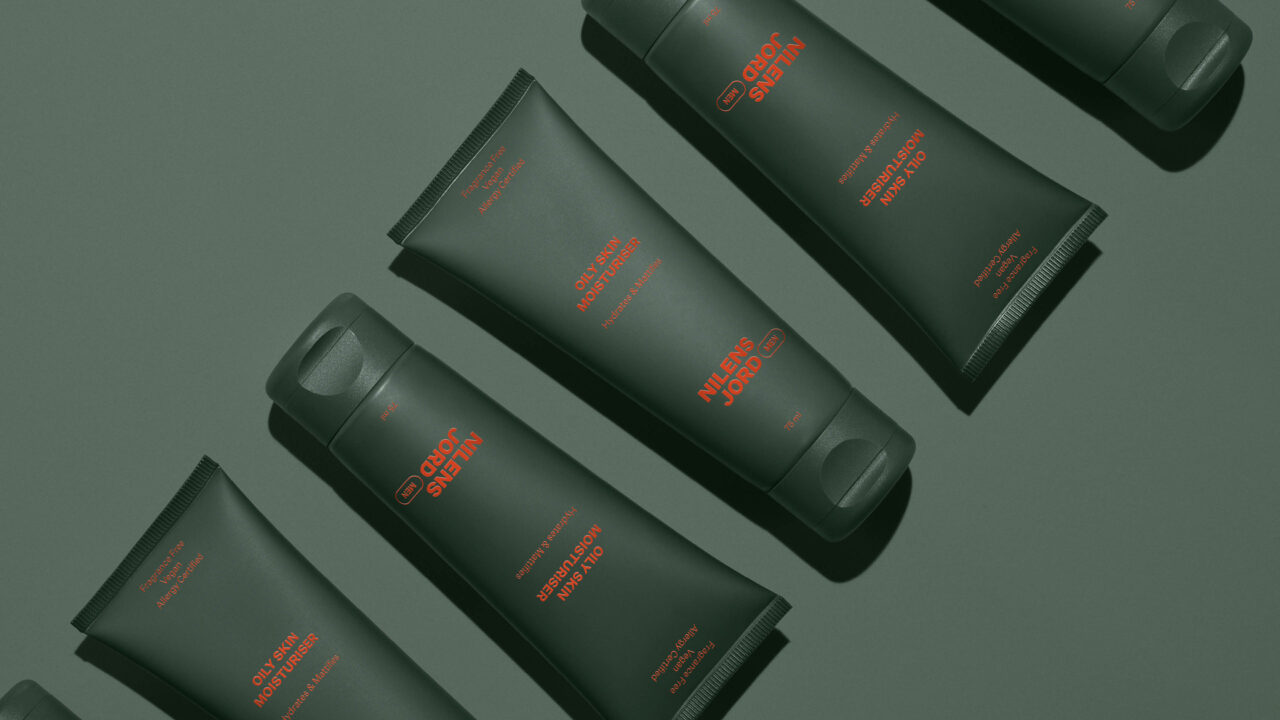
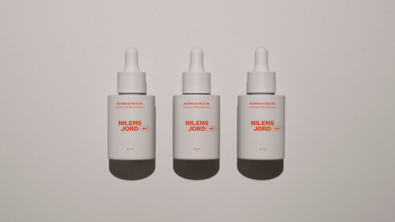
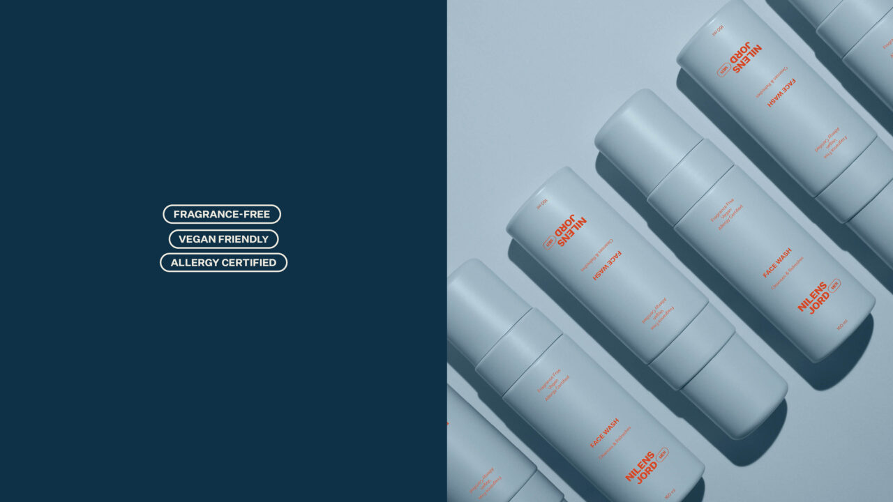
The concept behind the packaging design was to embody modern masculinity through an appealing and functional approach. The design aims to create a modern and aesthetic look and feel, reflecting contemporary perceptions of masculinity with clean lines, distinctive colours and minimalist aesthetics. Simplicity and functionality are key considerations, ensuring the packaging is both visually appealing and practical for consumers to interact with.
Together with the client, we reviewed many different options for the texture and materials, aiming to craft a matte and textured sensation for the consumer – blending the soft and the smooth with bold and the strong.
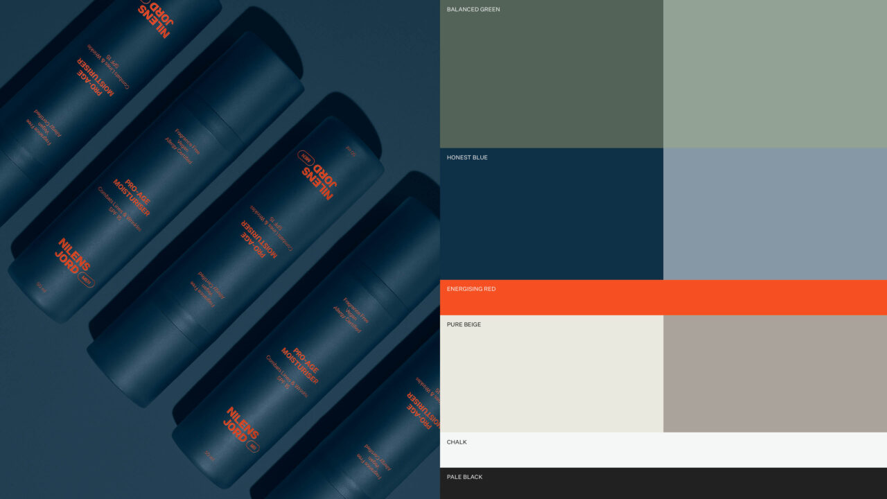
The color scheme drew inspiration from the hues found in the Scandinavian nature, encompassing various shades of blue, green, grey and beige to establish a cohesive but versatile palette for the different products. In addition, we introduced a vibrant and energetic orange to provide a striking contrast to the more subtle, natural tones.
Shortliste
CCA 2024

