Kunde
Moover Toys
Bureau
Hey Jack Studio
Krediteringer
Beskrivelse
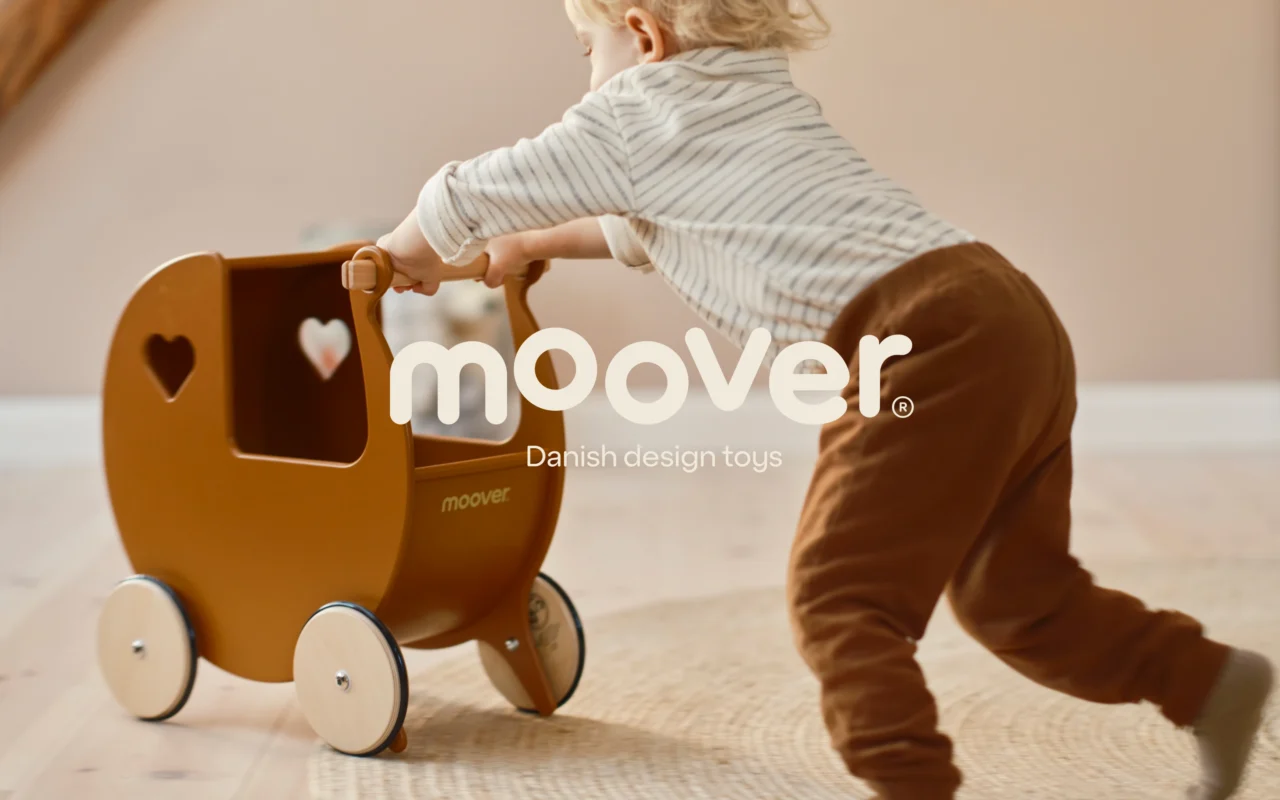
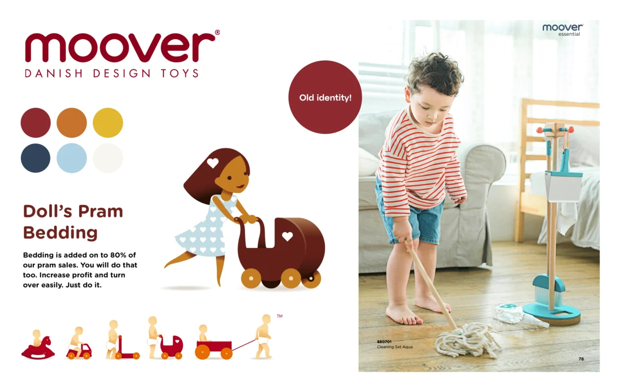
Sometimes even classics need a revamp; that was the case with Danish toy designers Moover, that reached out to us with a visual refresh mission. We dug deep into the DNA of Moover, rooted in Scandinavian simplicity and tradition of making durable wooden toys for toddlers, and expanded their identity to appear more attractive to the lifestyle of modern consumers.
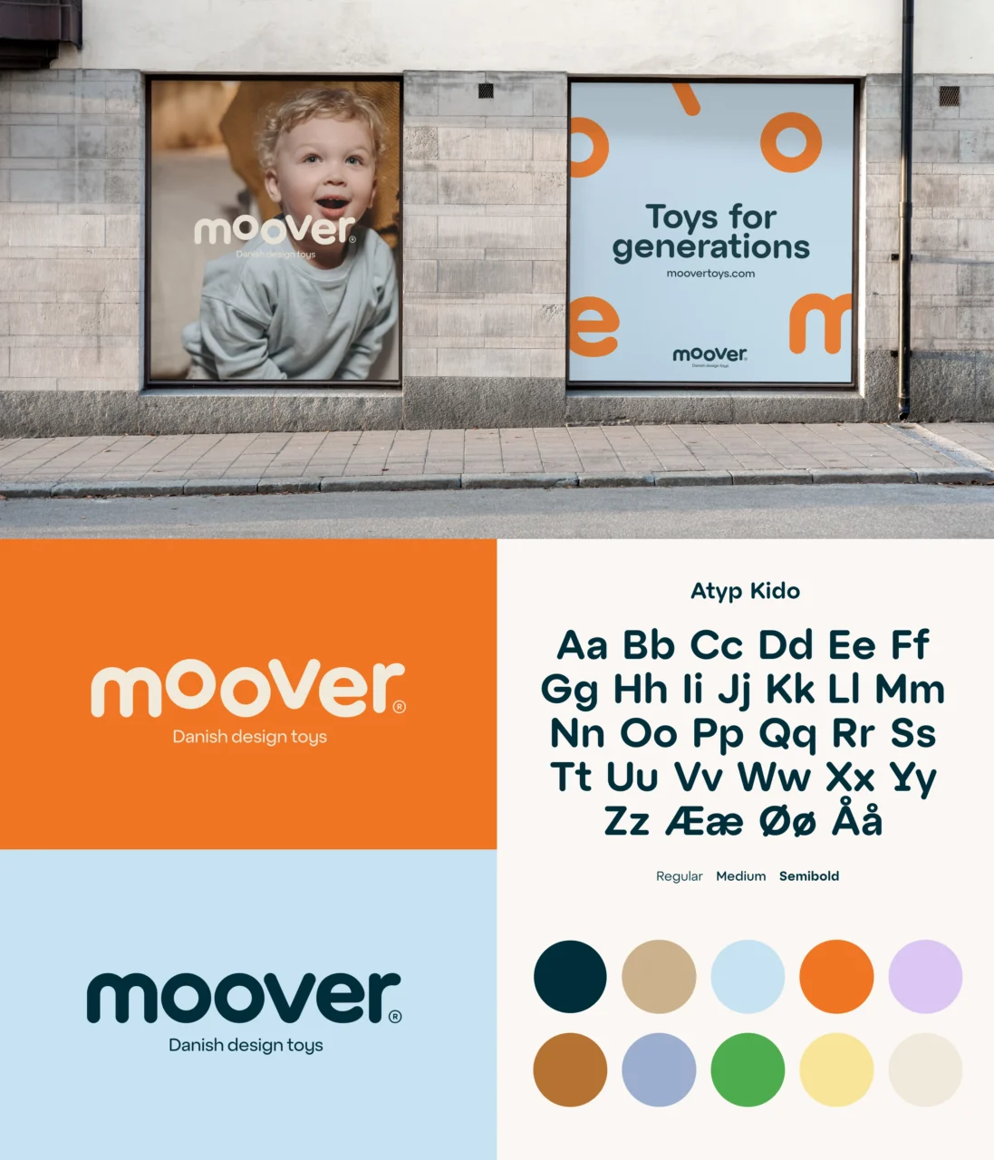
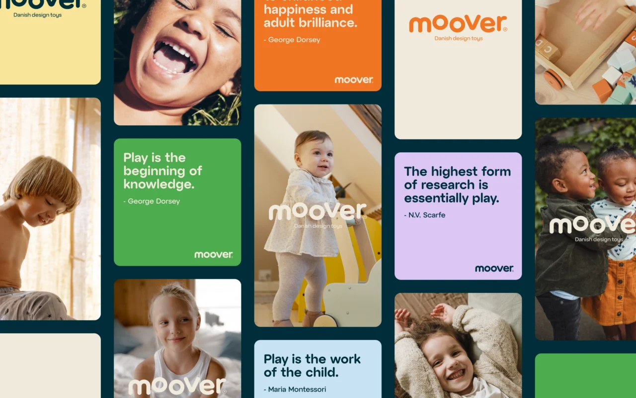
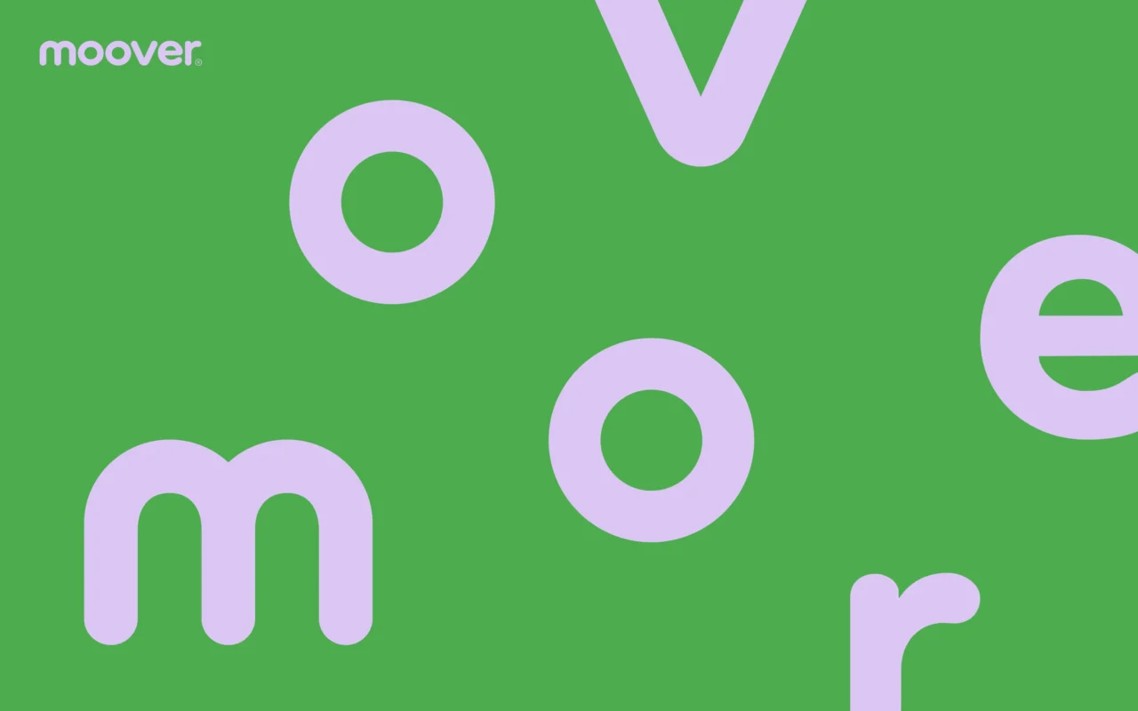
To retain brand recognition, we only elevated the rounded logotype, making it fleshier and more dynamic to reflect the mobility aspect of the Moover toys. In line with the aspiration to cater to entire families, we added a matching typeface with a pleasing plumpness at its core. The travelling letters of the 5th element is where we wanted to celebrate curiosity found in those endless toddler adventures, and use them to inspire their parents. Child-like innocence, like toys scattered around the living room, paved the way to different logo variations and visual play with the letters anyone can engage in.
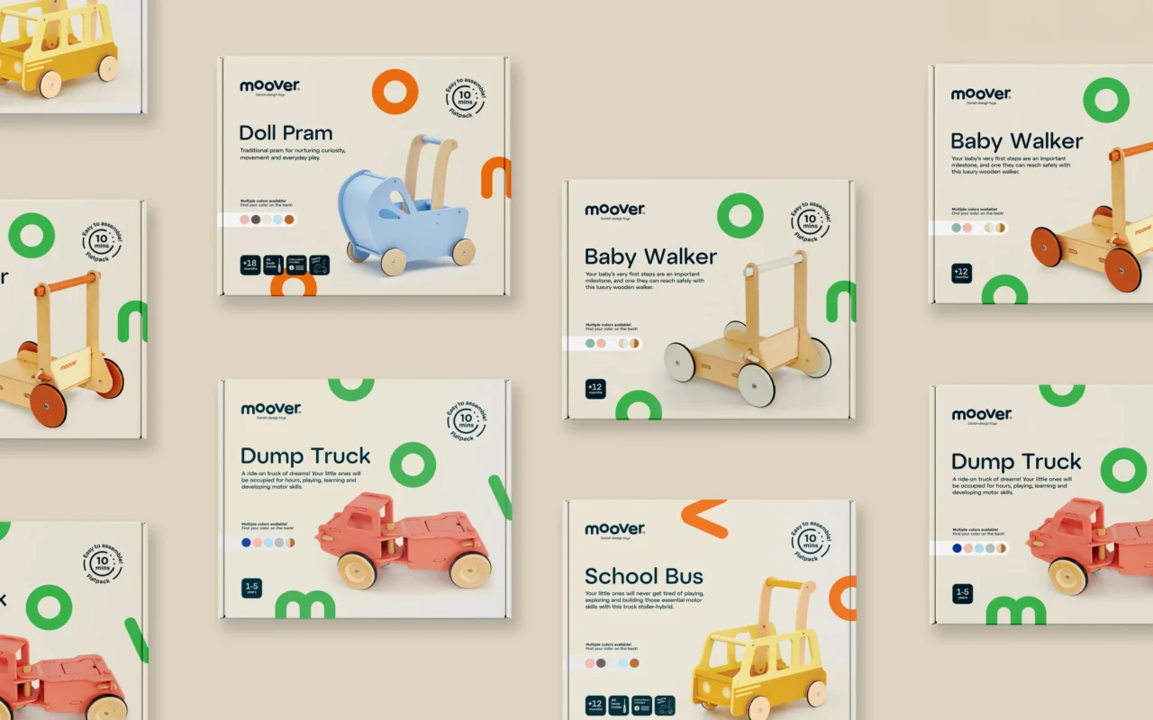
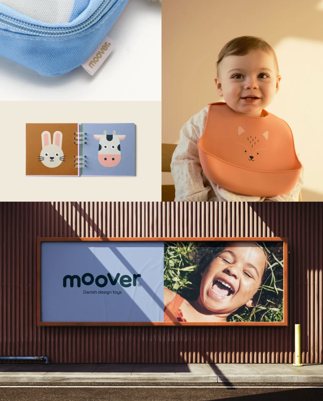
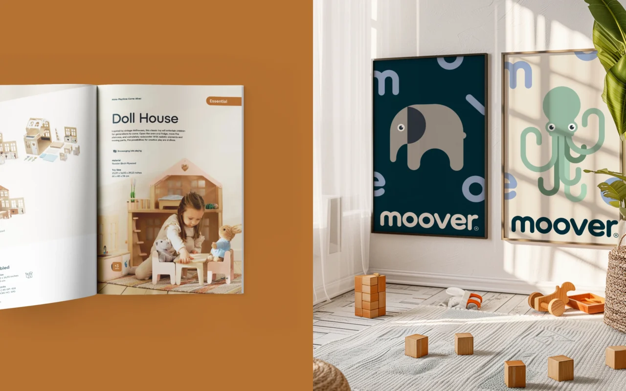
Complete with bespoke illustration style and clad in new, stylish colourways, Moover can now boldly expand into new markets and future generations, proving timeless doesn’t have to mean stagnant.
PDF Filer
Shortliste
CCA 2024

