Kunde
Kontrapunkt
Bureau
Kontrapunkt
Beskrivelse
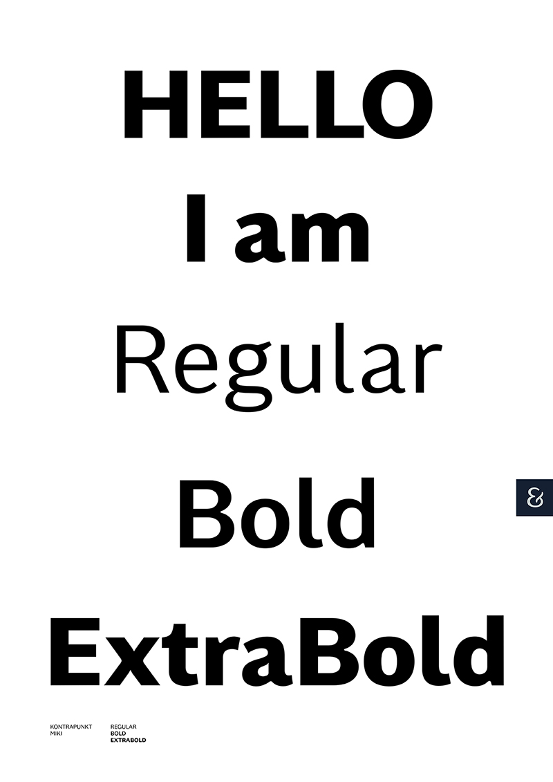
The Kontrapunkt spirit has always rested on the idea of sharing - not just sources of inspiration, but actual designs that are relevant and immediately applicable. We design our typefaces based on this notion and the first free Kontrapunkt typeface released in 2003 met the demand of being applicable and modern at once. In 2011, we expanded our portfolio with ”Kontrapunkt Bob”, and this year we introduced our newest family member, ”Kontrapunkt Miki”.
“Kontrapunkt Miki” was created on behalf of the discovery that many of the San Serif typefaces available today, are similar in both expression and application, and we therefore wanted to create a typeface which had more personality and a wider usage repertoire. We did this by creating a typeface that occupies the place in between the Antiqua and the Sans Serif design approach. The result is an elegant Sans Serif typeface with more contrast between thick and thin strokes and less geometric forms, which in contrast to other Sans Serif’s, ensures great standout with uppercase letters whilst also embracing lowercase letters in body text. The typeface encapsulates the danish design tradition with its emphasis on human forms and soft, sculptural edges.

Vinder 2016
CCA 2016


