Kunde
The Copenhagen Metro
Bureau
Urgent.Agency
Krediteringer
Beskrivelse
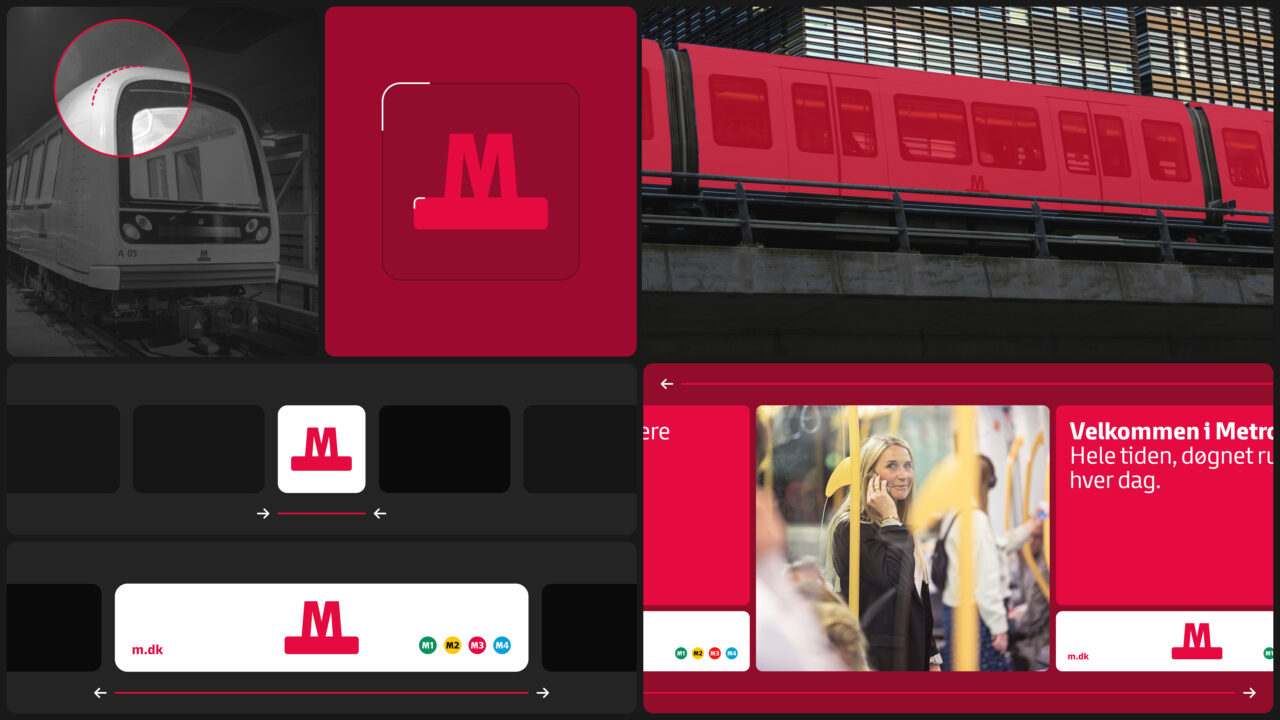
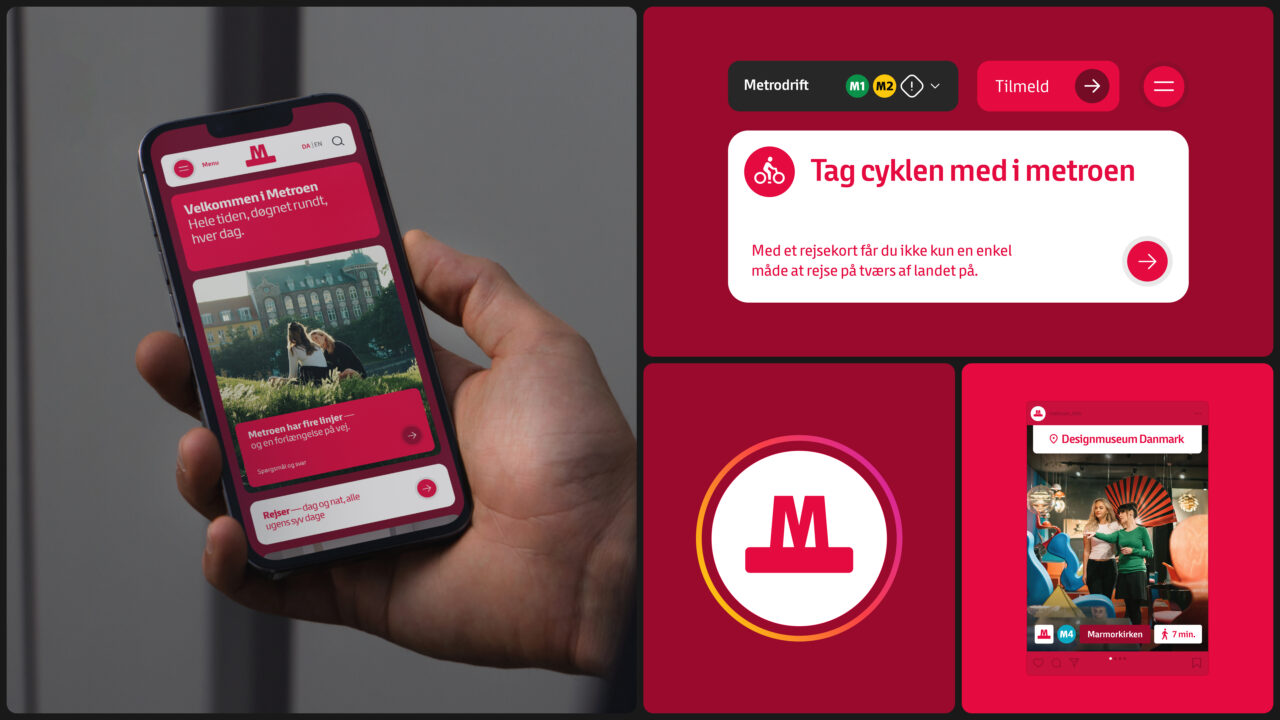
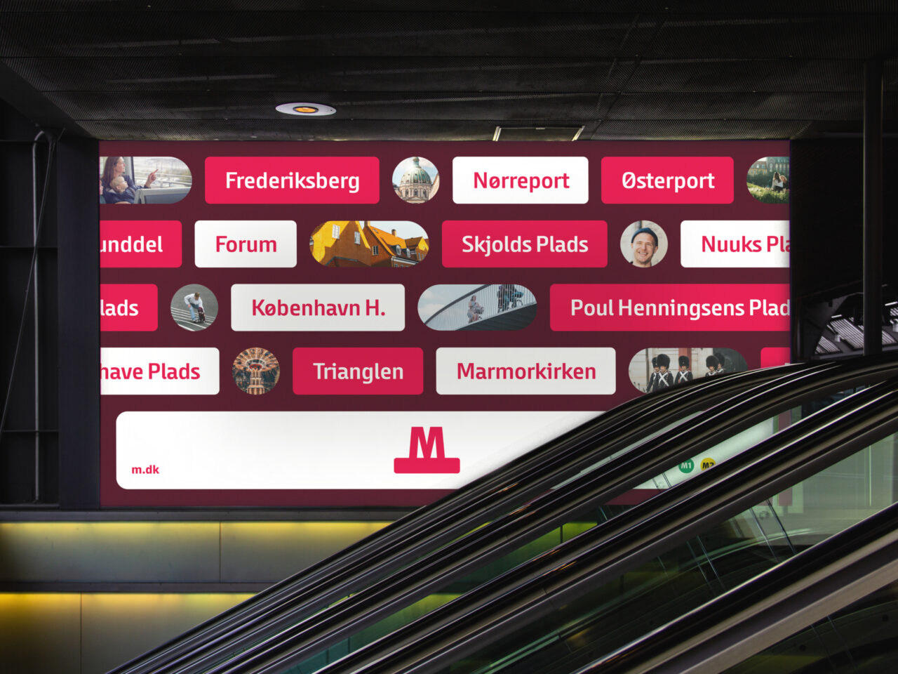
The Copenhagen Metro is straightforward, aesthetically pleasing and runs with an unmistakable rhythm and flow. It is a brand that is easy to understand yet hard to explain. We set out to do both when asked to revitalize and tighten the brand’s design and voice.
Challenge
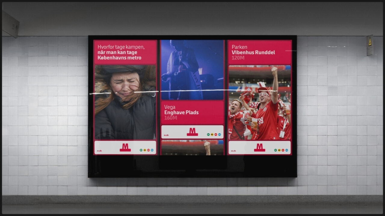
How do you reintroduce the Metro to Copenhagen – while respecting the excisting brand position and design? The challenge is to make sure that the brand’s visual and textual expressions are effective yet inviting, without friction yet full of emotion, streamlined yet with ample room to move.
Idea
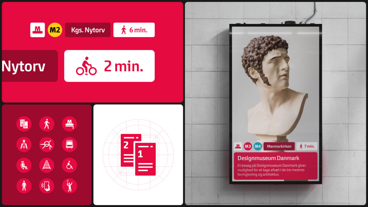
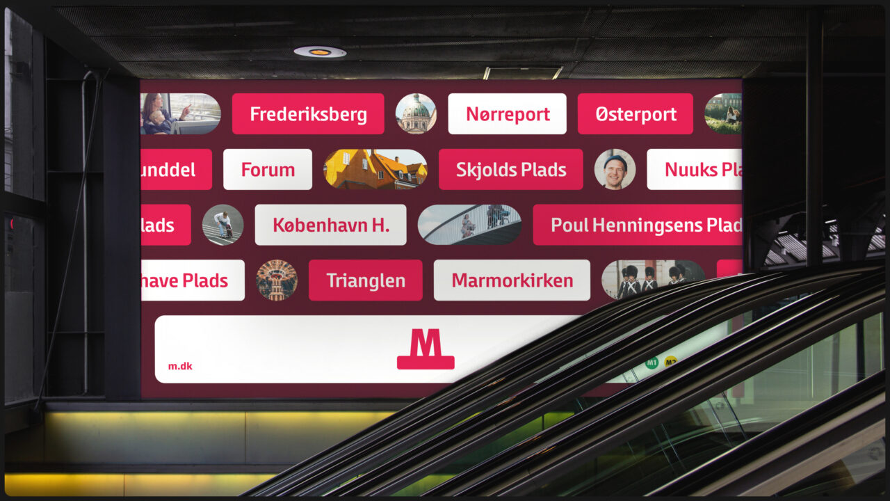
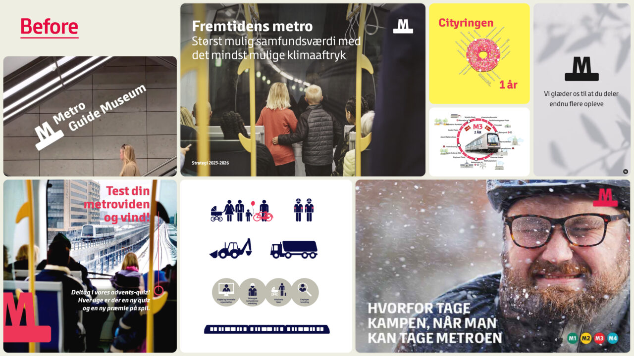
Early talks about the architectural vision and technical solutions behind the Metro infrastructure inspired looking into removing rather than adding. A no-clutter approach with a simplifying ambition. This idea of making everything run as smoothly as the trains became the guiding principle of the strategy and design work.
Solution
By removing and simplifying, we found that the brand emerged with more precision and strength than ever. With the red M in the centre, we crafted a brand guide and toolbox where every element of design or copy where weighed against the guiding principle of mirroring the flow and functionality of the stations and trains.
Shortliste
CCA 2025