Kunde
MAX Burgers
Krediteringer
Beskrivelse
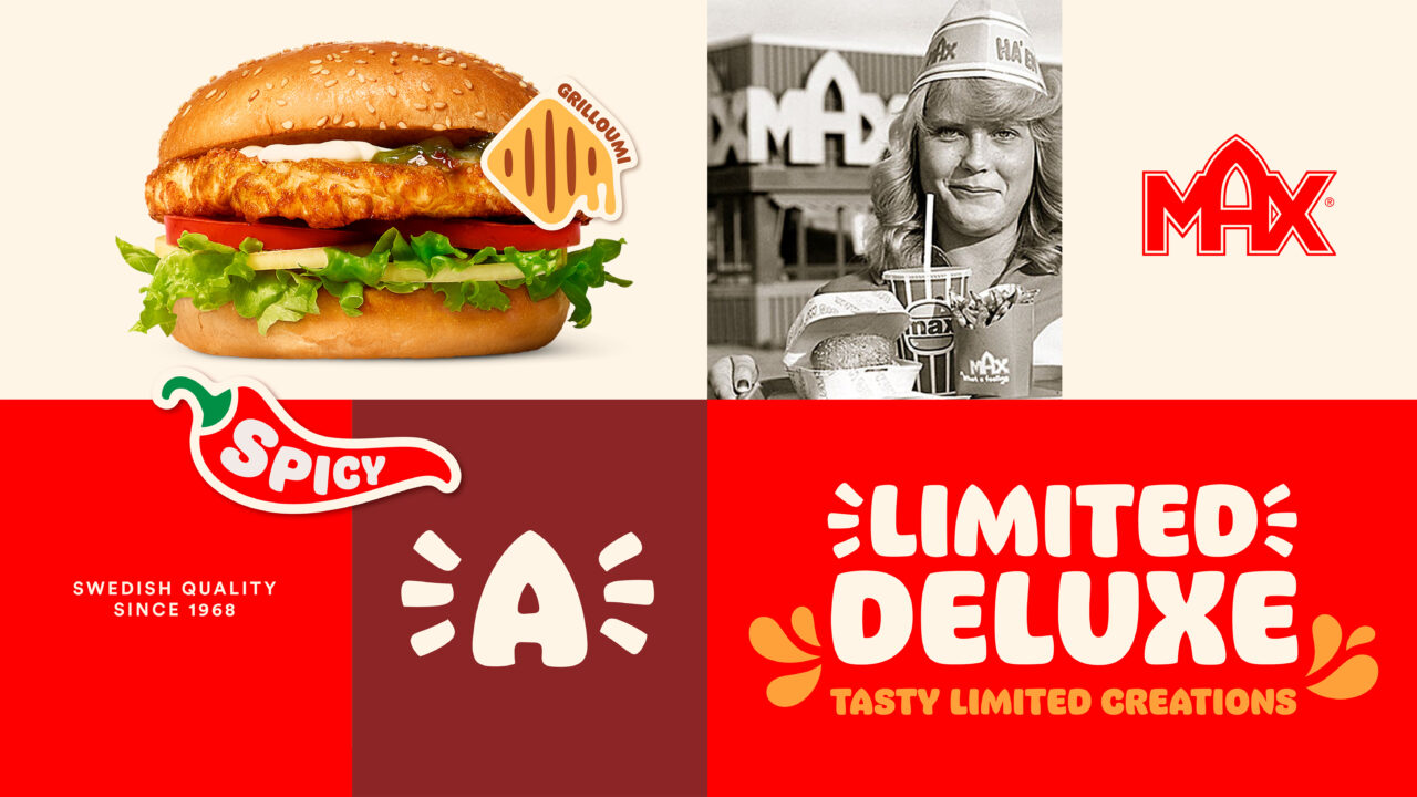
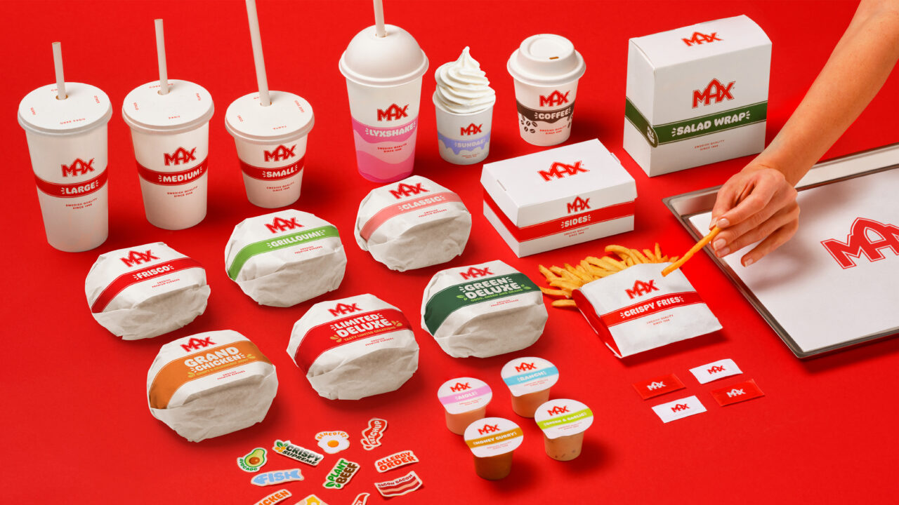
The updated visual and verbal representation of MAX Burgers packaging, the climate-positive food company and renowned Swedish burger chain, pays tribute to its Swedish roots and the rich legacy it has cultivated over the years. This re-design is a celebration of the sheer delight of food without compromising on quality, taste, or global impact.
The primary objective was to strike a harmonious balance between a refreshing new design and the comforting familiarity that MAX embodies. By delving into the essence of MAX through its iconic logo, the design system was anchored in the foundation of the brand, emphasising the distinctive red and white stripes. This simple yet powerful symbol serves to unite the brand and its diverse portfolio while retaining a sense of familiarity for the loyal MAX guests, even within the context of a revamped brand environment.
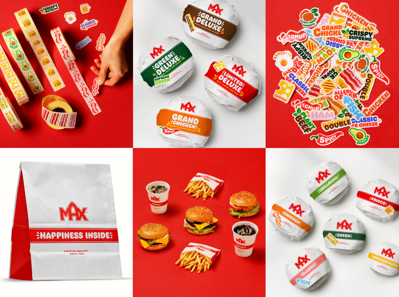
To infuse a sense of fun and flexibility into the system without excessive material usage, a personalised touch was introduced to the packaging. Stickers were ingeniously crafted to customize each burger for the guests various preferences, and providing adaptability for a constantly evolving portfolio. This not only ensures practicality but also injects personality and joy into the overall system. Further enhancing the brand’s uniqueness, a custom-designed typeface Max Classic™ was introduced. This exclusive font, solely owned and utilized by MAX, was meticulously crafted to convey MAX’s dedication, craftsmanship, and the sheer joy of food. Inspired by the iconic brandmark, this cheerful typographic element adds depth and distinctiveness to the MAX packaging and brand, contributing to its overall personalised and engaging identity.
PDF Filer
Shortliste
CCA 2024


