Kunde
Galerie Wolfsen
Bureau
Uncle Grey
Krediteringer
Beskrivelse
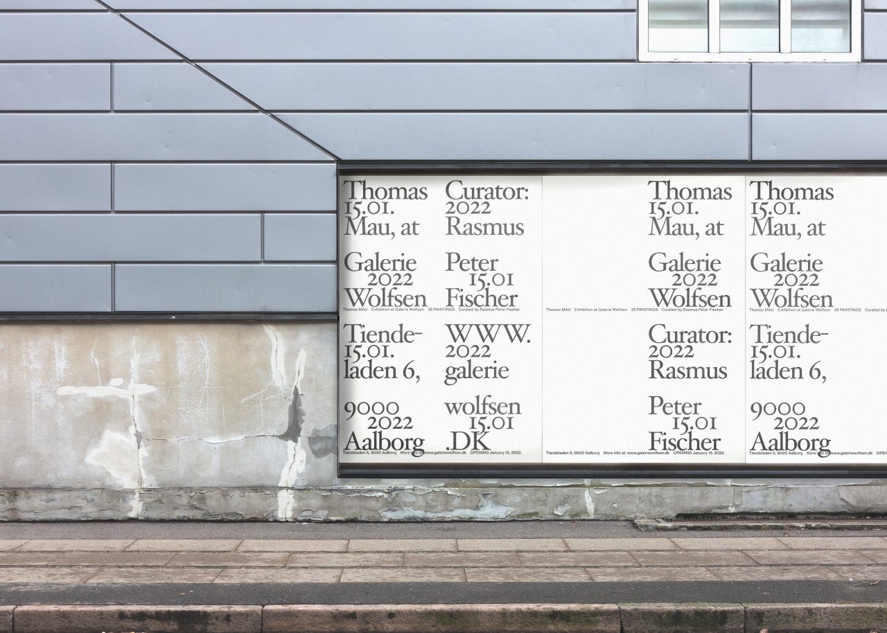
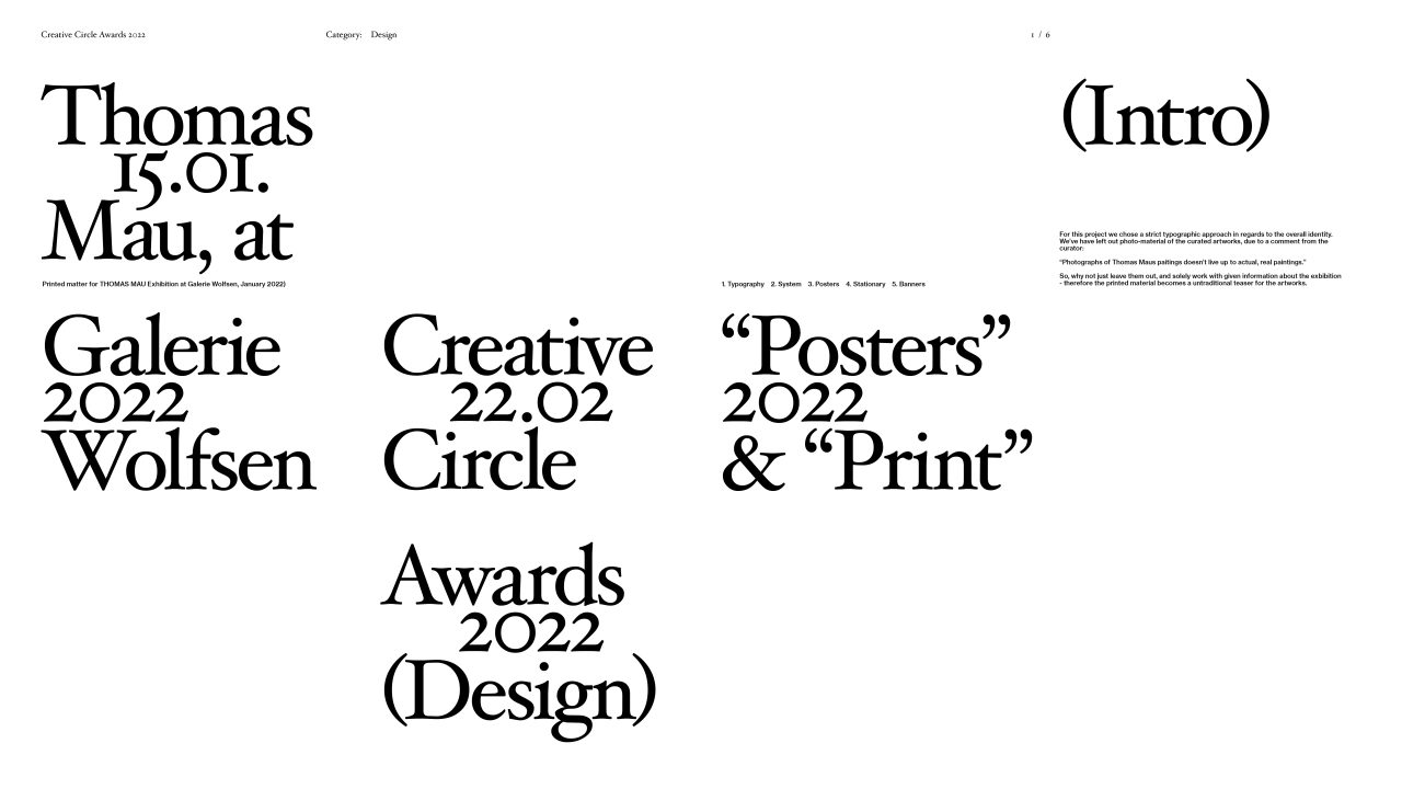
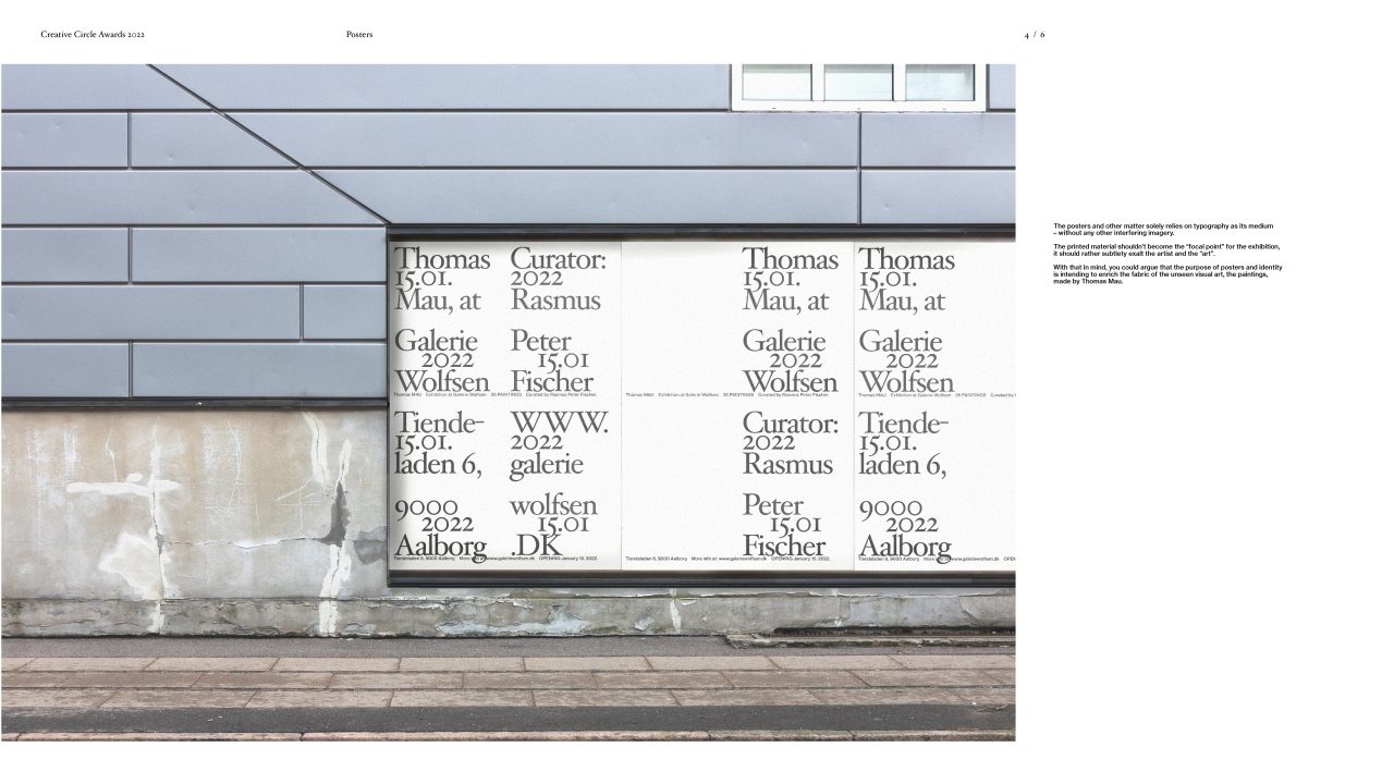
When designing the posters and prints for Thomas Maus exhibition at Galerie Wolfsen, we chose a strict typographic approach in regards to the overall identity. We decided to leave out any imagery of the curated artworks whatsoever, due to a comment from the curator:
“Photographs of Thomas Maus paintings doesn’t live up to actual, real paintings.”
So, why not just leave them out, and solely work with given information about the exhibition? Therefore the printed material became an untraditional teaser for the artworks.
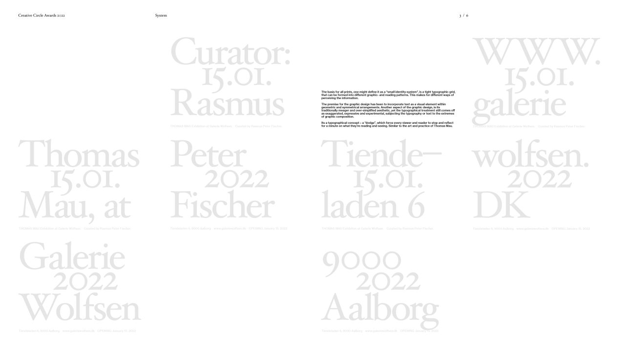
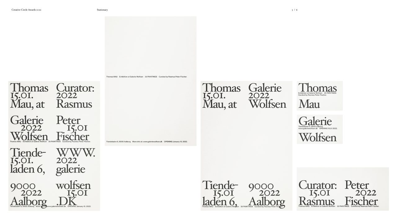
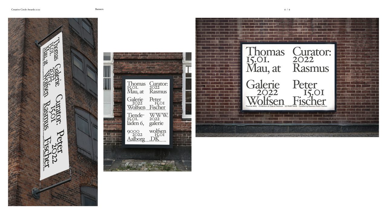
The basis for all prints, one might define it as a "small identity-system", is a tight typographic grid, that can be formed into different graphic- and reading patterns. This makes for different ways of perceiving the information.
The premise for the graphic design has been to incorporate text as a visual element within geometric and symmetrical arrangements. Another aspect of the graphic design, is its traditionally meagre and over-simplified aesthetic, yet the typographical treatment still comes off as exaggerated, expressive and experimental, subjecting the typography or text to the extremes of graphic composition.
It's a typographical concept – a “dodge”, which force every viewer and reader to stop and reflect for a minute on what they’re reading and seeing. Similar to the art and practice of Thomas Mau.
The posters and other matter solely relies on typography as its medium
– without any other interfering imagery.
The printed material shouldn’t become the “focal point” for the exhibition,
it should rather subtlety exalt the artist and the “art”.
With that in mind, you could argue that the purpose of posters and identity
is intending to enrich the fabric of the unseen visual art, the paintings, made by Thomas Mau.
PDF Filer
Shortliste
CCA 2022

