Kunde
Libratone
Bureau
Twentyten
Krediteringer
Beskrivelse
Libra(liberate)tone(sound).
Since the company’s dawn in 2009, Libratone has been on a mission to set sound free. Focusing on wireless technologies such as Airplay, WiFi and Bluetooth, Libratone’s products encourage users to enjoy music wherever they may be.
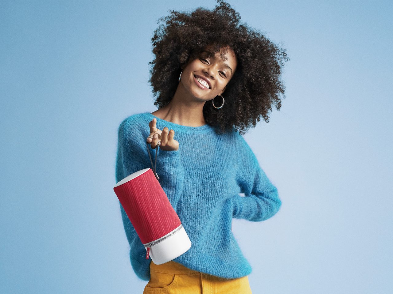
In a space where everything is about features and technological advancements, the Libratone brand needed a dash of personality. A distinct visual language that would set them apart from the growing amount of brands in the personal tech category. From blend in, to stand out.
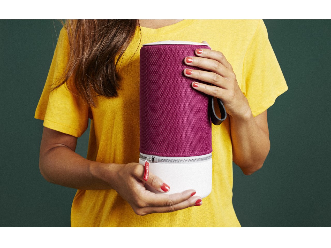
Libratone’s products are instantly recognizable. Soft edges, rounded corners and a wide range of colors and materials, make up for a friendly and inviting design language. Our goal was to create a visual language for the brand, that supported the product design, in a way that could be applied to all relevant channels.
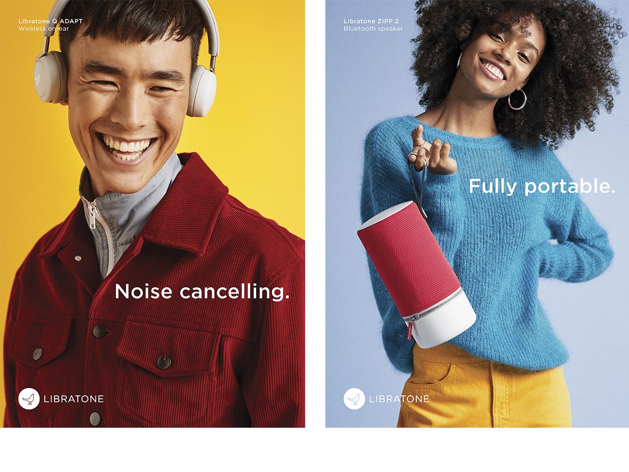
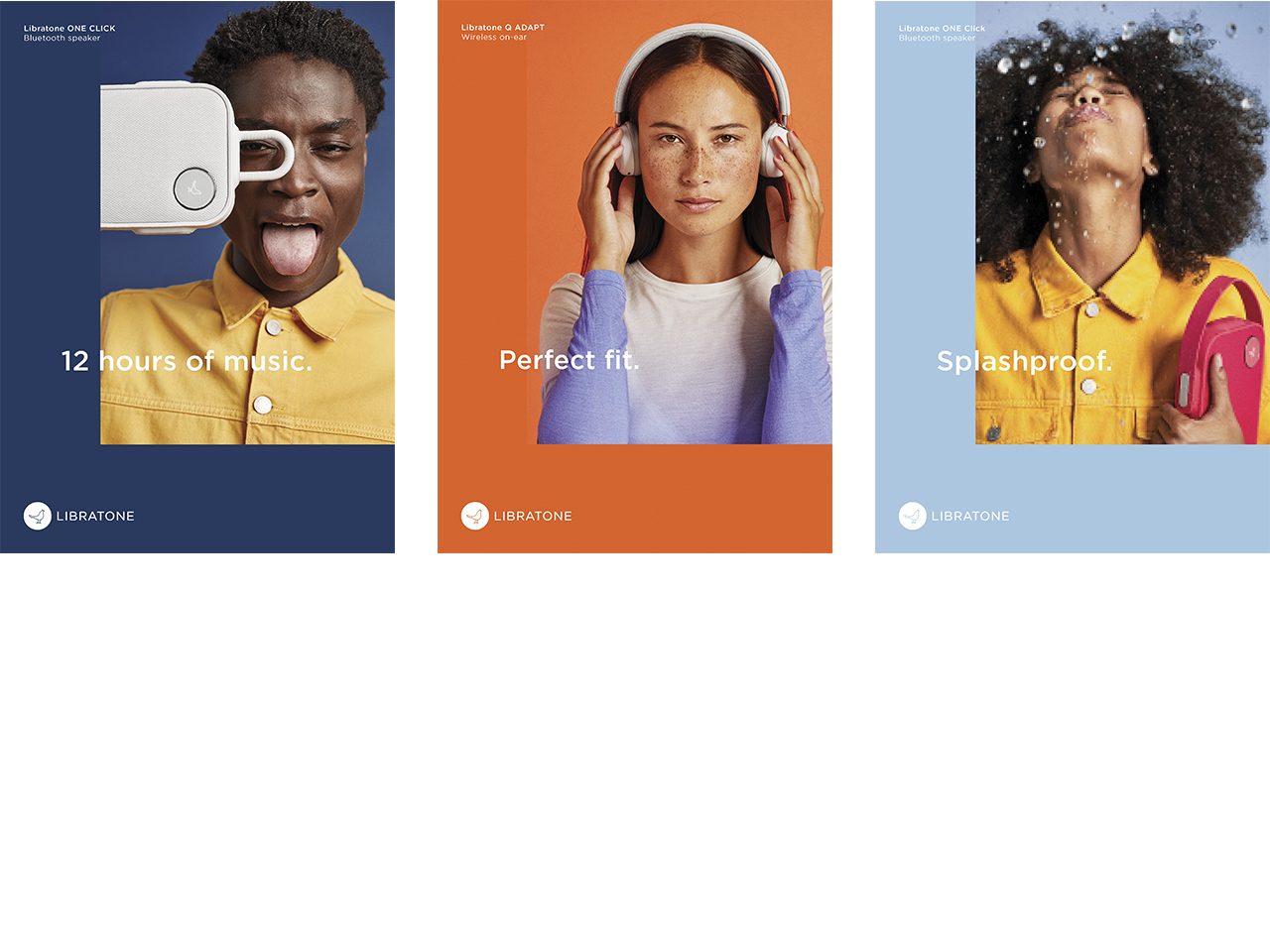
Together with the good people at Libratone, we created a vast set of image styling principals to bring the new brand personality to life, with a distinct international approach. Each image focuses on 1 of 3 different elements of the brand: 1. Personality, 2. Product, 3. Features, depending on the use case. The images are then placed in a simple design system, that uses the sharp edges of the square and a minimalistic approach to copy, to make the organic shapes of the products stand out even more. The popping colors are featured in all aspects of the brand, and we have assisted in implementing the new identity across everything from CVI, spatial design (together with Borg Brückner), website (together with Hello Great Works), all the way to the product launch campaign for ZIPP 2 for which we did the art and creative direction (uploaded as video).
PDF Filer
Shortliste
CCA 2019

