Kunde
Gestalten
Beskrivelse
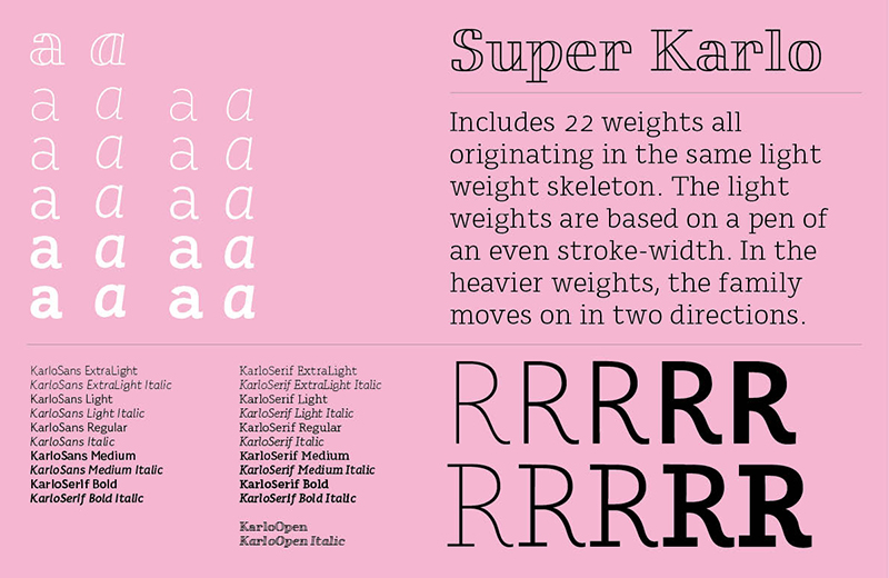
The super typeface family Karlo includes 22 weights all originating in the same light weight skeleton. The light weights are based on a pen of an even stroke-width. In the heavier weights, the family moves on in two directions. Inspired by the writings of calligrapher Edward Johnston, who demonstrated that the broad nib pen can produce different writing styles: one style of heavy weight has a humanistic low stroke contrast (KarloSerif Bold and KarloSans Bold), and another has a high stroke contrast of vertical axis with references to the 19th century jobbing typefaces (KarloOpen). The latter is inspired by Johnston’s demonstration of the broad nib pen, where he suggested fastening two pencils together. With each pencil representing an edge of the pen, it becomes more evident how the pen works in writing.
The friendly informal look of a conservative letter skeleton makes KarloSans and KarloSerif usable for both running text and for display sizes. KarloOpen, on the other hand, is solely designed for display purposes showing few words at a time.
Design by Sofie Beier

Vinder 2015
CCA 2015


