Kunde
Botnia https://www.botniaskincare.com/
Bureau
Hugmun
Produktionsselskab
Packaging Printery: Marceli Printery
Photography: ANKU WORKS, Jenna Rae
Illustration: Dominika Brychcy
Beskrivelse
Botnia is an eco-conscious skincare company based in Sausalito, California. They believe in the philosophy of 'we are nature,' crafting high-quality skincare with sustainably-sourced botanicals. Their products prioritize ethical practices, minimal waste, and environmental stewardship, grown on their microfarm and made in their own lab.
Their Founder Justine reached out to us because she had seen our work and admired the storytelling aspect of our projects. She needed to rebrand her business and products, to be more in-line with their ethos. First we helped her to source more sustainable materials for her inner packaging, and then we focussed on the design and outer packaging.
They needed an evolution to step forward into something eco. The main objectives of the design, with the mission in mind, were three ways.
Designed for holistic estheticians. Botnia is a professional skincare line, they needed something to reflect that the skincare is as much for the practitioner as it is the client. Something that bridges the gap between individualistic design for the consumer and a professional spa line.
It needed to look modern and up to date, to better communicate commitment to inclusivity, health and well-being. Botnia also provides an educational service to their esthetician partners around the ingredients and skincare based practices.
Ensure deep connection to nature while delivering transformative skincare results. Harmony between the products and the earth.
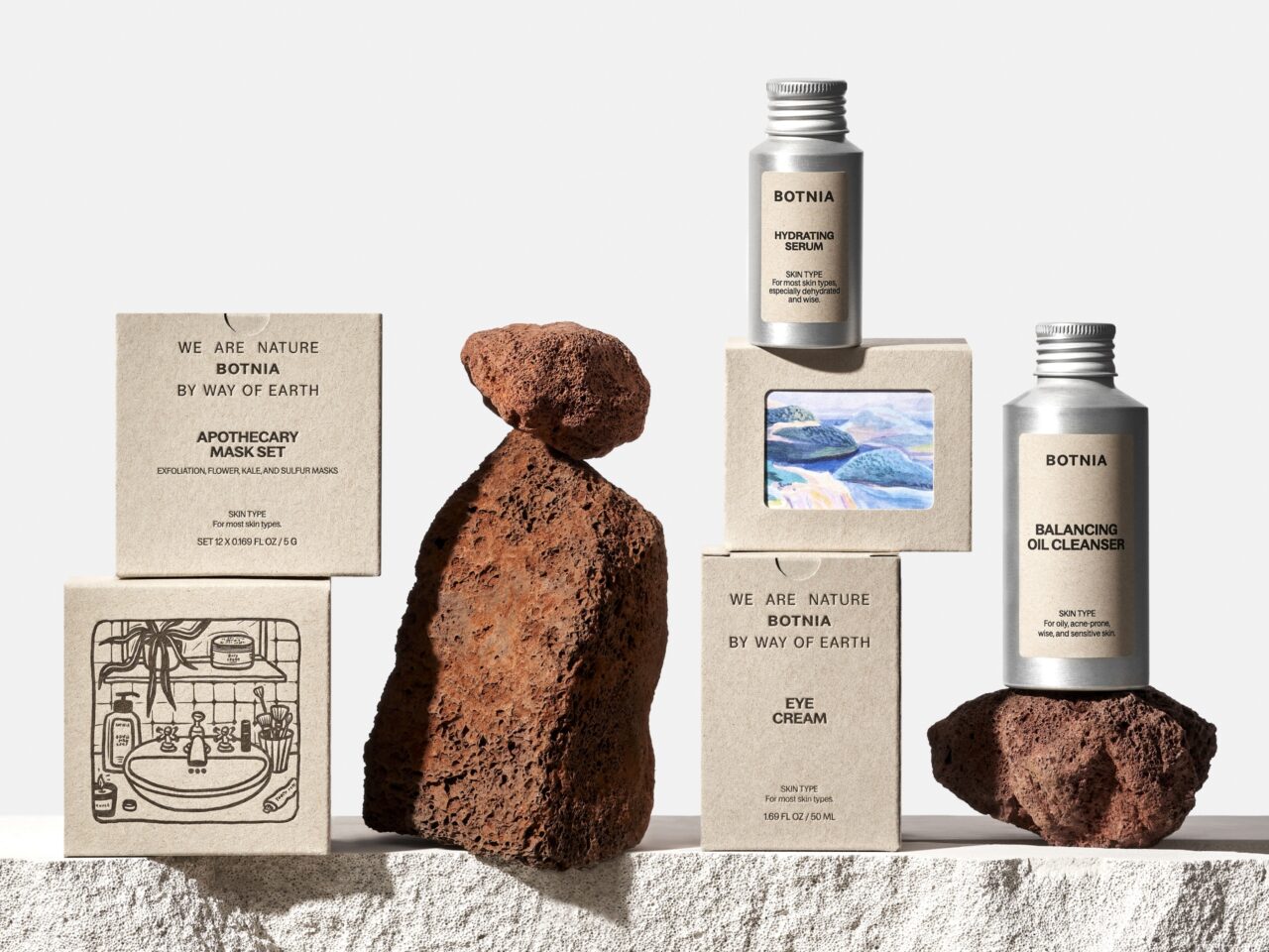
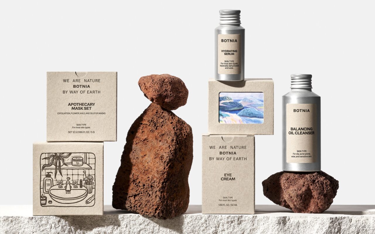
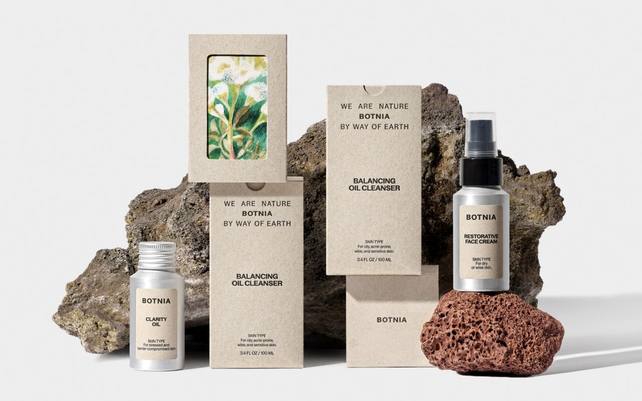
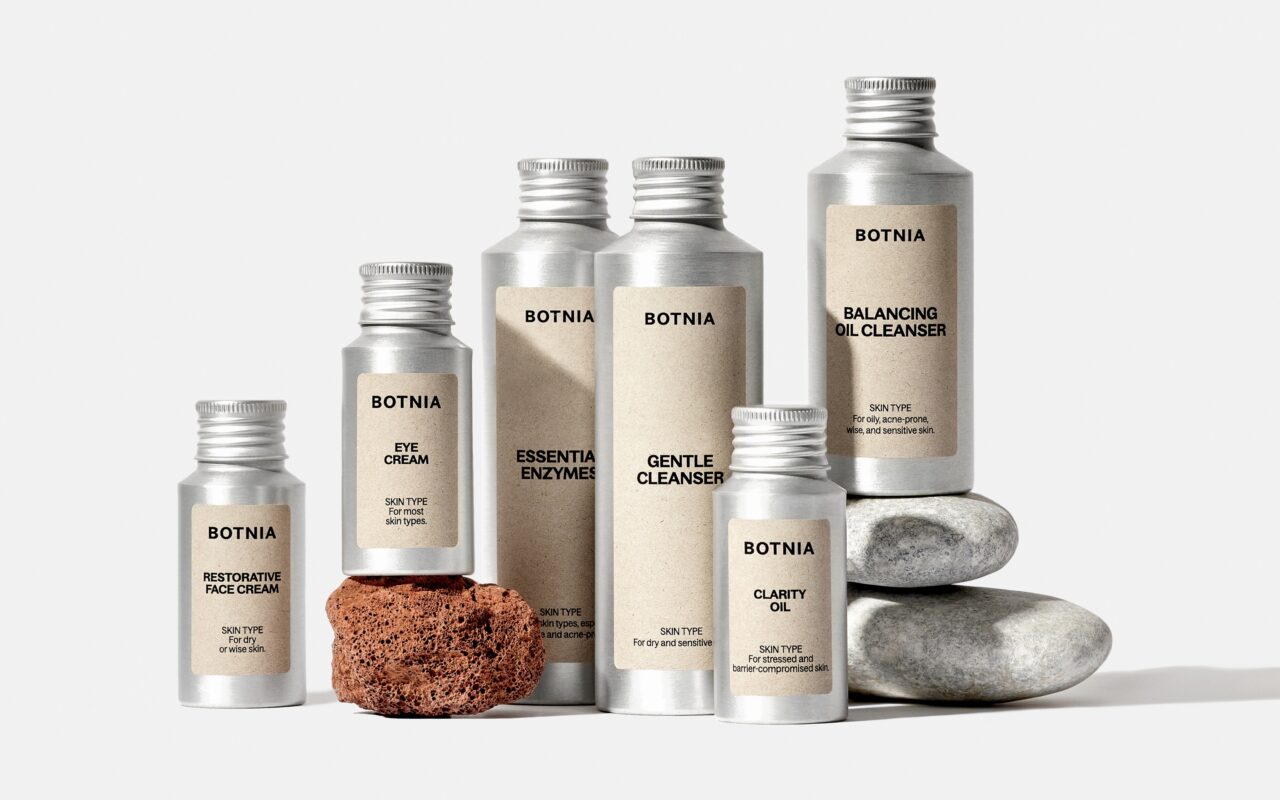
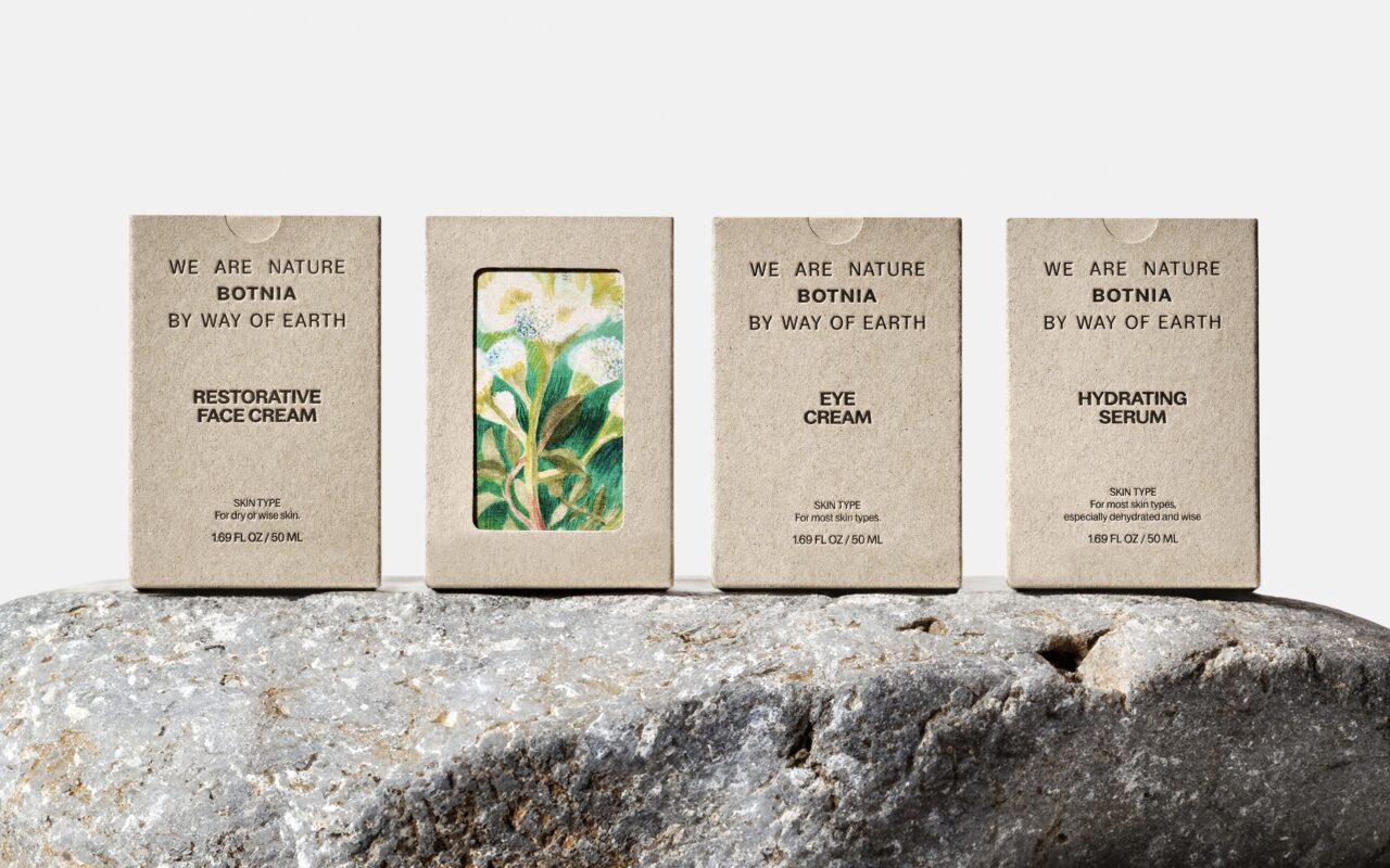
The new design follows the lead of the materials, such as aluminium. We decided to go with a more muted earthy beige color of the cardboard used on the sustainable eco-friendly material of the boxes. This color is also used across the label system.
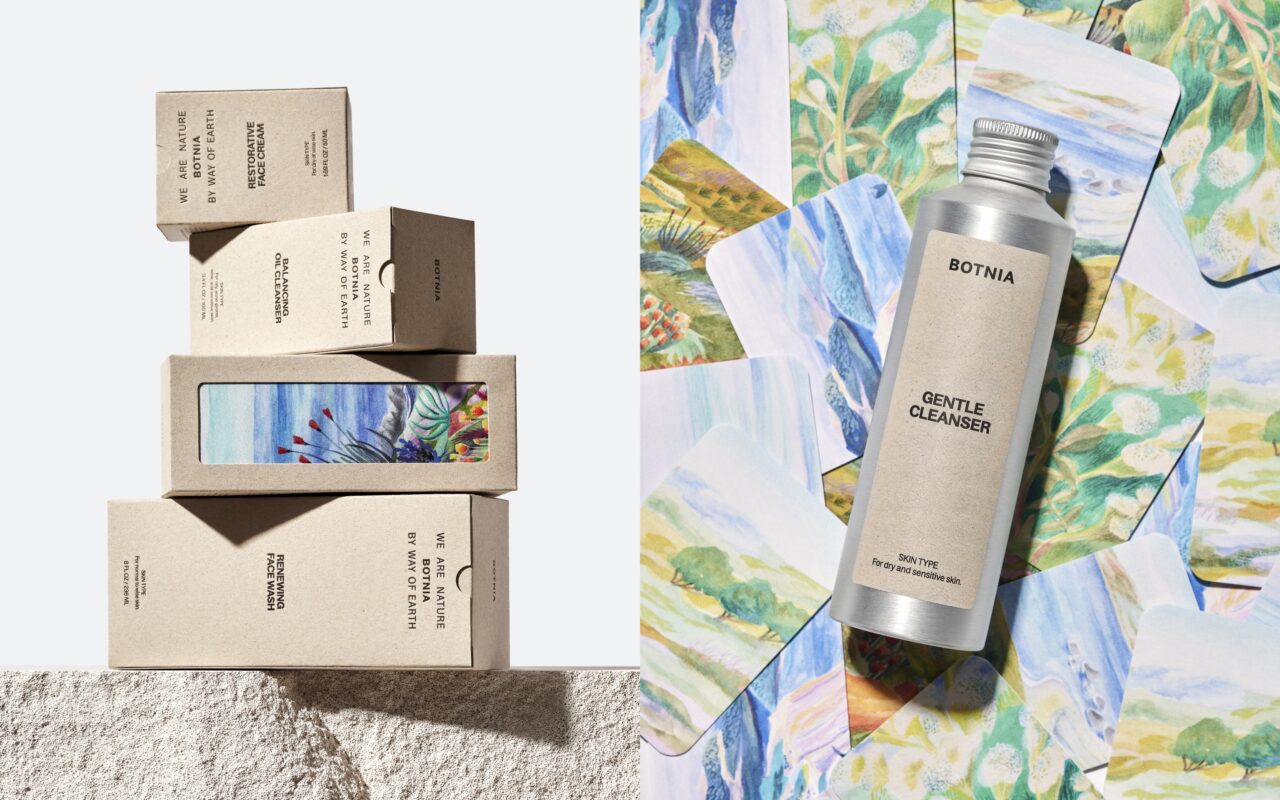
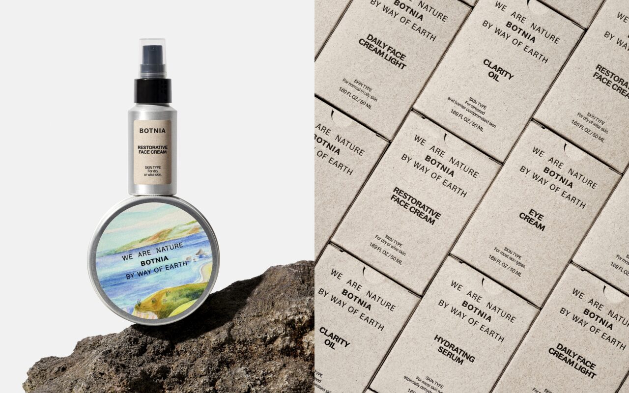
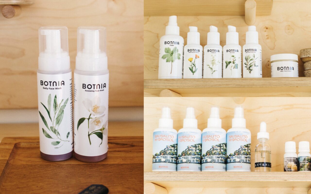
The previous bottles were made of white glass or plastic with white labels. In a way, we are continuing the initial direction as the bottles also had labels with small plant ingredient illustrations. We upscaled the illustration idea to be a bigger brand element across the packaging in the box insert designs. The illustrations showcase ingredients as well as landscapes that are relevant to the products. We unified the layout and fonts in the new direction, and added more info on the front labels.
The logo symbolizes Botnia's position between nature and earth, while the packaging mirrors honesty and eco-friendliness. Illustrations by artists such as Dominica Brychcy capture the brand's essence, printed on eco-friendly packaging from Marceli Printery. We worked closely with Marceli to test and create a never-before-done style of outer box packaging and insert. The color palette, derived from raw materials, fosters a bright, pastel, and organic feel, creating a harmonious, spa-like experience for users.

Vinder 2024
CCA 2024

