Kunde
HemoCue AB
Bureau
Designit
Krediteringer
Beskrivelse
For more than four decades HemoCue has been at the global forefront of point of care diagnostics. To expand their reach into new health areas and prepare for their next phase of growth they needed a revitalised brand platform that honoured their legacy and supported their ambition of advancing global health.
Inspired by the genuine care and deep expertise HemoCue offer to the world we created a brand platform that goes beyond the functional benefits of their devices while paying homage to their pioneering beginnings and bold goals.
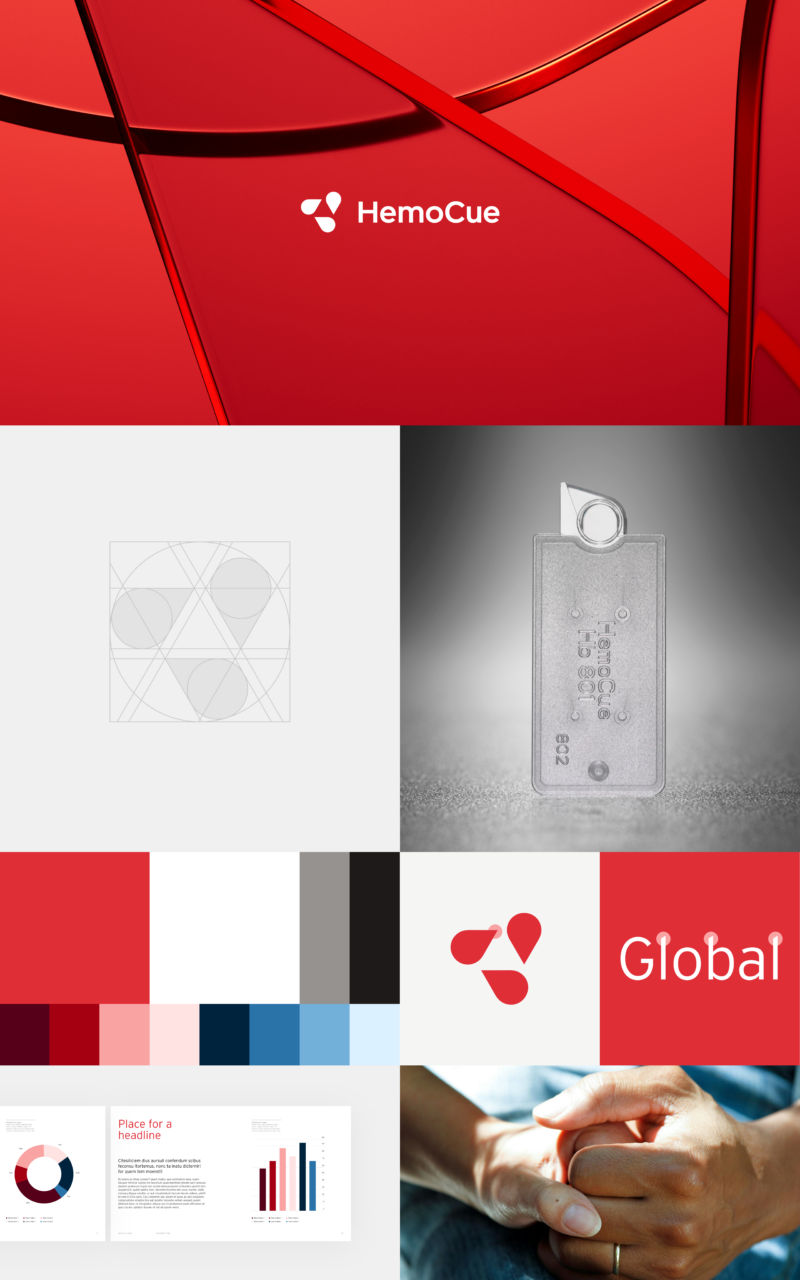
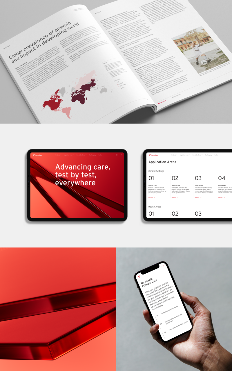
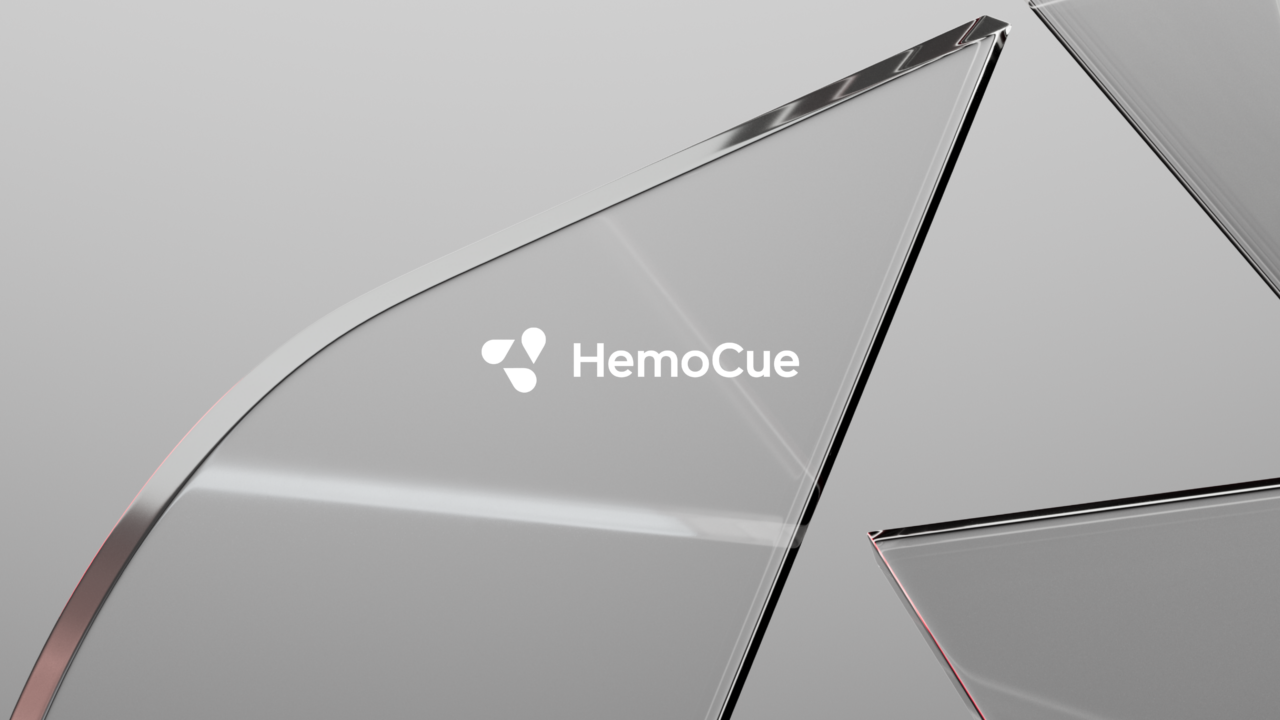
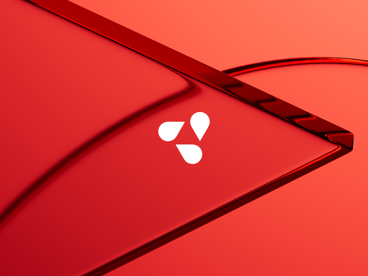
With more than 140m tests performed every year, HemoCue's Micro Cuvettes are ubiquitous at the frontlines of global health care. With a keen eye on accuracy and clarity we transformed their famous cuvette into a logo that communicates their brand essence across applications and touchpoints.
Inspired by the functional simplicity of their devices we crafted a foundational identity that cuts through the complexity often found in health care. Allowing HemoCue to communicate with renewed clarity.
We then elevated the brand expression with a fifth element referencing the logo and the interplay between expertise and care in both static and animated use cases.
HemoCue is known globally for its 'little red boxes', so we wanted to maintain brand recognition through the colour red while adding a multi-functional secondary palette.
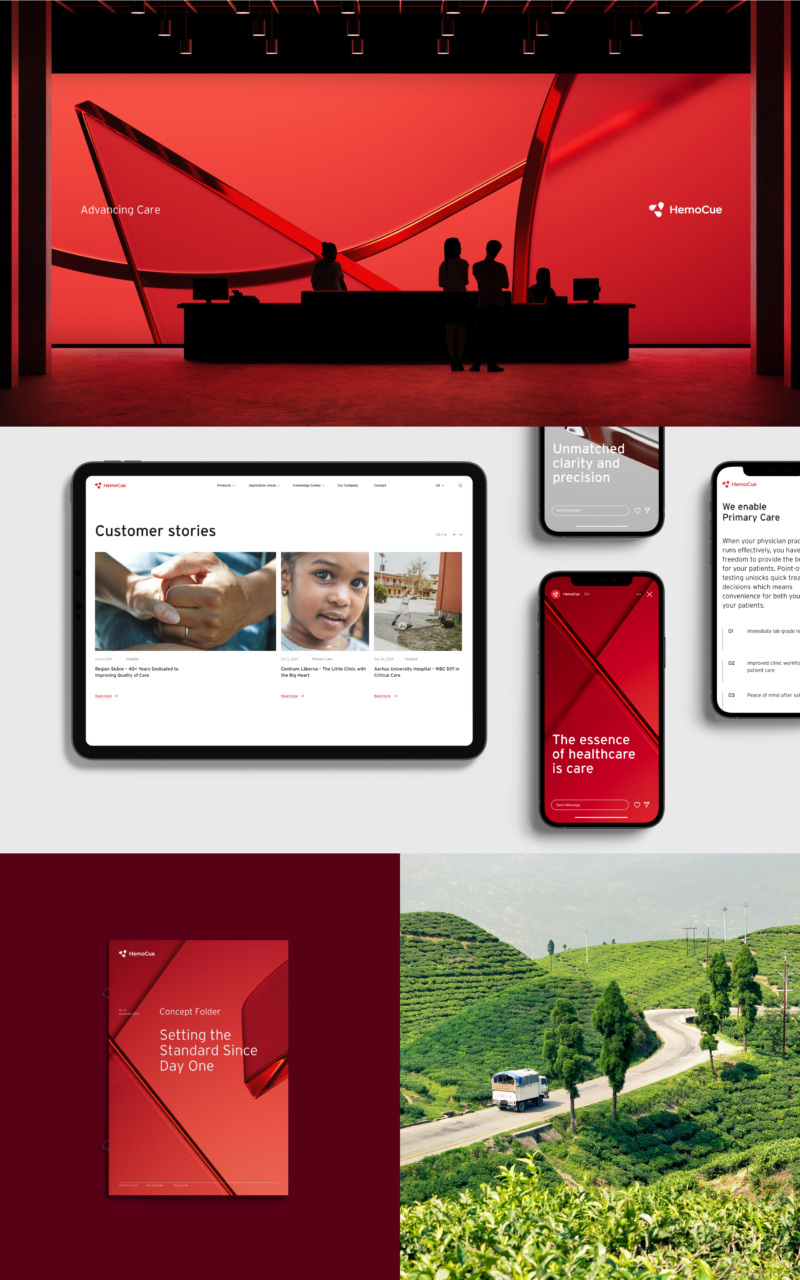
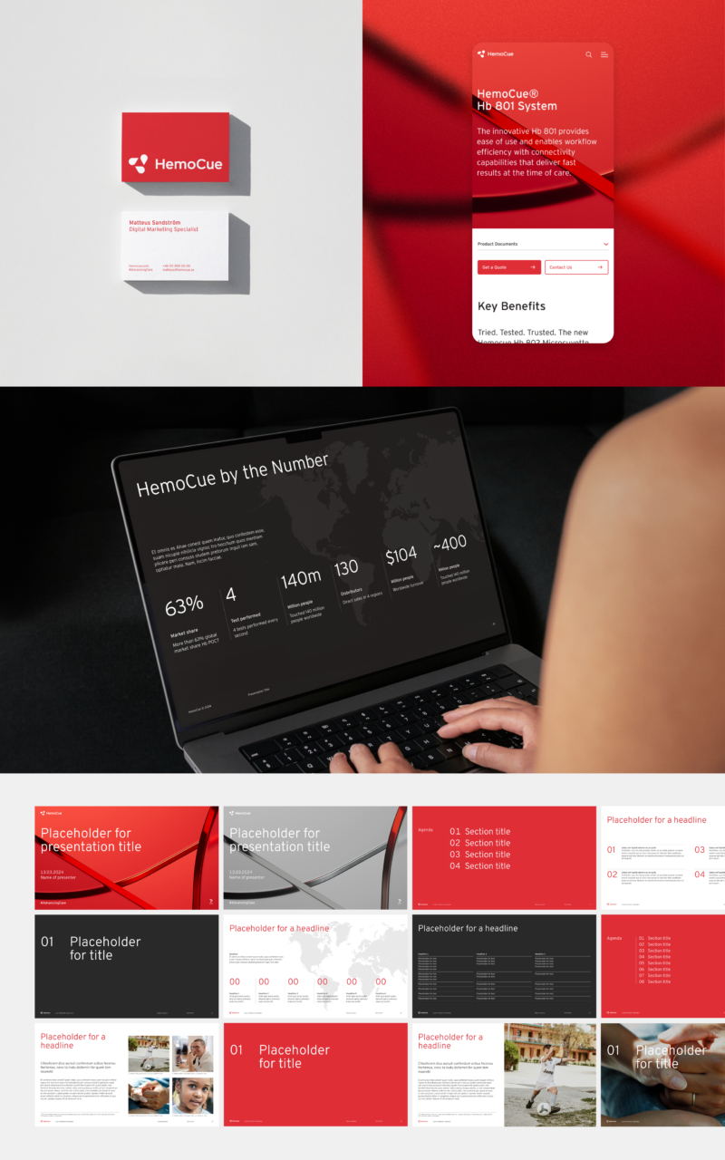
Putting it all together, HemoCue now has a brand that matches the ingenuity of their devices and the genuine care they offer to the world.
Shortliste
CCA 2025