Kunde
HAN Kjøbenhavn
Bureau
NoA Ignite
Krediteringer
Beskrivelse
Founded on the streets of Copenhagen in 2008, Han Kjøbenhavn offers design within eyewear, menswear and womenswear with roots in Danish design culture. We worked with them to design a full brand and ecommerce site that felt every bit as unconventional as the brand itself.
HAN Kjøbenhavn wanted to strengthen its digital presence with a website that could further build their brand and help them grow the business. A site that could work as a firm brand platform in the ever changing world of fashion, where new collections change the game at least twice a year. The site therefore had to be a natural extension of the HAN brand and still lend its focus to current products and communication.
HAN has always worked on gut feelings and have tried to tell stories with their collections. These stories come from the roots of HAN and their Creative Director Jannik Wikkelsø Davidsen in 2650 suburban Copenhagen. HAN Kjøbenhavn always start from that perspective and our design approach developed from there. The aim was to build an aesthetic, that would be different from the rest. In line with the brand it should be contemporary but with a cold, grounded energy that is part of life in the outskirts of a big city. HAN Kjøbenhavn transcends age and generations with their persevere usage of models in all ages - Steen being the most iconic. The design needed to do that as well.
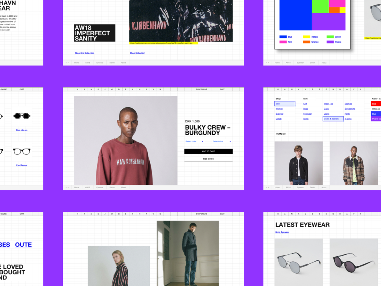
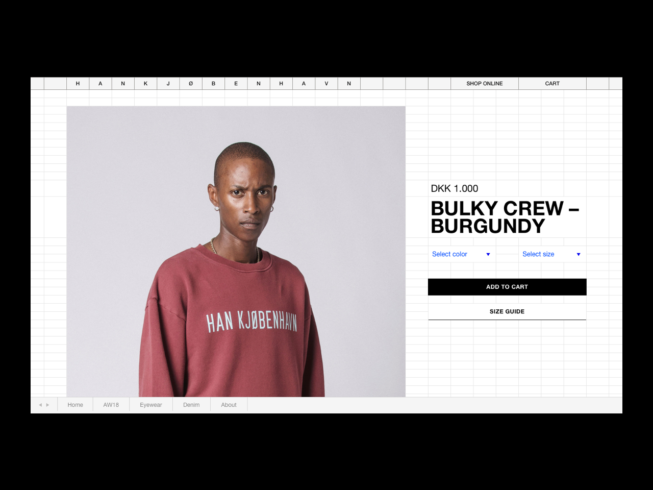
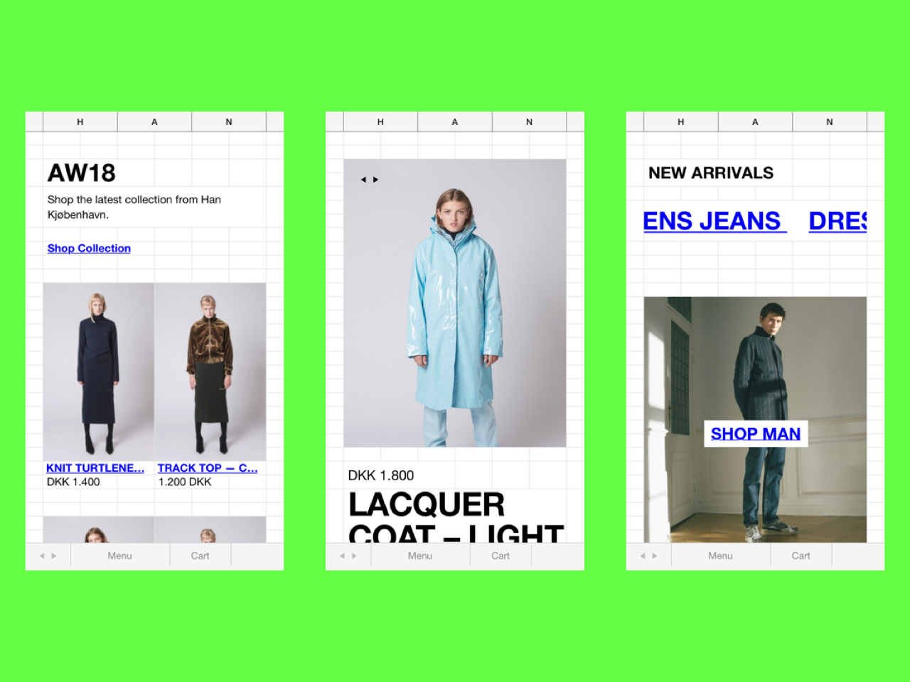
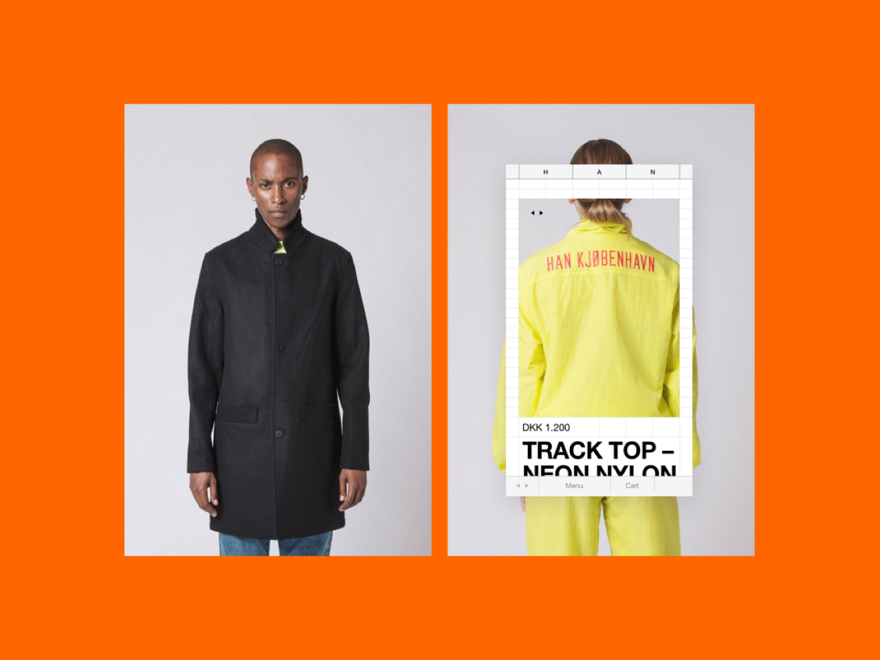
In the conventional world of corporate and e-commerce sites we crafted a site that acts as both a strong, personal voice and a frictionless buying experience. Our main design task was to create a framework that was both original and could fit the ever changing lineup of Han Kjøbenhavn’s SS/FW collections.
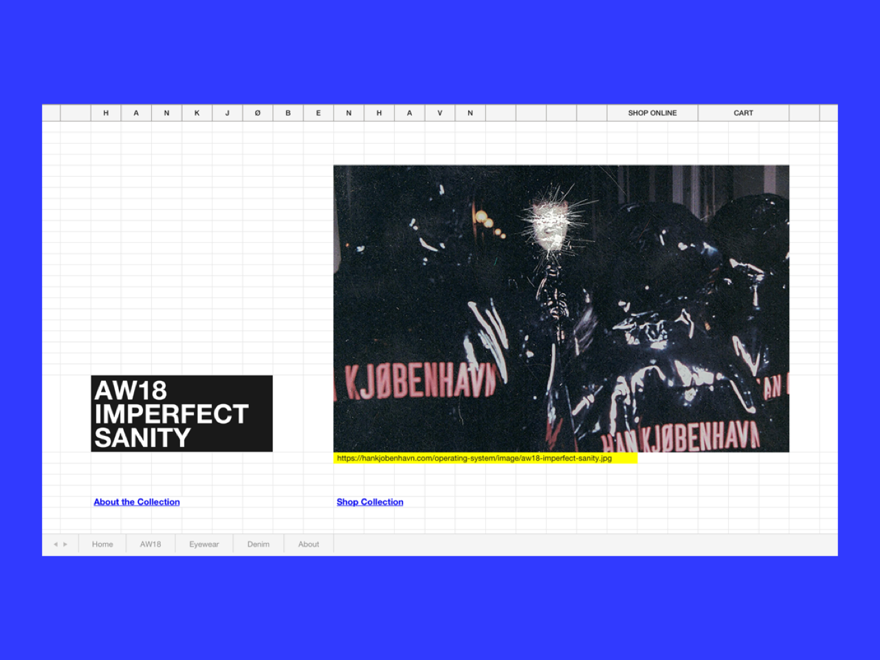
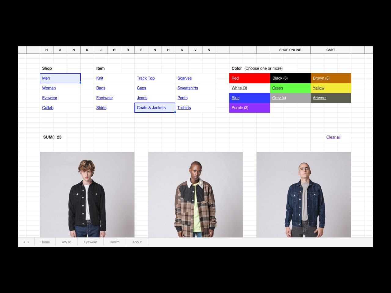
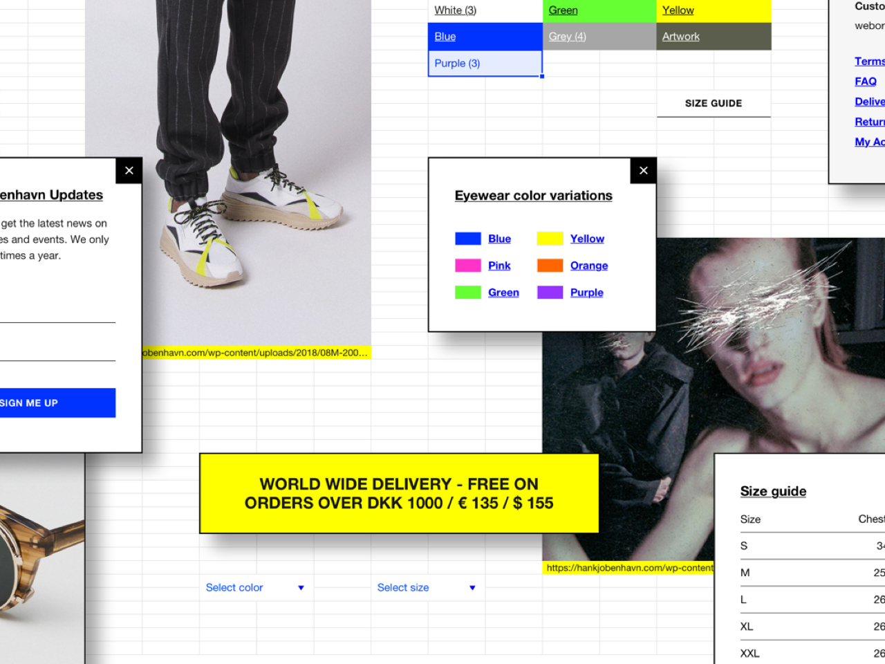
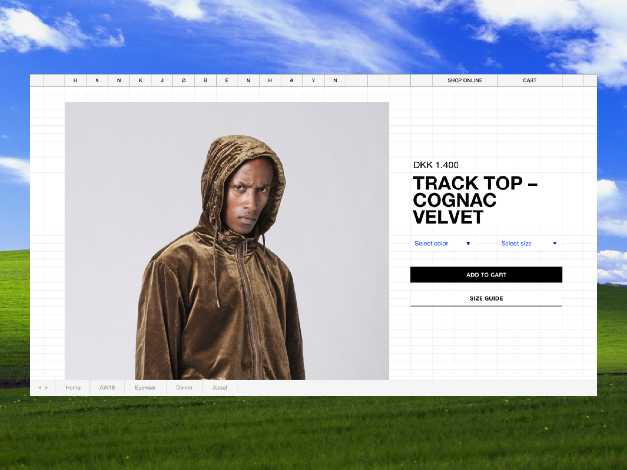
To do that, we sought inspiration in 1990’s software such as Excel and MS Paint and designed a system that was built for content but at the same time screamed the opposite of fashion. Excel is the one thing you would imagine being furthest away from the creative volcano that HAN Kjøbenhavn is. And then again: That's what makes it work. All the way from the cells in the background, the blue borders on mouse overs over the colours, the drop shadows to the sheets in to bottom of the page. This solution is as HAN Kjøbenhavn as any HAN Kjøbenhavn solution has ever been.
The result is an online platform, presence and design, that transcends the ever changing world of fashion. It has a personality that can live through fashion trends for years. By updating the outdated, HAN Kjøbenhavn now has the ability to digitally build their brand value in the long term, and to sell products worldwide in the short term.
"This solution gives us the ability to build our brand value and still make a daily business. At core, we want to be as differentiated from the fashion norm as possible. I'd rather want to have 10 followers that 100 customers. The website allows to have that approach also", says Jannik Wikkelsø, Creative Designer from HAN Kjøbenhavn.
After launch of the website in late 2018 HAN Kjøbenhavn has seen an increase in online sales. At the same time, the platform was used to present the brand at their very first Parisian fashion week appearance. Something that raised eyebrows globally in the fashion industry.
Shortliste
CCA 2019

