Kunde
H.M. Dronningens Hofstat & Wonderful Copenhagen
Bureau
Kontrapunkt
Krediteringer
Beskrivelse
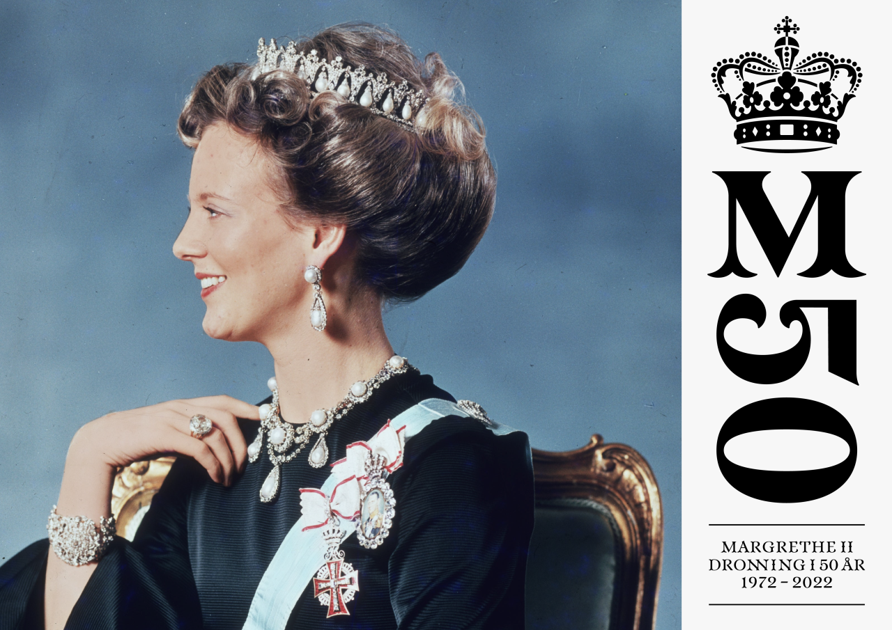
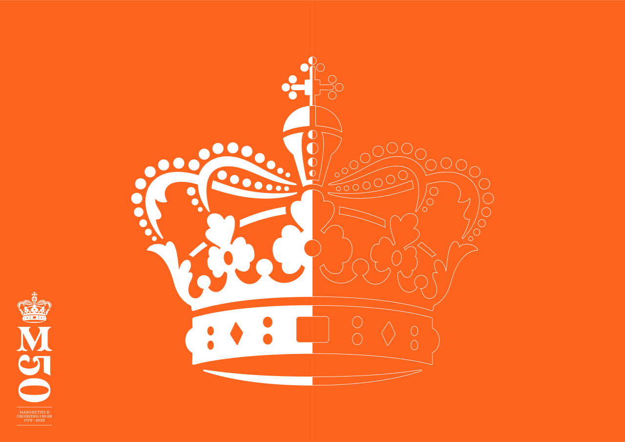
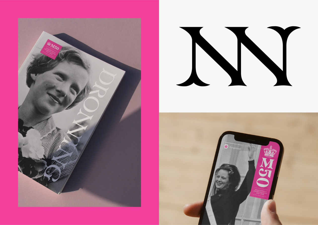
In connection with the 50th anniversary of the accession of HRH Queen Margrethe II, a logo to communicate and mark the Queen’s anniversary was assigned by The Royal House and Wonderful Copenhagen. The result is a redesigned crown in a colourful logo.
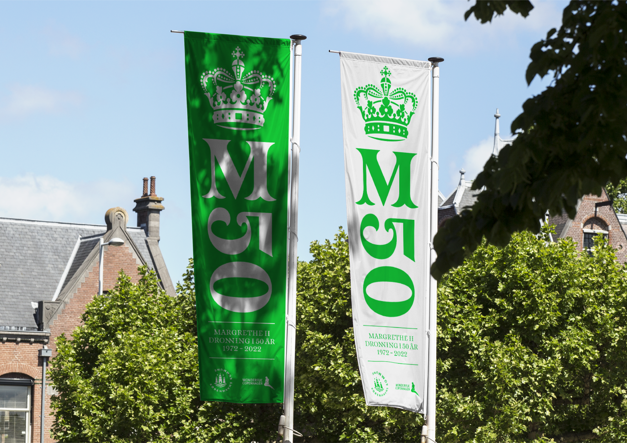
Christian V’s crown, from 1671, is found at the top of the logo. It is a redesigned visual form of the crown, making it more transparent and legible than previous versions of the visual form. The update makes it flexible in sizing and usage in everything from small stationery to large-scale banners and flags. It is also applicable across all digital touchpoints.
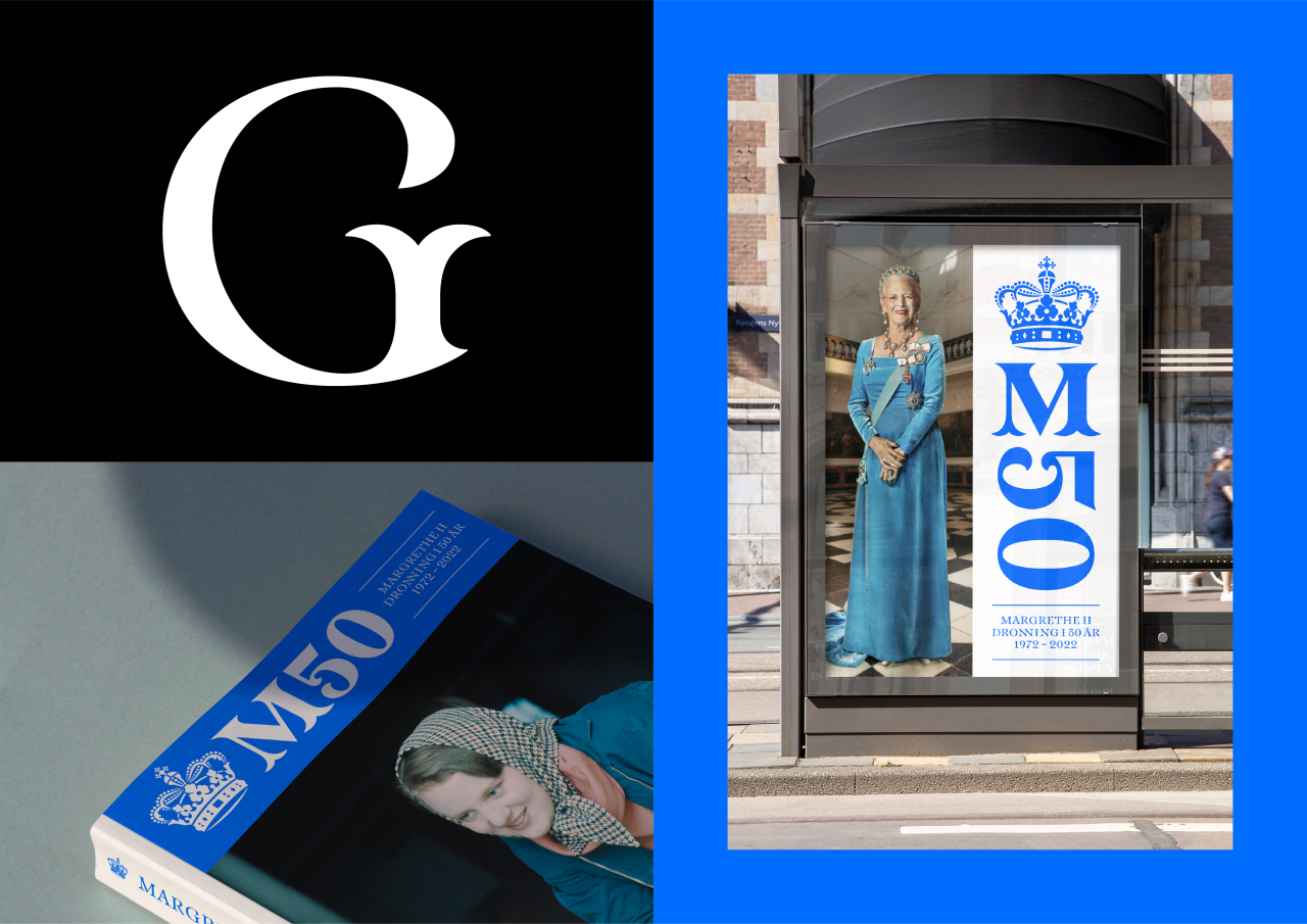
The typeface accompanying the crown is vibrant, drawing from details of the acanthus leaf and elegance from the rococo style found in the architecture at both Amalienborg and Fredensborg Palace. It is almost a painted typeface with disciplined strokes, similar to lines created by a paintbrush – a respectful nod to the Queen's art. You sense the craftmanship behind each form when diving into the details of the typeface. ‘M50’ is written in the logo’s middle, referring to the Queen and the 50 years since her accession. It connects the additional information underneath and the crown gently placed above.
The logo speaks the design language of the Queen – a versatile artist in costume designs, scenography, illustrations and paintings. Her artwork and watercolours speak a colourful and organic language. Consequently, the logo embraces colours often seen in the Queen’s art and personal style. The vibrant colours also emphasize the logo as one marking a national celebration.
(Video credit: animation by DR)

Vinder 2022
CCA 2022

