Kunde
GALDERMA
Bureau
Studio C
Krediteringer
Beskrivelse
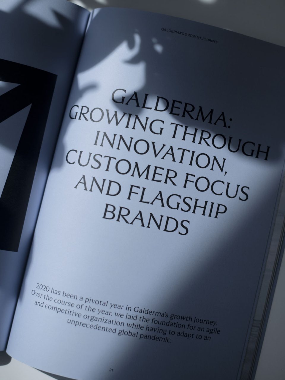
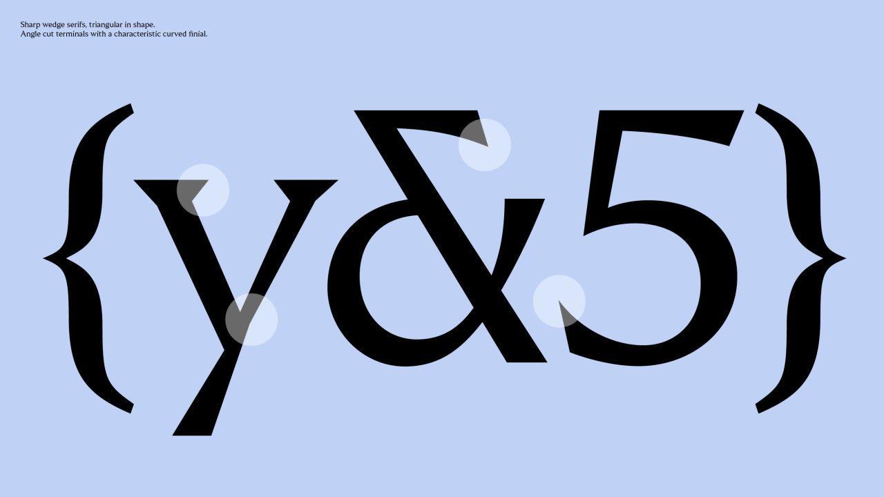
Galderma is redefining what pharma looks like. In a world of corporate pharmaceutical brands using generic and default sans serif typefaces Galderma chose another path.
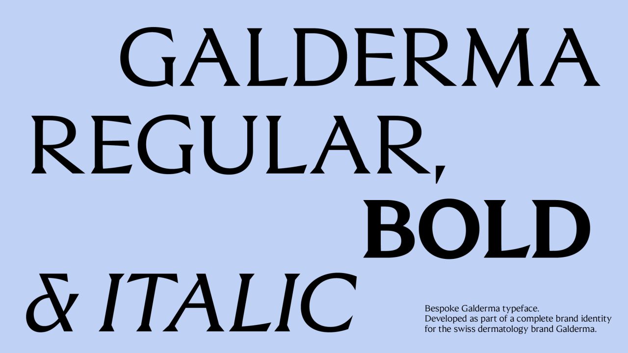
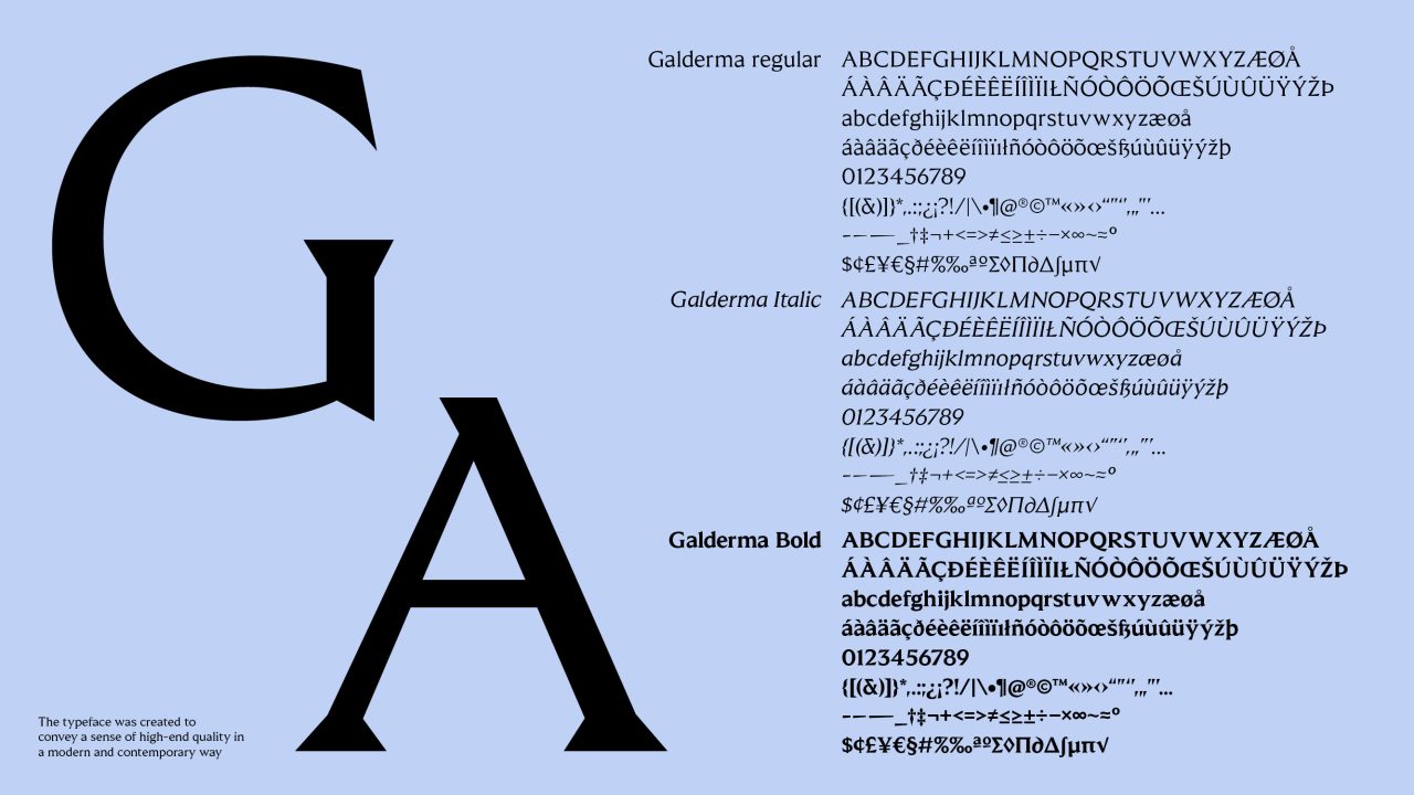
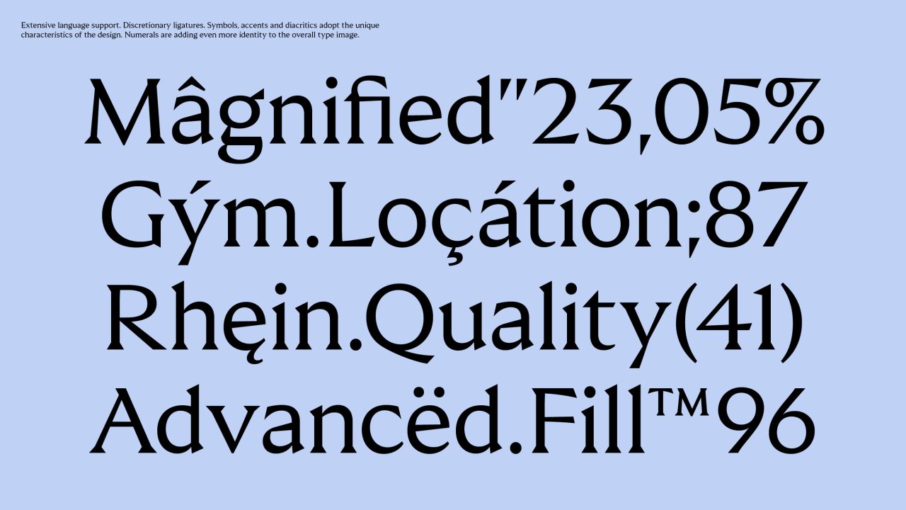
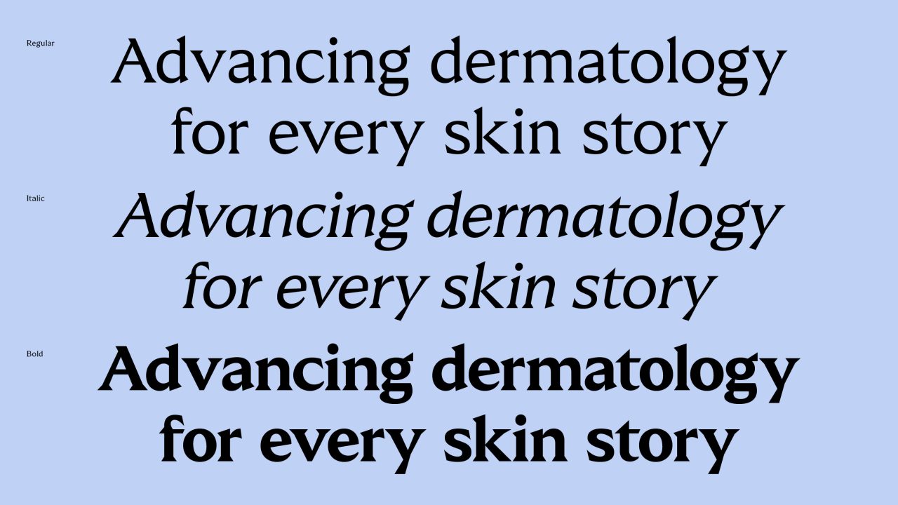
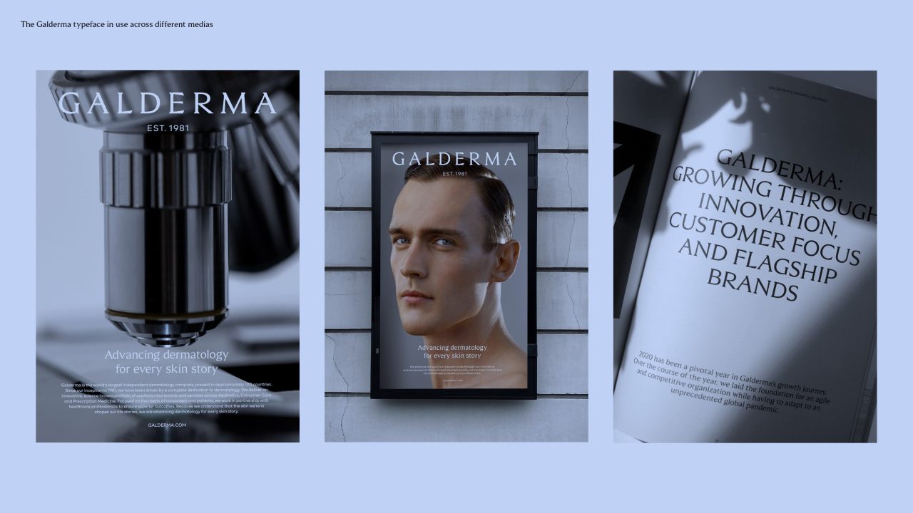
With a bespoke typeface, Galderma expresses their values through every word and in all levels of their communication, creating a unique, premium brand experience.
Building on Galderma's long-standing legacy within dermatology and science and their leading position in the market, the typeface is designed with precision and quality as the main drivers.
The typeface repositions Galderma from a mid-level dermatology brand to a premium, upscale corporate brand taking on a unique approach to typographic communication.
PDF Filer
Shortliste
CCA 2022

