Kunde
Fritz Hansen
Bureau
e-Types
Krediteringer
Beskrivelse
Modern Heritage in New Light
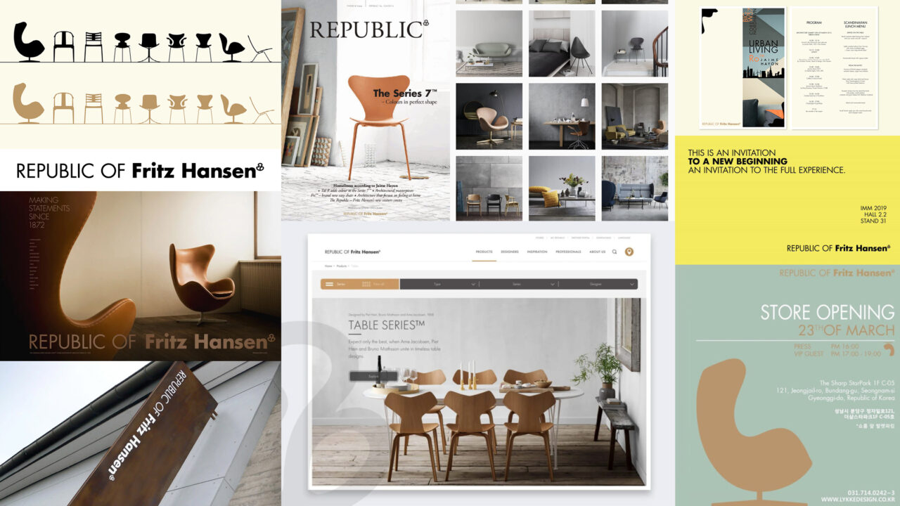
Fritz Hansen is often seen as the godfather of Danish design. Their rich heritage and history has played an important role in influencing and sculpting the landscape of local and international design. But with such a legacy follows a large responsibility to stay relevant and keep leading the way, and Fritz Hansen recognised this as a need to capture a new and younger audience. The solution was a rebranding on all platforms, that reintroduced Fritz Hansen in a fresh, new light.
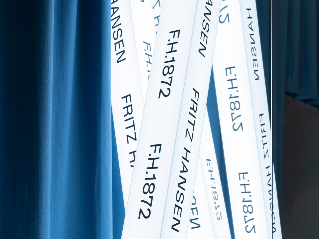
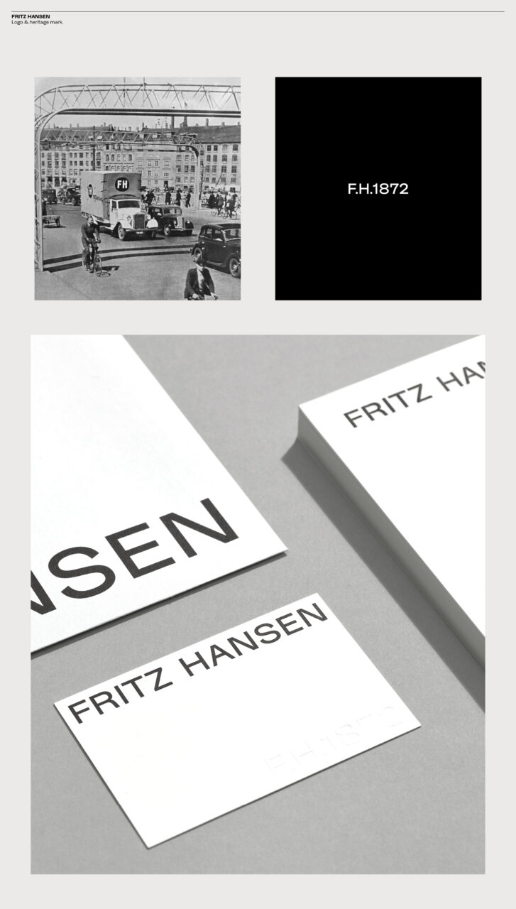
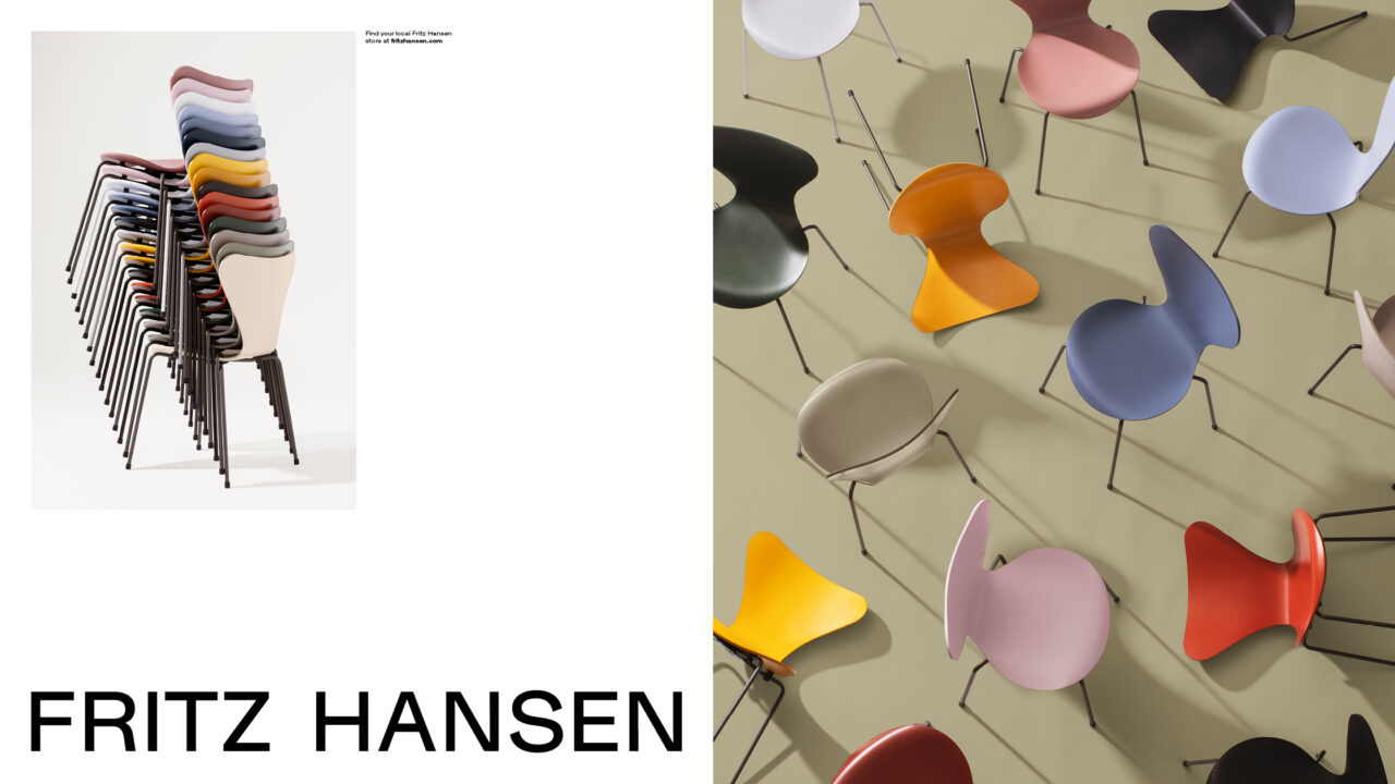
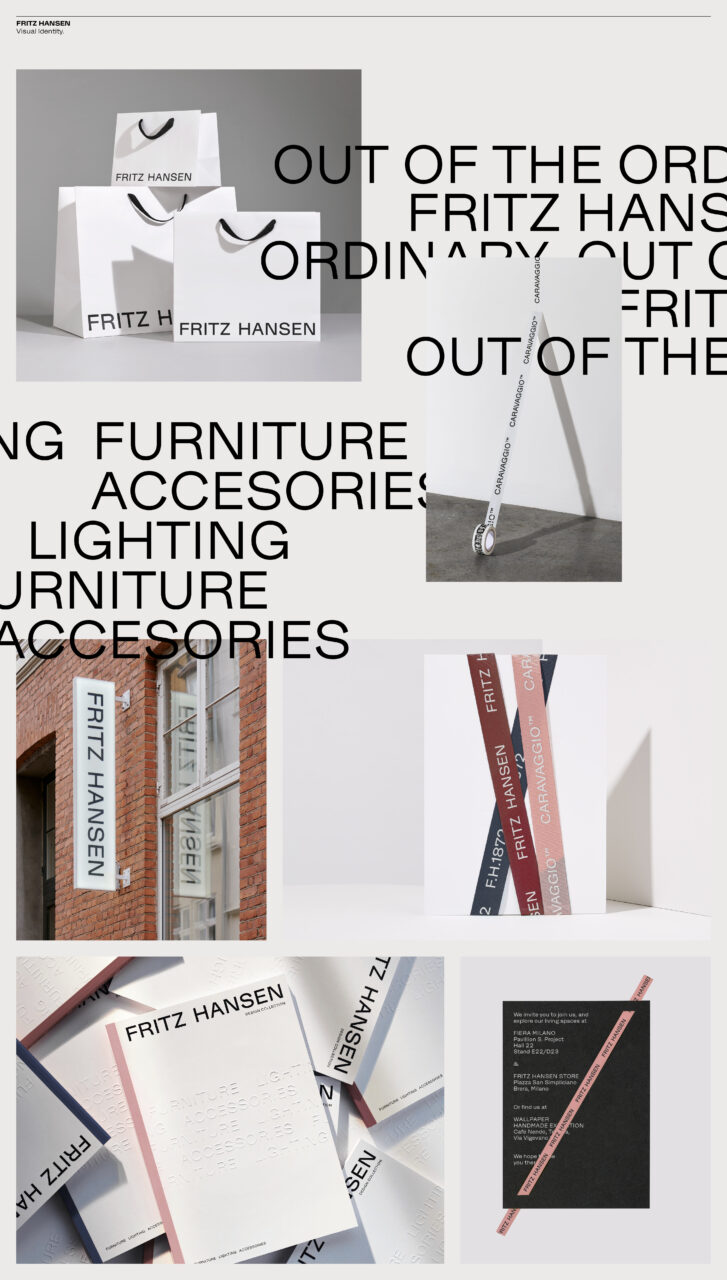
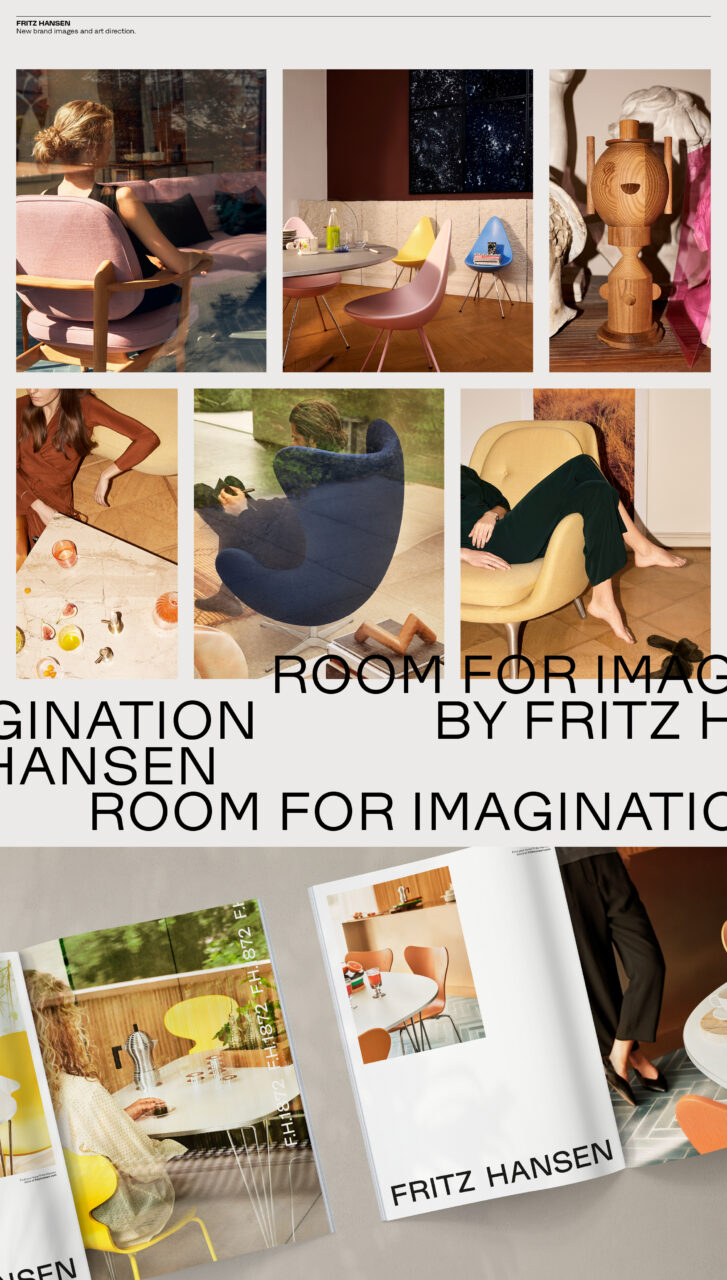
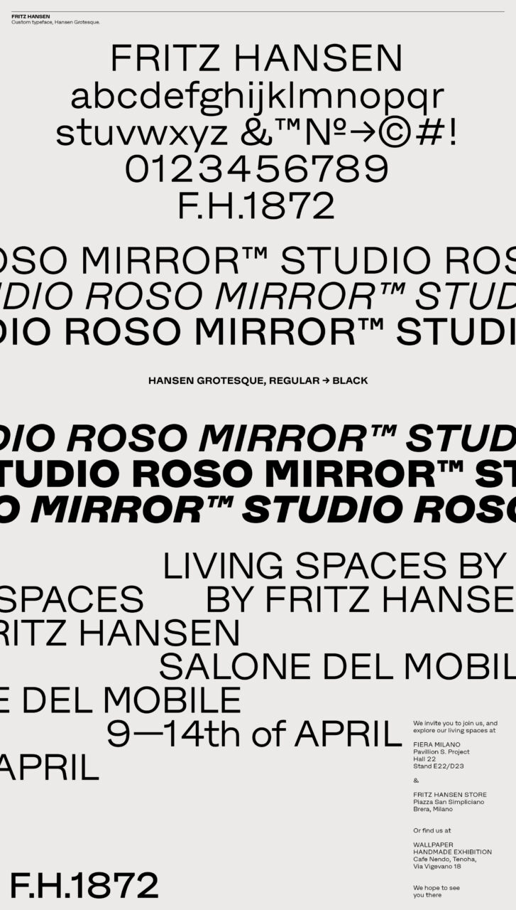
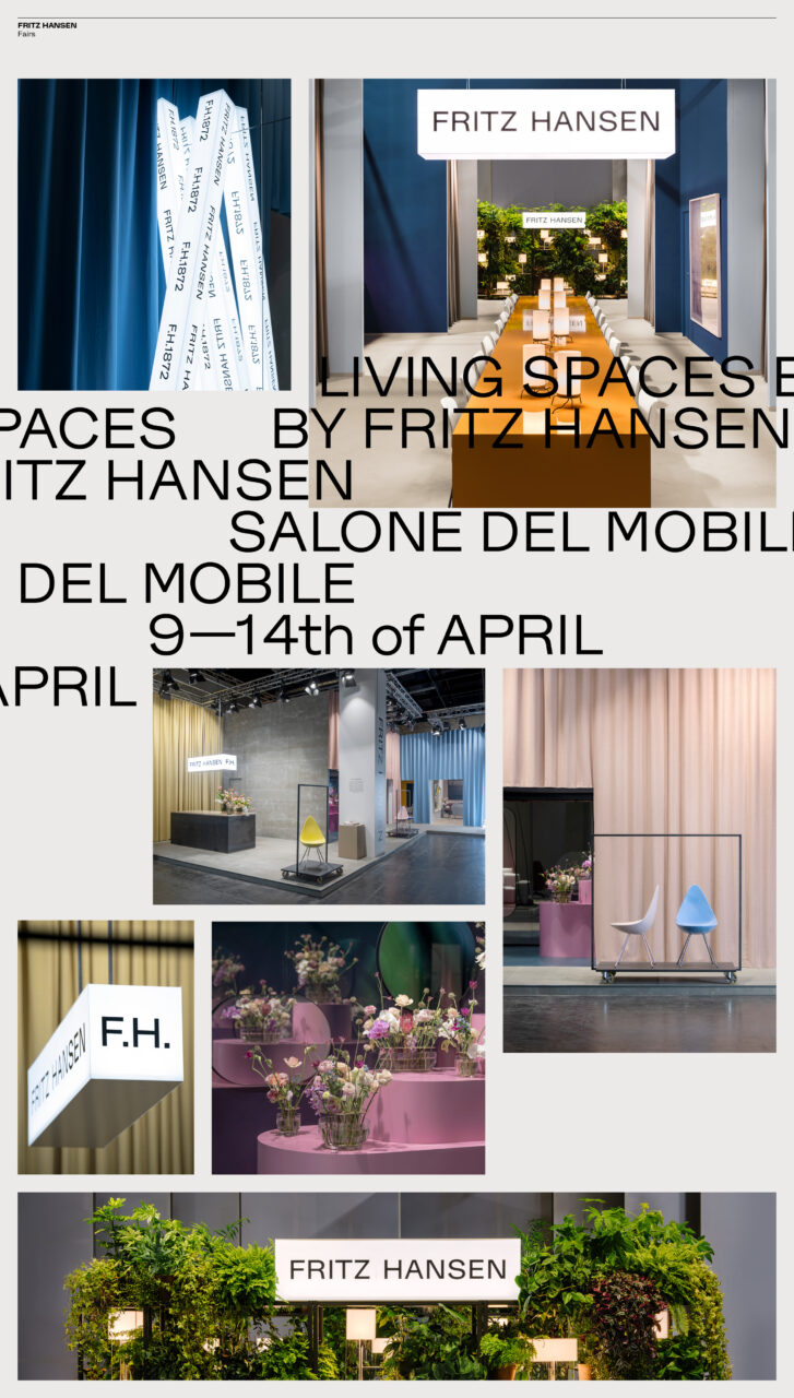
Through a strategic process, sketching out various future scenarios and defining a revisited brand platform, we designed a new path for Fritz Hansen that leveraged the brands heritage and welcomed their future consumer. The new strategy also focused on strengthening the Fritz Hansen brand in itself, so as it was strong enough to stand alone and not rely on the various designer names. When it came to the refreshed design, amongst other things we reintroduced the FH heritage mark, that was found in the brand’s historical records. We also added a new typeface, named Hansen Grotesque, as well a new logo, palette of colors and a new image style too. The image style in particular played a large role in the rebranding, as it set out to portray a human element that had otherwise been lacking. It focused on showcasing the furniture in real, aspirational, modern homes – portraying the everyday life in which it plays an important part. All in all, the rebranding opened the door to a new generation of design lovers, whilst safeguarding the exclusivity, integrity and future of the iconic Fritz Hansen brand.
Deliverables:
Brand strategy
Brand identity
Typeface
Packaging
Signage
Campaigns
Fair Concepts
Campaign Film and Images
Communication
PDF Filer

Vinder 2021
CCA 2021

