Kunde
Forlaget Falco
Bureau
Dwarf A/S
Krediteringer
Beskrivelse
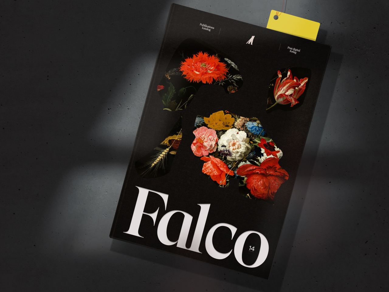
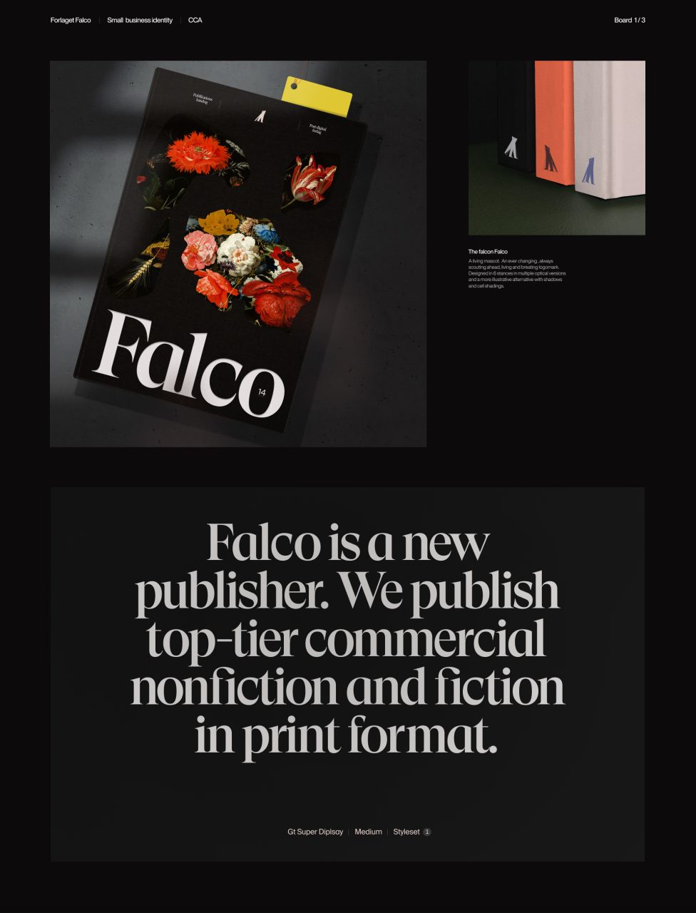
Falco is a brand-new publishing house established in 2021 by 4 literary enthusiasts, and we were fortunate enough to get the task of creating a full visual identity for the publisher, which embraces the spread between classically bound quality literature for modern fiction in various digital formats. And there's just something about birds and publishers. Of course, Falco has a falcon as the mascot. We created a new character that is more sharp than clever and at the same time brave almost dangerous.
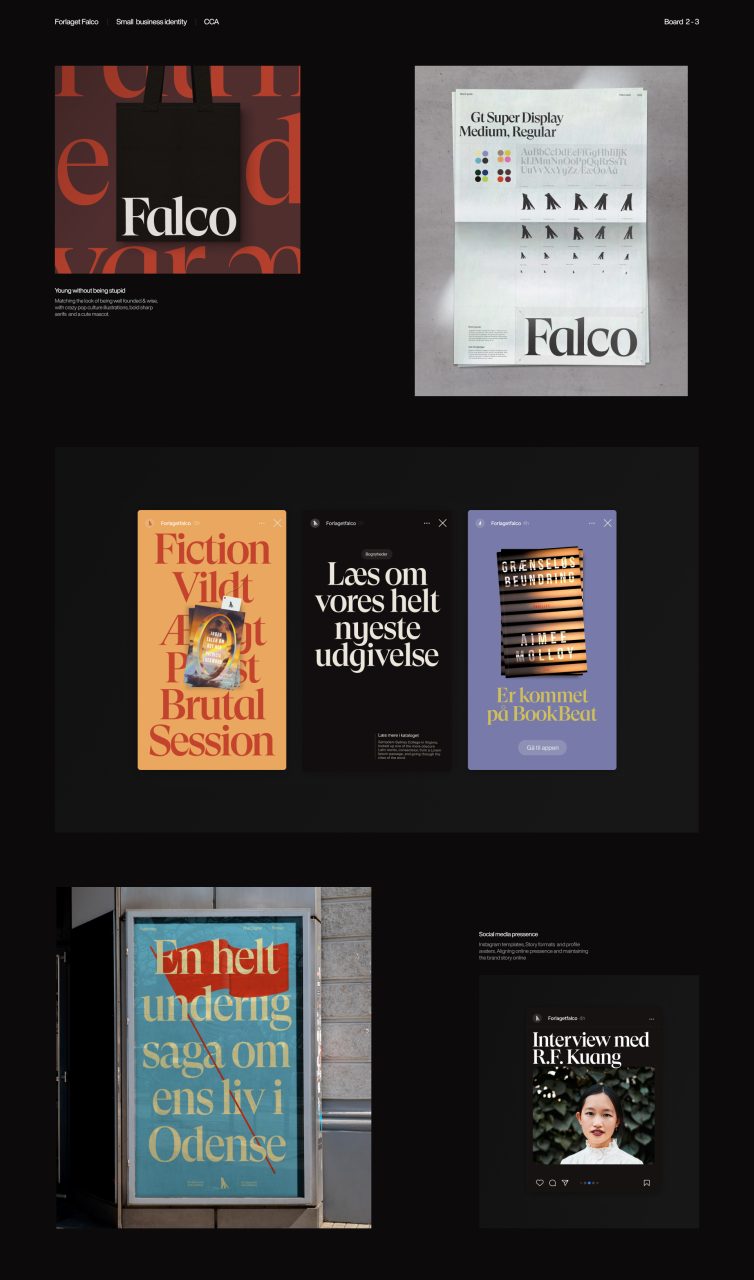
Falco is a secretive character who has their eyes set on the future. It is always moving and is therefore spotted in many situations, colors, and sizes, so it can appear anywhere. Moving on a book forum entry – or quietly standing on the back of a classic. It’s a living and breathing mascot and that means Falco always will look different depending on its appearance. Therefore, we developed multiple versions in 3 different optical sizes to ensure recognizability on book spines, posters, different digital platforms, and more.
We went with GT Super Display as the brand’s font. Chosen because of its distinct serif features. They almost look like a falcon’s claws catching its prey. Smart yet dangerous at the same time.
Deliverables to Forlaget Falco:
- Brand identity
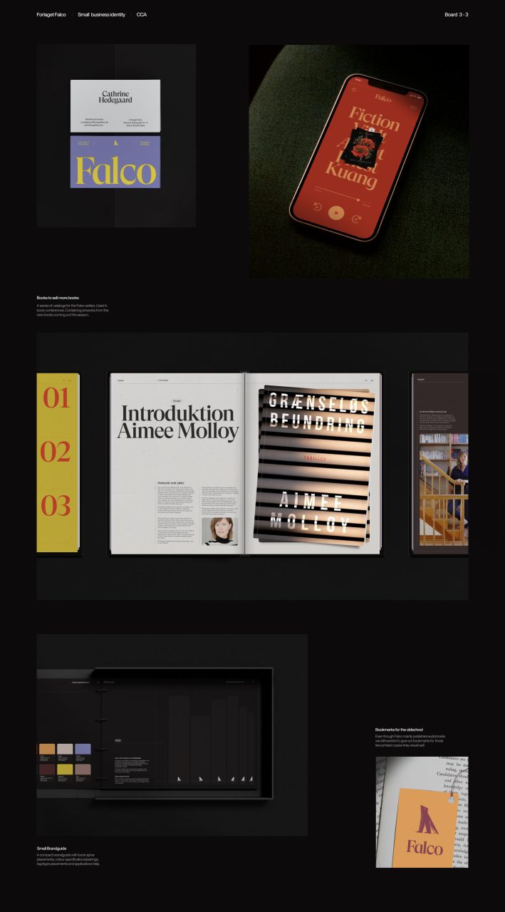
- App Concept Design
- Strategy
- Social Media
- Catalog Editorial Design
- Identity Guidelines
Shortliste
CCA 2022

