Kunde
Faurschou
Bureau
Kontrapunkt
Krediteringer
Designer
Designer
Designer
Project Manager
Anne Grave
Beskrivelse
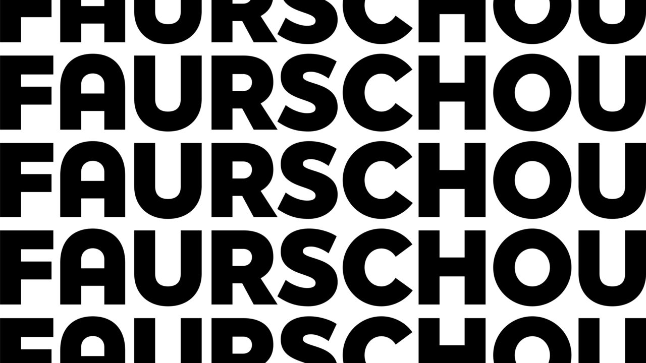
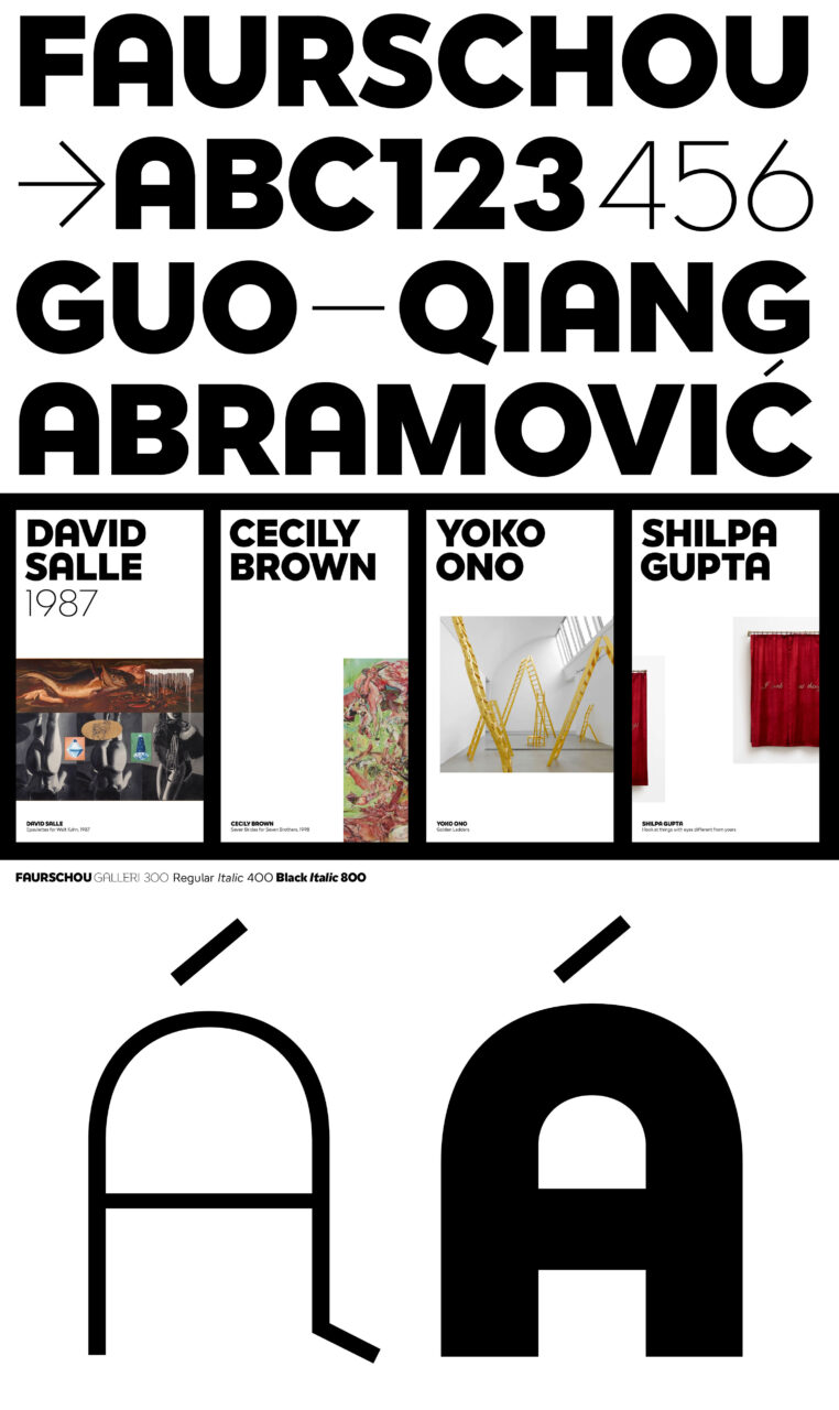
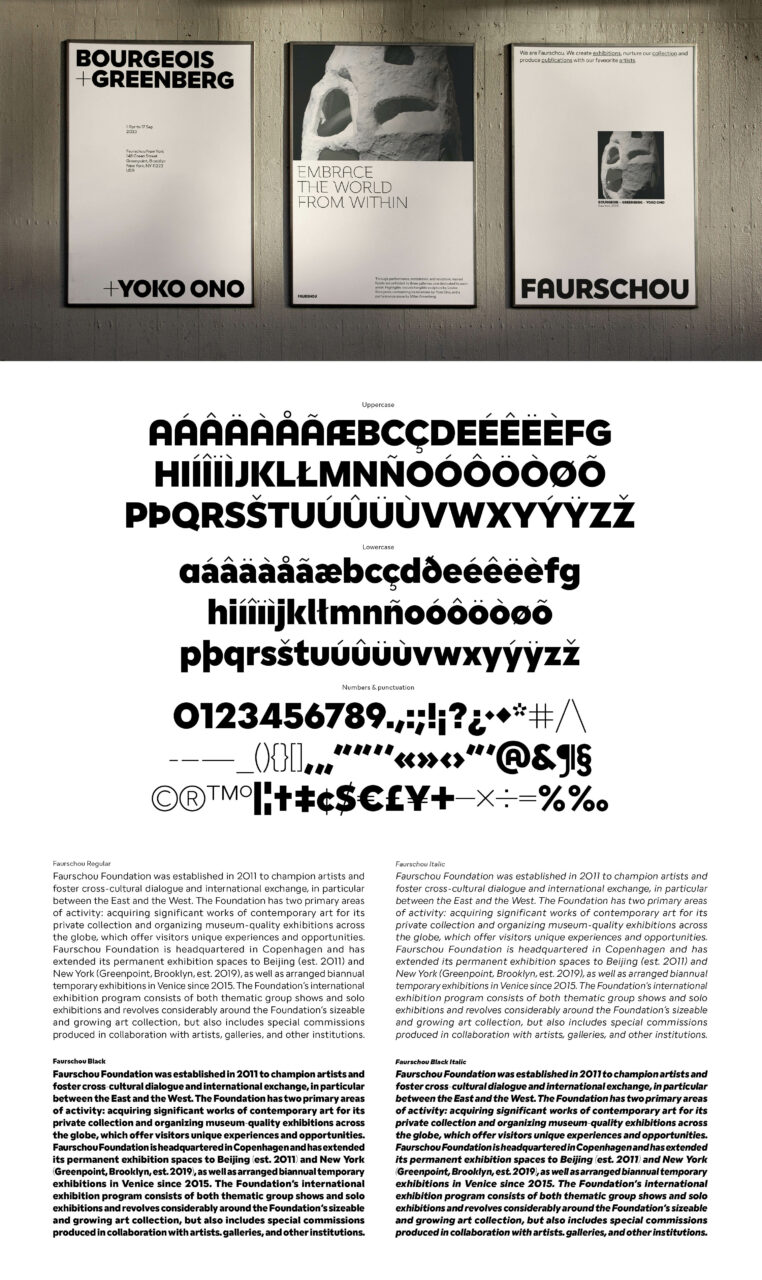
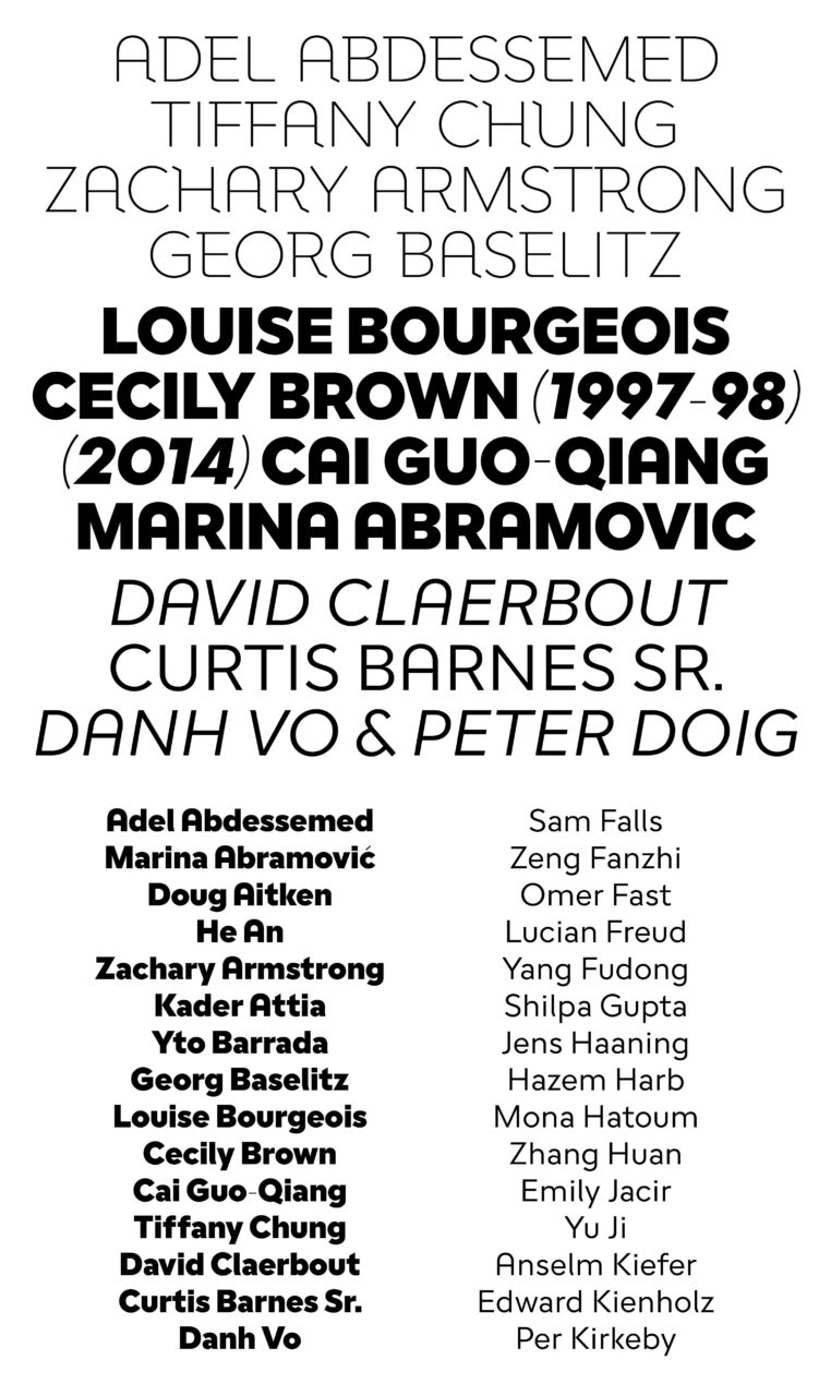
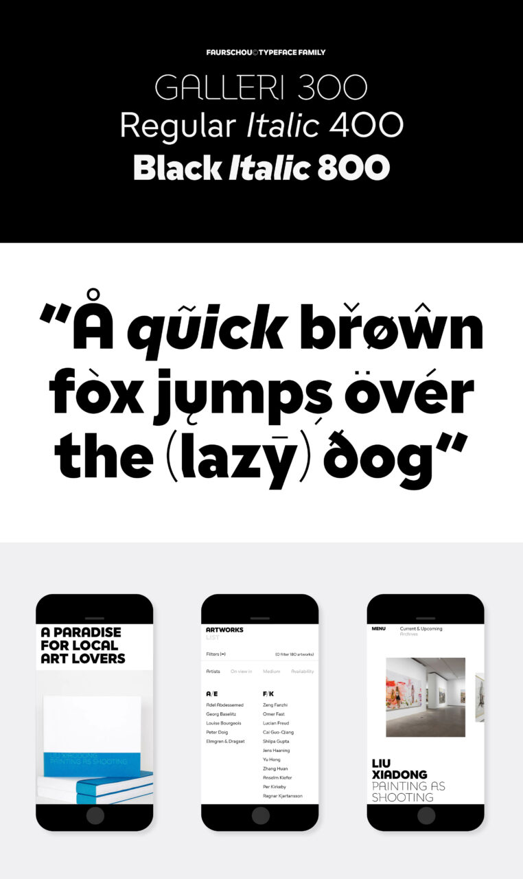
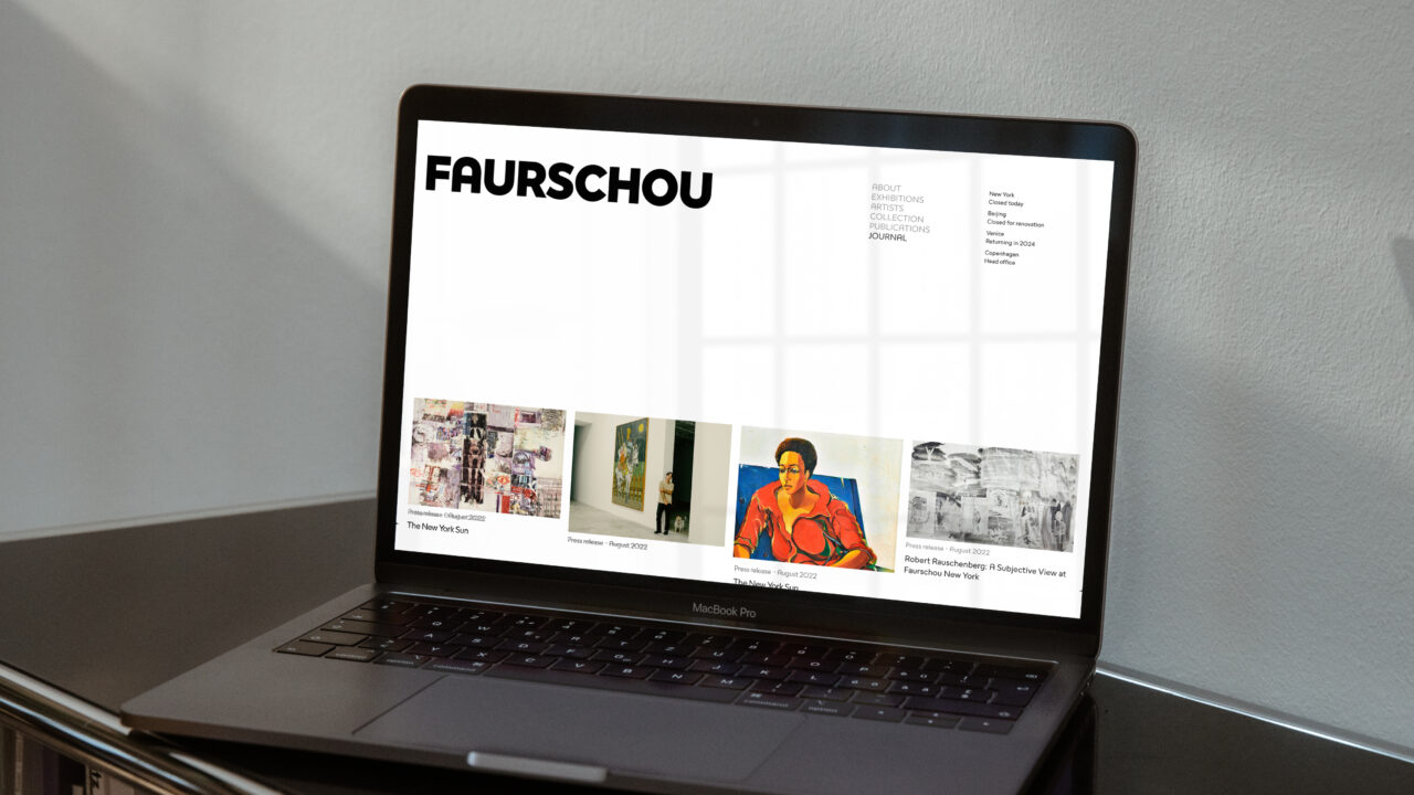
An update on a 2013 identity. This year, the Faurschou typeface was updated in parallel with the launch of their new website and CVI. The idea was to modernize and extend the typeface’s usage to touchpoints where the old typeface wouldn’t work - and in doing so, taking the gallery experience into the digital realm and brand expression. The result was a simple, functional and impactful sans serif family born from the original Faurschou font made 10 years ago.
PDF Filer
Shortliste
CCA 2023

