Kunde
FaulknerBrowns Architects
Bureau
Urgent.Agency
Krediteringer
Beskrivelse
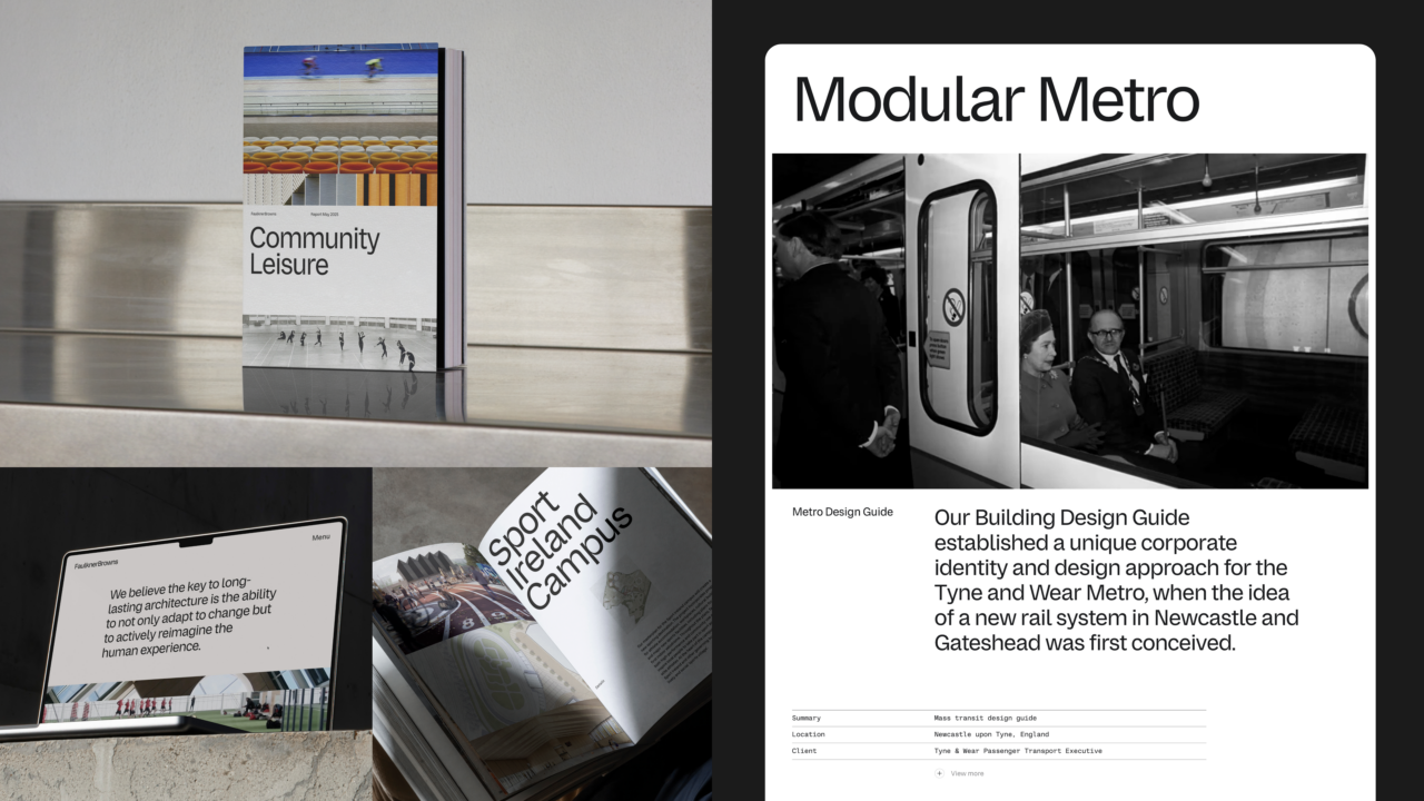
FaulknerBrowns is a studio steeped in history, with a legacy dating back to the 1960s. They believe the key to long-lasting architecture is the ability to not only adapt but to actively reimagine the human experience. Their work is deeply rooted in a human-centric approach, shaping environments that foster connection and community.
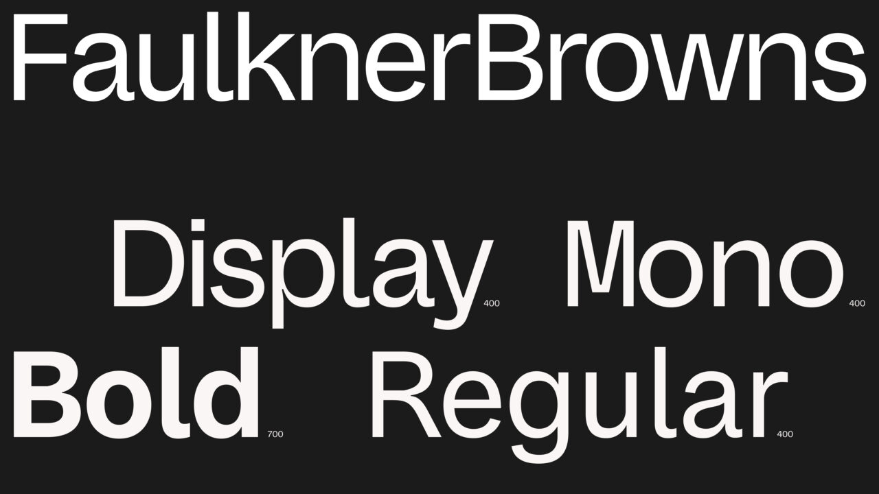
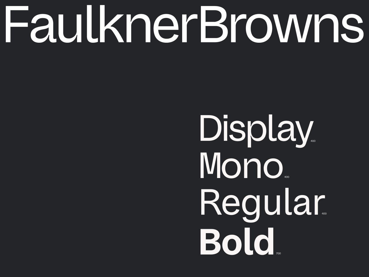
FaulknerBrowns wanted to renew their voice. So, the creation of a bespoke typeface became the cornerstone of their rebrand. The typeface embodies a brand voice that pays homage to their history while embracing transformation.
Precision in the Details
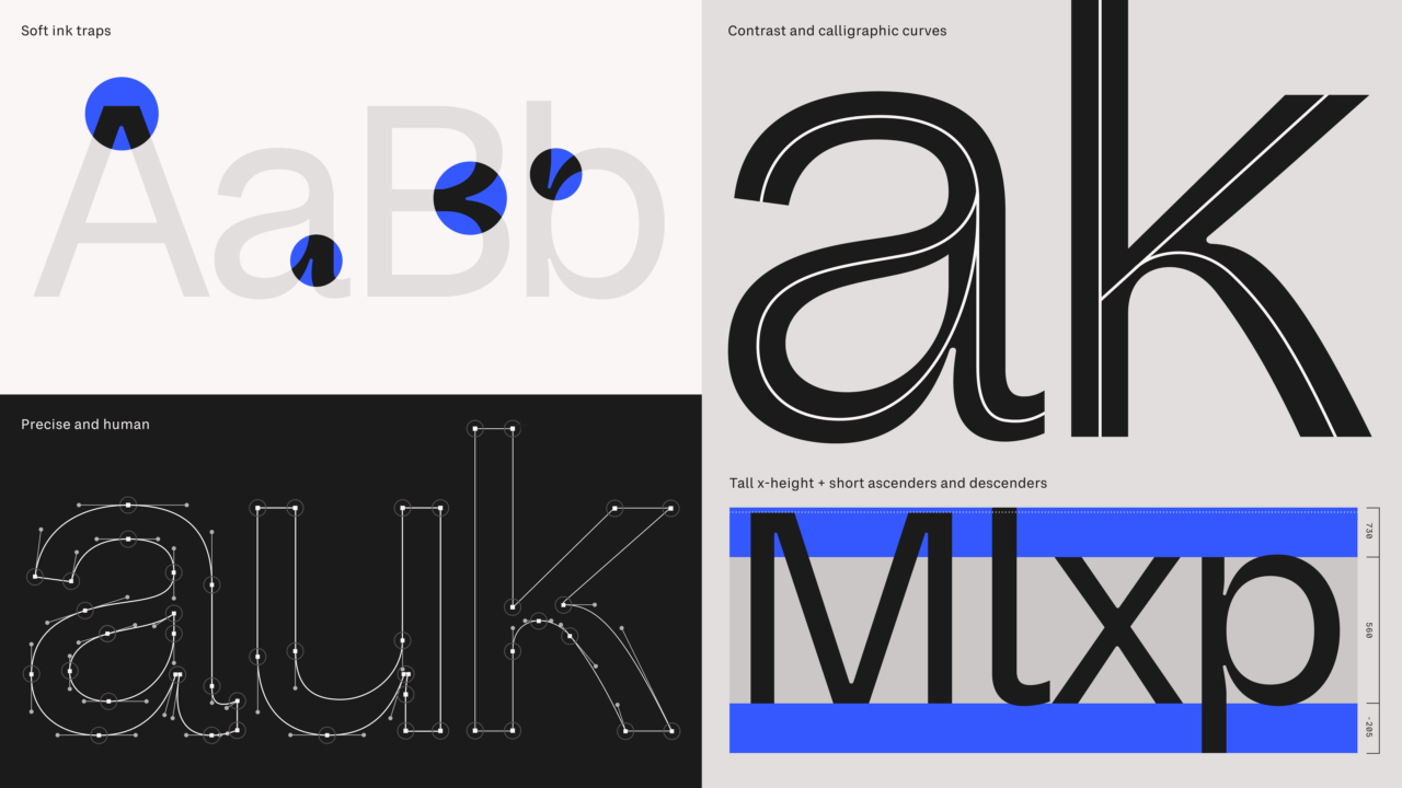
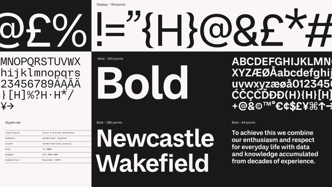
True to FaulknerBrowns’ philosophy, the typeface reveals its beauty in the details The design strike a balance between functionality and aesthetic expression. By merging precise, clean lines with delicate ink traps and warm curves – including curled stems and tails – we’ve instilled a human touch into its structure, achieving a balance of approachability and clarity. These elements reward close examination, much like the intricate craftsmanship seen in FaulknerBrowns’ buildings.
Designed for Everyday Life
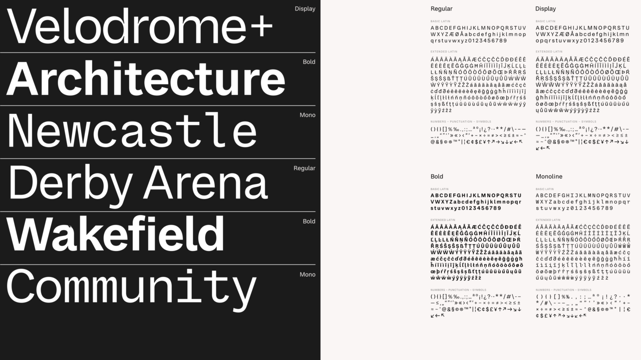
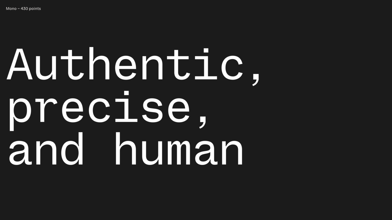
Developed as a cohesive family of three styles – Display, Text, and Mono – the typeface offers versatility and adaptability. The Display, with its high-stroke contrast and calligraphic strokes, brings a sense of boldness and structure. The Regular, designed with readability in mind, features open apertures, condensed forms, and a more loosely spaced construction for effortless legibility. The Mono introduces a technical yet soft aesthetic, with quirks that echo Display’s curved details and subtle ink-traps.
Together, these styles form a typographic system that reflects FaulknerBrowns’ dual commitment to precision and human warmth – a balance of innovation and tradition, clarity and character, structure and fluidity. The result is a voice for every occasion, reinforcing the studio’s legacy while embracing its future.
Shortliste
CCA 2025