Kunde
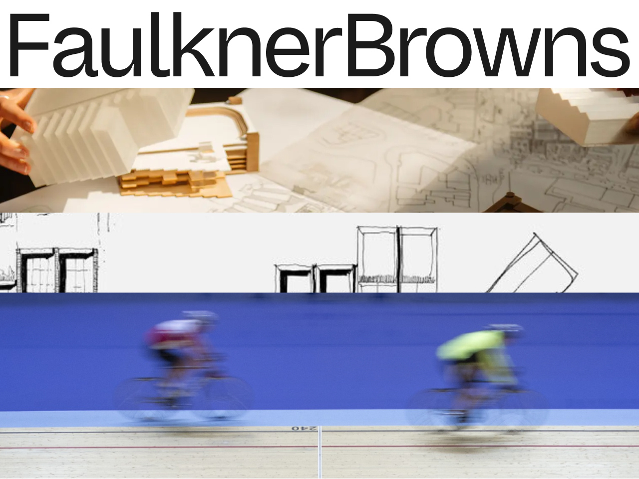
FaulknerBrowns Architects
Bureau
Urgent.Agency
Krediteringer
Beskrivelse
FaulknerBrowns is a practice steeped in history, evolving from a renowned sports and leisure architecture firm into a global multidisciplinary studio. With an expanding portfolio and three international offices, FaulknerBrowns needed a new identity that could unify the firm's expertise under a cohesive, forward-looking narrative.
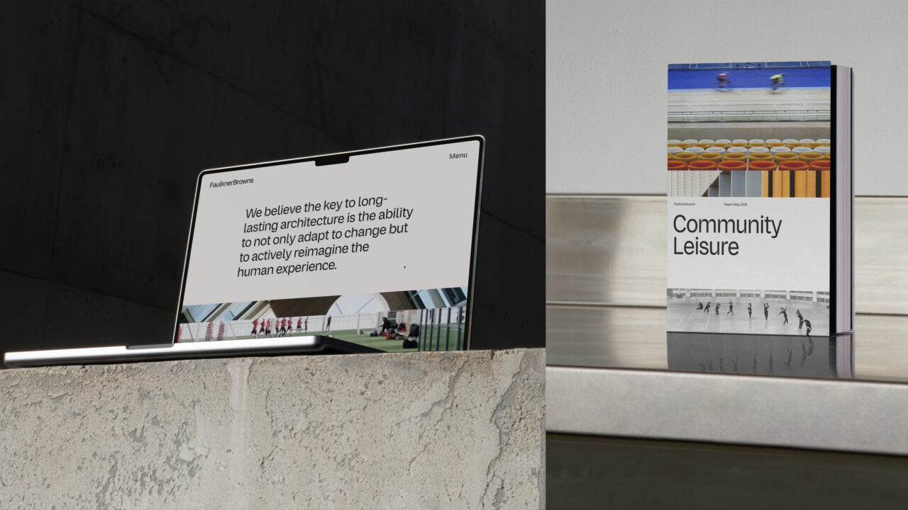
At the core of the rebrand is the studio's promise of perpetual change, as well as their belief in architecture as a social catalyst for enduring communities. The rebrand brings this purpose to life through a new visual identity, a bespoke typeface, and a dynamic image concept.
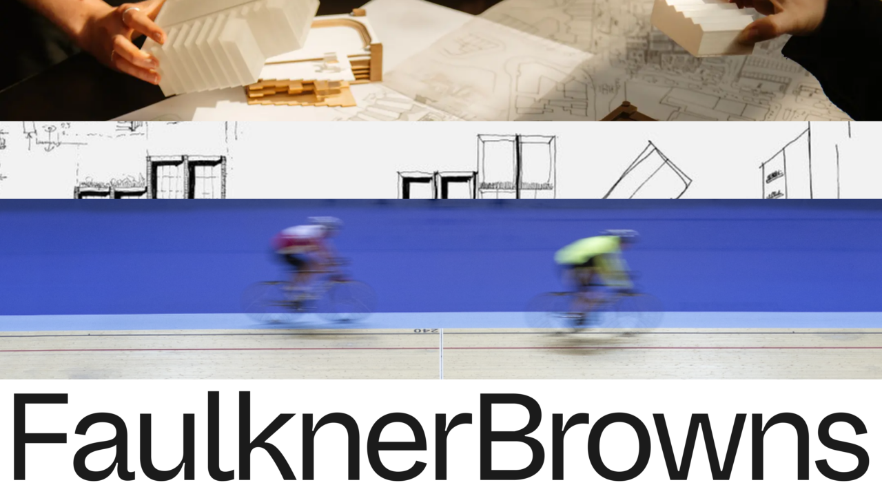
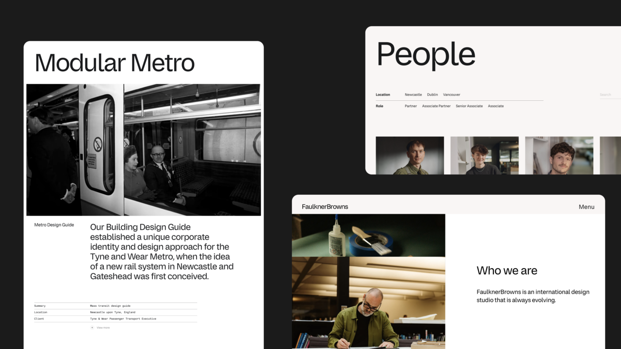
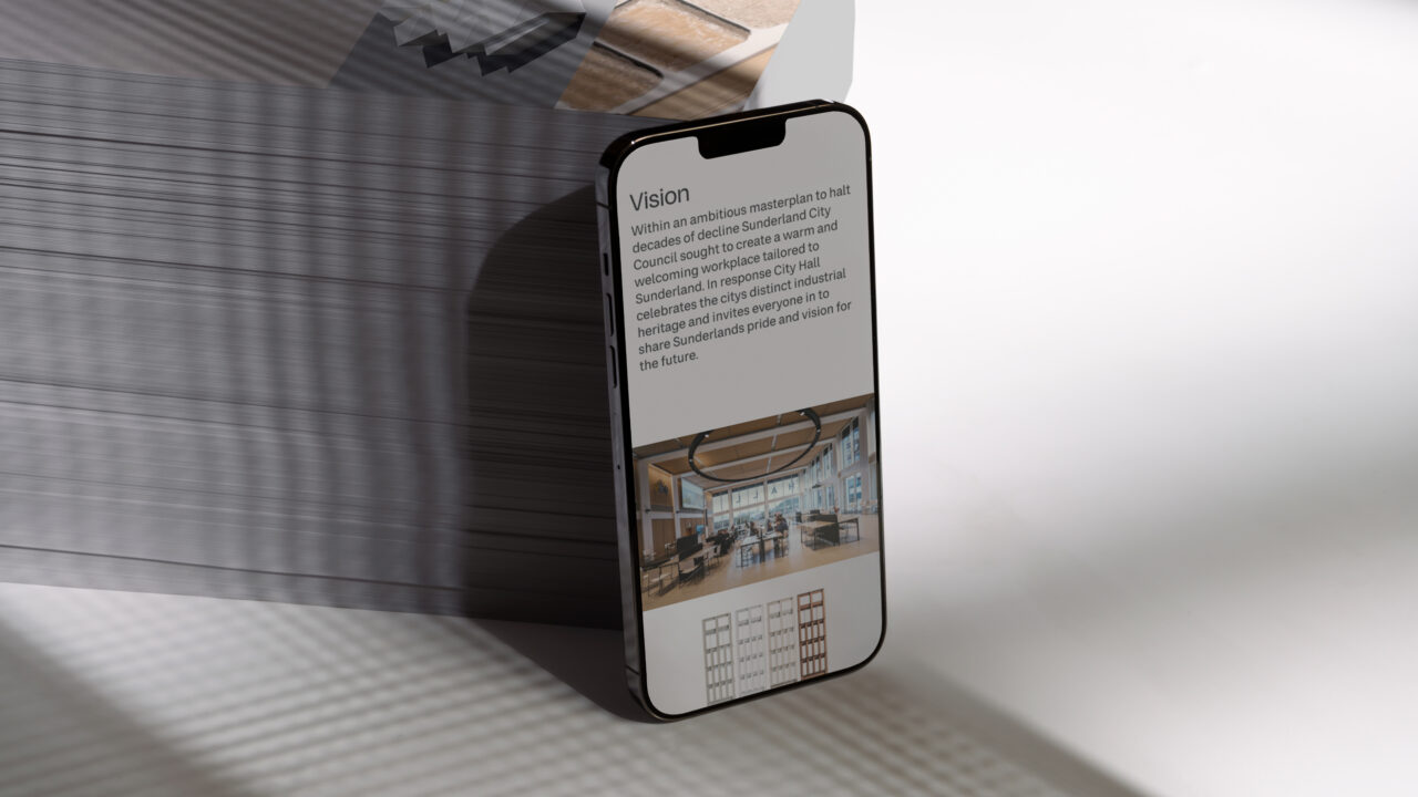
The visual identity highlights the studio’s innate ability to constantly adapt and innovate. It is built on a system of seamless vertical motion, symbolizing continuity and progress. All visuals transition upward in smooth, continuous flows, creating a sense of energy and forward momentum. The imagery, on the other hand, tells a layered story: buildings in use, moments of craftsmanship, and archival footage juxtaposed with contemporary studio images embrace FaulknerBrowns’ legacy and future ambitions.
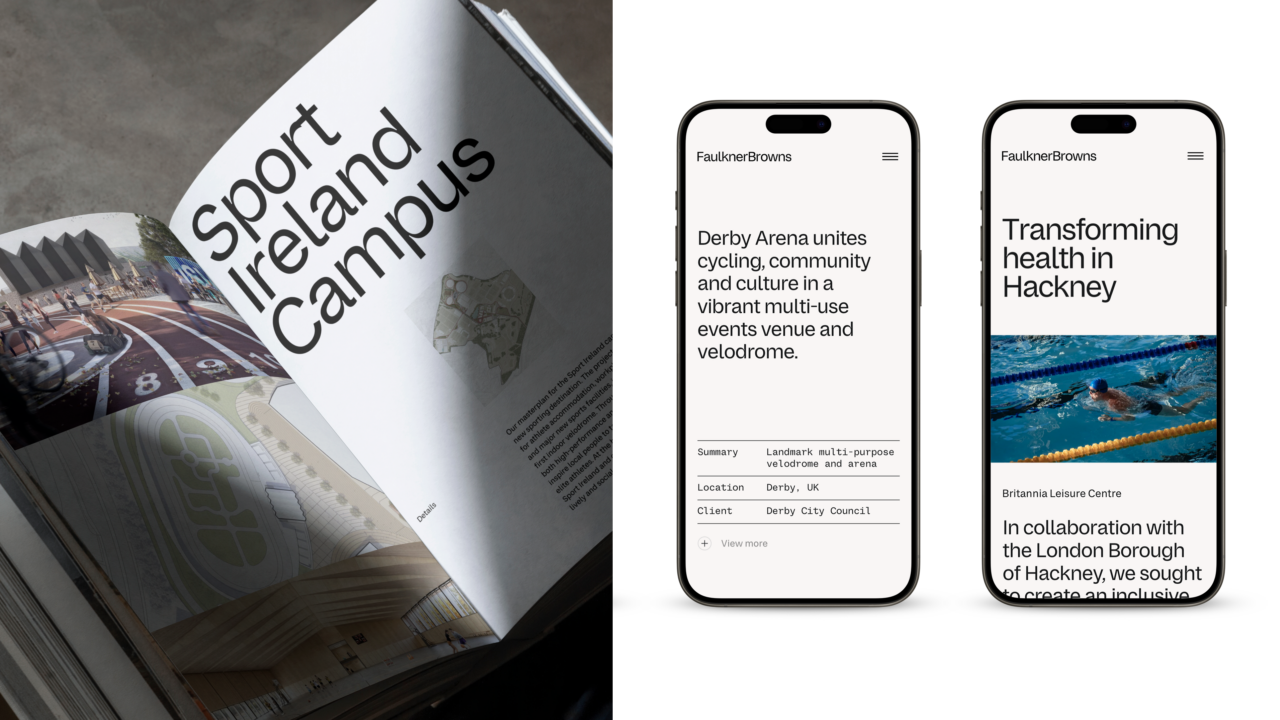
The layout principles are a key tool to enhance clarity, impact, and the dynamic nature of the design. Tight grids ensure structure and alignment, while contrast in type sizes draws attention to key elements. Embracing asymmetry adds vitality and movement, while white space provides breathing room and juxtaposes full-bleed images, enhancing visual appeal.
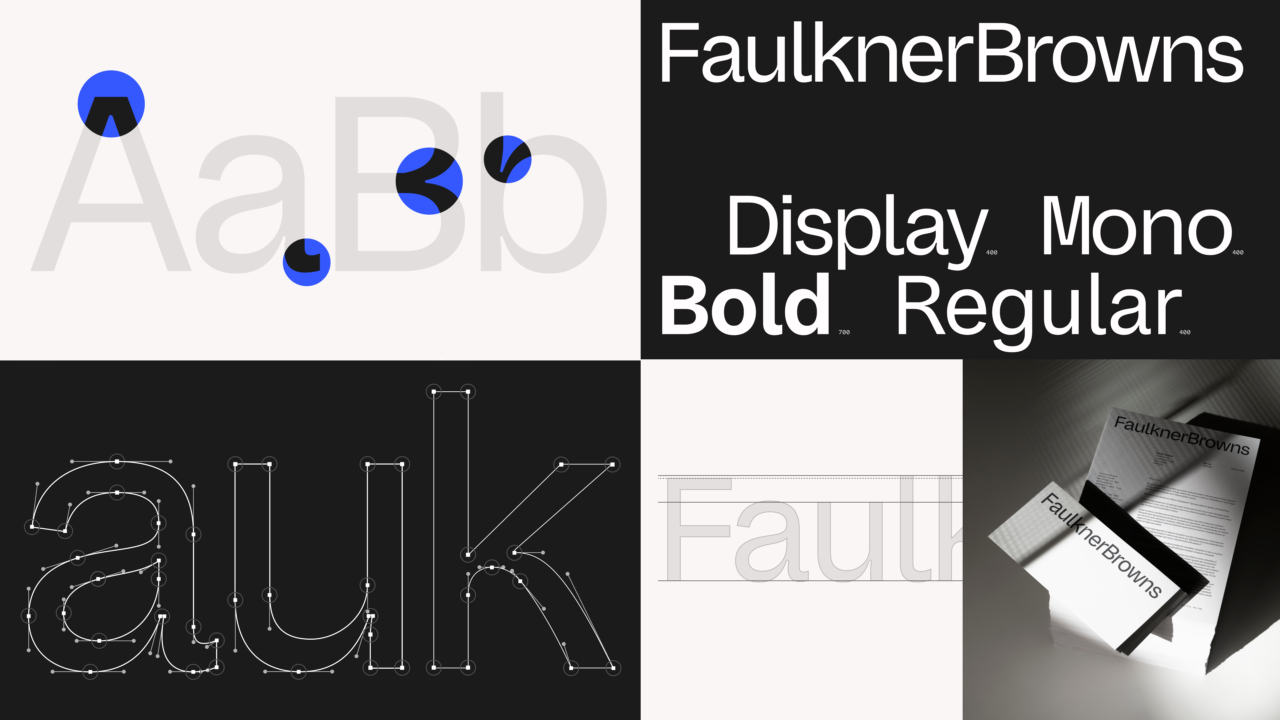
The new typeface is a recalibration of the one that preceded it, adding a human touch. Subtle ink traps, soft curves, and precise joints combine functionality and aesthetic expression — much like the intricate craftsmanship in FaulknerBrowns’ design. Combined, these elements reflect the studio’s commitment to change, their iterative approach to design, and their long-term dedication to the communities they help create.
Shortliste
CCA 2025