Kunde
Education Esbjerg
Bureau
e-Types
Krediteringer
Beskrivelse
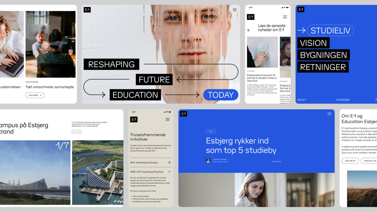
What does the future of education look like? How to present a new hybrid learning concept in Esbjerg that offers curated programmes from national and international universities? With the bold intention of putting Esbjerg on the map, we developed the name, identity and digital platform for this new educational concept. With a Bjarke Ingels building still in the making, the client, Education Esbjerg, needed a relevant and attractive universe for everyone to understand their ambitions.
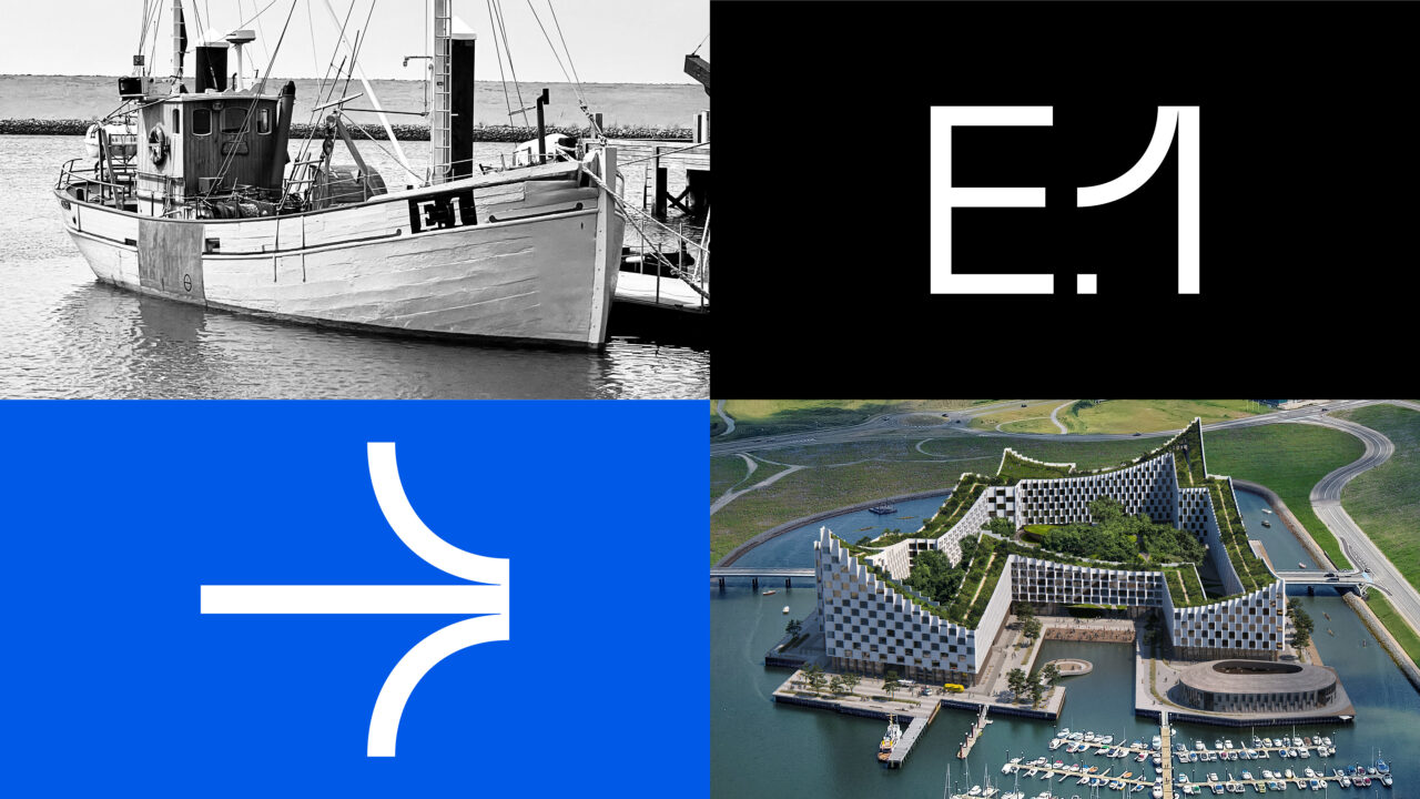
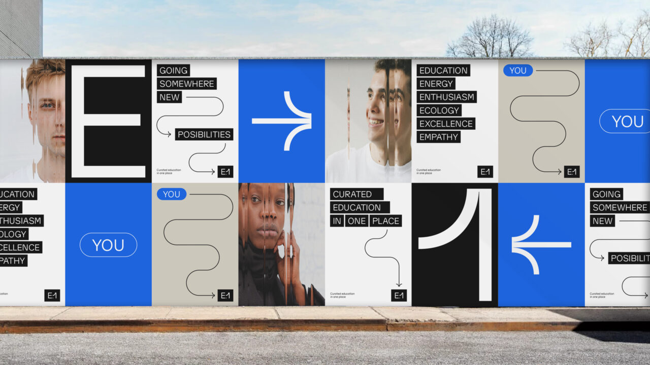
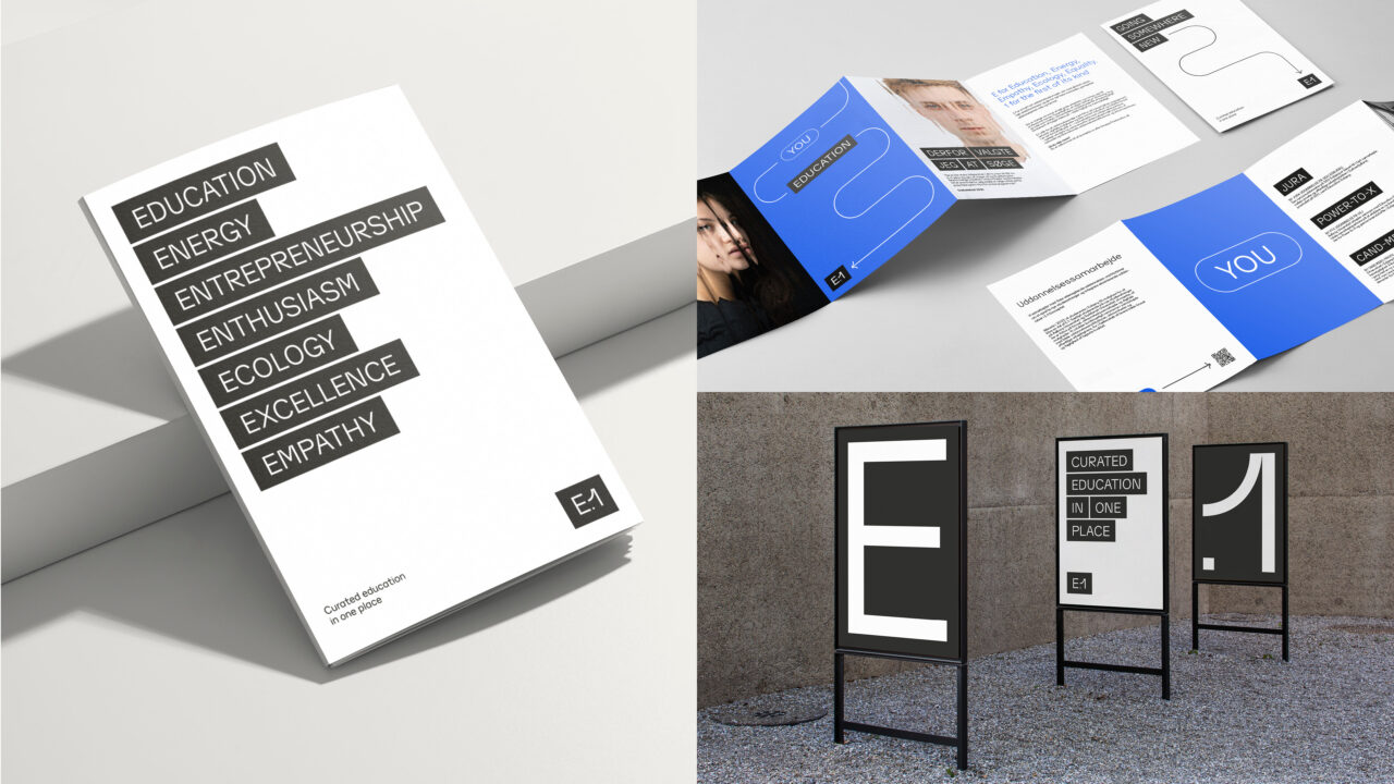
We developed the name E1 to celebrate the heritage of Esbjerg. E1 as in the original Esbjerg fishing vessel and its characteristic black numberplate “E.1”, but also E1 as in ‘the first education of its kind’. The E represents Esbjerg, Education, Entrepreneurship, Energy, Ecology, Empathy and many other qualities.
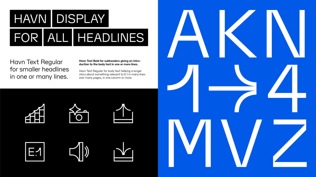
The industrial heritage of Esbjerg became the inspiration for the visual identity that consists of a logomark that hints at the original E1 vessel, two bespoke sans serif typefaces with an industrial harbour and container ship aesthetic named ‘Havn Display’ and ‘Havn Text’, a visual system of animated text boxes and arrows that speak to the digital nature of the brand, and a colour palette that reflects nature around Esbjerg; the sea, the sand, the harbour.
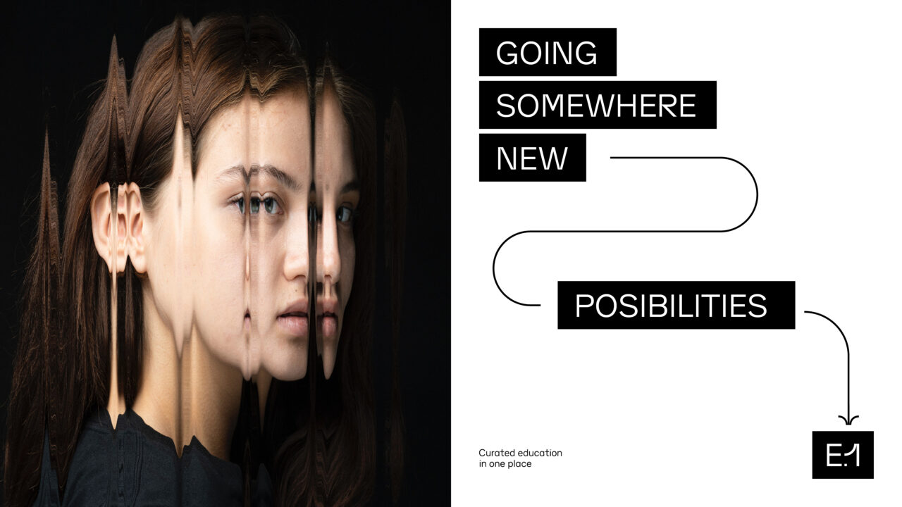
The digital design is intended to be vibrant and contemporary, targeting younger audiences, who are portrayed in the concept using a characteristic ripple effect on the photos to show the transformational power of education.
Brand Architecture
Brand Positioning
Brand Identity
Visual Identity
Bespoke Typeface
Design Guidelines
Motion Design
Stationary
Illustration
Icons
Brand Imagery
Digital Design
Website design

Vinder 2023
CCA 2023

