Krediteringer
Beskrivelse
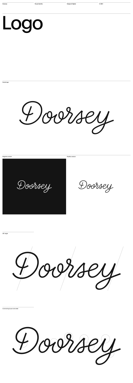
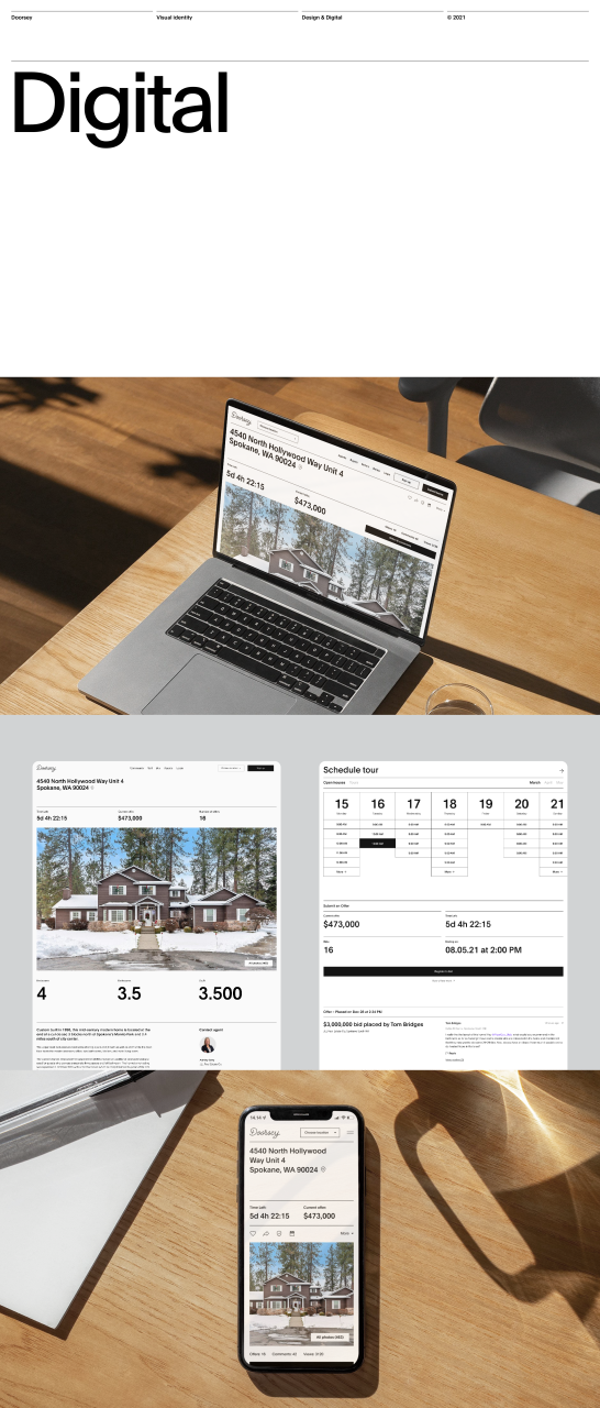
In response to the traditional blind-offer process in the overheated housing market in the US, Doorsey is a pioneering new product and company, offering a radically transparent home buying process, where deal terms, home condition, and price are available to everyone — in real time. Tasked with building the Doorsey brand from the ground up, we helped in defining the brand strategy, name and characteristic Tone of Voice, as well as creating a rich brand identity and bespoke script logo.
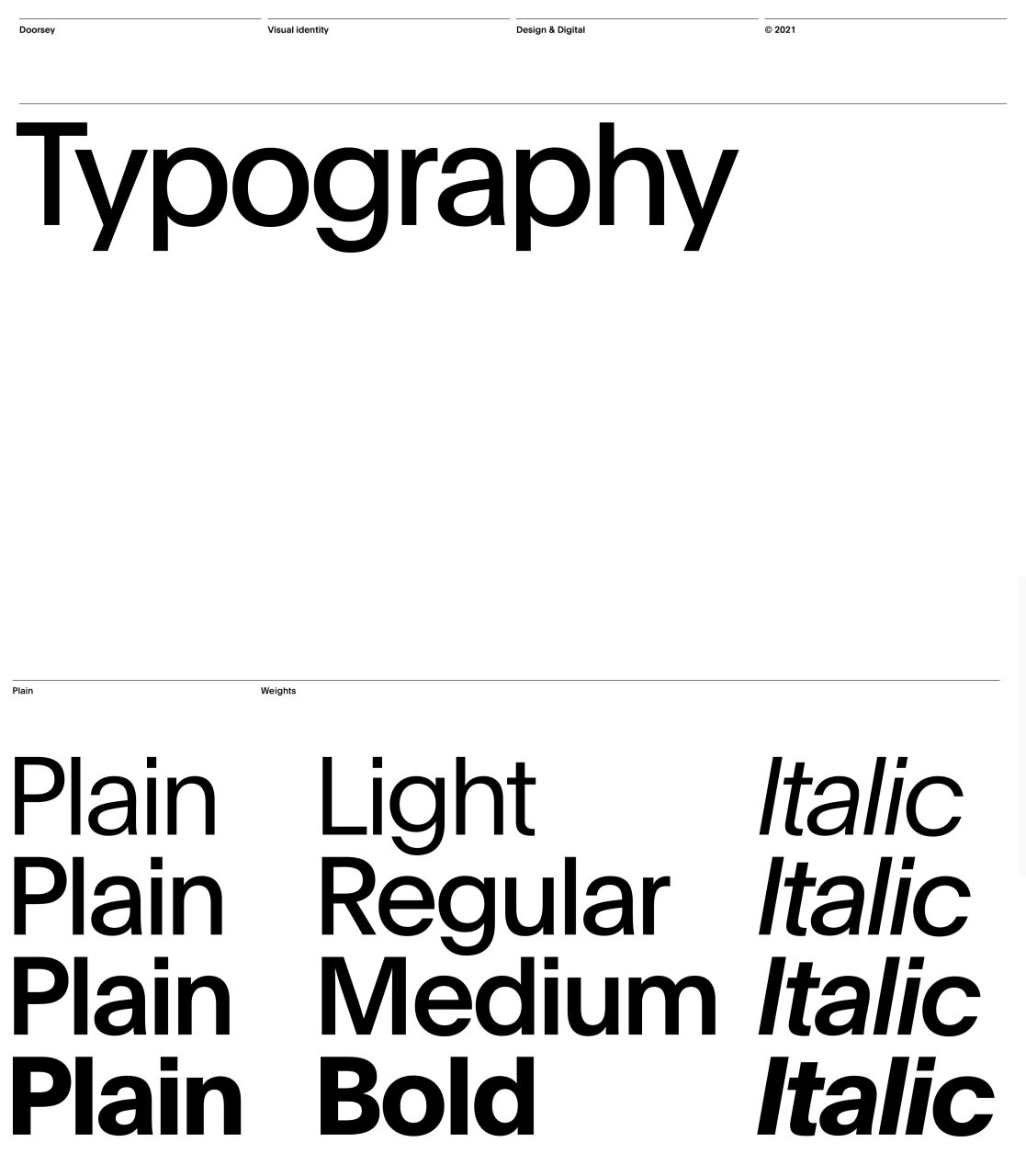
We wanted to capture the essence of the brand promise, transparency, through a clear and simple identity, whilst using the unique and animated nature of a signature as the logo to spark a balance of meaning and playfulness in the identity. To help convey the myriad of information collected on a property listing, we turned to a traditional Swiss-style layout concept structure and typographical treatment. The characteristic gridlines and grid columns is a design trait that translates well across the different digital platforms where the Doorsey brand and product lives. The signature represents the critical and exciting moment where the new owner puts pen to paper, to make their dream home become their reality. The moment where buyer, seller and agent have come together under one roof, at Doorsey. The point of no return, signed and sealed.
DELIVERABLES:
Brand Strategy
Naming
Brand Identity
Brand Communication
Motion Design
Digital Identity
PDF Filer
Shortliste
CCA 2022

