Kunde
DFDS
Bureau
e-Types
Krediteringer
Beskrivelse
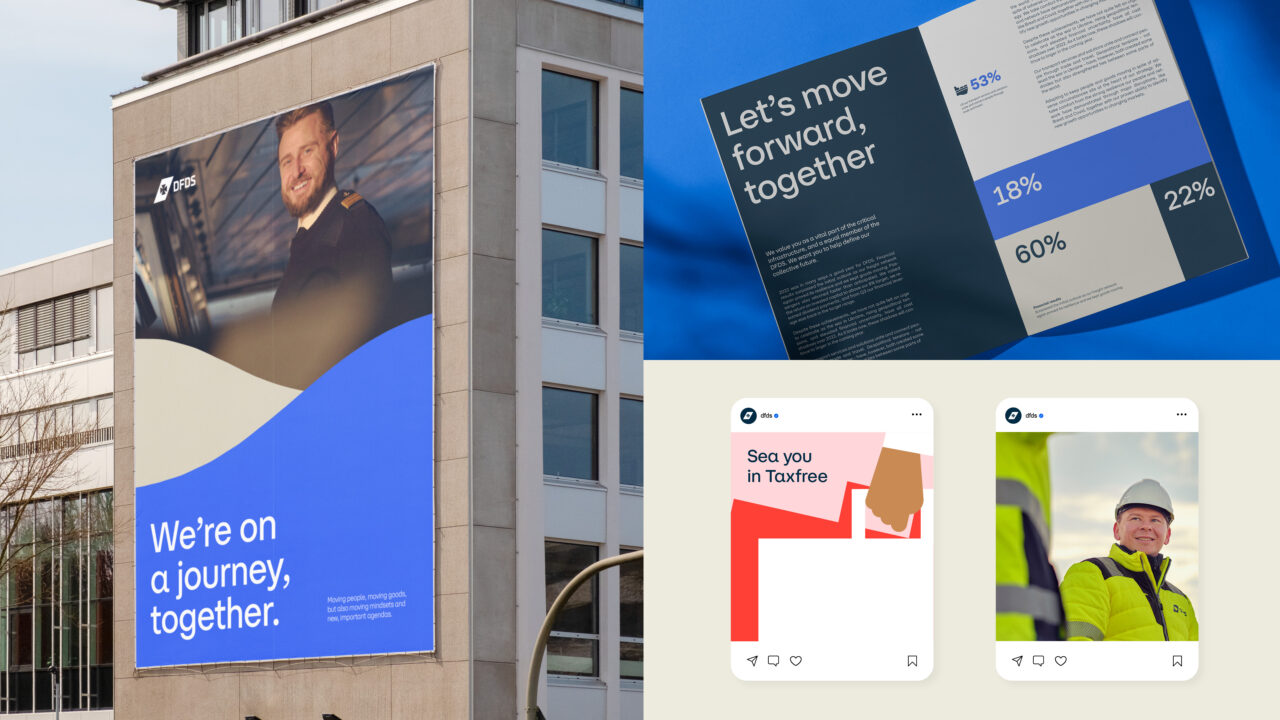
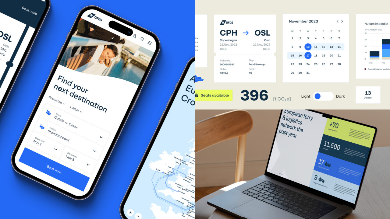
On the back of their new purpose, “We move for all to grow”, DFDS wanted to redefine their visual identity to be more in line with their new purpose and brand personality; strong and reliable, warm and open, smart and proactive. Especially the “warm and open” part of the brand was to be more present in both the visuals and the tone of voice.
Apart from this, there was also a need to unite the Passenger, Freight and Group divisions under one brand expression and experience – finding their common denominator and what ties them all together, which was in fact “movement”. Be it moving people or moving good, the DFDS brand has been moving together to connect Europe and beyond for over 130 years.
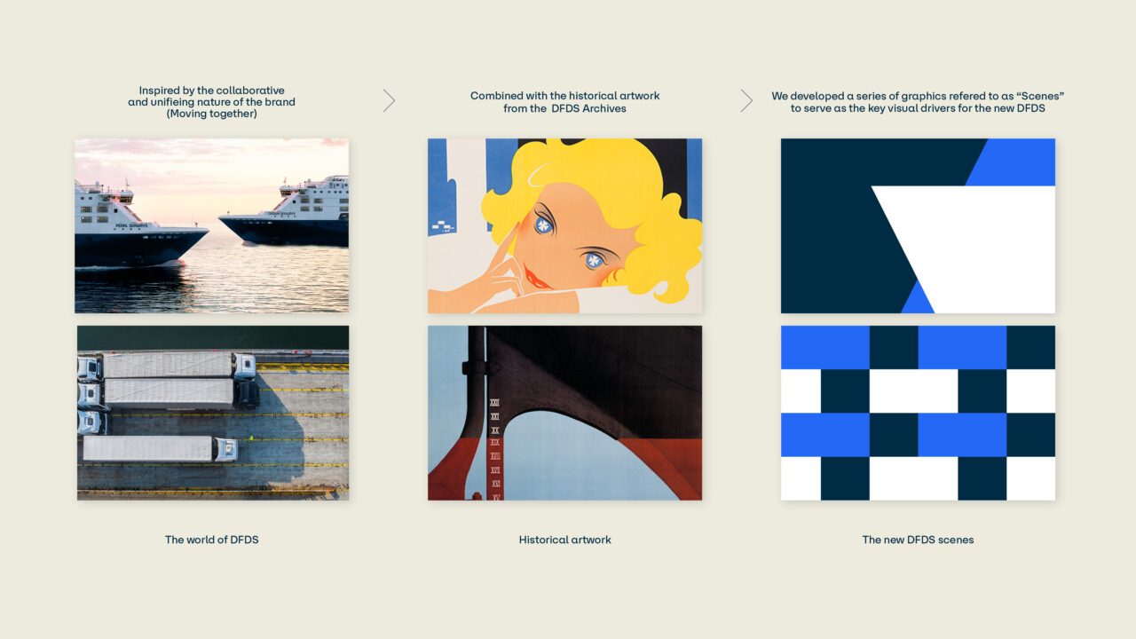
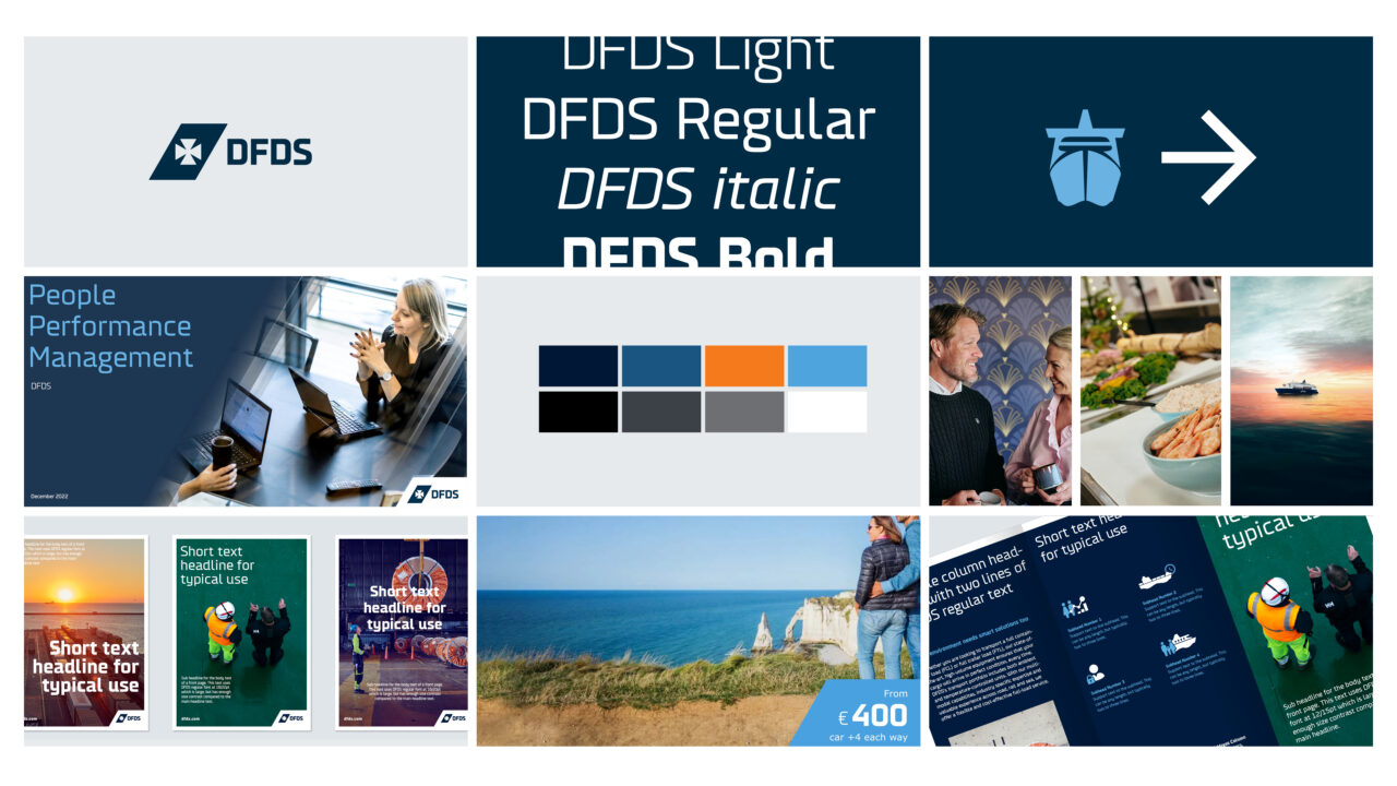
It was with this in mind that we titled our core concept, “Moving Together”, and began researching and digging through the historic brand archives to discover more of the brand’s common ground. We quickly became familiar with the brand’s rich history of colourful and dynamic posters and ad’s. Many of these had a beautiful, geometric feel to them – a look that inspired our 5.th element “Scenes”, which became a central part of our brand identity. The scenes form the base for our CVI, and are what add a fresh, new feel to the look.
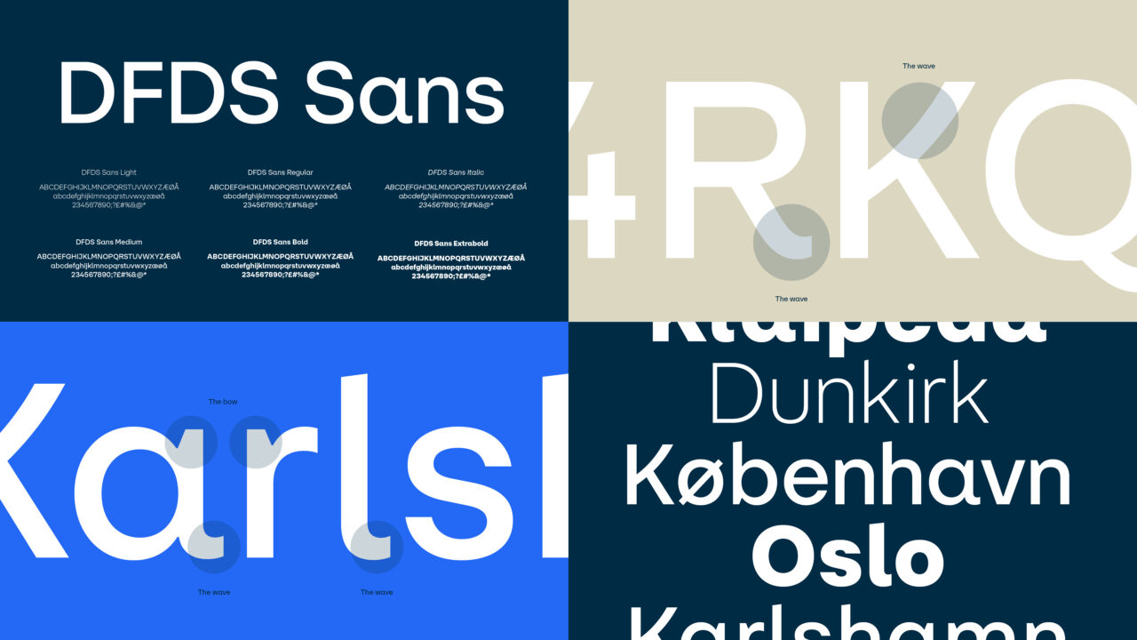
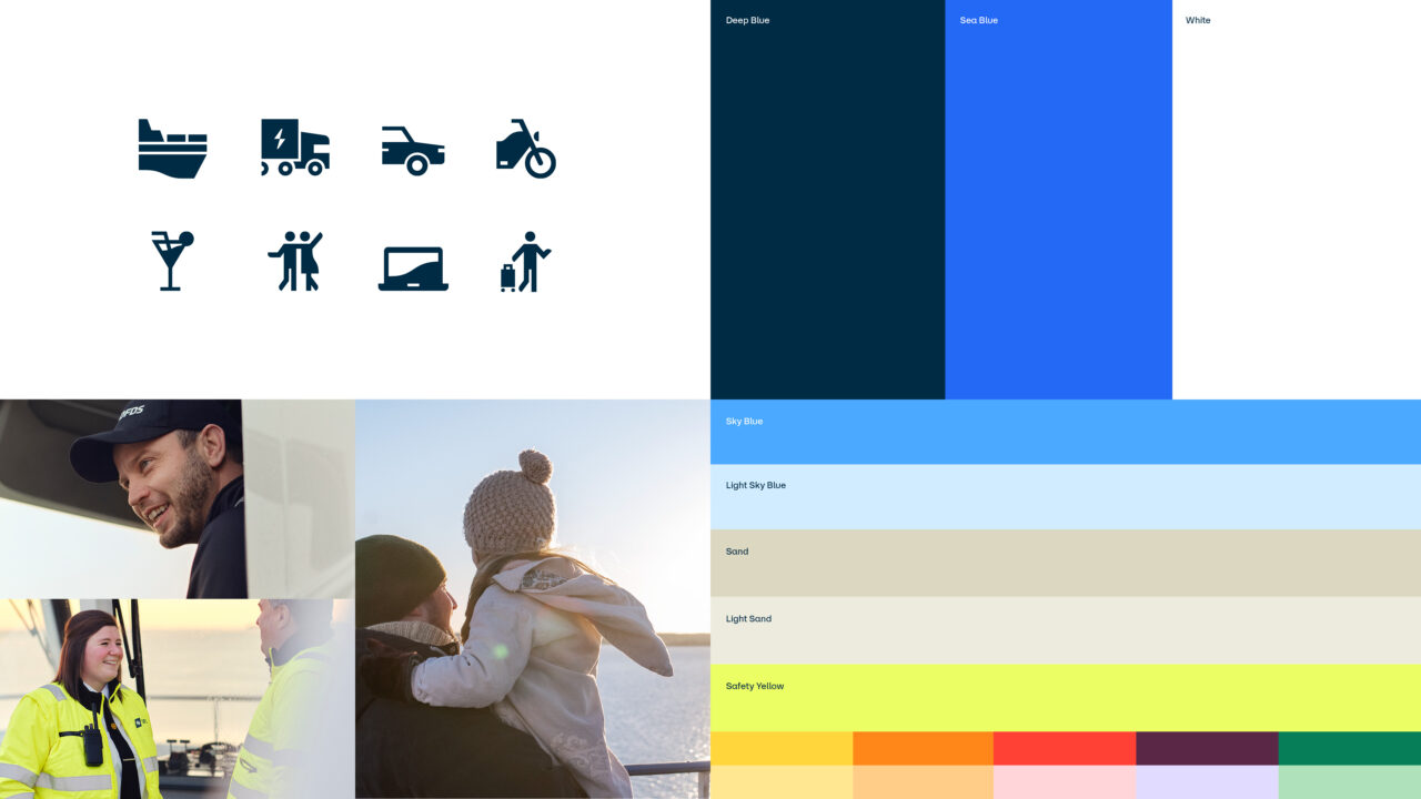
As we were maintaining the logo and historic DFDS Blue, we also added a new “Sea Blue”, that could tap into the brands new electric truck fleet and focus on digitalisation. Along with this we also created bespoke new typeface, image style, motion style, layouts, icons, tone of voice, brand soundtrack and much much more.
Shortliste
CCA 2024

