Kunde
Telmore
Bureau
NORD DDB
Krediteringer
Beskrivelse
Background
Telmore have innovation as a core value and wants to be the smart choice. Something they have proved by being Denmark’s first online only telco and the first Danish telco to offer streaming packages.
Problem
However, their look did not communicate innovation and being smart, but was rather generic and dull. A problem that was made worse by the fact that Telmore has lower ad spend than most competitors and thus ad recognition and ad efficiency numbers were low.
Task
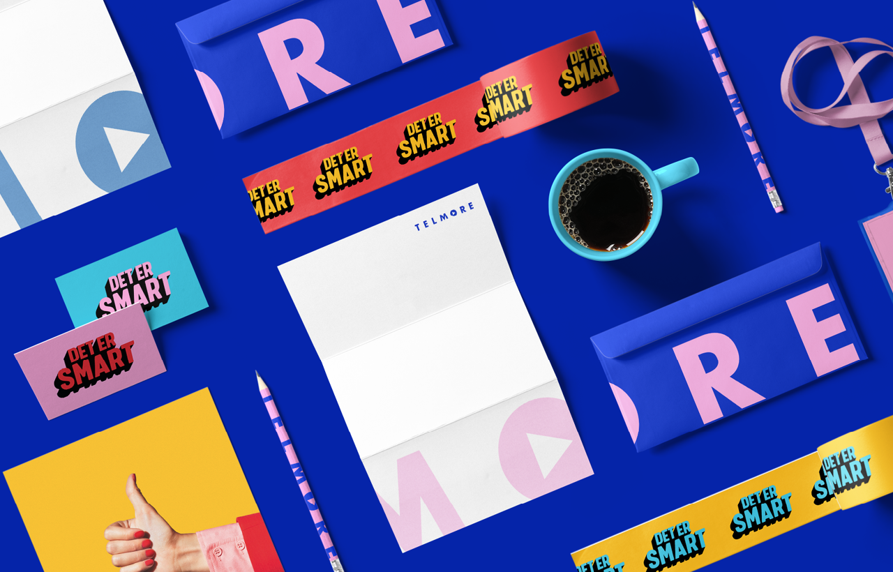
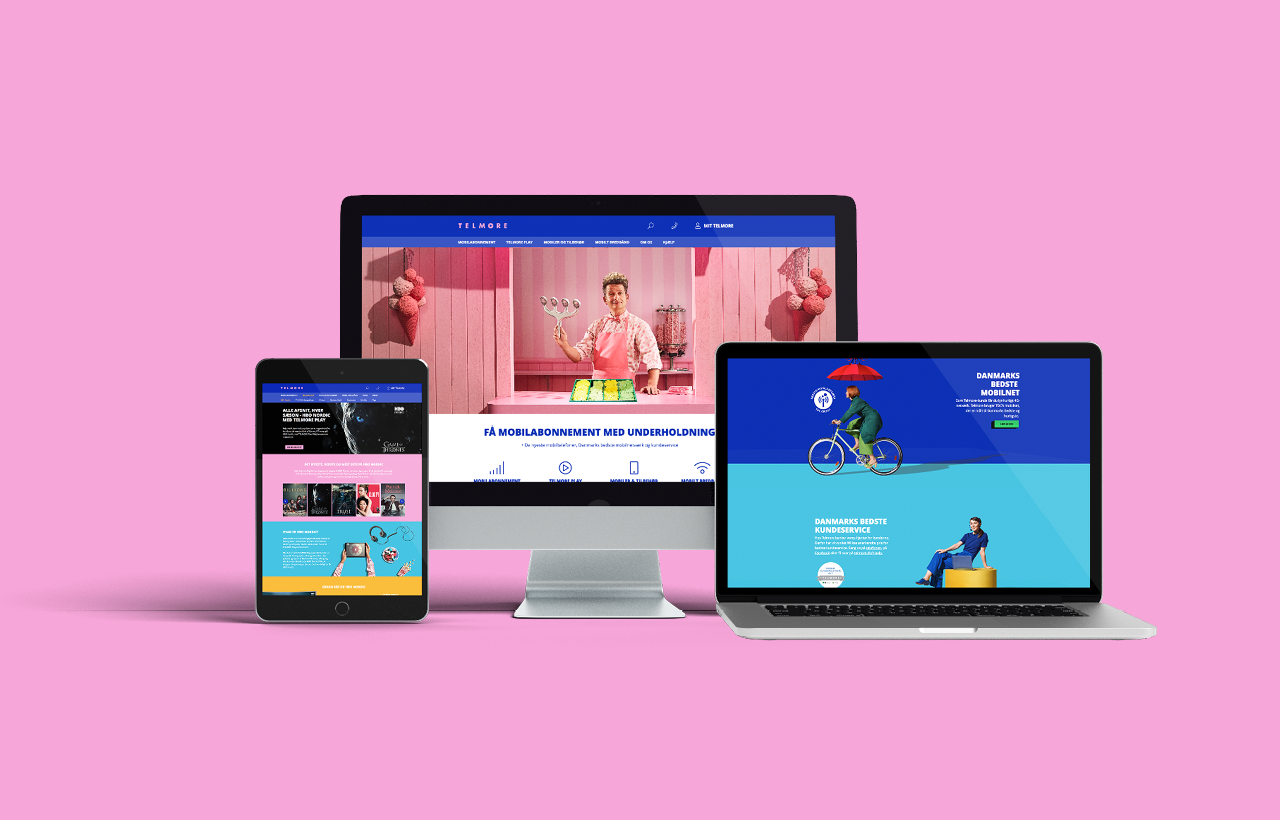
Update the design to a smarter look that is consistent across all platforms. Key KPIs was improvement of ad recognition and efficiency.
Solution
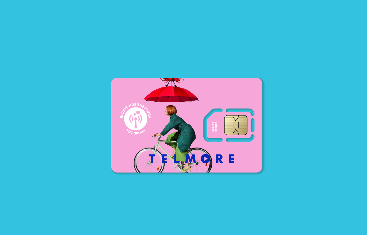
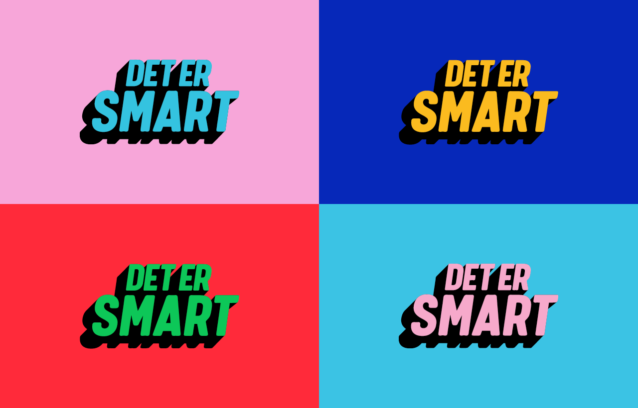
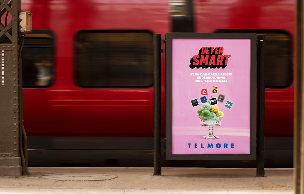
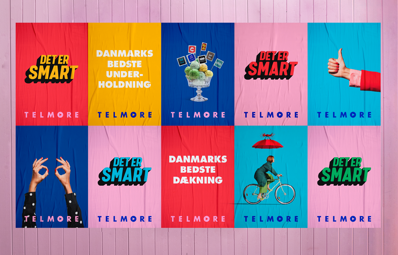
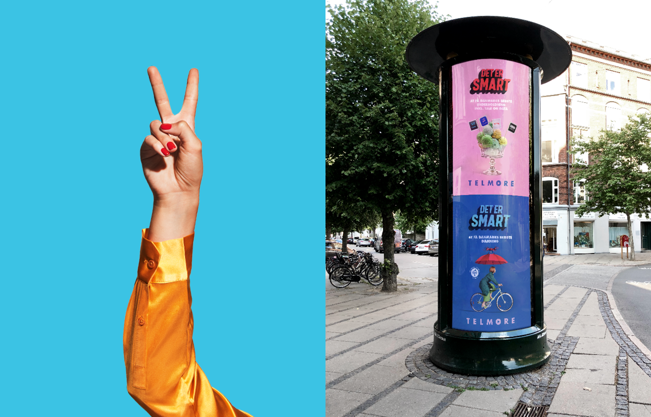
Telmore went from blending in to standing out. From black and white to pink on blue, blue on red, red on yellow, and yellow on green. They went from trying to be cool to being themselves. Being loud, confident and noticeable.
Results
Ad recognition went from an all-time low to a long-time high. Advertising efficiency followed and Telmore Play sales numbers increased by 50%. Telmore now have a design that reflects their core value and shows a commitment to being the smart choice in telco.
Shortliste
CCA 2019


