Kunde
MAKE Consulting
Bureau
Make
Beskrivelse
The setting
MAKE Consulting provides both research analysis and consulting services in the renewable energy sector. This places the company in a unique position, but a brand platform was needed that communicated this dual offering enabling each ‘arm’ to operate successfully while achieving a strong synergy.
The solution
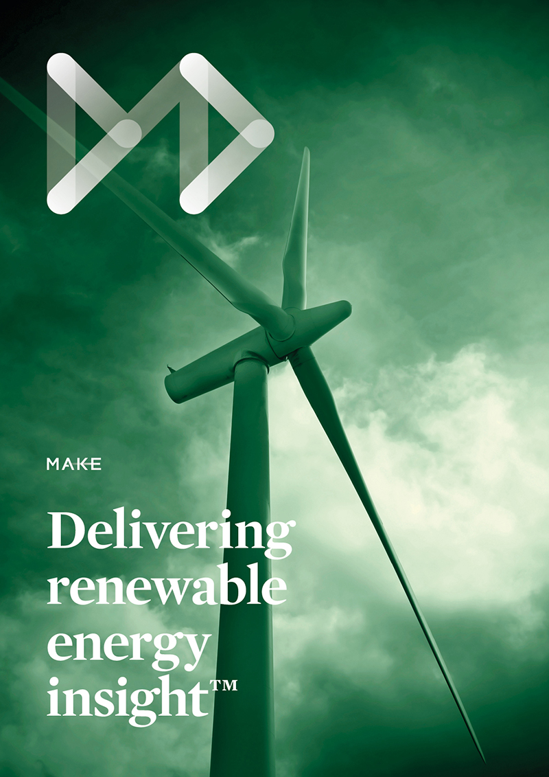
Leaving behind the generic look, a concept of “Delivering Renewable Energy Insights” was introduced and captured in a strategic brand foundation, verbal explanations, and a visual identity that comprises:
• A new dynamic arrow symbol that connects the dots and an updated wordmark, expressing the company’s forward thinking and agile analytical insights
• A vibrant greener-than-green colour palette that MAKE Consulting were eager to take ownership of in a predominantly blue competitor landscape
• Brand typefaces providing both clarity in their essential data presentation and personality in the visual expression of their corporate voice
• Photographic imagery deepening the expression through colour-grading and evocative subject matter.
Shortliste
CCA 2014


