Kunde
Dansk Boldspild-Union
Bureau
Urgent.Agency
Krediteringer
Beskrivelse
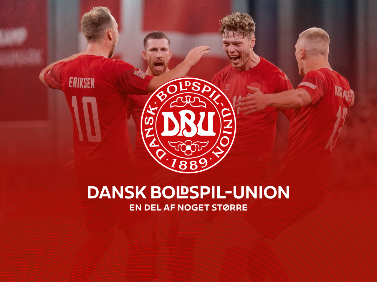
There is something almost strange about calling DBU a brand. For a great deal of Danish people DBU is an integral part of life - a familiar frame for childhood memories and an ongoing supplier of big, collective experiences. Win, lose or draw. So, how do you revitalise a brand that is so embedded in our national identity? And how do you ensure that every stakeholder in this vast organisation will be able to implement a united and professional identity across all sub-brands and platforms?
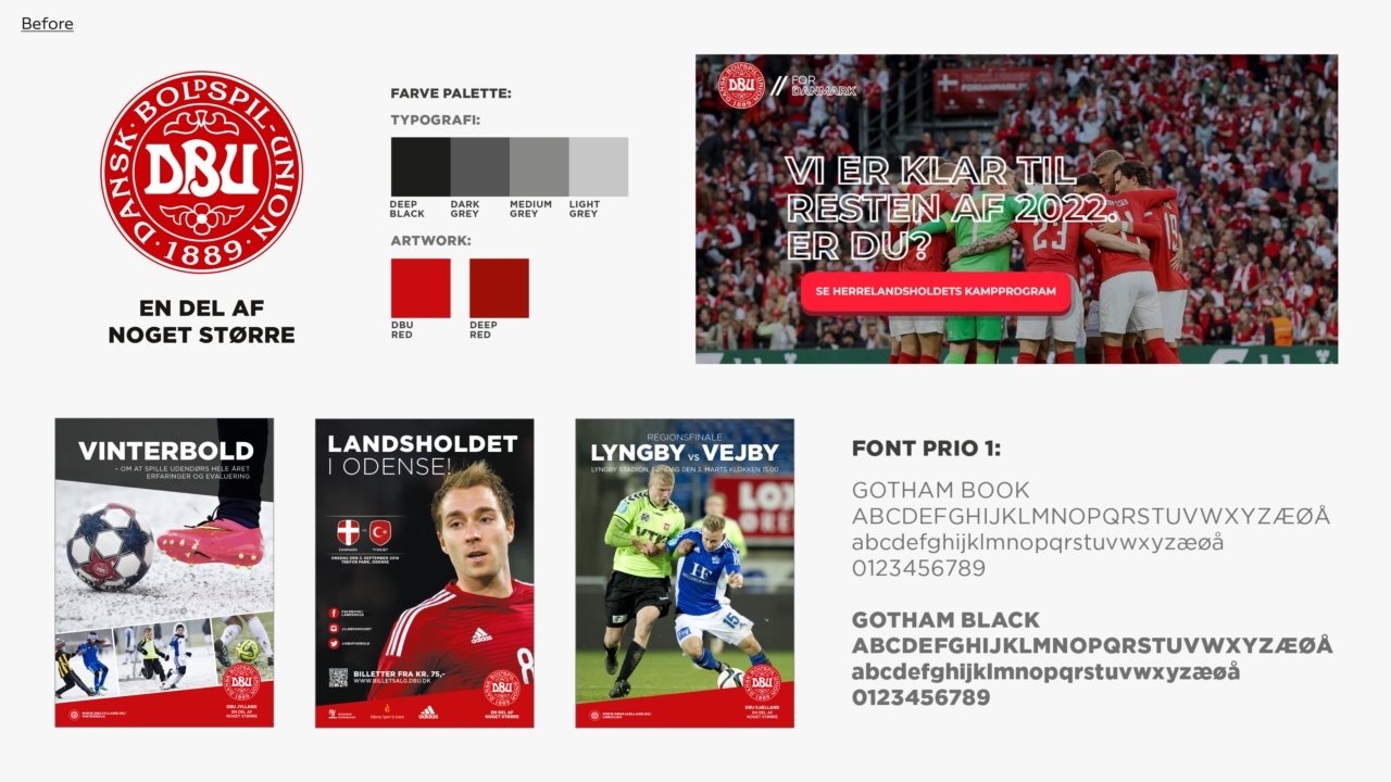
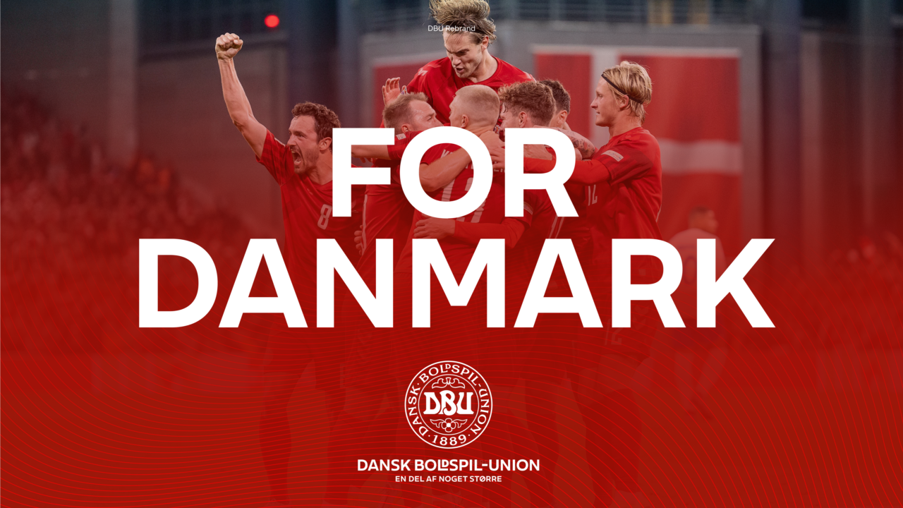
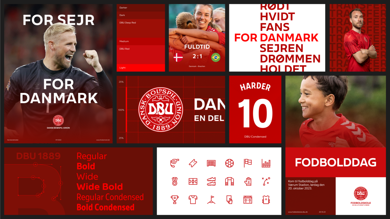
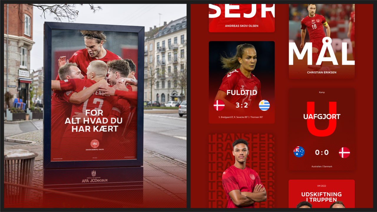
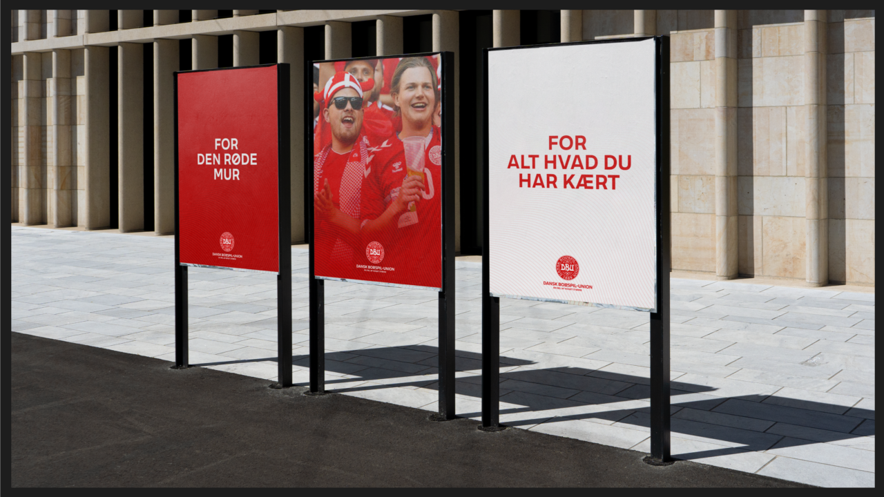
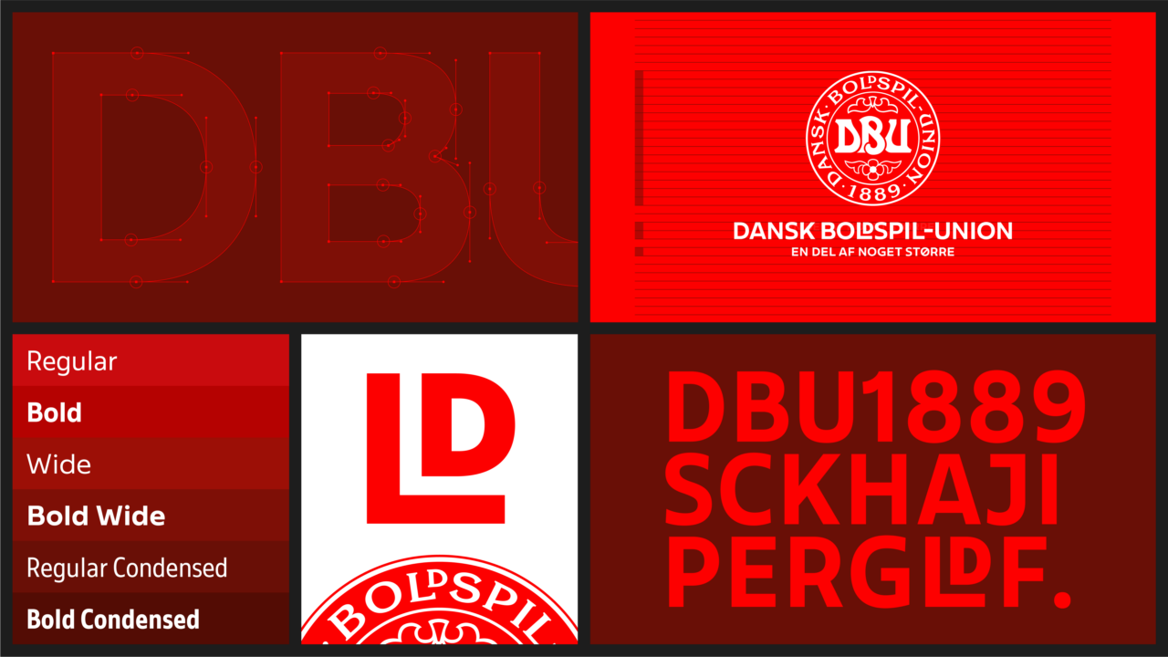
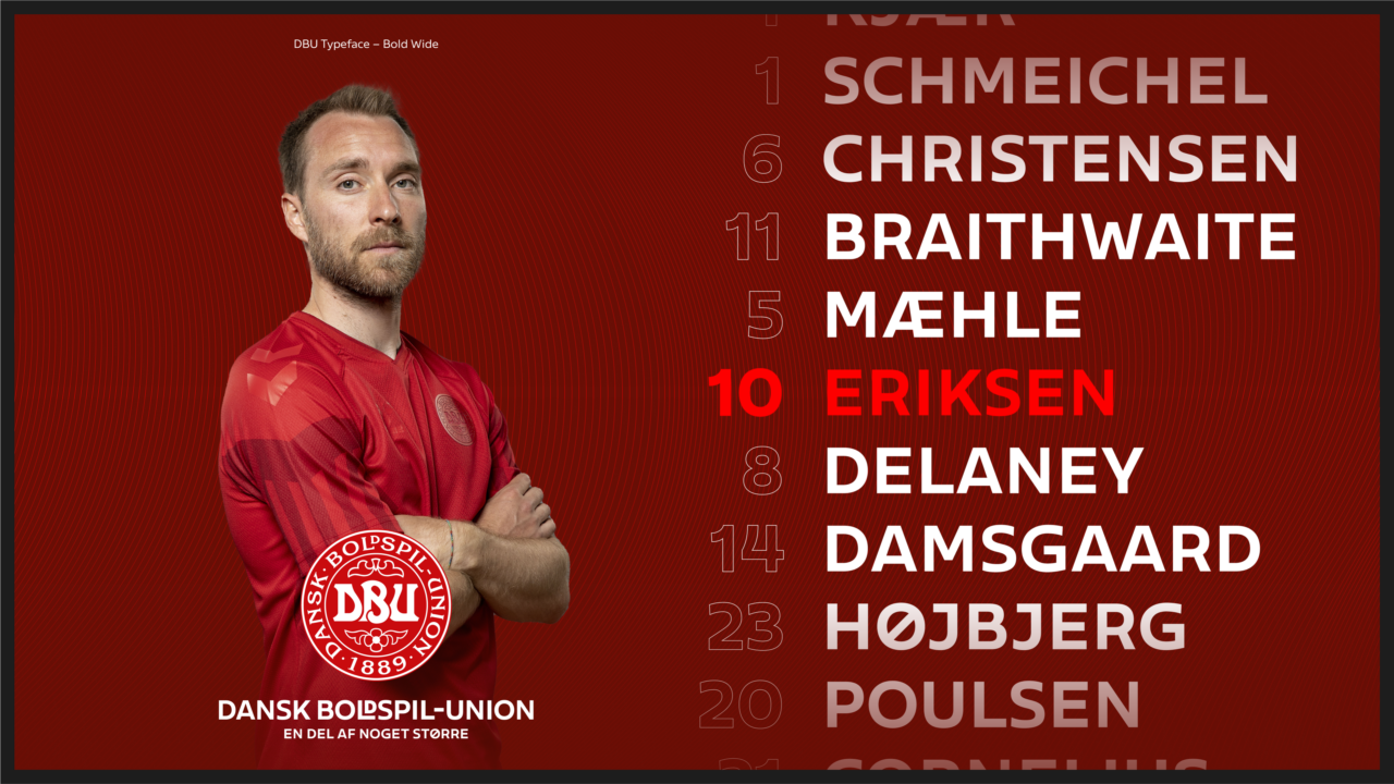
With much respect for the iconic logo and DBU's traditions, we have given the DBU identity a modern boost. All lines, dots and strokes are in reference to the strong logo – including a dynamic fifth element and a new custom-made typeface. It is a streamlined identity that works across and unifies all sub-brands and platforms – from everything from digital media and huge banners in Parken to commercial campaigns and posters in the local football club.
The Danish Football Association (DBU) has always been about creating the best conditions for football in our country from talent development, local clubs, volunteers to our national teams. The new and revitalised brand identity is designed to maintain that sense of belonging and to move the hearts - and feet - of all the football lovers out there.
Shortliste
CCA 2024

