Kunde
Design denmark & Danish Design Centre
Bureau
Kontrapunkt
Beskrivelse
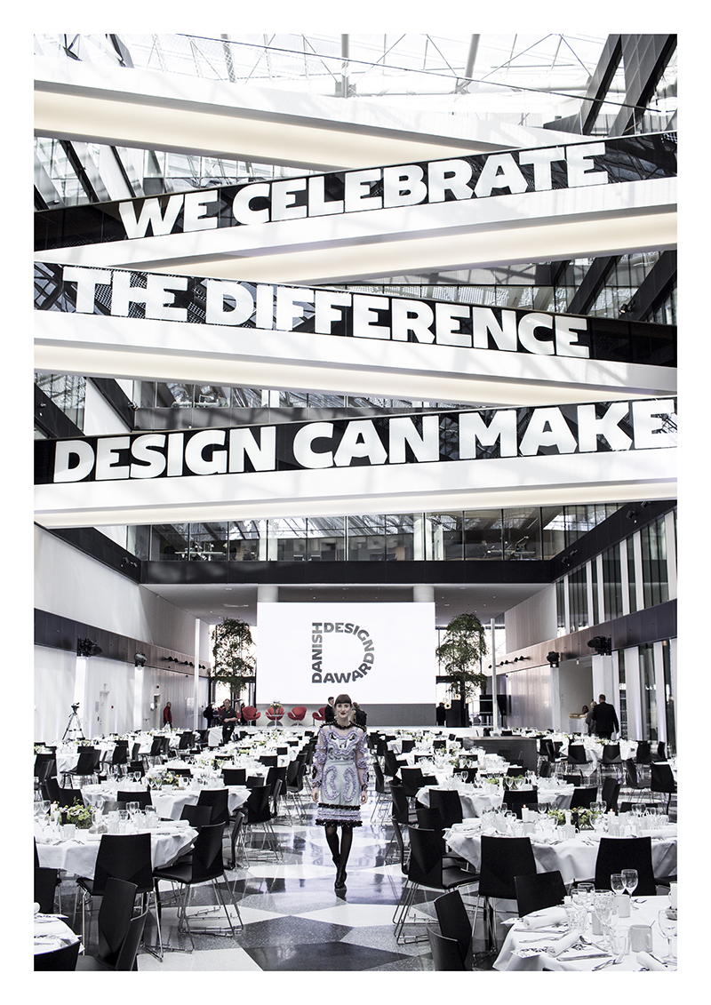
Every year Danish Design Award celebrates the difference design makes, broadening our concept of design and showcasing how design makes our lives better, healthier and happier. Danish Design Award wanted a visual identity that matched the high quality of the projects nominated. And more importantly, a visual identity that supports the overall message: design makes a difference.
We started our design process by looking back. Danish design has a long, proud tradition of humanistic and democratic design. Especially the early modernist and Danish design pioneer Knud V. Engelhardt’s typographic work became key in our search for inspiration. So we decided to design a new typography that we called “Danish”, based on Engelhardt’s functionalistic aesthetics.
Then we looked forward. We worked with tight and “chunky” typeface compositions, and monochromatic graphics to add a contemporary touch. The result is a visual identity that captures both tradition and innovation in a recognizable font. Together with the tight and simple graphical universe, the typeface gives Danish Design Award a strong voice to promote the power of design.
Design denmark’s Strategic Creative Director is impressed with the result, “Kontrapunkt has designed a visual identity that shares a love of what design can do. It’s clearly crafted from their love of typography since the “Danish” typeface is such an important part of the overall visual identity. The typeface is impactful, unique, flexible, and very strong”.
The visual identity is applied to everything from the website to posters and promotional materials, as well as the actual award itself, made of ash wood covered with gold leaf.

Vinder 2017
CCA 2017


