Kunde
D'Angleterre
Bureau
Kontrapunkt
Beskrivelse
Modern grandeur.
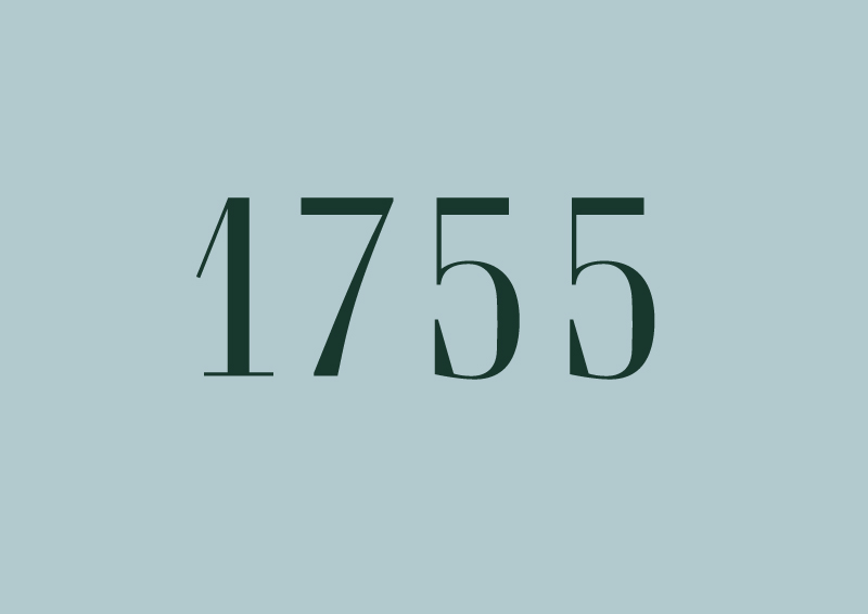
The focal point of d’Angleterre’s new typography was the narrow writing on the buildings facade. We created a typography of “d’Angleterrian" worthiness with an abundance of luxury, confidence and precision. Equally modern and grand.
The typography ties together all touch-points – business cards, door-numbers, elevator-buttons, web, etc. A tool to display visual cohesiveness and world-class quality in everything that d’Angelterre expresses in writing.

Vinder 2014
CCA 2014


