Kunde
D. E. Shaw
Bureau
HELLO MONDAY/DEPT®
Krediteringer
Beskrivelse
Introduction
The D. E. Shaw group is a global investment and technology development firm with more than 1,200 employees around the globe who manages more than $50 billion in investments, yet creativity, entrepreneurship, and the spirit of discovery are still part of their core value.
Challenge
Our challenge was to design and build a website for one of the largest hedge funds in the world. A website that could reflect 29 years of constant innovation, a collaborative culture and behind it all, a set of intellectually curious individuals who, together, constantly strive for the very best. Because new clients come to D.E. Shaw through word of mouth they came to us looking for a website that would attract the high caliber recruits they seek as well as demonstrate the exceptional place where they work.
Concept
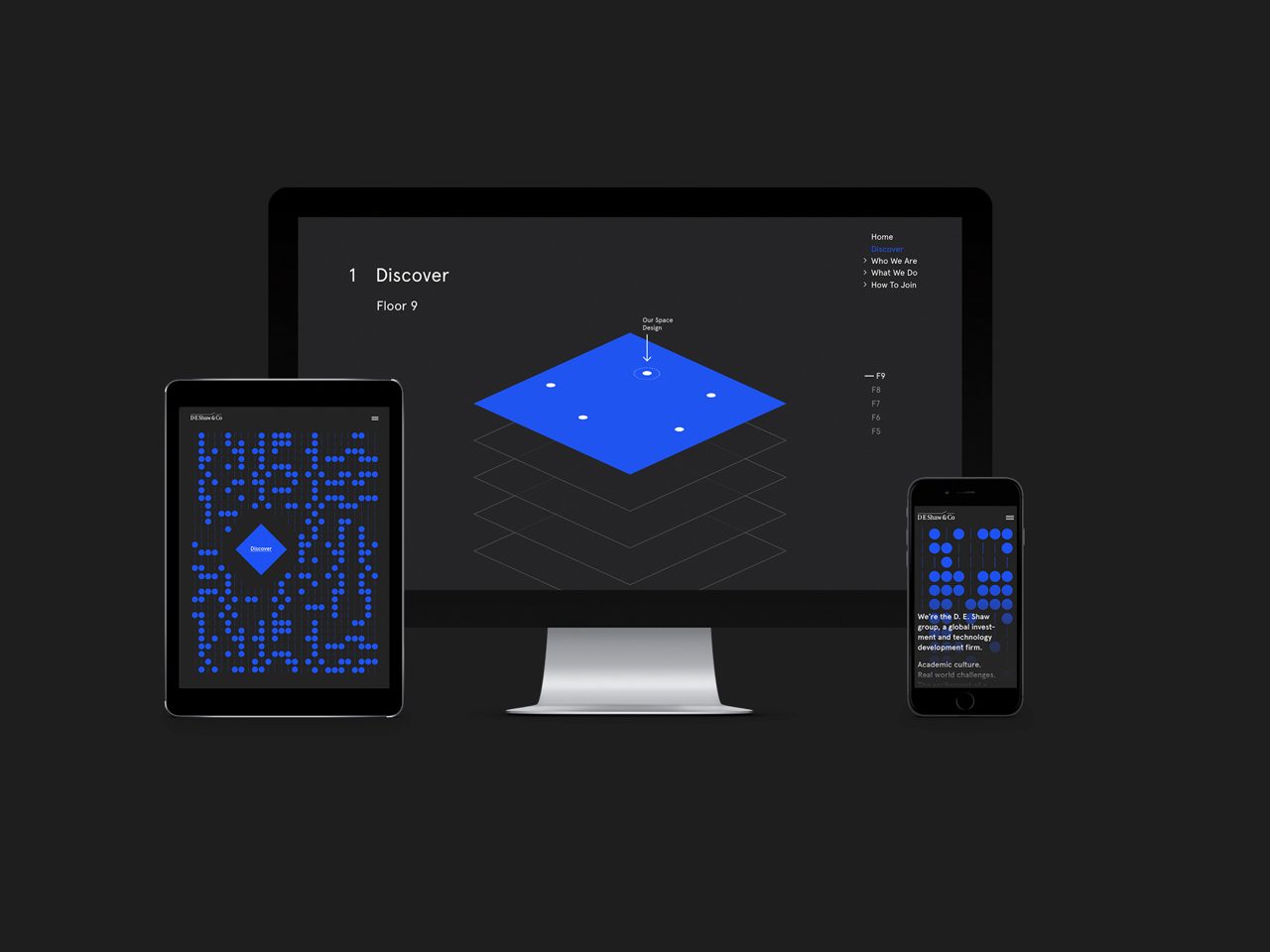
Being one of the frontrunners in computational finance and wanting a more tech and innovation feel we drew on subtle references to early computing for both the homepage concept and design in general.
Homepage
One of the main goals with the website is recruiting the right candidates. And those candidates are high intellectuals who likes to figure things out on their own; We based the homepage on a bold and abstract visual with a hidden message that a select few might figure out to decode. Being based on binary numbers, the background can be decoded to: “We’re always looking for the extraordinary. If you decoded this please send us an email at...”.
Exploring the company through the floorplan
To let users explore the ins and outs of D.E. Shaw we created an abstract representation of their office space. Each floor has several hot spots that lets you discover things like office perks, employees, and interns, and pulls you further into the website, where you can learn more.
Inspired by academic papers
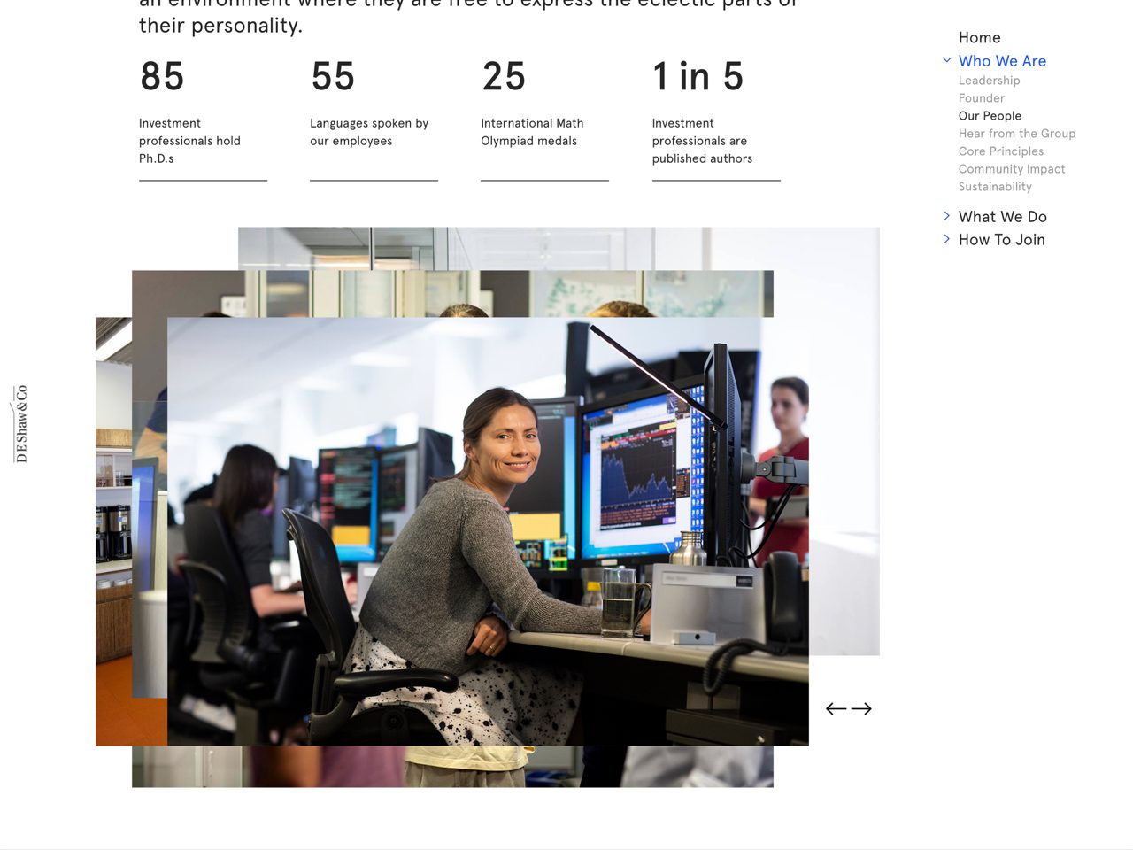
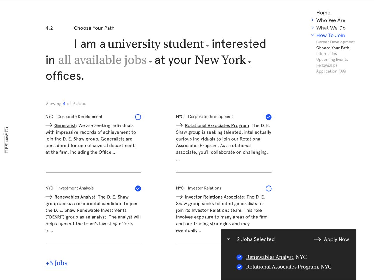
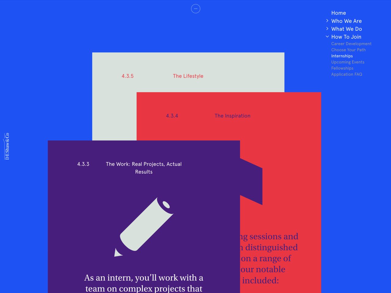
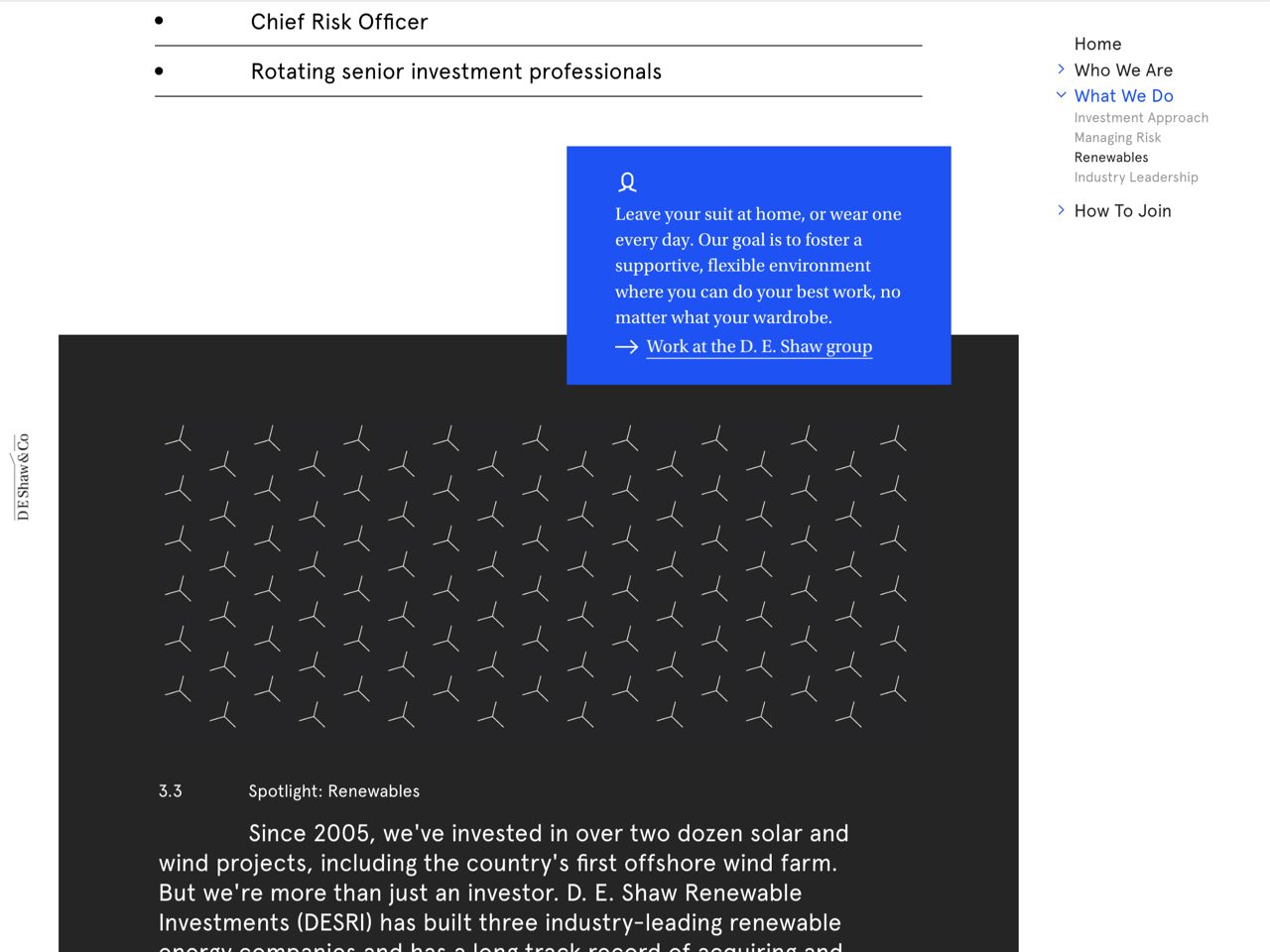
The rest of the site is structured like a traditional website with hints of academic papers it is the base layer on top of which some more explorative layers delivers relevant content to users at key moments.
Conclusion
With the new website, D. E. Shaw clearly stands out from their competitors with a visual expression that speaks more tech than finance, which helps attract the right kind of talent to the company.
The combination of solid structure and a more explorative way to discover what the company is all about, it sends the message that D. E. Shaw has the excitement of a start up combined with the resources of an industry leader.
Shortliste
CCA 2019

