Kunde
Chamberlain Coffee
Bureau
Kontrapunkt
Krediteringer
Designer
Torsten Lindsø Andersen
Designer
Rasmus Michaëlis
Beskrivelse
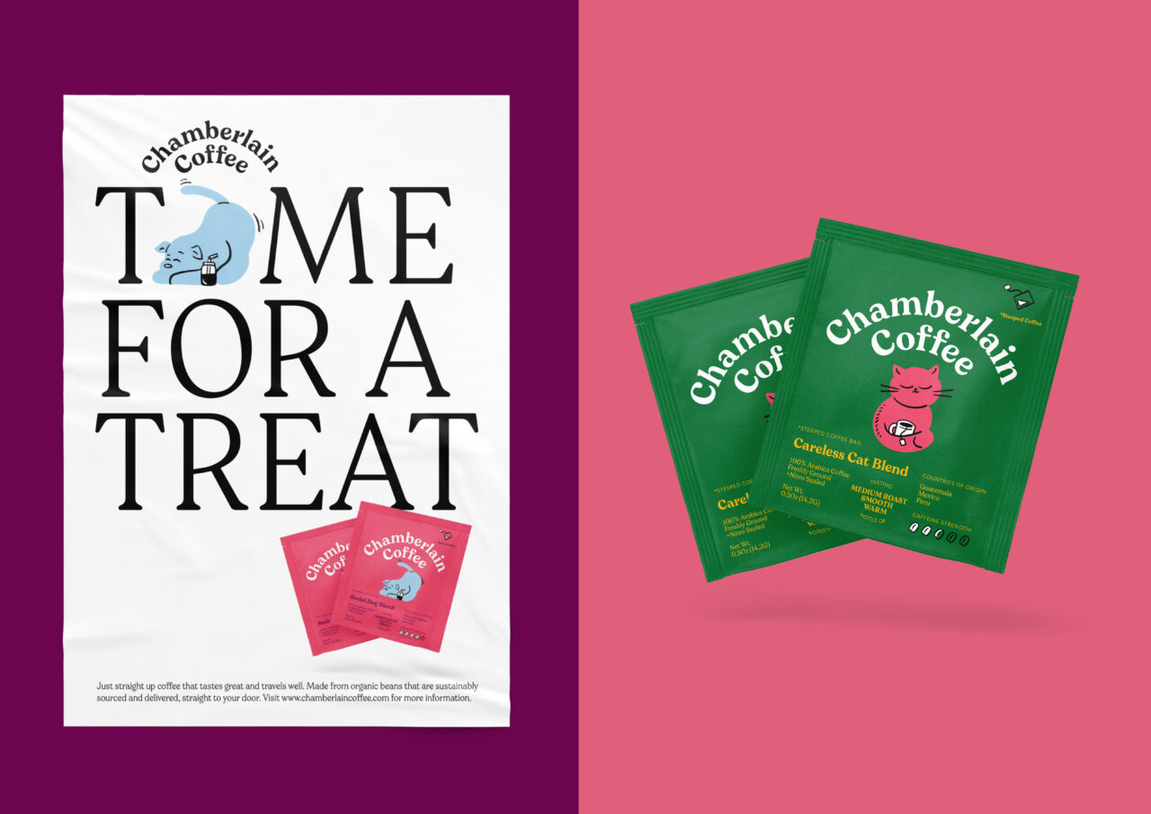
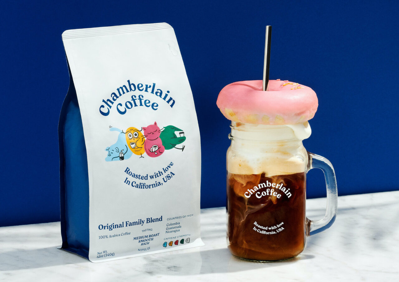
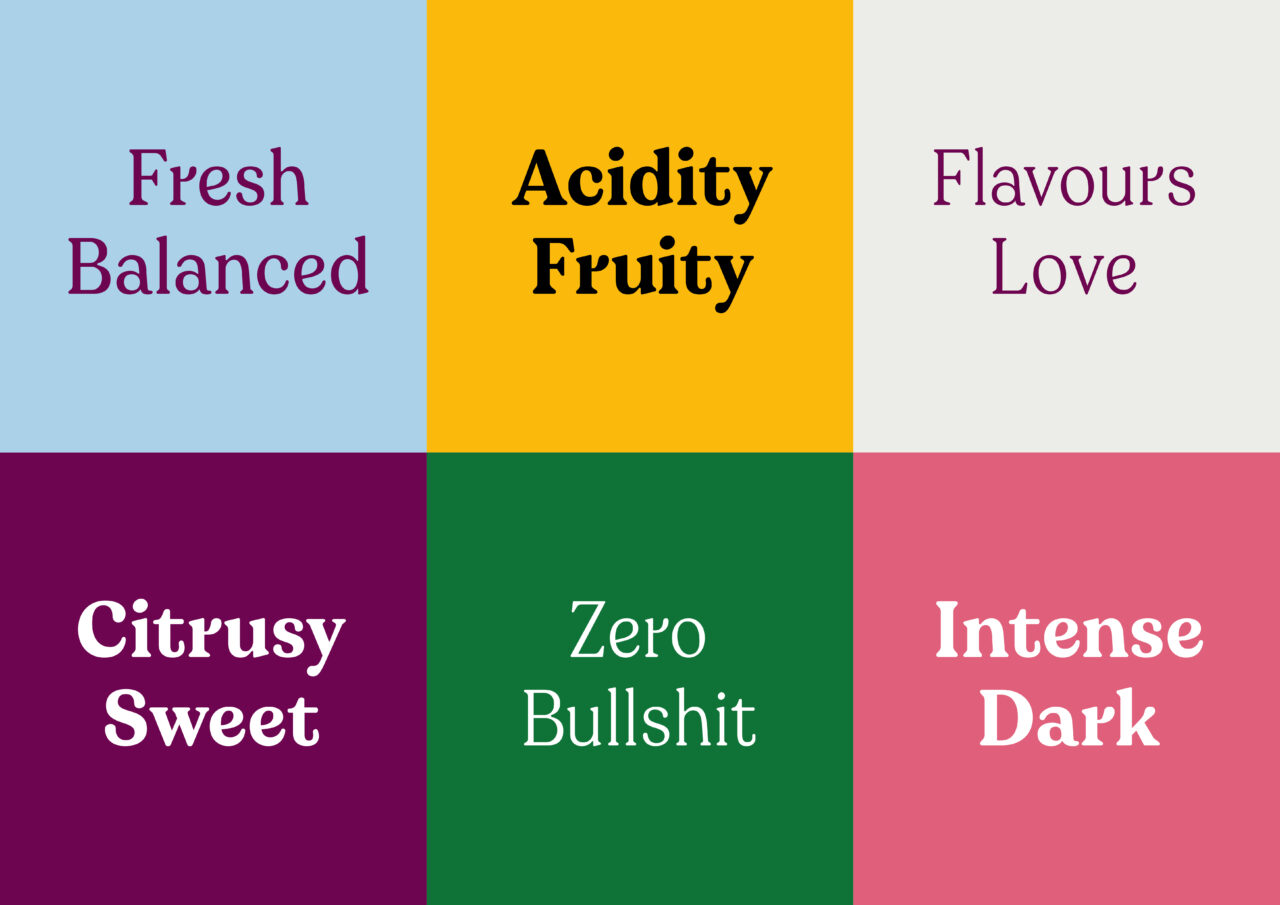
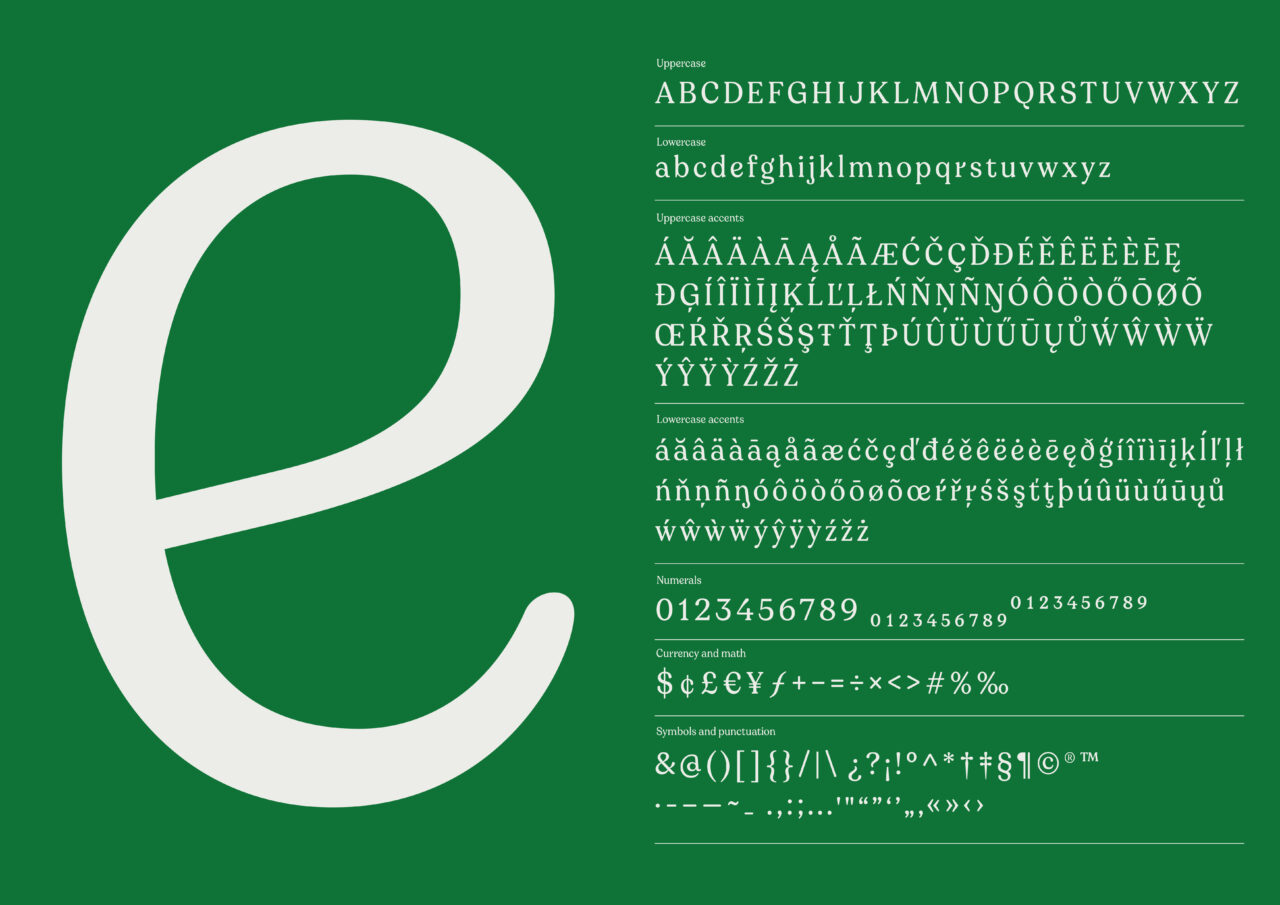
We worked with YouTube-sensation-gone-coffee-aficionada Emma Chamberlain and her team to deliver a kickass brand refresh. The rebrand included, among other things, a bespoke typeface: Totally Emma’s type.
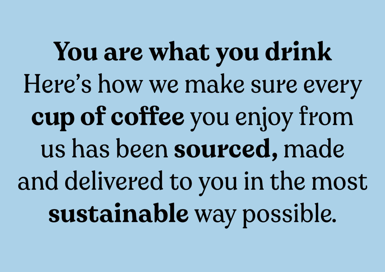
We drew an unpretentious and approachable typeface oozing of good vibes. Straightforward, but with personal tweaks, soft and friendly corners.
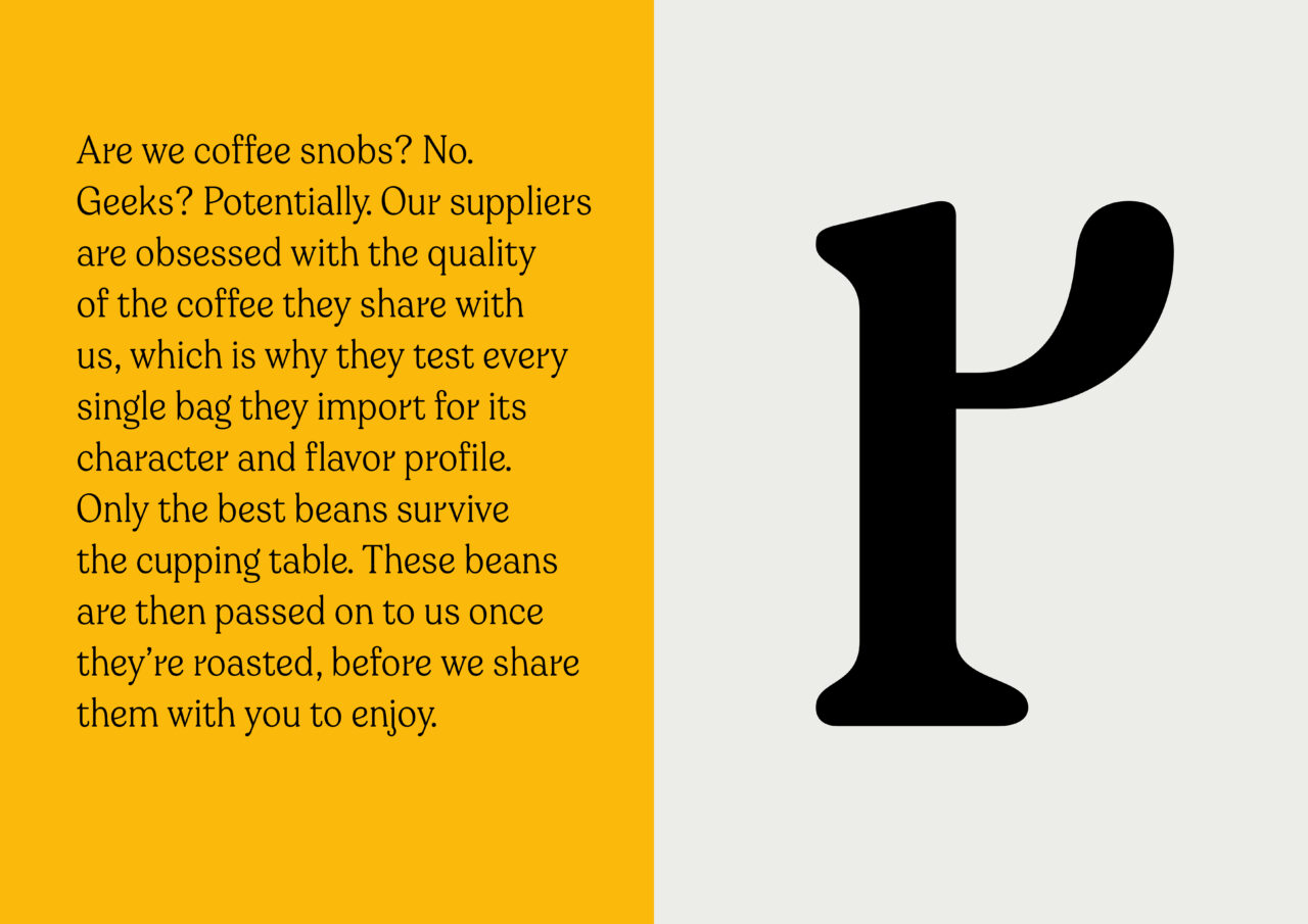
The typeface embodies the spirit of the brand by being quirky, honest and real. All corners are soft and friendly, just like Emma Chamberlain, but with unique characteristics here and there. Notice, for instance, the lower case ‘r’ and ‘j’.
PDF Filer
Shortliste
CCA 2021

