Kunde
Chamberlain Coffee
Bureau
Kontrapunkt
Krediteringer
Beskrivelse
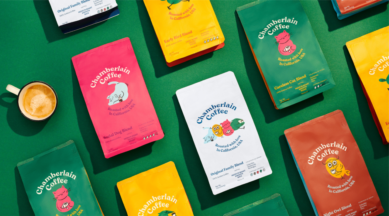
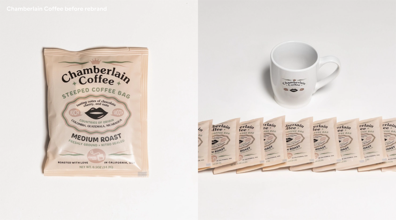
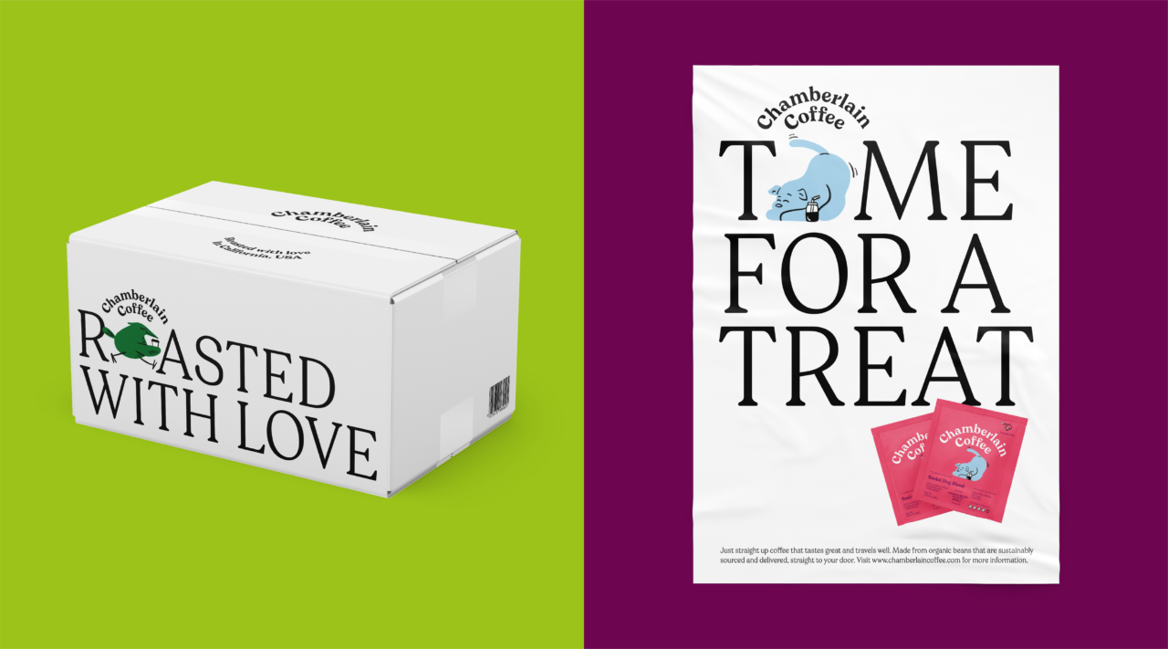
We worked with YouTube-sensation-gone-coffee-aficionada Emma Chamberlain and her team to deliver a kickass brand refresh. The rebrand included packaging design, bespoke typeface, brand Identity, copywriting, customer experience and e-commerce.
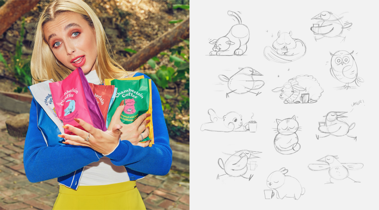
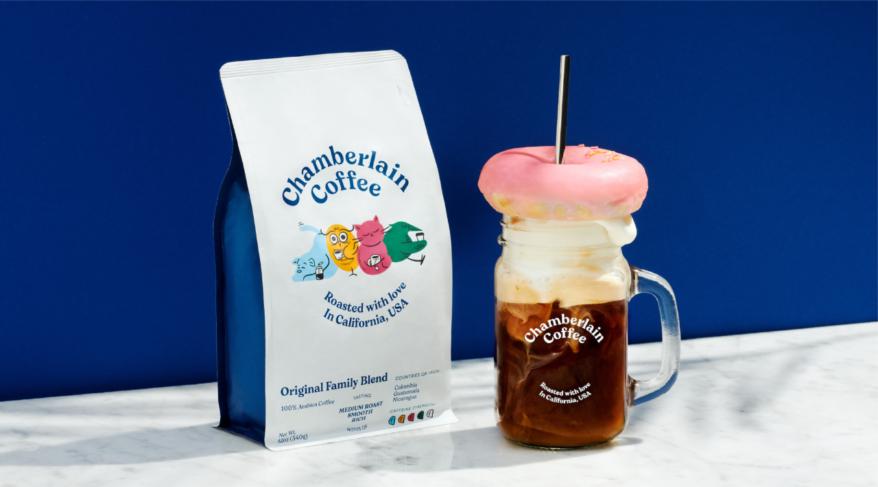
Speaking to young millennials, Chamberlain Coffee is a brand that praises coffee lovers and believes that coffee is more than just a beverage. It is an attitude and a mood. But Chamberlain Coffee didn’t feel Emma’ish. So the new brand universe originates from Emma’s personality, driven by a playful tone of voice and builds on four initial characters that represent characteristics we can all relate to. Like most people, she’s complex and contradictory. That’s why we decided to develop a number of brand characters that each represent branches of Emma’s personality. Each character is also connected to Chamberlain Coffee’s different flavours. Because coffee is more than a beverage. It’s a whole mood.
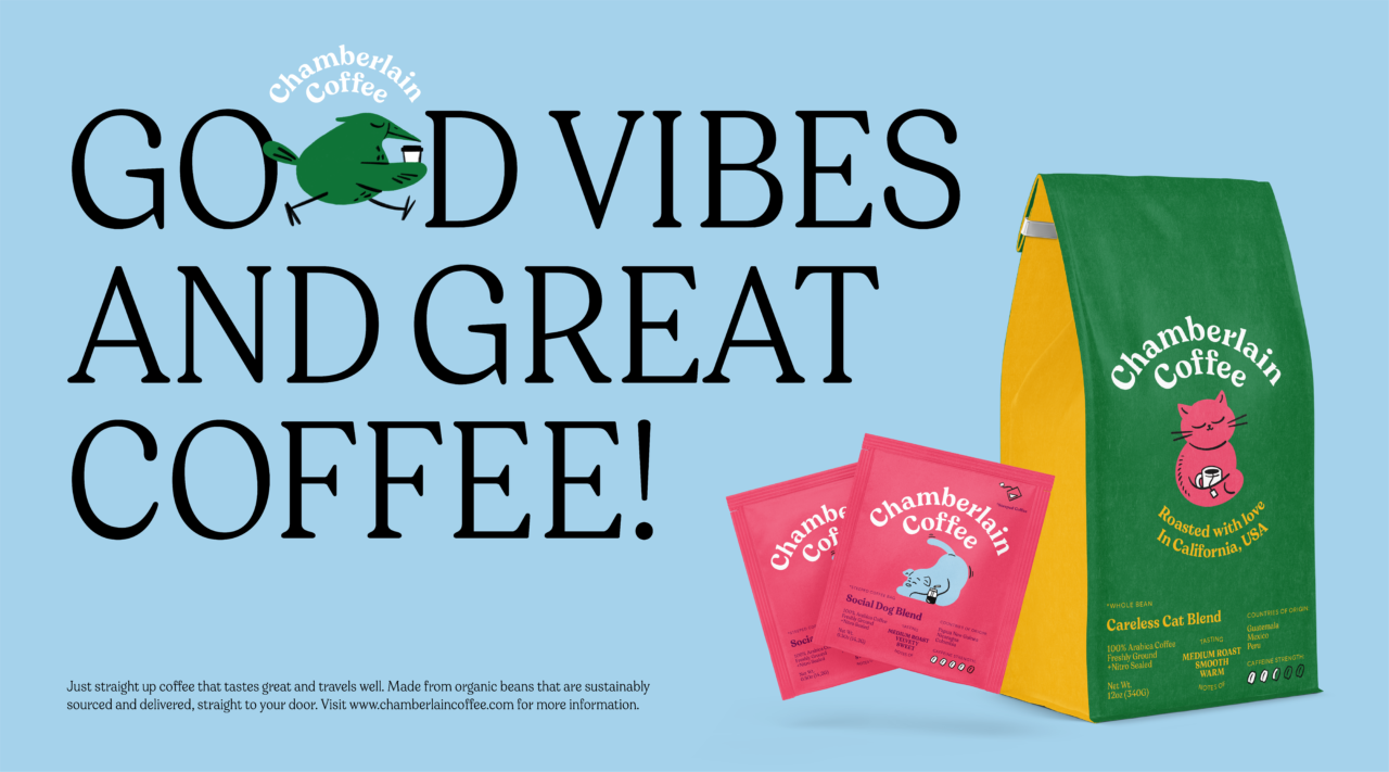
We transformed Emma’s tone from ‘the tube’ on to Chamberlain Coffee’s top touchpoints, making the brand tone of voice as honest and ironic as Emma. Undecided what mood you’re in – FOMO or JOMO? Just go for the coffee that speaks to you on that day and you’ll know.
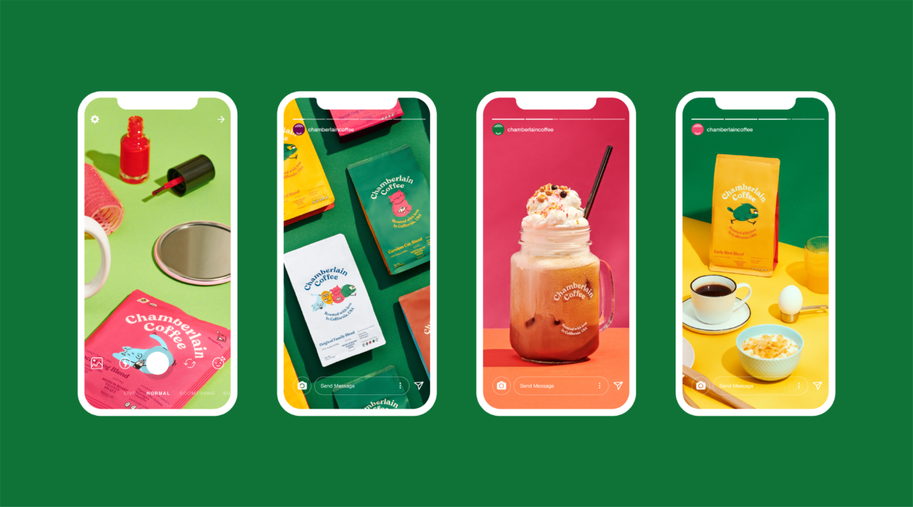
Emma’s primary points of sale are online. On Instagram as well as her brand new website. On Instagram we aim for a personal snap-shot vibe. Photos always in colour, shot on film or with a film/analogue-like look. Colourful clothing, and a personal and relatable expression. So, the guidelines basically go: Emma, just be Emma.
The e-commerce website is playful and vibrant like the brand’s other touchpoints – spiced up with a good bit of motion, making the online experience more surprising and dynamic. Here, each brand character and its distinct personality come to life. What better way to show that Chamberlain Coffee is busily preparing your order than with the busy, over-achieving Early Bird?
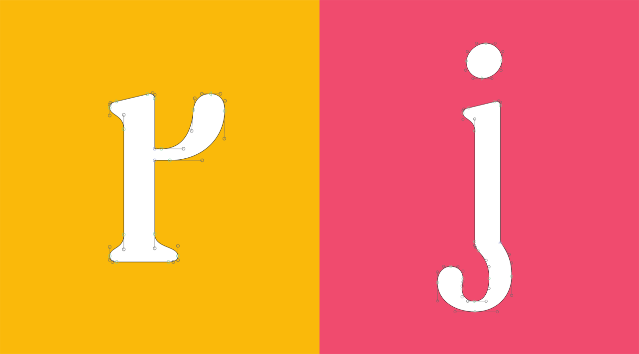
We drew Totally Emma’s type, an unpretentious and approachable typeface oozing of good vibes. Straightforward, but with personal tweaks, soft and friendly corners. The typeface embodies the spirit of the brand by being quirky, honest and real. All corners are soft and friendly, just like Emma, but with unique characteristics here and there. Notice, for instance, the lower case 'r' and ‘j’.
PDF Filer
Shortliste
CCA 2021

