Krediteringer
Beskrivelse
A SIMPLE, SENSORY AND SOPHISTICATED FLAGSHIP STORE
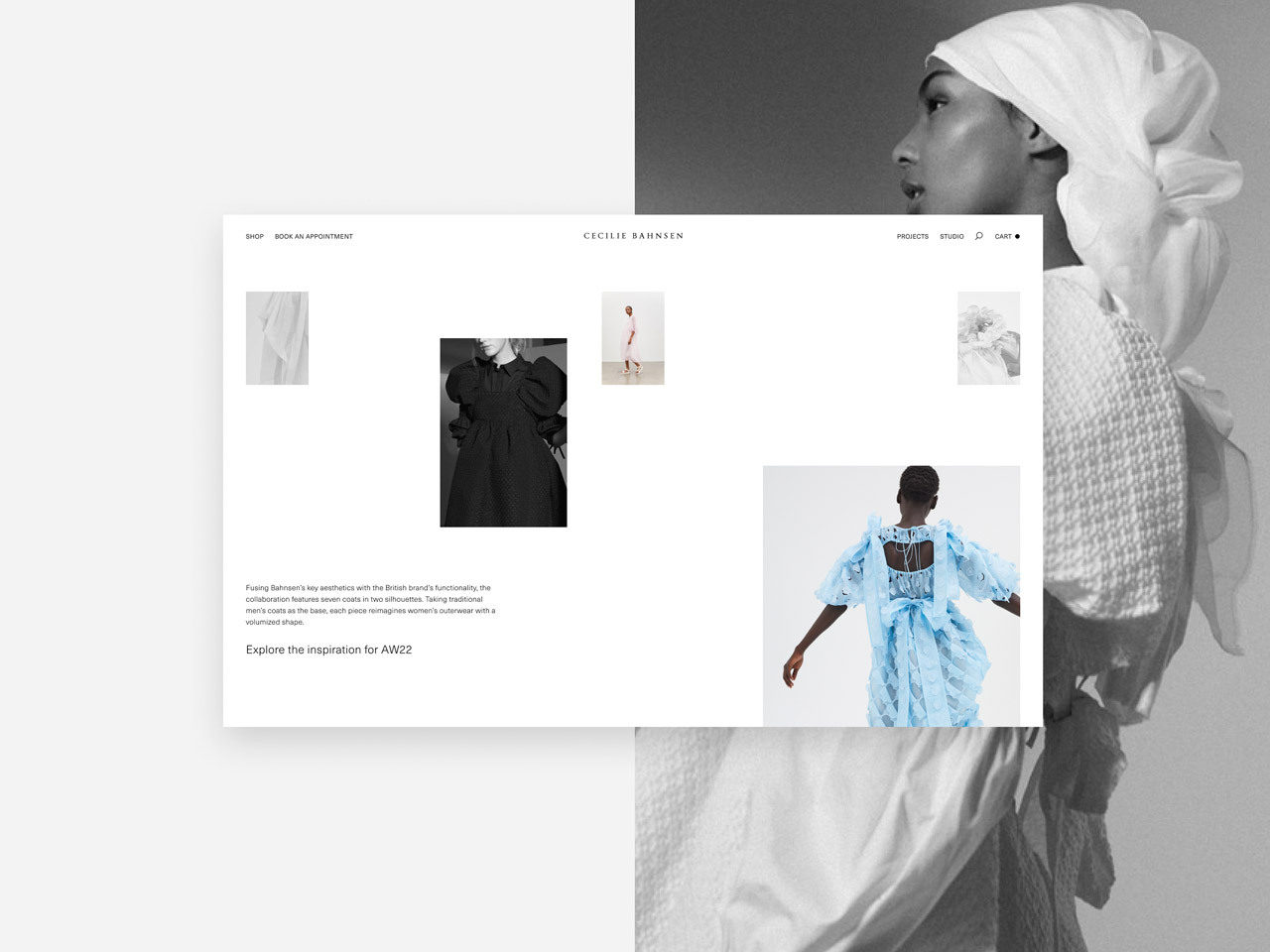
Cecilie Bahnsen operates at the intersection of couture and ready-to-wear to create luxury clothing with a relaxed, timeless style. Celebrating the traditions of fine French fashion and the design culture of Scandinavia, the collections combine craftsmanship and details with architectural volumes and sculptural silhouettes to offer a contemporary take on femininity.
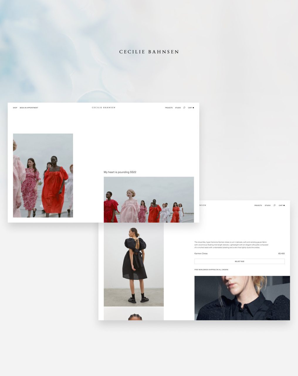
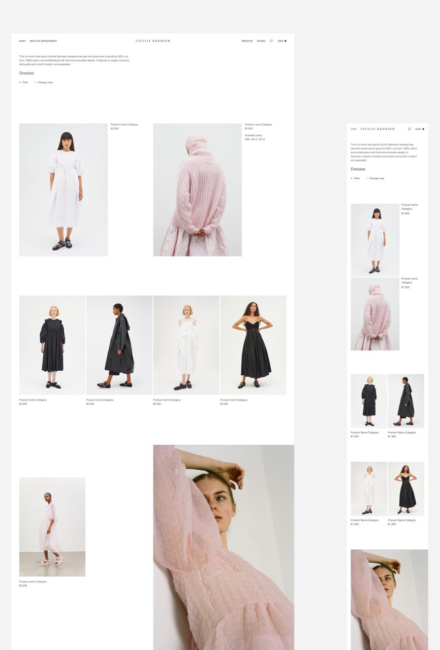
With the redesign of ceciliebahnsen.com we wanted to give the successful and growing fashion brand a new home to both match the premium international brand position, but also to specifically support the user experience and strengthen conversion. In essence, we wanted to create a simple, sensory and sophisticated flagship store experience. This was achieved through delivering the following three experience principles:
THE FLAGSHIP FEELING
The website is a primary destination to experience the Cecilie Bahnsen brand. By extension, a digital flagship store. As a result, we wanted to utilize the website as a space where the brand has full control over how the brand meets the customers. The website should feel both inspiring and extensive for anyone who would like to dig deeper into the Cecilie Bahnsen universe.
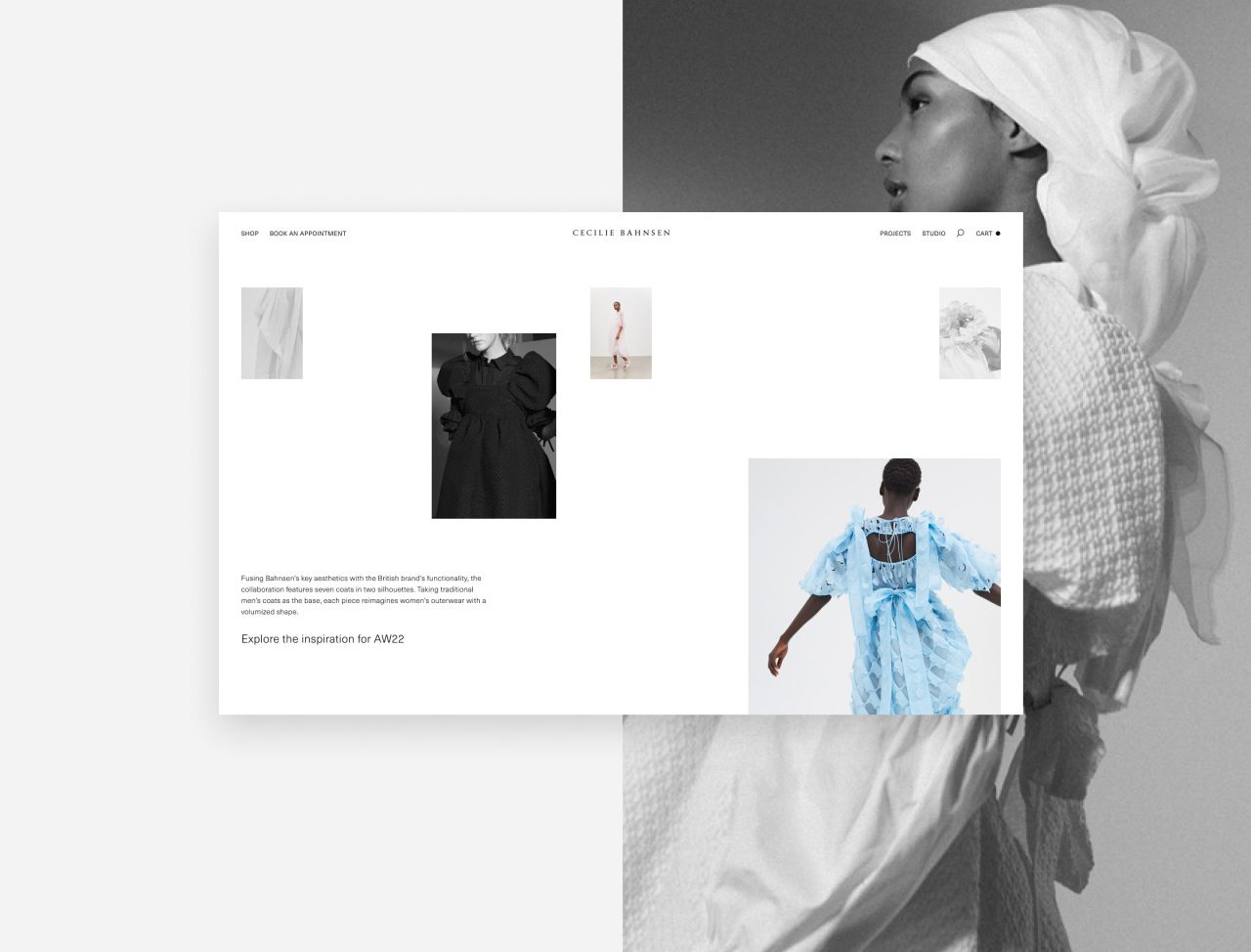
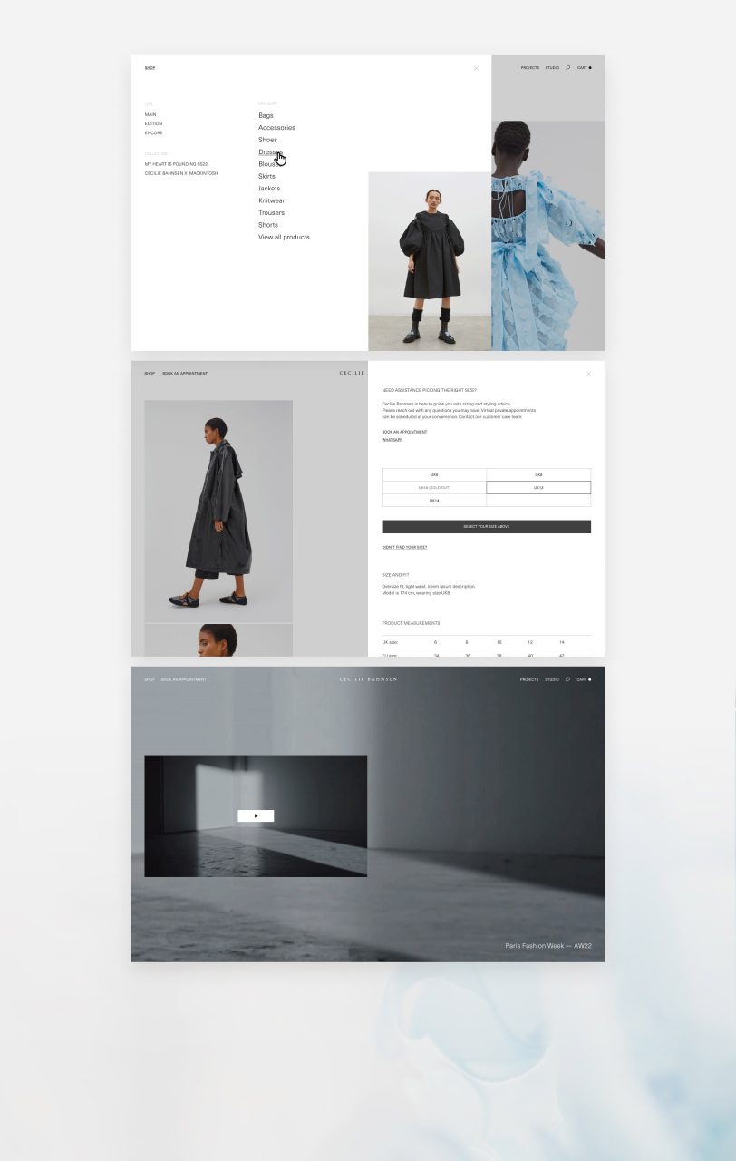
The product is at the center of the experience, but needed to be wrapped in a uniquely Cecilie Bahnsen ambience, and selective but well composed storytelling bites. We made use of video where suitable to add an emotive layer, and used interactive features to dive deeper into the details of the product and their impressive craft.
FROM THE PRODUCT AND OUT
Everything on the site is steered towards staging the products as attractive and desirable as possible, while maintaining integrity from the initial design intention.
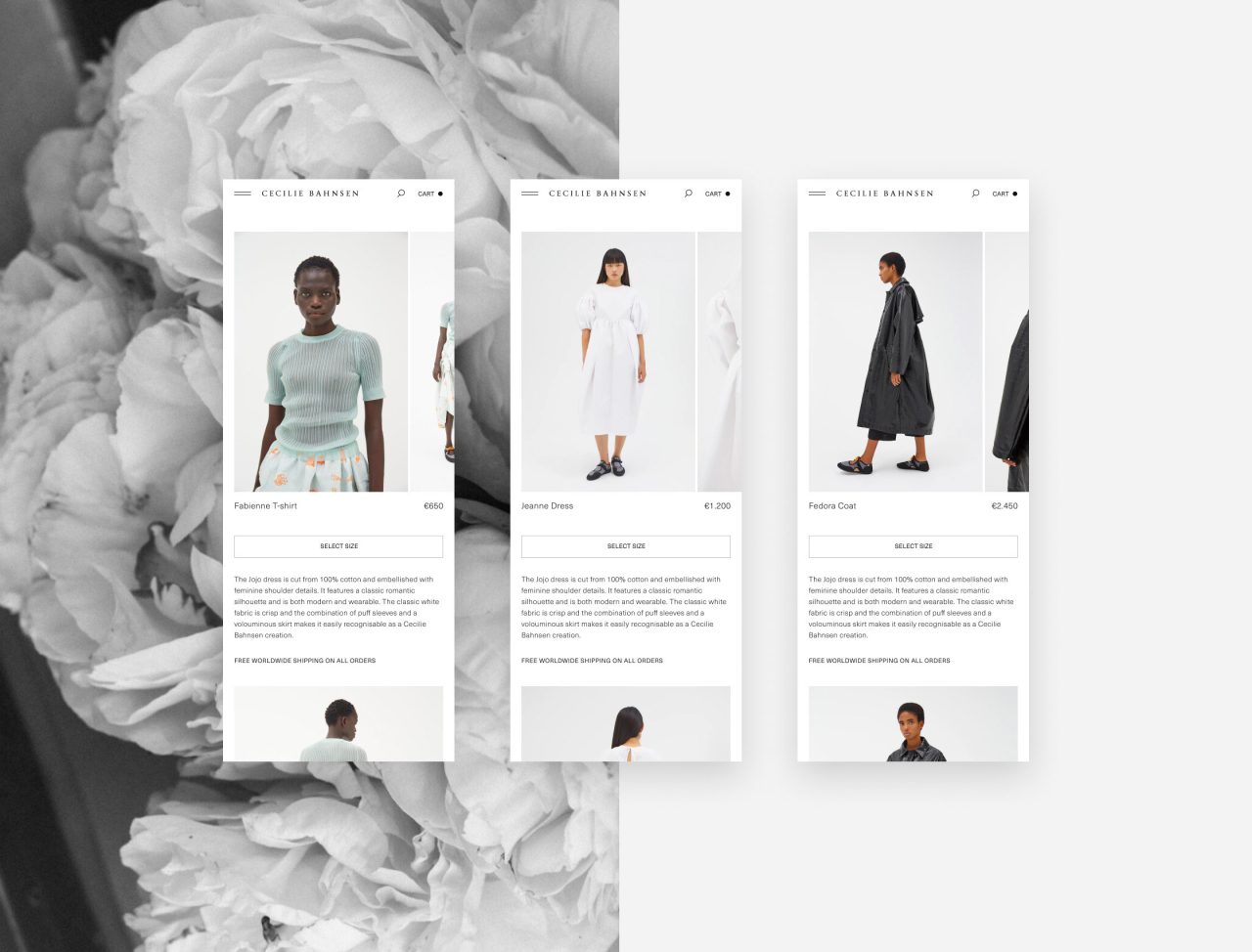
The first visual element we show on our product pages is the product on a model. This is the moment where customers need to fall in love with the product and imagine owning it. After this first section, we wanted to unfold all the stories about the extreme effort that goes into crafting every single product. Making use of space to highlight the details of each product, with the goal that every customer should take the time to understand Cecilies intention behind the product, and be made aware of the immense and fascinating labor that goes into crafting each piece.
CHOREOGRAPHED SIMPLICITY
With the experience of the new Cecelie Bahnsen site, the purpose of the design is to function as a stage for the brand and products. It needed to convey the feeling of the Cecilie Bahnsen universe without feeling too invasive.
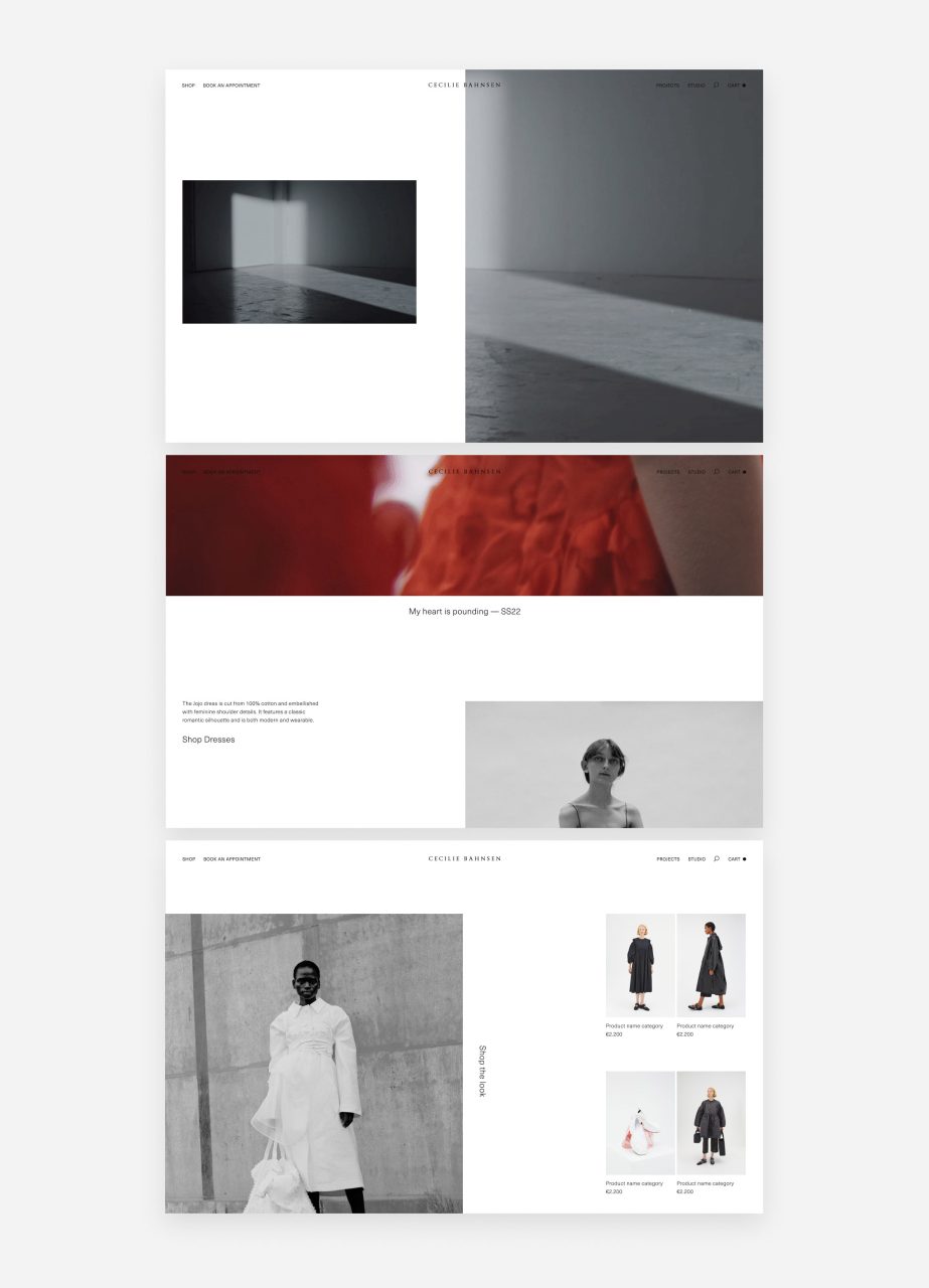
With this in mind, we also needed the website to feel sophisticated and crafted and not overley basic and generic. We gained this character through a clean, yet dynamic layout with contrasting elements spanning the screen.
At the core of the design is a modular and flexible design system where we are able to shuffle and repurpose modules across pages to simplify both the development and the editing processes.
Shortliste
CCA 2022

