Kunde
Carlsberg
Bureau
Kontrapunkt
Krediteringer
Beskrivelse
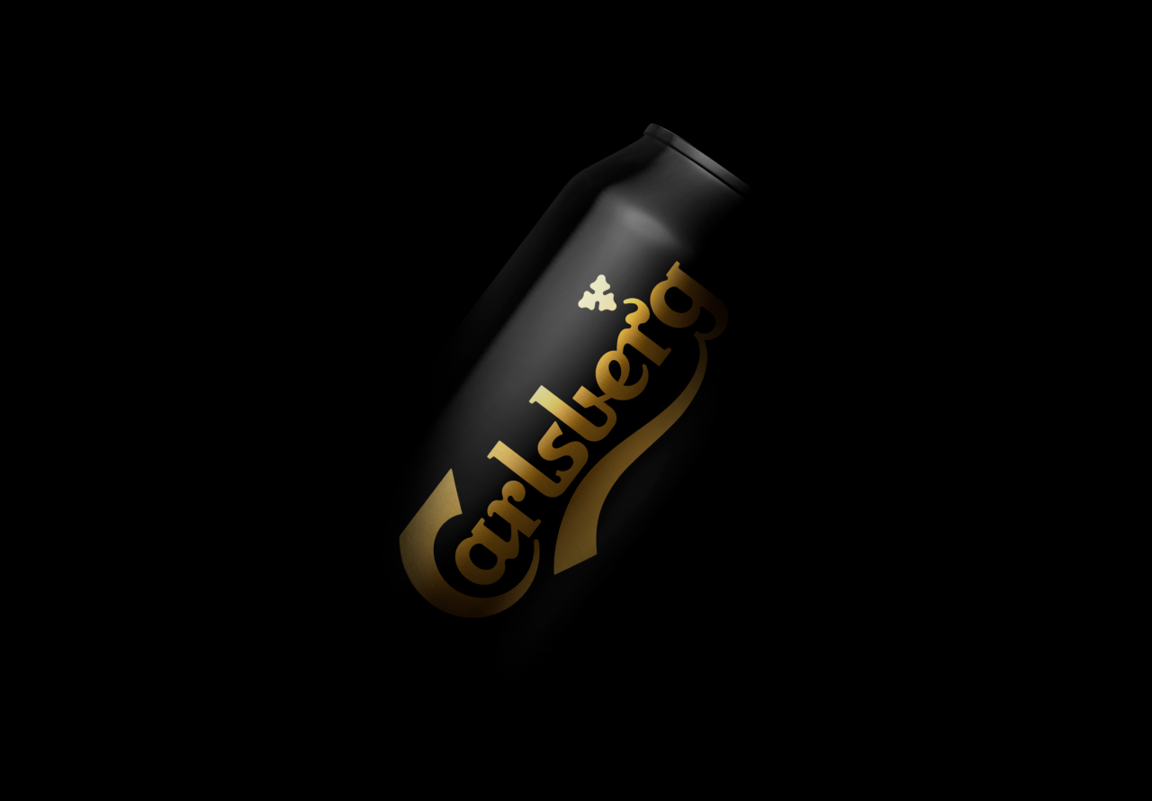
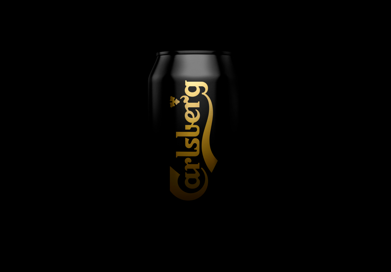
From the cool cat of beers to an overlooked lager in the Carlsberg range, Black Gold needed a facelift to revive its relevance. The design has moved towards a more current visual expression. A simple design in black and gold with one concise communicative intention.
In family with Carlsberg's regular pilsner, Black Gold is brewed for slightly longer, giving it a richer flavour profile and higher alcohol content. To reflect the bold and more full-bodied pilsner experience, we designed a darker than dark can.
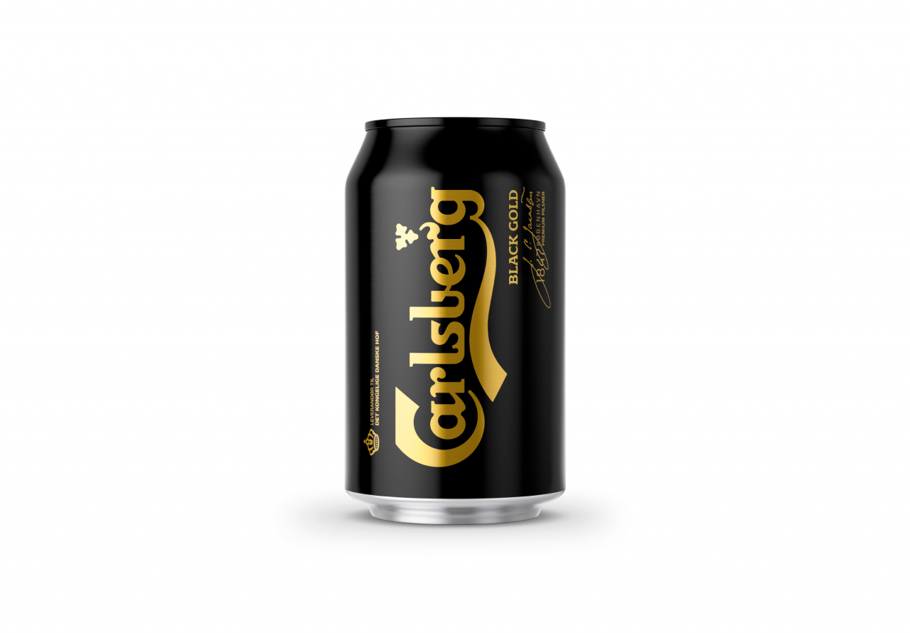
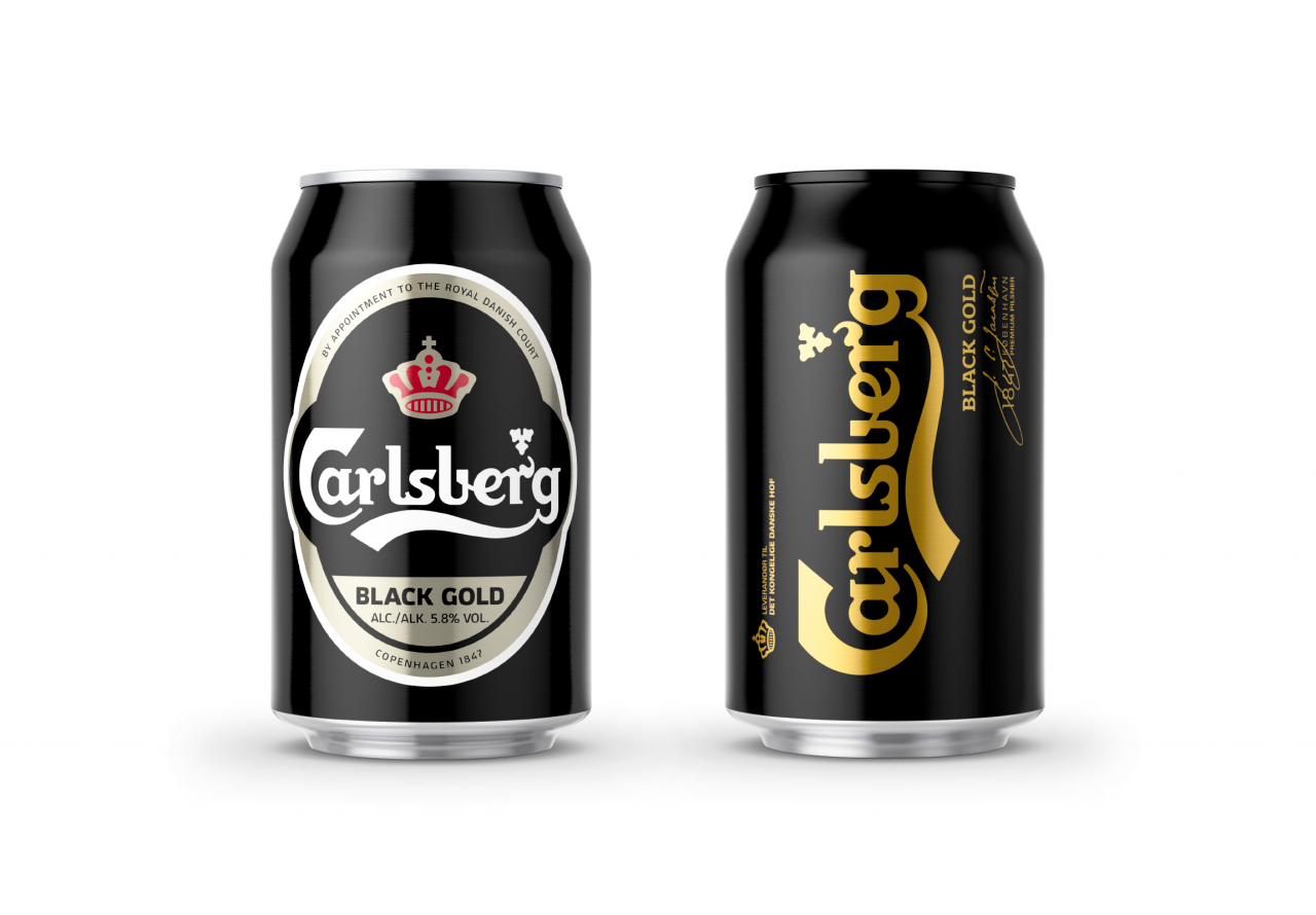
As the alpha male of the Carlsberg portfolio, we saturated the black and golden colours to dial up the contrast and give the design the richness of the beer itself. The design has a clear sense of legacy, aesthetic continuity and universality in the traditional, oval, beer bottle label. It pays homage to the historic Black Gold bottles.
The new design tells an immediate and concise visual story through three key expressions released from the oval. We made the most of the canvas and gave each asset space to bring out its stylistic qualities and associations. We did not create new assets but took full use of the well-established and familiar elements. Through great attention to detail, we continued Carlsberg's visual language while taking it in a new direction.
The text and the crown on the can mark the letter-craft, impact and familiarity of the Carlsberg wordmark and a genuine legacy in J.C Jacobsen's signature with the quality and provenance of a Danish Royal Appointment. These assets are linked by the distinction, flavour cues and aged quality of a black and warm gold.
The all black top is both simple and in line with the design but also sets it apart from the rest of the competition. A rare addition that brings quality and underlines the holistic approach.
To elevate the experience we used a warmer colour and an improved balance, and a better use of proportion alongside orientation.
Lettering maintains a continuity of brand and leverages an associated heritage and sense of craft, which continues through to a custom slab-serif.
Relying only on proportion and contrast, arrangement and space, colour and finish to derive an immediate visual disruption, sense of modernity, yet a continuity of legacy and a reassurance of quality.
A communicative simplicity speak of a modern brand with a quiet confidence in its history and profile, and a distinction and quality of product.
Shortliste
CCA 2018

