Kunde
Canairi®
Bureau
BASEBORN
Krediteringer
Beskrivelse
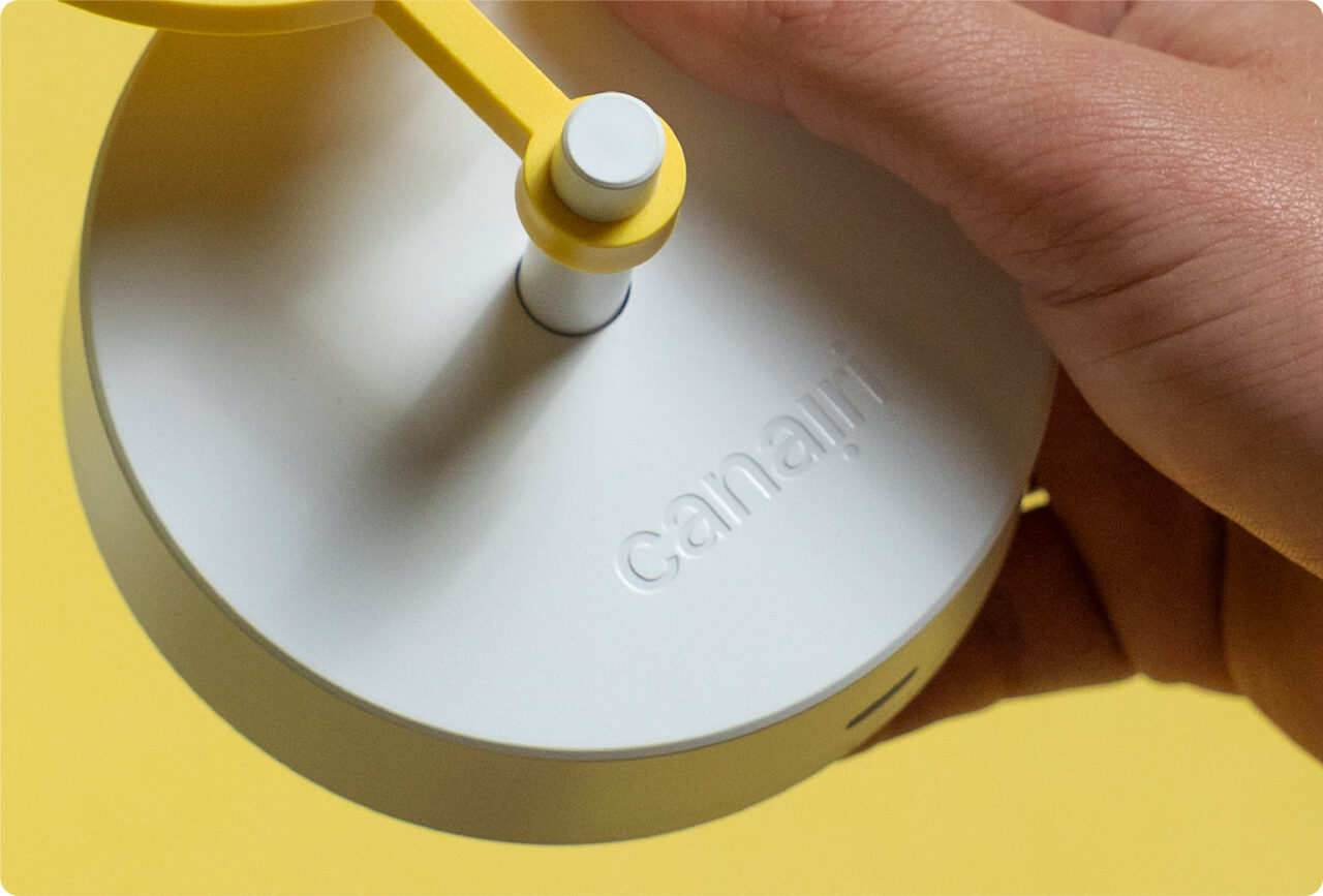
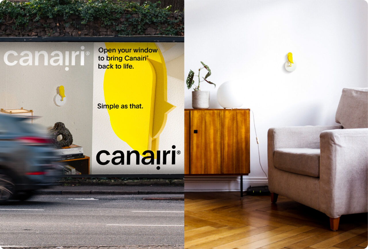
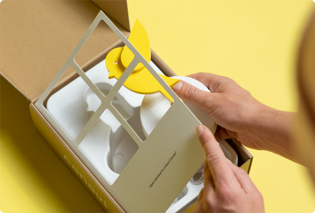
Back in the days, mine workers would bring a canary with them in the coal mine, to detect toxic gasses. When the bird fainted, it was time to get out. With a built-in CO2-sensor, Canairi® works exactly the same way - but in your home, office or classroom. When the air quality is poor the bird will drop, until you open your windows and bring it back up.
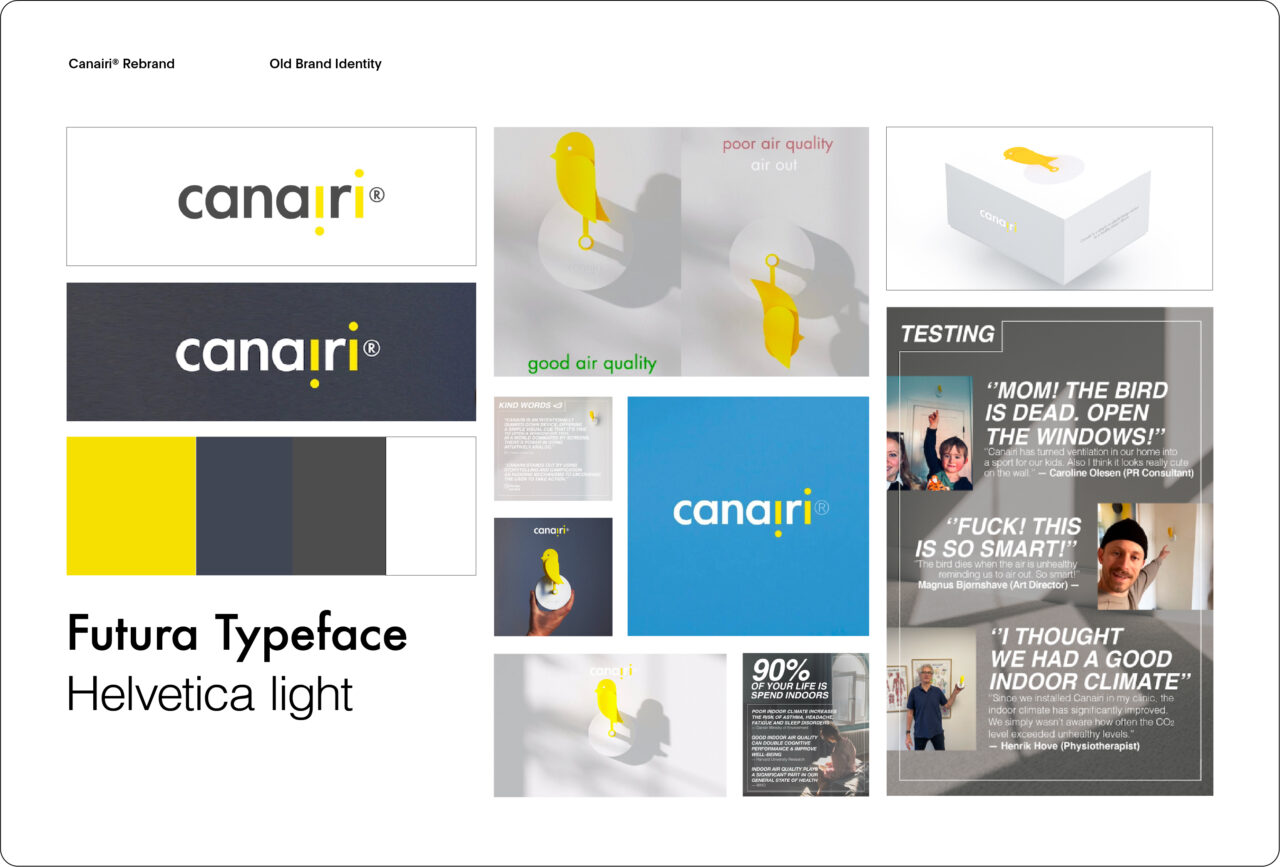
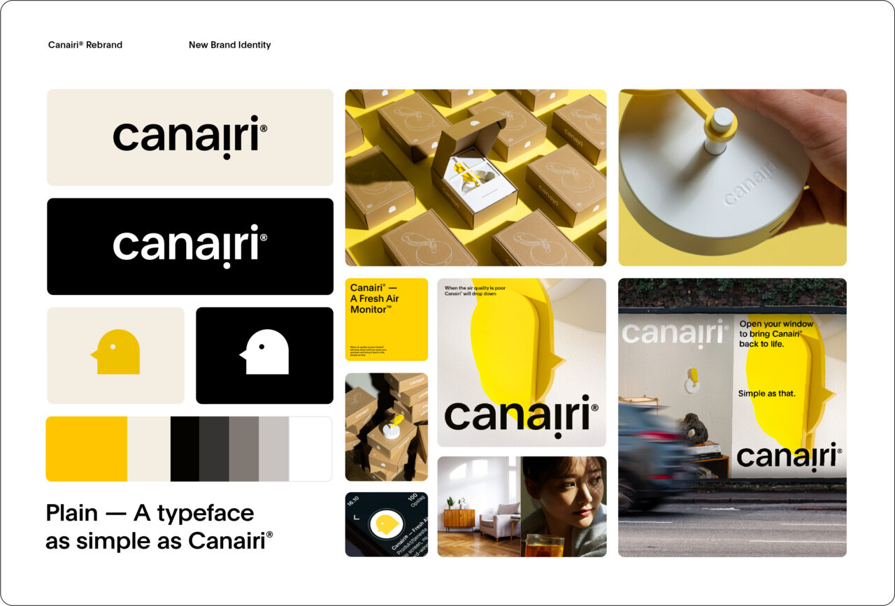
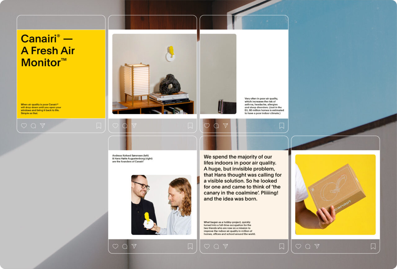
The new brand identity for Canairi® is based on the idea of focusing more on the lifestyle around the product but still keeping it as the everyday hero. By introducing bright imagery with natural light coming in from the windows, we create the feeling of a clean and fresh indoor climate, without focusing too much on opening the windows themselves. This way there's more focus on Canairi® as a beautiful design product that fits any room in the house, but still tells the story of how it helps with keeping the air quality good. Swapping for a warmer tone of yellow gives a more natural feeling of the sun and letting in nature.
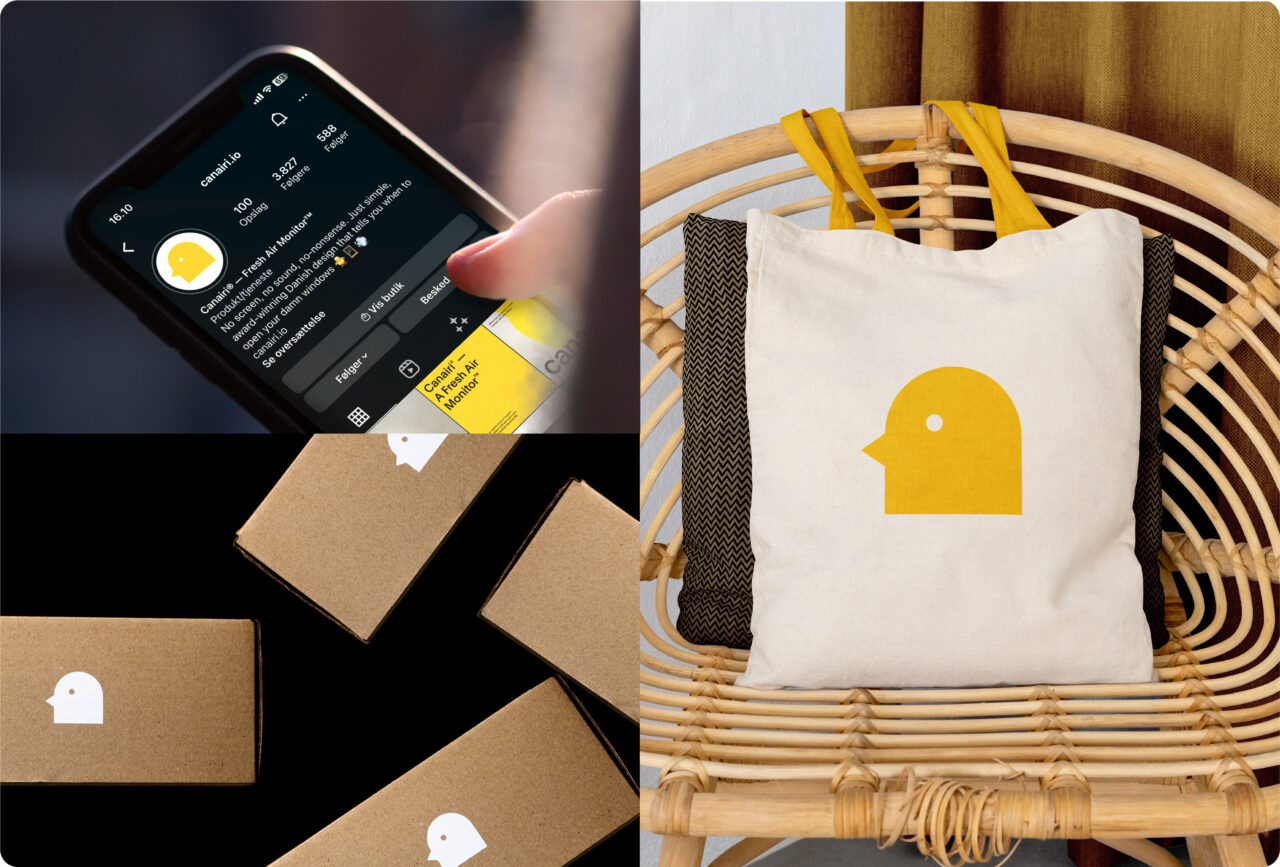
We wanted to keep the idea of the original logo with the i's representing the main states of Canairi® (up or down), but aligning it with details from the shape of the bird, to improve coherence between the product and the logotype. The logomark is made to resemble the bird head. Allowing the bird itself to be a main brand driver throughout all platforms even when the product isn’t shown. The animations are based on the simple movement of the bird dropping when the air quality is poor and rising when the air quality is good again.
Shortliste
CCA 2023


