Kunde
AUDO Copenhagen
Bureau
Studio C
Krediteringer
Beskrivelse
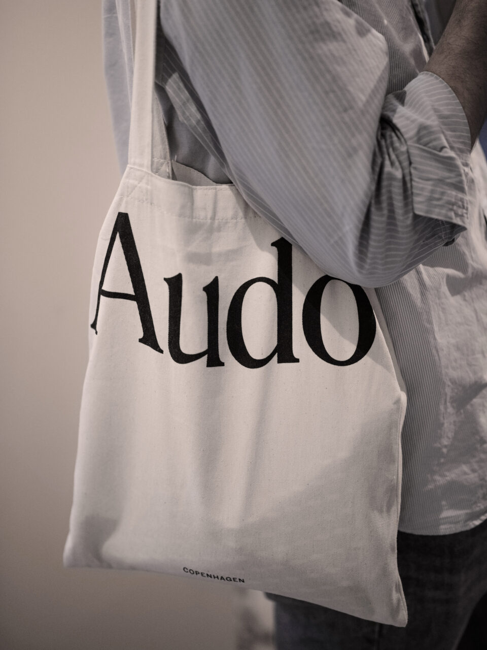
Audo Copenhagen’s logo consists of a logotype and mark which form an adaptive system for use in many different modes and situations across the brand’s touchpoints.
The condensed serif logotype draws on inspiration from the 20th century and echoes the brands connection to and reverence of design heritage whilst playful, oversized applications bring a more modern attitude. Originally cut for text sizes, the typeface’s soft bracketed serifs give it a welcoming softness, particularly when used at large scale.
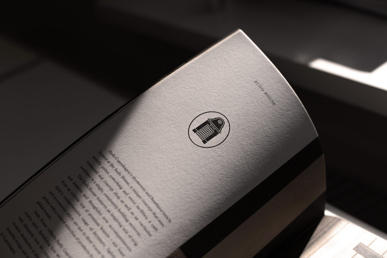
The brand’s logomark, depicting a house, represents Audo’s unique approach to showcasing its products. Instead of owning a showroom in Copenhagen, Audo decided to make their furniture part of a lifestyle experience. The brand remodelled a shipping office in Copenhagen’s old harbour, creating a boutique hotel with every room showcasing the brand’s products alongside a café, restaurant, co-working space and interior design reference library. Representing a pathway into the Audo universe, the logomark depicts the entryway of the building and also serves as a classic category marker as well as a unique and timeless symbol used for storytelling and authenticity.
Shortliste
CCA 2025