Kunde
Aquaporin
Bureau
Uncle Grey
Krediteringer
Beskrivelse
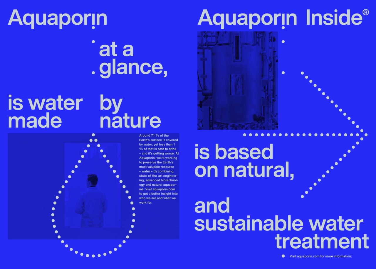
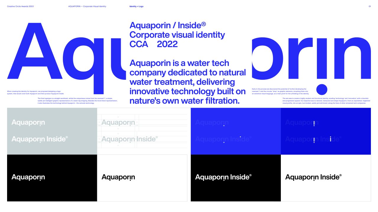
Aquaporin is a water tech company dedicated to natural water treatment, delivering innovative technology built on nature's own water filtration.
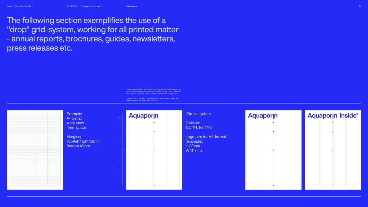
When creating the identity for Aquaporin, we proposed designing a logo-system, that would cover both Aquaporin and their product Aquaporin Inside.
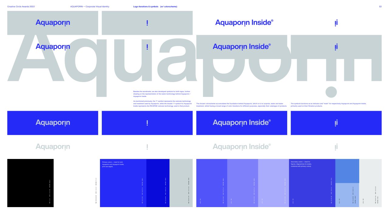
The final logotype is a straight wordmark, whilst the uniqueness comes from the reversed 'i', a simple,
subtle yet intelligent graphic representation of a water-tap dripping. Besides the more literal representation,
it also illustrates the technology behind Aquaporin - the osmosis technology.
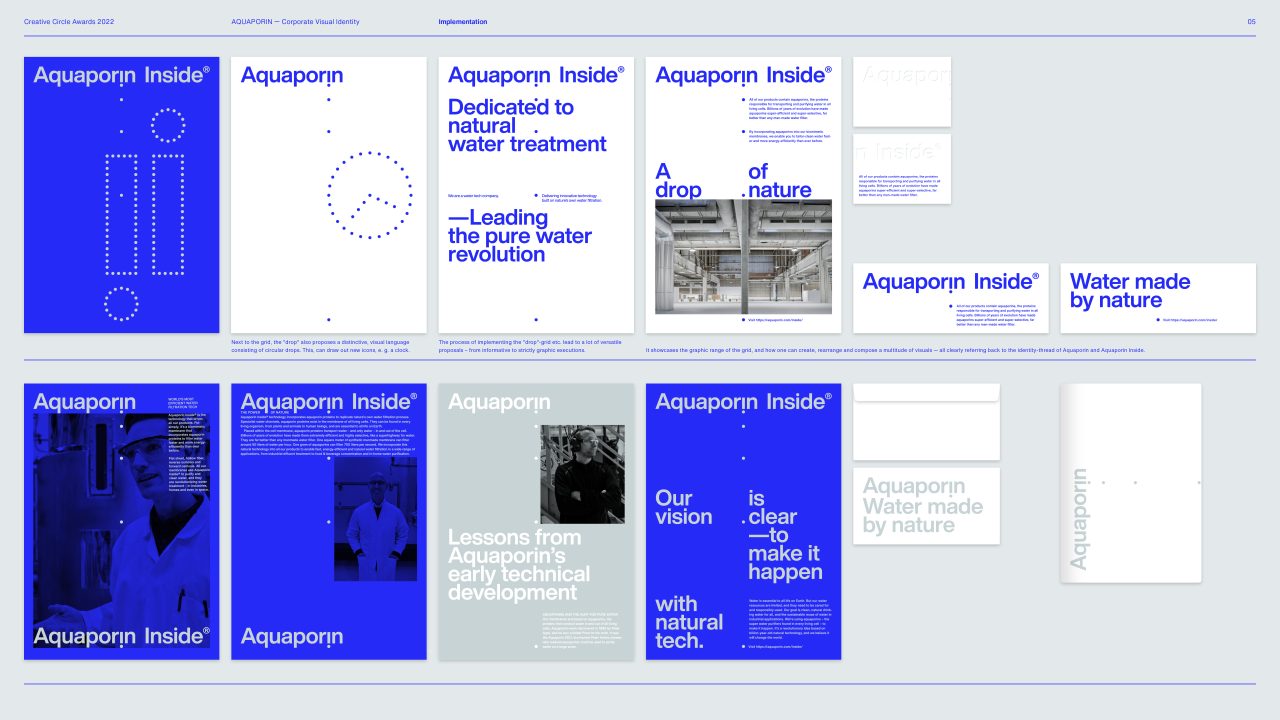
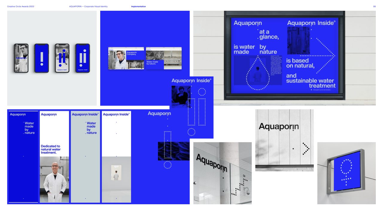
Early in the process we discovered the potential of further developing the reversed 'i' and the circular "drop" as graphic elements, morphing them into an extentive visual language, as a main point for the unfolding of the identity.
The aim was to create a highly modern and functional identity, exuding 'technology' and 'innovation', with a futuristic and progressive appeal. Our objective was to rebrand, transcend and shape Aquaporin, from an unpolished, neglected visual profile, into an epic, but modest, subtle yet bold brand, along the lines of other renowned tech-companies.
PDF Filer
Shortliste
CCA 2022

