Kunde
Andel
Krediteringer
Beskrivelse
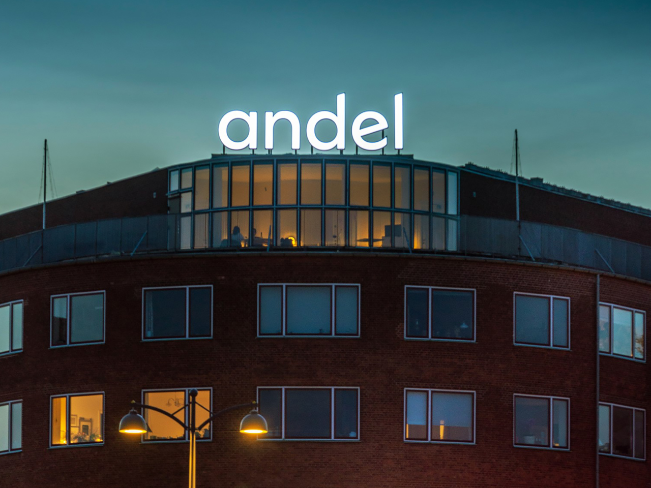
Serving as Denmarks leading energy and fibre-optic provider, Andel create energy solutions to live life. Elevating energy beyond the supply of power through creating welfare and growth regionally and in society by providing vital infrastructure and future-proof energy solutions.
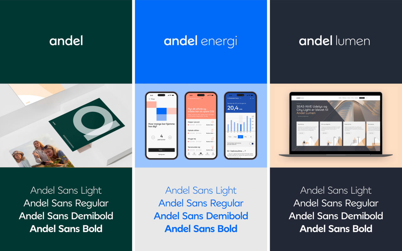
As cooperative society and a group with subsidiaries, we have designed a visual identity for the entire family of Andel brands that captures their distinctive vision and values.
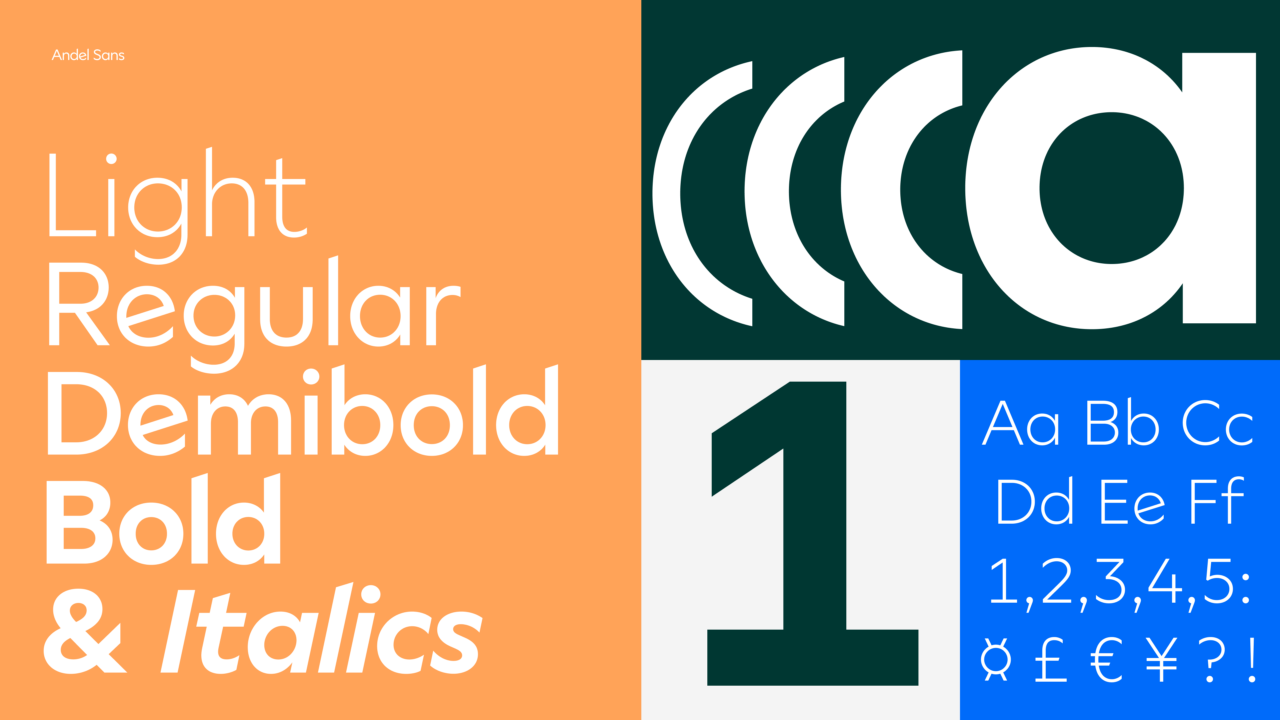
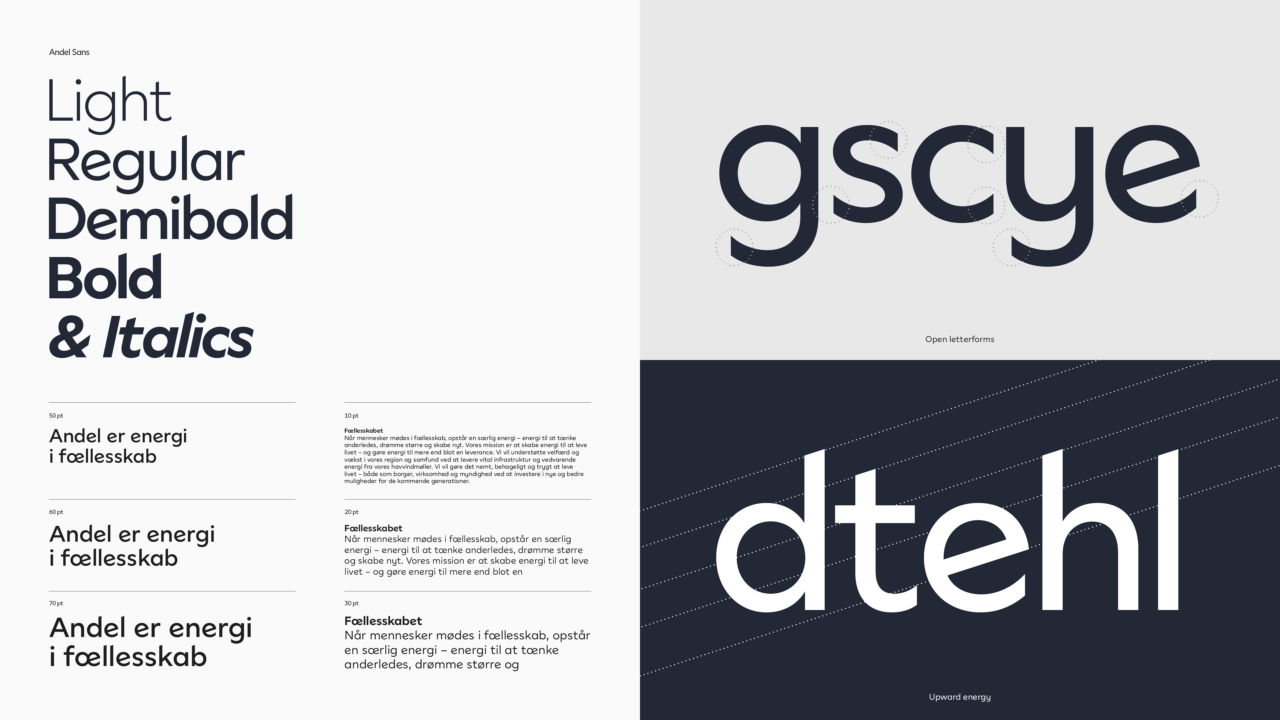
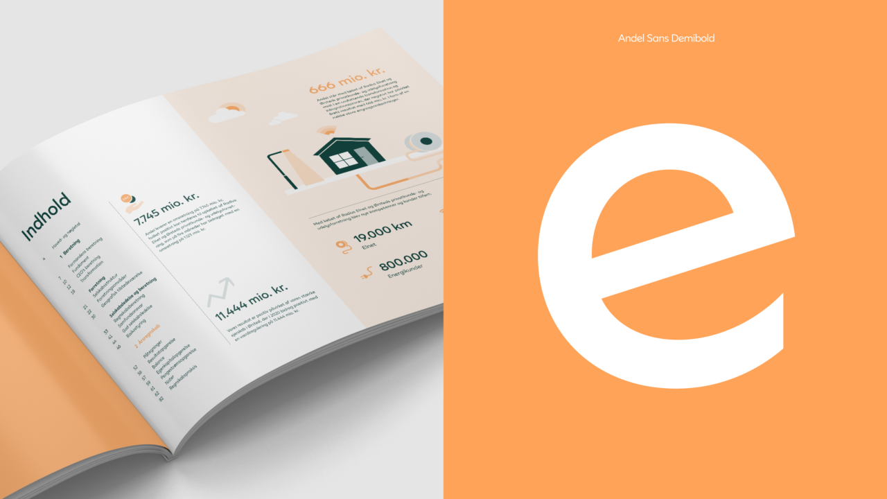
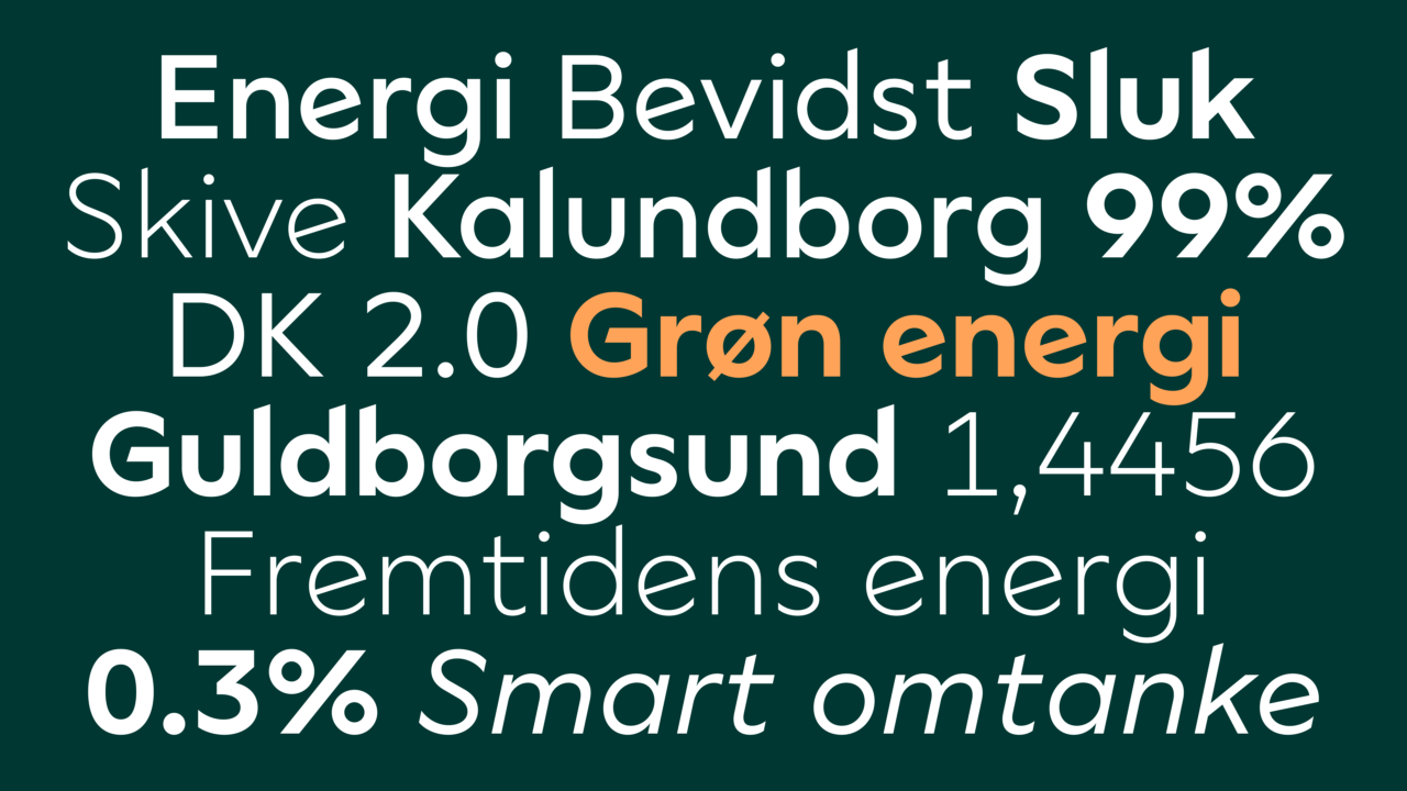
At the core of the visual identity is a bespoke typeface, Andel Sans. The uniquely created typeface is a geometric and almost modular feeling sans-serif – inspired by the shared-ownership structure that Andel is based on.
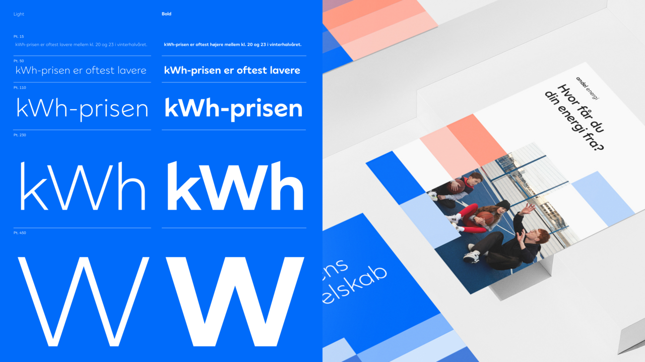
Andel Sans balances a utilitarian functionality with personality and character. With four weights and its accompanying italics it serves as a workhorse family and visual unifier across the entire Andel brand and its multiple sub-brands.
The typeface family has a clean crisp look with detailing adding to an energetic feel. Its wide circular proportions lend to a contemporary, friendly and approachable appearance.
Shortliste
CCA 2023

