Kunde
Andel
Bureau
e-Types
Krediteringer
Beskrivelse
Turning energy supply into a community feeling.
Denmark’s leading energy and fibre-optic group was in need of a visual system to tie all its brands and services together.
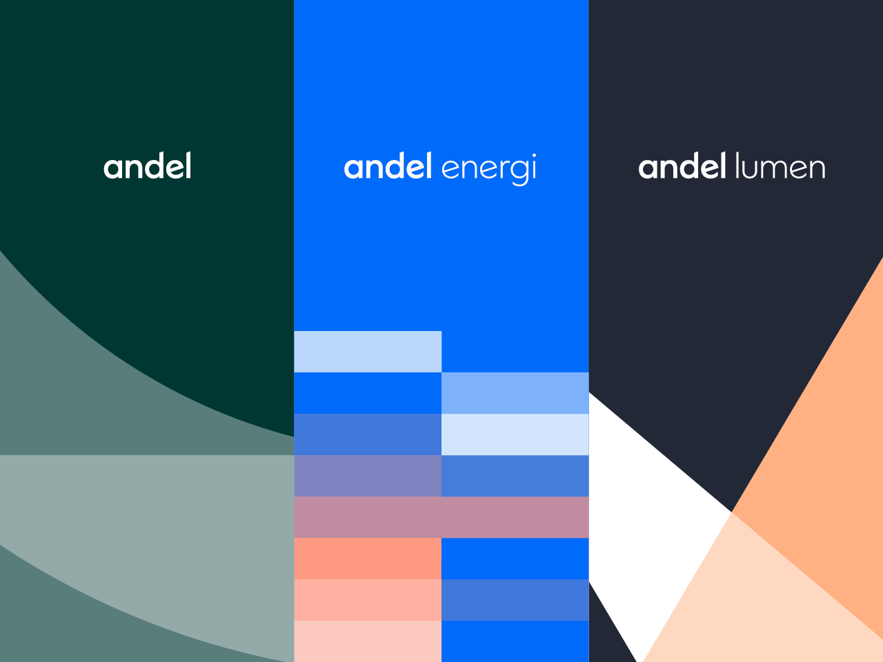
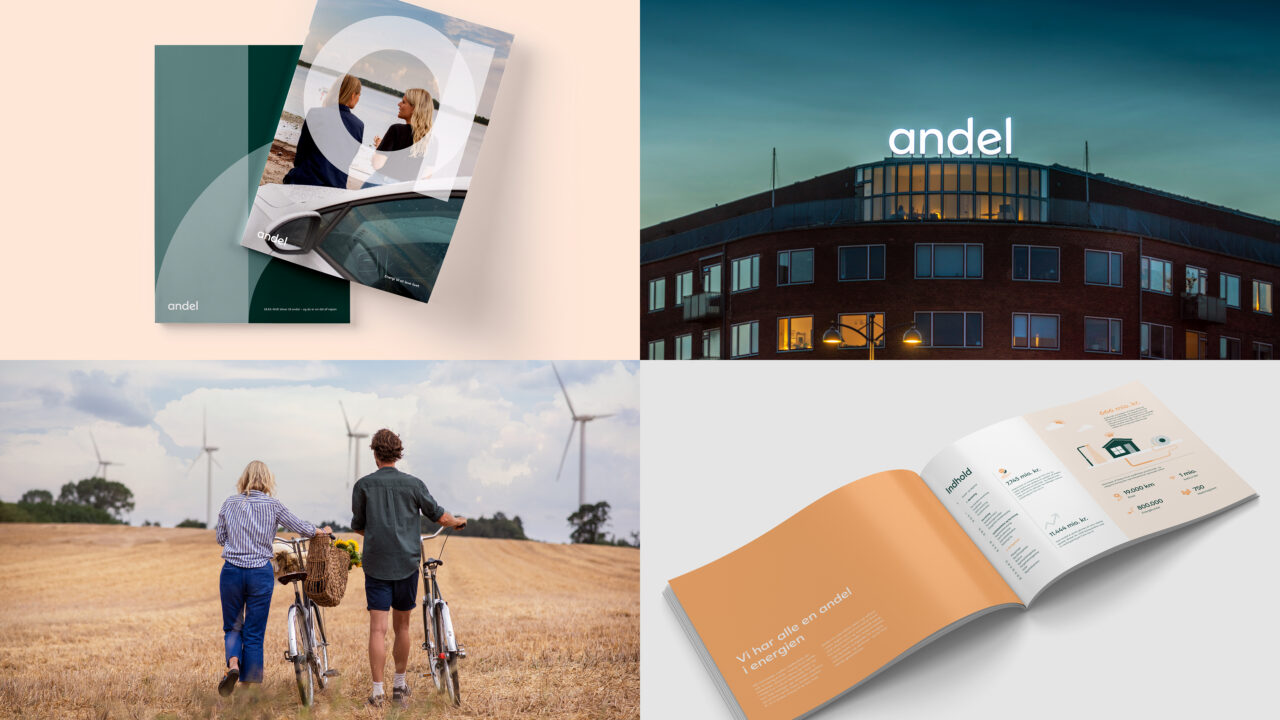
Building on the idea that energy is something we share and even create together, we set out to craft a visual identity and brand architecture for the entire family of brands that expresses a feeling of community and togetherness – and helps everyone understand the synergy between all brands in the family.
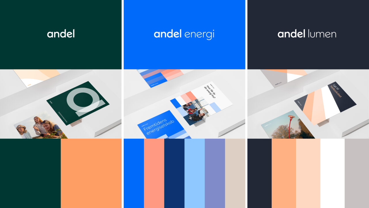
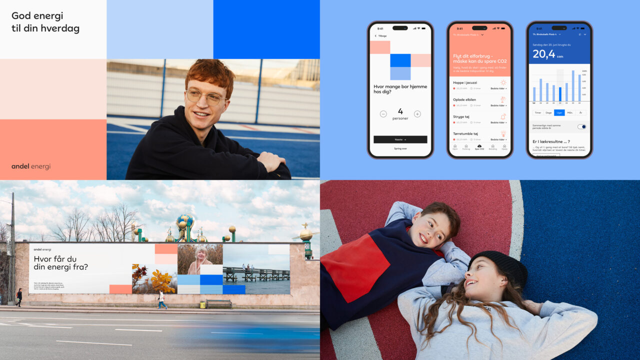
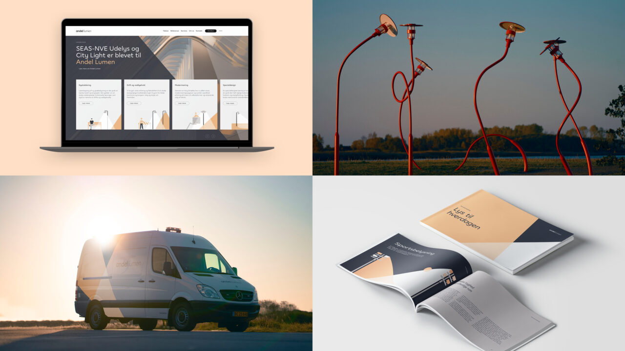
We created a comprehensive design system that could be applied across all their brands, from Andel Energi to Andel Lumen. With this new design system, Andel could now build distinctive yet visually coherent brands, allowing each brand to have its unique expression while still communicating that they are part of a family.
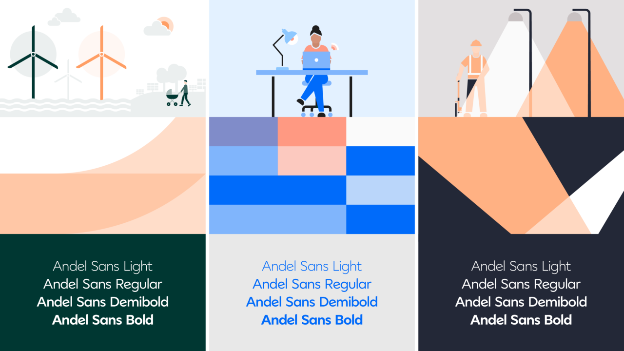
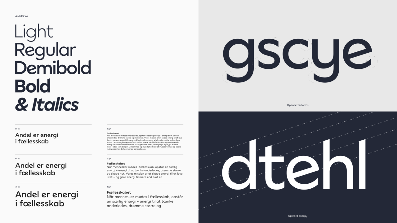
The visual identity for the Andel family features a bespoke typeface family and a uniquely crafted logo system, a universe of colours and principles for 5th elements, layout and motion, as well as icons and illustration style.
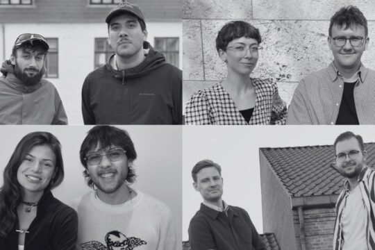
The image style underlines the warm community feeling that runs across all Andel brands. When people get together, a special kind of energy develops – energy to think differently, dream bigger and create something new.
Brand Architecture
Brand Positioning
Brand Identity
Visual Identity
Bespoke Typeface
Design Guidelines
Motion Design
Stationary
Illustration Concept
Illustrations
Icons
Brand Imagery
Sound Design
Digital Design
Website design
App Design

Vinder 2023
CCA 2023

