Kunde
AI
Bureau
Halbye Kaag JWT
Beskrivelse
AI is a Copenhagen-based architect- and engineering consultant agency specialized in sustainable solutions.
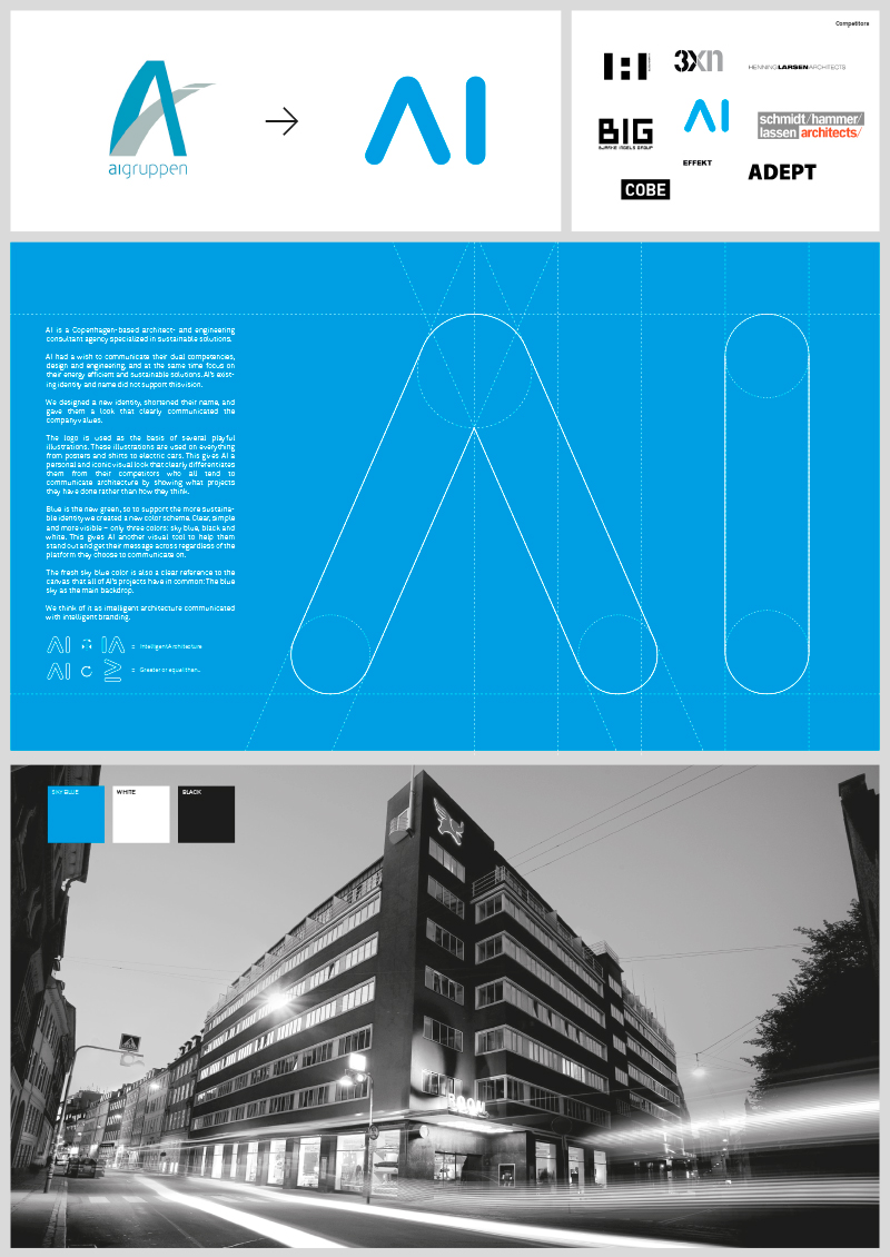
AI had a wish to communicate their dual competencies, design and engineering, and at the same time focus on their energy efficient and sustainable solutions. AI’s existing identity and name did not support this vision.
We designed a new identity, shortened their name, and gave them a look that clearly communicated the company values.
The logo is used as the basis of several playful illustrations. These illustrations are used on everything from posters and shirts to electric cars. This gives AI a personal and iconic visual look that clearly differentiates them from their competitors who all tend to communicate architecture by showing what projects they have done rather than how they think.
Blue is the new green, so to support the more sustainable identity we created a new color scheme. Clear, simple and more visible – only three colors: sky blue, black and white. This gives AI another visual tool to help them stand out and get their message across regardless of the platform they choose to communicate on.
The fresh sky blue color is also a clear reference to the canvas that all of AI’s projects have in common: The blue sky as the main backdrop.
We think of it as intelligent architecture communicated with intelligent branding.
Shortliste
CCA 2013


