Kunde
Albatros
Bureau
e-Types
Beskrivelse
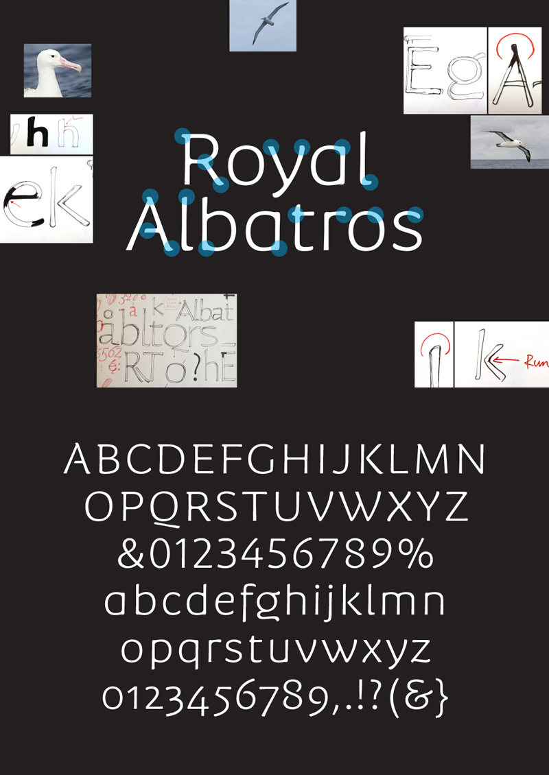
A globetrotter typeface — suits all destinations
Competition on the travel market is strong, and travel ads tend to look the same. Leading Danish travel agent Albatros wanted to stand out from the crowd. A custom typeface was the answer. The brief was to create a truly original type that reflected the quality of Albatros travels as well as function in many different contexts from online to print catalogues.
The features from the bird were drawn into the type - the long span of the wings, the characteristic beak, the lively moves and the bird’s round but sharp details. And then huge emphasis was put to make sure the type was so organic and lithe that it could be used to
communicate everything from the Great Wall marathon to luxury Mekong river cruises.
The Typeface is the core element in Albatros’ new visual identity and comes in 6 weights and is hinted for flawless screen use.
Shortliste
CCA 2014


