Kunde
Spillerforeningen
Bureau
Kontrapunkt
Krediteringer
Beskrivelse
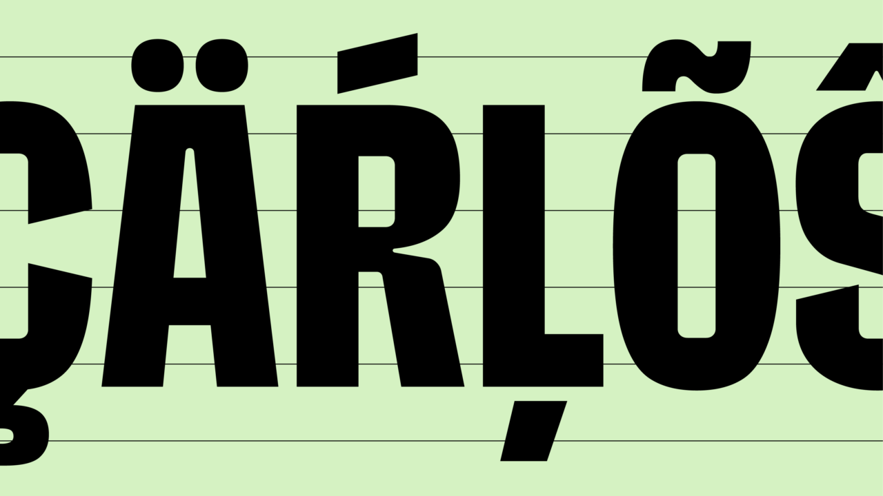
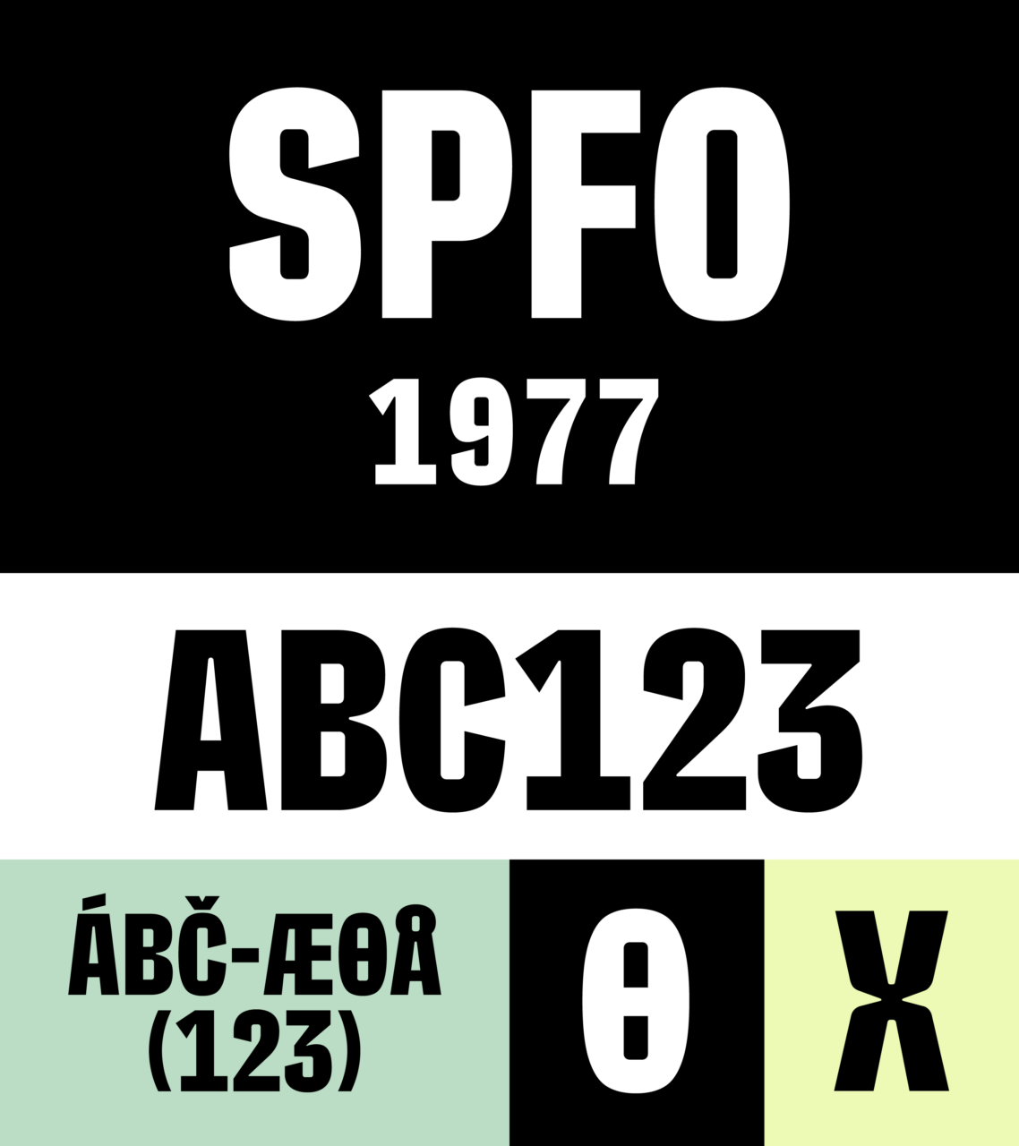
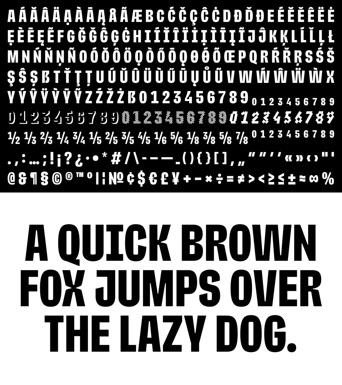
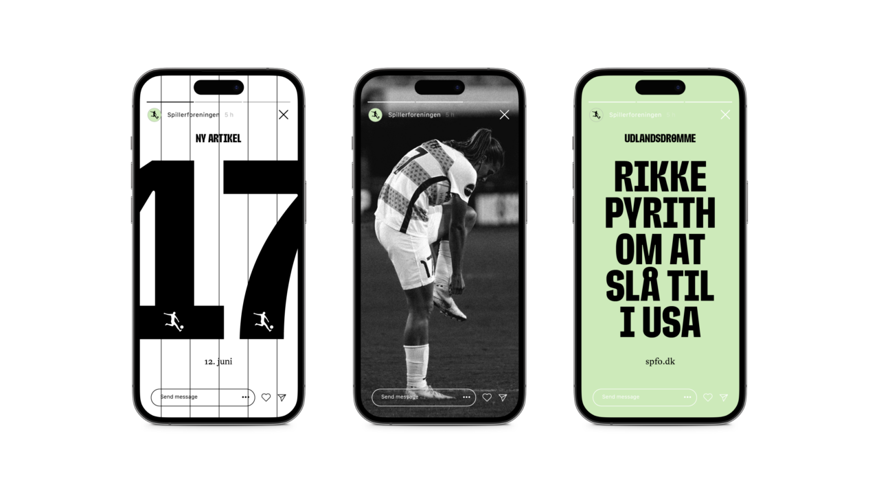
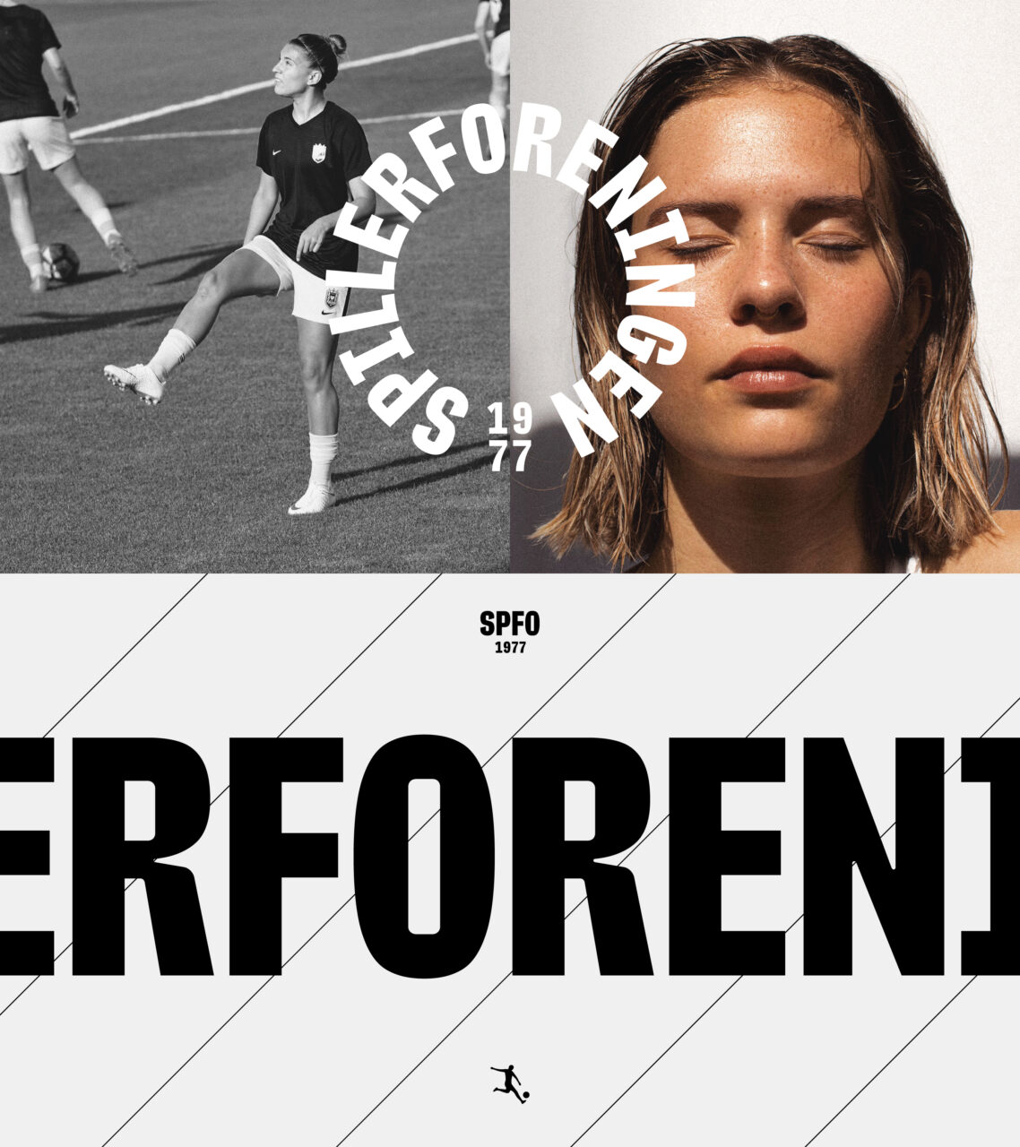
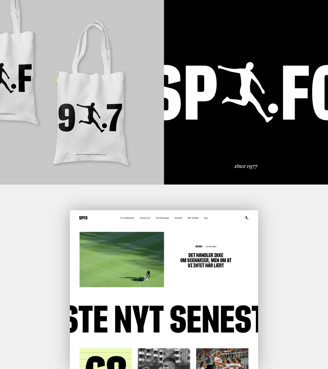
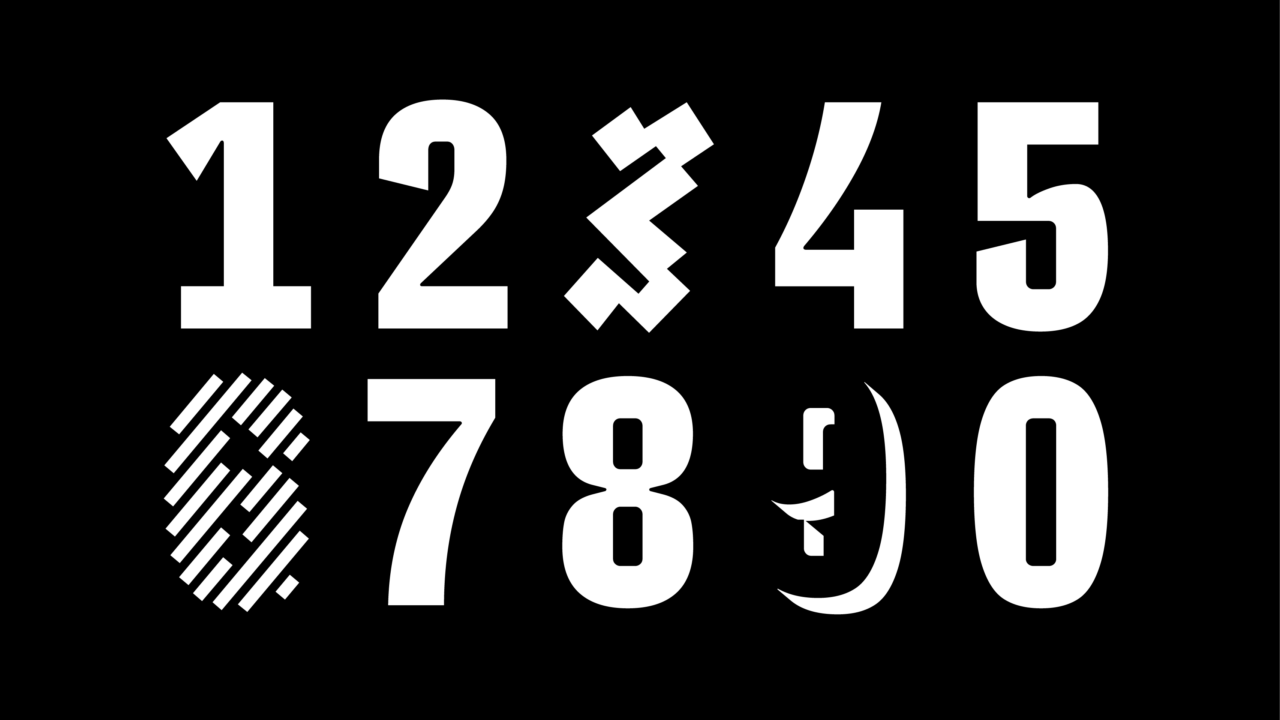
The Society for Professional Footballers (Spillerforeningen) operates in a complex and often political space between the media, trade unions, clubs, governing bodies, agents and most important of all, the players themselves. They needed to give their brand a clearer-defined position and expression to reflect their strengths, ambitions and expertise and to galvanise their organisation. A new, unifying core story and values were expressed through a custom typeface, ‘SPFO Bold’. Inspiration drew from historical football jerseys where the limited space on the back makes it necessary to use a clear, distinctive and narrow font. The result was a typeface with narrow and strong letters with slightly rounded inner spaces combined with sharp details and slanted cuts - all assisting in giving the typeface a dynamic and strong expression.
PDF Filer
Shortliste
CCA 2023

