Kunde
Noma
Bureau
Kontrapunkt
Beskrivelse
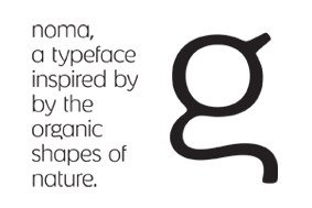
Typeface – inspired by the organic shapes of the Nordic nature
Typeface for all communication platforms. The character set is developed with strong inspiration in the Nordic nature and design tradition. All characters have a quirky feeling to them – like Mother Nature - not always being perfect in order but being alive. With noma less is truly more. Therefore the typeface should never steal attention from the gastronomic creations but rather function as a subtle extension of the experience.

Vinder 2011
CCA 2011


