Kunde
Astra
Bureau
Kontrapunkt
Beskrivelse
Astra is the new national Centre for Learning in Science, Technology and Health in Denmark, a new organisation which is the result of the merge of NTS-centeret, Danish Science Factory and ScienceTalenter.
Astra works to ensure that all young people gain insights and skills in science subjects and that a greater proportion of young people choose science education and careers.
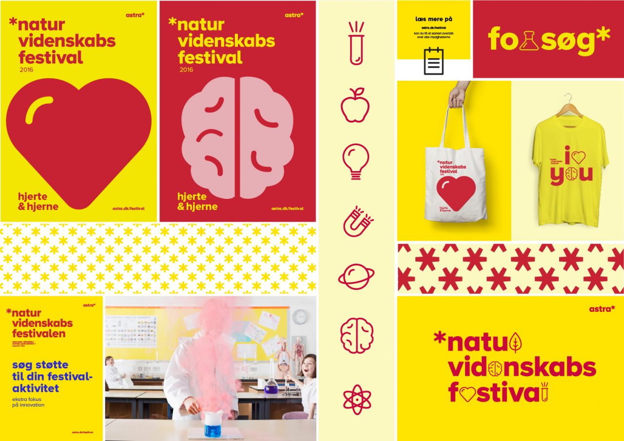
Our task was to develop a strong masterbrand, including name and visual identity that has the power to embrace all astra’s activities around the country.
Astra means star in Ancient Greek. A colossal accumulation of energy and light. The symbol is an asterisk meaning a reference pointing towards more knowledge. The visual identity expresses astra as one organization that puts shine on tomorrow’s stars in science, technology and health. The asterisk is, in combination with a playful and distinct colour palette, the driving force of the identity. The master brand colours bubble over to the different projects, showing clear affiliation to astra across platforms.

Vinder 2016
CCA 2016


